Perform the following steps to explore and visualize data:
- First, you can use a bar plot and histogram to generate descriptive statistics for each attribute, starting with Ozone. The following code gives us a bar plot for Ozone Observations:
> barplot(table(mydata$Ozone), main="Ozone Observations", xlab="O bservations", ylab="Frequency")

Ozone observation
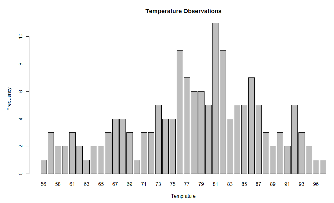
- We can generate the bar plot of Temp using the following code:
> barplot(table(mydata$Temp), main="Temperature Observations", xlab="Temprature", ylab="Frequency")