In this section, we'll talk about how we can change the display order of flex items and how this can be helpful for responsive web design. We'll also talk about how this impacts web accessibility.
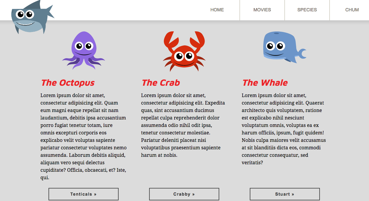
At wider screen widths, the content is displayed horizontally: first with the octopus, then the crab, and then the whale:
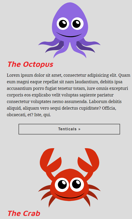
At narrower device widths, the content is displayed in the same order, just vertically, as shown in the following screenshot:
In both the cases, the display order is identical to the source ...