Plotting thematic maps
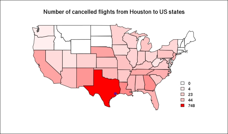
Now we have everything to create our first thematic map. Let's pass the val vector to the previously used map function (or plot it using the us object), specify a plot title, add a blue point for Houston, and then create a legend, which shows the quantiles of the overall number of cancelled flights as a reference:
> map("state", col = rgb(1, 0, 0, sqrt(val/max(val))), fill = TRUE)
> title('Number of cancelled flights from Houston to US states')
> points(h$lon, h$lat, col = 'blue', pch = 13)
> legend('bottomright', legend = round(quantile(val)),
+   fill = rgb(1, 0, 0, sqrt(quantile(val)/max(val))), box.col = NA)
Please note ...
Get Mastering Data Analysis with R now with the O’Reilly learning platform.
O’Reilly members experience books, live events, courses curated by job role, and more from O’Reilly and nearly 200 top publishers.

