(Ray)
(Fogra 39)Job:10-29438 Title:RP-Playing with Type
#175 Dtp:225 Page:30
001-041_29438.indd 30 10/24/12 2:09 PM
(Ray)
(Fogra 39)Job:10-29438 Title:RP-Playing with Type
#175 Dtp:225 Page:31
001-041_29438.indd 31 10/24/12 2:09 PM
30 playing with type
(Text)
Here, large decorative letters are used for branding purposes.
“For Country Restaurant, we created a dynamic system where the logo changes on each application. We used multiple letterforms,
overlapping the C of Country to create thirty-something distinct logos, so it can be visibly displayed without ever feeling overused.
Using interesting printing details such as die-cutting, overprinting, and metallic inks gave the logo a rich, tactile feel that adds to the
experience of the cuisine.”
Creative Director: Matteo Bologna, Mucca Design, Designer: Andrea Brown
(Ray)
(Fogra 39)Job:10-29438 Title:RP-Playing with Type
#175 Dtp:225 Page:30
001-041_29438.indd 30 10/24/12 2:08 PM
(Text)
letter and wordplay 31
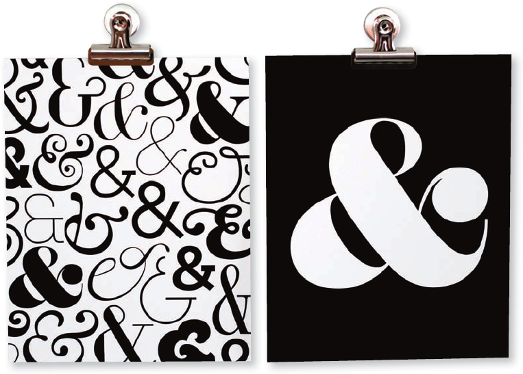
8
ampersands
An ampersand is a ligature of the letters in
et, Latin for and. Because of the stylized
nature of this character, type enthusiasts
are obsessed with it.
Explore the ampersand form and create a
poster. The only thing on the poster should
be an ampersand. You can use a digital
character that you love or explore the
character by hand, using the medium of
your choice.
If you loved this, you’ll love this!
Lucky Numbers, page 35
The ampersand pattern uses various typefaces. The single ampersand print
uses Sahara Bodoni Roman. Printed on velvet fine art paper with 100 percent
cotton rag with archival pigment inks.
Designers: Morgan Georgie and Carrie Kiefer, Ampersand Design Studio
(Ray)
(Fogra 39)Job:10-29438 Title:RP-Playing with Type
#175 Dtp:225 Page:31
001-041_29438.indd 31 10/24/12 2:08 PM
(Ray)
(Fogra 39)Job:10-29438 Title:RP-Playing with Type
#175 Dtp:225 Page:32
001-041_29438.indd 32 10/24/12 2:09 PM
(Ray)
(Fogra 39)Job:10-29438 Title:RP-Playing with Type
#175 Dtp:225 Page:33
001-041_29438.indd 33 10/24/12 2:09 PM
32 playing with type
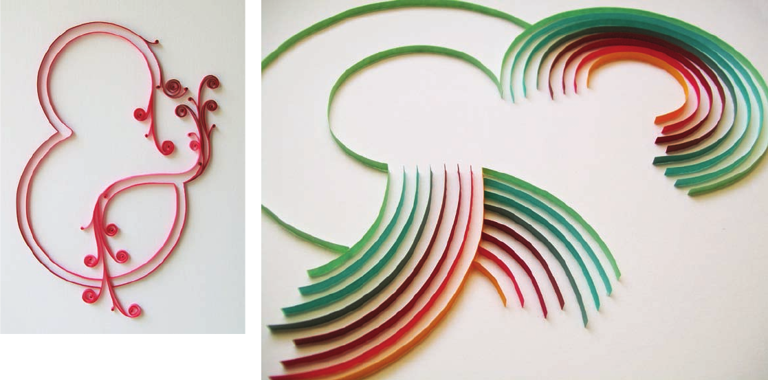
(Text)
“All of my quilled pieces begin as a design concept in
the computer where I select the spirals, shapes, and
colors I want to use. I then use the printed piece as
a template, and using quilling paper, I transfer them
to a high-quality cardstock background. The paper is
carefully glued on its side, to match the template,
with various tweezers and quilling tools.”
Designer: Melissa Van Hoose
(Ray)
(Fogra 39)Job:10-29438 Title:RP-Playing with Type
#175 Dtp:225 Page:32
001-041_29438.indd 32 10/24/12 2:08 PM
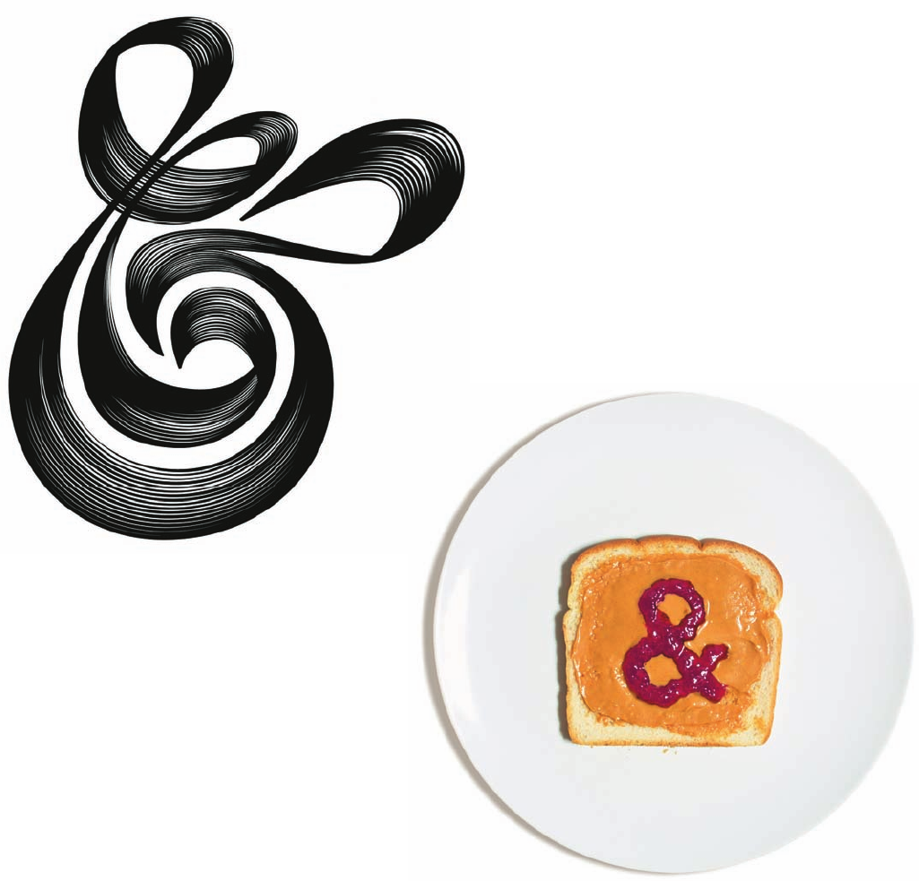
(Text)
letter and wordplay 33
Left: Designers: Friends of Type (Aaron Carámbula,
Erik Marinovich, Dennis Payongayong, Jason Wong)
Below: Designer: David Schwen
(Ray)
(Fogra 39)Job:10-29438 Title:RP-Playing with Type
#175 Dtp:225 Page:33
001-041_29438.indd 33 10/24/12 2:08 PM
(Ray)
(Fogra 39)Job:10-29438 Title:RP-Playing with Type
#175 Dtp:225 Page:32
001-041_29438.indd 32 10/24/12 2:09 PM
(Ray)
(Fogra 39)Job:10-29438 Title:RP-Playing with Type
#175 Dtp:225 Page:33
001-041_29438.indd 33 10/24/12 2:09 PM
32 playing with type
(Text)
“All of my quilled pieces begin as a design concept in
the computer where I select the spirals, shapes, and
colors I want to use. I then use the printed piece as
a template, and using quilling paper, I transfer them
to a high-quality cardstock background. The paper is
carefully glued on its side, to match the template,
with various tweezers and quilling tools.”
Designer: Melissa Van Hoose
(Ray)
(Fogra 39)Job:10-29438 Title:RP-Playing with Type
#175 Dtp:225 Page:32
001-041_29438.indd 32 10/24/12 2:08 PM
(Text)
letter and wordplay 33
Left: Designers: Friends of Type (Aaron Carámbula,
Erik Marinovich, Dennis Payongayong, Jason Wong)
Below: Designer: David Schwen
(Ray)
(Fogra 39)Job:10-29438 Title:RP-Playing with Type
#175 Dtp:225 Page:33
001-041_29438.indd 33 10/24/12 2:08 PM
(Ray)
(Fogra 39)Job:10-29438 Title:RP-Playing with Type
#175 Dtp:225 Page:34
001-041_29438.indd 34 10/24/12 2:09 PM
(Ray)
(Fogra 39)Job:10-29438 Title:RP-Playing with Type
#175 Dtp:225 Page:35
001-041_29438.indd 35 10/24/12 2:09 PM
34 playing with type
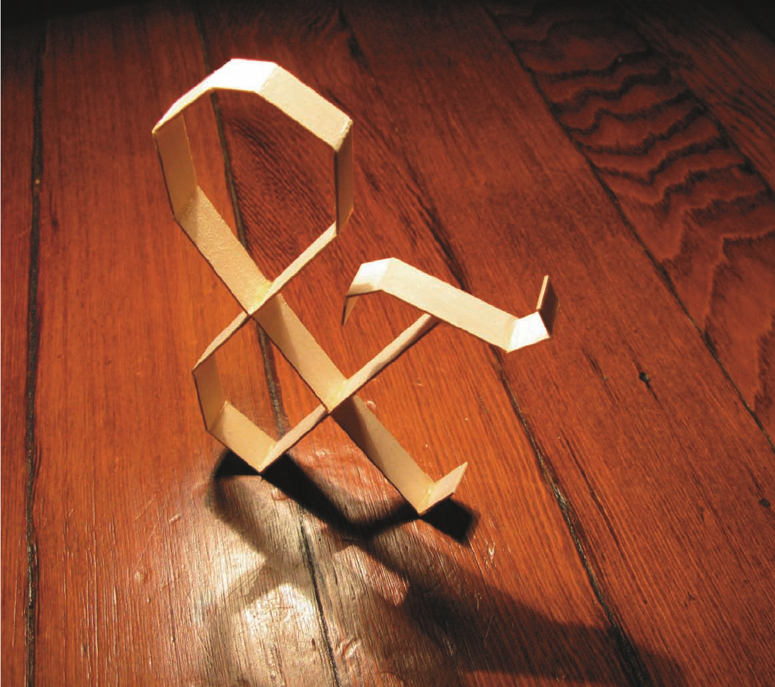
(Text)
Designers: Friends of Type (Aaron Carámbula,
Erik Marinovich, Dennis Payongayong, Jason Wong)
(Ray)
(Fogra 39)Job:10-29438 Title:RP-Playing with Type
#175 Dtp:225 Page:34
001-041_29438.indd 34 10/24/12 2:08 PM
(Text)
letter and wordplay 35
9
lucky numbers
Design a poster that includes text and
numbers from a fortune cookie, and is
inspired by Swiss modernist design.
Open your fortune cookie. The content of
your fortune will be the text to include in
your design. One side of the paper provides
your fortune; the other side provides your
lucky numbers. Select one or two numbers
to use as design elements in your poster.
Design your poster. Use only text and color.
Your visual inspiration should be pulled
from the Swiss modernist design aesthetic.
If you loved this, you’ll love these!
Ampersands, page 31; Bauhaus Grid, page 47
Swiss Style
The Swiss Style, developed
in Switzerland in the 1950s,
emphasizes cleanliness,
readability, and objectivity.
Typefaces: Futura, Clarendon
Designer: Rachel Ferguson
(Ray)
(Fogra 39)Job:10-29438 Title:RP-Playing with Type
#175 Dtp:225 Page:35
001-041_29438.indd 35 10/24/12 2:08 PM
Get Playing with Type: 50 graphic experiments for exploring typographic design principles now with the O’Reilly learning platform.
O’Reilly members experience books, live events, courses curated by job role, and more from O’Reilly and nearly 200 top publishers.

