Creating visualizations with Power BI
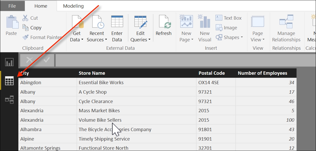
Once the data is loaded into Power BI, we can preview the results by clicking on the Data icon, below the Report icon, as seen in the following screenshot:

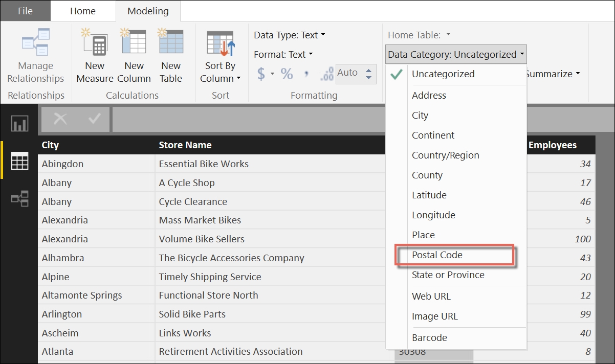
This gives us an opportunity to format the data in a way that will be most suitable to us for building a map chart. While selecting the Postal Code column header in the Modeling tab, we can change the format type from Uncategorized to Postal Code, as seen in this screenshot:

This modification ensures that the Postal Code column will be treated as a location ...
Get Practical Business Intelligence now with the O’Reilly learning platform.
O’Reilly members experience books, live events, courses curated by job role, and more from O’Reilly and nearly 200 top publishers.

