Chapter 1. Exploratory Data Analysis
As a discipline, statistics has mostly developed in the past century. Probability theory—the mathematical foundation for statistics—was developed in the 17th to 19th centuries based on work by Thomas Bayes, Pierre-Simon Laplace, and Carl Gauss. In contrast to the purely theoretical nature of probability, statistics is an applied science concerned with analysis and modeling of data. Modern statistics as a rigorous scientific discipline traces its roots back to the late 1800s and Francis Galton and Karl Pearson. R. A. Fisher, in the early 20th century, was a leading pioneer of modern statistics, introducing key ideas of experimental design and maximum likelihood estimation. These and many other statistical concepts live largely in the recesses of data science. The main goal of this book is to help illuminate these concepts and clarify their importance—or lack thereof—in the context of data science and big data.
This chapter focuses on the first step in any data science project: exploring the data. Exploratory data analysis, or EDA, is a comparatively new area of statistics. Classical statistics focused almost exclusively on inference, a sometimes complex set of procedures for drawing conclusions about large populations based on small samples. In 1962, John W. Tukey (Figure 1-1) called for a reformation of statistics in his seminal paper “The Future of Data Analysis” [Tukey-1962]. He proposed a new scientific discipline called data analysis that included statistical inference as just one component. Tukey forged links to the engineering and computer science communities (he coined the terms bit, short for binary digit, and software), and his original tenets are suprisingly durable and form part of the foundation for data science. The field of exploratory data analysis was established with Tukey’s 1977 now-classic book Exploratory Data Analysis [Tukey-1977].

Figure 1-1. John Tukey, the eminent statistician whose ideas developed over 50 years ago form the foundation of data science.
With the ready availability of computing power and expressive data analysis software, exploratory data analysis has evolved well beyond its original scope. Key drivers of this discipline have been the rapid development of new technology, access to more and bigger data, and the greater use of quantitative analysis in a variety of disciplines. David Donoho, professor of statistics at Stanford University and former undergraduate student of Tukey’s, authored an excellent article based on his presentation at the Tukey Centennial workshop in Princeton, New Jersey [Donoho-2015]. Donoho traces the genesis of data science back to Tukey’s pioneering work in data analysis.
Elements of Structured Data
Data comes from many sources: sensor measurements, events, text, images, and videos. The Internet of Things (IoT) is spewing out streams of information. Much of this data is unstructured: images are a collection of pixels with each pixel containing RGB (red, green, blue) color information. Texts are sequences of words and nonword characters, often organized by sections, subsections, and so on. Clickstreams are sequences of actions by a user interacting with an app or web page. In fact, a major challenge of data science is to harness this torrent of raw data into actionable information. To apply the statistical concepts covered in this book, unstructured raw data must be processed and manipulated into a structured form—as it might emerge from a relational database—or be collected for a study.
There are two basic types of structured data: numeric and categorical. Numeric data comes in two forms: continuous, such as wind speed or time duration, and discrete, such as the count of the occurrence of an event. Categorical data takes only a fixed set of values, such as a type of TV screen (plasma, LCD, LED, etc.) or a state name (Alabama, Alaska, etc.). Binary data is an important special case of categorical data that takes on only one of two values, such as 0/1, yes/no, or true/false. Another useful type of categorical data is ordinal data in which the categories are ordered; an example of this is a numerical rating (1, 2, 3, 4, or 5).
Why do we bother with a taxonomy of data types? It turns out that for the purposes of data analysis and predictive modeling, the data type is important to help determine the type of visual display, data analysis, or statistical model. In fact, data science software, such as R and Python, uses these data types to improve computational performance. More important, the data type for a variable determines how software will handle computations for that variable.
Software engineers and database programmers may wonder why we even need the notion of categorical and ordinal data for analytics. After all, categories are merely a collection of text (or numeric) values, and the underlying database automatically handles the internal representation. However, explicit identification of data as categorical, as distinct from text, does offer some advantages:
-
Knowing that data is categorical can act as a signal telling software how statistical procedures, such as producing a chart or fitting a model, should behave. In particular, ordinal data can be represented as an
ordered.factorin R, preserving a user-specified ordering in charts, tables, and models. -
Storage and indexing can be optimized (as in a relational database).
-
The possible values a given categorical variable can take are enforced in the software (like an enum).
The third “benefit” can lead to unintended or unexpected behavior:
the default behavior of data import functions in R (e.g., read.csv) is to automatically convert a text column into a factor.
Subsequent operations on that column will assume that the only allowable values for that column are the ones originally imported,
and assigning a new text value will introduce a warning and produce an NA (missing value).
Further Reading
-
Data types can be confusing, since types may overlap, and the taxonomy in one software may differ from that in another. The R-Tutorial website covers the taxonomy for R.
-
Databases are more detailed in their classification of data types, incorporating considerations of precision levels, fixed- or variable-length fields, and more; see the W3Schools guide for SQL.
Rectangular Data
The typical frame of reference for an analysis in data science is a rectangular data object, like a spreadsheet or database table.
Rectangular data is essentially a two-dimensional matrix with rows indicating records (cases) and columns indicating features (variables). The data doesn’t always start in this form: unstructured data (e.g., text) must be processed and manipulated so that it can be represented as a set of features in the rectangular data (see “Elements of Structured Data”). Data in relational databases must be extracted and put into a single table for most data analysis and modeling tasks.
In Table 1-1, there is a mix of measured or counted data (e.g., duration and price), and categorical data (e.g., category and currency). As mentioned earlier, a special form of categorical variable is a binary (yes/no or 0/1) variable, seen in the rightmost column in Table 1-1—an indicator variable showing whether an auction was competitive or not.
| Category | currency | sellerRating | Duration | endDay | ClosePrice | OpenPrice | Competitive? |
|---|---|---|---|---|---|---|---|
Music/Movie/Game |
US |
3249 |
5 |
Mon |
0.01 |
0.01 |
0 |
Music/Movie/Game |
US |
3249 |
5 |
Mon |
0.01 |
0.01 |
0 |
Automotive |
US |
3115 |
7 |
Tue |
0.01 |
0.01 |
0 |
Automotive |
US |
3115 |
7 |
Tue |
0.01 |
0.01 |
0 |
Automotive |
US |
3115 |
7 |
Tue |
0.01 |
0.01 |
0 |
Automotive |
US |
3115 |
7 |
Tue |
0.01 |
0.01 |
0 |
Automotive |
US |
3115 |
7 |
Tue |
0.01 |
0.01 |
1 |
Automotive |
US |
3115 |
7 |
Tue |
0.01 |
0.01 |
1 |
Data Frames and Indexes
Traditional database tables have one or more columns designated as an index.
This can vastly improve the efficiency of certain SQL queries.
In Python, with the pandas library,
the basic rectangular data structure is a DataFrame object.
By default, an automatic integer index is created for a DataFrame based on the order of the rows.
In pandas, it is also possible to set multilevel/hierarchical indexes to improve the efficiency of certain operations.
In R, the basic rectangular data structure is a data.frame object.
A data.frame also has an implicit integer index based on the row order.
While a custom key can be created through the row.names attribute,
the native R data.frame does not support user-specified or multilevel indexes.
To overcome this deficiency,
two new packages are gaining widespread use: data.table and dplyr.
Both support multilevel indexes and offer significant speedups in working with a data.frame.
Terminology Differences
Terminology for rectangular data can be confusing. Statisticians and data scientists use different terms for the same thing. For a statistician, predictor variables are used in a model to predict a response or dependent variable. For a data scientist, features are used to predict a target. One synonym is particularly confusing: computer scientists will use the term sample for a single row; a sample to a statistician means a collection of rows.
Nonrectangular Data Structures
There are other data structures besides rectangular data.
Time series data records successive measurements of the same variable. It is the raw material for statistical forecasting methods, and it is also a key component of the data produced by devices—the Internet of Things.
Spatial data structures, which are used in mapping and location analytics, are more complex and varied than rectangular data structures. In the object representation, the focus of the data is an object (e.g., a house) and its spatial coordinates. The field view, by contrast, focuses on small units of space and the value of a relevant metric (pixel brightness, for example).
Graph (or network) data structures are used to represent physical, social, and abstract relationships. For example, a graph of a social network, such as Facebook or LinkedIn, may represent connections between people on the network. Distribution hubs connected by roads are an example of a physical network. Graph structures are useful for certain types of problems, such as network optimization and recommender systems.
Each of these data types has its specialized methodology in data science. The focus of this book is on rectangular data, the fundamental building block of predictive modeling.
Graphs in Statistics
In computer science and information technology, the term graph typically refers to a depiction of the connections among entities, and to the underlying data structure. In statistics, graph is used to refer to a variety of plots and visualizations, not just of connections among entities, and the term applies just to the visualization, not to the data structure.
Estimates of Location
Variables with measured or count data might have thousands of distinct values. A basic step in exploring your data is getting a “typical value” for each feature (variable): an estimate of where most of the data is located (i.e., its central tendency).
At first glance, summarizing data might seem fairly trivial: just take the mean of the data (see “Mean”). In fact, while the mean is easy to compute and expedient to use, it may not always be the best measure for a central value. For this reason, statisticians have developed and promoted several alternative estimates to the mean.
Metrics and Estimates
Statisticians often use the term estimates for values calculated from the data at hand, to draw a distinction between what we see from the data, and the theoretical true or exact state of affairs. Data scientists and business analysts are more likely to refer to such values as a metric. The difference reflects the approach of statistics versus data science: accounting for uncertainty lies at the heart of the discipline of statistics, whereas concrete business or organizational objectives are the focus of data science. Hence, statisticians estimate, and data scientists measure.
Mean
The most basic estimate of location is the mean, or average value. The mean is the sum of all the values divided by the number of values. Consider the following set of numbers: {3 5 1 2}. The mean is (3 + 5 + 1 + 2) / 4 = 11 / 4 = 2.75. You will encounter the symbol (pronounced “x-bar”) to represent the mean of a sample from a population. The formula to compute the mean for a set of n values is:
Note
N (or n) refers to the total number of records or observations. In statistics it is capitalized if it is referring to a population, and lowercase if it refers to a sample from a population. In data science, that distinction is not vital so you may see it both ways.
A variation of the mean is a trimmed mean, which you calculate by dropping a fixed number of sorted values at each end and then taking an average of the remaining values. Representing the sorted values by where is the smallest value and the largest, the formula to compute the trimmed mean with smallest and largest values omitted is:
A trimmed mean eliminates the influence of extreme values. For example, in international diving the top and bottom scores from five judges are dropped, and the final score is the average of the three remaining judges. This makes it difficult for a single judge to manipulate the score, perhaps to favor his country’s contestant. Trimmed means are widely used, and in many cases, are preferable to use instead of the ordinary mean: see “Median and Robust Estimates” for further discussion.
Another type of mean is a weighted mean, which you calculate by multiplying each data value by a weight and dividing their sum by the sum of the weights. The formula for a weighted mean is:
There are two main motivations for using a weighted mean:
-
Some values are intrinsically more variable than others, and highly variable observations are given a lower weight. For example, if we are taking the average from multiple sensors and one of the sensors is less accurate, then we might downweight the data from that sensor.
-
The data collected does not equally represent the different groups that we are interested in measuring. For example, because of the way an online experiment was conducted, we may not have a set of data that accurately reflects all groups in the user base. To correct that, we can give a higher weight to the values from the groups that were underrepresented.
Median and Robust Estimates
The median is the middle number on a sorted list of the data. If there is an even number of data values, the middle value is one that is not actually in the data set, but rather the average of the two values that divide the sorted data into upper and lower halves. Compared to the mean, which uses all observations, the median depends only on the values in the center of the sorted data. While this might seem to be a disadvantage, since the mean is much more sensitive to the data, there are many instances in which the median is a better metric for location. Let’s say we want to look at typical household incomes in neighborhoods around Lake Washington in Seattle. In comparing the Medina neighborhood to the Windermere neighborhood, using the mean would produce very different results because Bill Gates lives in Medina. If we use the median, it won’t matter how rich Bill Gates is—the position of the middle observation will remain the same.
For the same reasons that one uses a weighted mean, it is also possible to compute a weighted median. As with the median, we first sort the data, although each data value has an associated weight. Instead of the middle number, the weighted median is a value such that the sum of the weights is equal for the lower and upper halves of the sorted list. Like the median, the weighted median is robust to outliers.
Outliers
The median is referred to as a robust estimate of location since it is not influenced by outliers (extreme cases) that could skew the results. An outlier is any value that is very distant from the other values in a data set. The exact definition of an outlier is somewhat subjective, although certain conventions are used in various data summaries and plots (see “Percentiles and Boxplots”). Being an outlier in itself does not make a data value invalid or erroneous (as in the previous example with Bill Gates). Still, outliers are often the result of data errors such as mixing data of different units (kilometers versus meters) or bad readings from a sensor. When outliers are the result of bad data, the mean will result in a poor estimate of location, while the median will be still be valid. In any case, outliers should be identified and are usually worthy of further investigation.
Anomaly Detection
In contrast to typical data analysis, where outliers are sometimes informative and sometimes a nuisance, in anomaly detection the points of interest are the outliers, and the greater mass of data serves primarily to define the “normal” against which anomalies are measured.
The median is not the only robust estimate of location. In fact, a trimmed mean is widely used to avoid the influence of outliers. For example, trimming the bottom and top 10% (a common choice) of the data will provide protection against outliers in all but the smallest data sets. The trimmed mean can be thought of as a compromise between the median and the mean: it is robust to extreme values in the data, but uses more data to calculate the estimate for location.
Other Robust Metrics for Location
Statisticians have developed a plethora of other estimators for location, primarily with the goal of developing an estimator more robust than the mean and also more efficient (i.e., better able to discern small location differences between data sets). While these methods are potentially useful for small data sets, they are not likely to provide added benefit for large or even moderately sized data sets.
Example: Location Estimates of Population and Murder Rates
Table 1-2 shows the first few rows in the data set containing population and murder rates (in units of murders per 100,000 people per year) for each state.
| State | Population | Murder rate | |
|---|---|---|---|
1 |
Alabama |
4,779,736 |
5.7 |
2 |
Alaska |
710,231 |
5.6 |
3 |
Arizona |
6,392,017 |
4.7 |
4 |
Arkansas |
2,915,918 |
5.6 |
5 |
California |
37,253,956 |
4.4 |
6 |
Colorado |
5,029,196 |
2.8 |
7 |
Connecticut |
3,574,097 |
2.4 |
8 |
Delaware |
897,934 |
5.8 |
Compute the mean, trimmed mean, and median for the population using R:
>state<-read.csv(file="/Users/andrewbruce1/book/state.csv")>mean(state[["Population"]])[1]6162876>mean(state[["Population"]],trim=0.1)[1]4783697>median(state[["Population"]])[1]4436370
The mean is bigger than the trimmed mean, which is bigger than the median.
This is because the trimmed mean excludes the largest and smallest five states (trim=0.1 drops 10% from each end).
If we want to compute the average murder rate for the country, we need to use a weighted mean or median to account for different populations in the states.
Since base R doesn’t have a function for weighted median,
we need to install a package such as matrixStats:
>weighted.mean(state[["Murder.Rate"]],w=state[["Population"]])[1]4.445834>library("matrixStats")>weightedMedian(state[["Murder.Rate"]],w=state[["Population"]])[1]4.4
In this case, the weighted mean and median are about the same.
Further Reading
-
Michael Levine (Purdue University) has posted some useful slides on basic calculations for measures of location.
-
John Tukey’s 1977 classic Exploratory Data Analysis (Pearson) is still widely read.
Estimates of Variability
Location is just one dimension in summarizing a feature. A second dimension, variability, also referred to as dispersion, measures whether the data values are tightly clustered or spread out. At the heart of statistics lies variability: measuring it, reducing it, distinguishing random from real variability, identifying the various sources of real variability, and making decisions in the presence of it.
Just as there are different ways to measure location (mean, median, etc.) there are also different ways to measure variability.
Standard Deviation and Related Estimates
The most widely used estimates of variation are based on the differences, or deviations, between the estimate of location and the observed data. For a set of data {1, 4, 4}, the mean is 3 and the median is 4. The deviations from the mean are the differences: 1 – 3 = –2, 4 – 3 = 1 , 4 – 3 = 1. These deviations tell us how dispersed the data is around the central value.
One way to measure variability is to estimate a typical value for these deviations. Averaging the deviations themselves would not tell us much—the negative deviations offset the positive ones. In fact, the sum of the deviations from the mean is precisely zero. Instead, a simple approach is to take the average of the absolute values of the deviations from the mean. In the preceding example, the absolute value of the deviations is {2 1 1} and their average is (2 + 1 + 1) / 3 = 1.33. This is known as the mean absolute deviation and is computed with the formula:
where is the sample mean.
The best-known estimates for variability are the variance and the standard deviation, which are based on squared deviations. The variance is an average of the squared deviations, and the standard deviation is the square root of the variance.
The standard deviation is much easier to interpret than the variance since it is on the same scale as the original data. Still, with its more complicated and less intuitive formula, it might seem peculiar that the standard deviation is preferred in statistics over the mean absolute deviation. It owes its preeminence to statistical theory: mathematically, working with squared values is much more convenient than absolute values, especially for statistical models.
Neither the variance, the standard deviation, nor the mean absolute deviation is robust to outliers and extreme values (see “Median and Robust Estimates” for a discussion of robust estimates for location). The variance and standard deviation are especially sensitive to outliers since they are based on the squared deviations.
A robust estimate of variability is the median absolute deviation from the median or MAD:
where m is the median. Like the median, the MAD is not influenced by extreme values. It is also possible to compute a trimmed standard deviation analogous to the trimmed mean (see “Mean”).
Note
The variance, the standard deviation, mean absolute deviation, and median absolute deviation from the median are not equivalent estimates, even in the case where the data comes from a normal distribution. In fact, the standard deviation is always greater than the mean absolute deviation, which itself is greater than the median absolute deviation. Sometimes, the median absolute deviation is multiplied by a constant scaling factor (it happens to work out to 1.4826) to put MAD on the same scale as the standard deviation in the case of a normal distribution.
Estimates Based on Percentiles
A different approach to estimating dispersion is based on looking at the spread of the sorted data. Statistics based on sorted (ranked) data are referred to as order statistics. The most basic measure is the range: the difference between the largest and smallest number. The minimum and maximum values themselves are useful to know, and helpful in identifying outliers, but the range is extremely sensitive to outliers and not very useful as a general measure of dispersion in the data.
To avoid the sensitivity to outliers, we can look at the range of the data after dropping values from each end. Formally, these types of estimates are based on differences between percentiles. In a data set, the Pth percentile is a value such that at least P percent of the values take on this value or less and at least (100 – P) percent of the values take on this value or more. For example, to find the 80th percentile, sort the data. Then, starting with the smallest value, proceed 80 percent of the way to the largest value. Note that the median is the same thing as the 50th percentile. The percentile is essentially the same as a quantile, with quantiles indexed by fractions (so the .8 quantile is the same as the 80th percentile).
A common measurement of variability is the difference between the 25th percentile and the 75th percentile, called the interquartile range (or IQR). Here is a simple example: 3,1,5,3,6,7,2,9. We sort these to get 1,2,3,3,5,6,7,9. The 25th percentile is at 2.5, and the 75th percentile is at 6.5, so the interquartile range is 6.5 – 2.5 = 4. Software can have slightly differing approaches that yield different answers (see the following tip); typically, these differences are smaller.
For very large data sets, calculating exact percentiles can be computationally very expensive since it requires sorting all the data values. Machine learning and statistical software use special algorithms, such as [Zhang-Wang-2007], to get an approximate percentile that can be calculated very quickly and is guaranteed to have a certain accuracy.
Percentile: Precise Definition
If we have an even number of data (n is even), then the percentile is ambiguous under the preceding definition. In fact, we could take on any value between the order statistics and where j satisfies:
Formally, the percentile is the weighted average:
for some weight w between 0 and 1.
Statistical software has slightly differing approaches to choosing w.
In fact, the R function quantile offers nine different alternatives to compute the quantile.
Except for small data sets,
you don’t usually need to worry about the precise way a percentile is calculated.
Example: Variability Estimates of State Population
Table 1-3 (repeated from Table 1-2, earlier, for convenience) shows the first few rows in the data set containing population and murder rates for each state.
| State | Population | Murder rate | |
|---|---|---|---|
1 |
Alabama |
4,779,736 |
5.7 |
2 |
Alaska |
710,231 |
5.6 |
3 |
Arizona |
6,392,017 |
4.7 |
4 |
Arkansas |
2,915,918 |
5.6 |
5 |
California |
37,253,956 |
4.4 |
6 |
Colorado |
5,029,196 |
2.8 |
7 |
Connecticut |
3,574,097 |
2.4 |
8 |
Delaware |
897,934 |
5.8 |
Using R’s built-in functions for the standard deviation, interquartile range (IQR), and the median absolute deviation from the median (MAD), we can compute estimates of variability for the state population data:
>sd(state[["Population"]])[1]6848235>IQR(state[["Population"]])[1]4847308>mad(state[["Population"]])[1]3849870
The standard deviation is almost twice as large as the MAD (in R, by default, the scale of the MAD is adjusted to be on the same scale as the mean). This is not surprising since the standard deviation is sensitive to outliers.
Further Reading
-
David Lane’s online statistics resource has a section on percentiles.
-
Kevin Davenport has a useful post on deviations from the median, and their robust properties in R-Bloggers.
Exploring the Data Distribution
Each of the estimates we’ve covered sums up the data in a single number to describe the location or variability of the data. It is also useful to explore how the data is distributed overall.
Percentiles and Boxplots
In “Estimates Based on Percentiles”, we explored how percentiles can be used to measure the spread of the data. Percentiles are also valuable to summarize the entire distribution. It is common to report the quartiles (25th, 50th, and 75th percentiles) and the deciles (the 10th, 20th, …, 90th percentiles). Percentiles are especially valuable to summarize the tails (the outer range) of the distribution. Popular culture has coined the term one-percenters to refer to the people in the top 99th percentile of wealth.
Table 1-4 displays some percentiles of the murder rate by state.
In R, this would be produced by the quantile function:
quantile(state[["Murder.Rate"]],p=c(.05,.25,.5,.75,.95))5% 25%50% 75%95%1.6002.4254.0005.5506.510
5% |
25% |
50% |
75% |
95% |
1.60 |
2.42 |
4.00 |
5.55 |
6.51 |
The median is 4 murders per 100,000 people, although there is quite a bit of variability: the 5th percentile is only 1.6 and the 95th percentile is 6.51.
Boxplots, introduced by Tukey [Tukey-1977], are based on percentiles and give a quick way to visualize the distribution of data. Figure 1-2 shows a boxplot of the population by state produced by R:
boxplot(state[["Population"]]/1000000,ylab="Population (millions)")

Figure 1-2. Boxplot of state populations
The top and bottom of the box are the 75th and 25th percentiles, respectively.
The median is shown by the horizontal line in the box.
The dashed lines, referred to as whiskers, extend from the top and bottom to indicate the range for the bulk of the data.
There are many variations of a boxplot; see, for example, the documentation for the R function boxplot [R-base-2015].
By default, the R function extends the whiskers to the furthest point beyond the box, except that it will not go beyond 1.5 times the IQR (other software may use a different rule).
Any data outside of the whiskers is plotted as single points.
Frequency Table and Histograms
A frequency table of a variable divides up the variable range into equally spaced segments, and tells us how many values fall in each segment. Table 1-5 shows a frequency table of the population by state computed in R:
breaks<-seq(from=min(state[["Population"]]),to=max(state[["Population"]]),length=11)pop_freq<-cut(state[["Population"]],breaks=breaks,right=TRUE,include.lowest=TRUE)table(pop_freq)
| BinNumber | BinRange | Count | States |
|---|---|---|---|
1 |
563,626–4,232,658 |
24 |
WY,VT,ND,AK,SD,DE,MT,RI,NH,ME,HI,ID,NE,WV,NM,NV,UT,KS,AR,MS,IA,CT,OK,OR |
2 |
4,232,659–7,901,691 |
14 |
KY,LA,SC,AL,CO,MN,WI,MD,MO,TN,AZ,IN,MA,WA |
3 |
7,901,692–11,570,724 |
6 |
VA,NJ,NC,GA,MI,OH |
4 |
11,570,725–15,239,757 |
2 |
PA,IL |
5 |
15,239,758–18,908,790 |
1 |
FL |
6 |
18,908,791–22,577,823 |
1 |
NY |
7 |
22,577,824–26,246,856 |
1 |
TX |
8 |
26,246,857–29,915,889 |
0 |
|
9 |
29,915,890–33,584,922 |
0 |
|
10 |
33,584,923–37,253,956 |
1 |
CA |
The least populous state is Wyoming, with 563,626 people (2010 Census) and the most populous is California, with 37,253,956 people. This gives us a range of 37,253,956 – 563,626 = 36,690,330, which we must divide up into equal size bins—let’s say 10 bins. With 10 equal size bins, each bin will have a width of 3,669,033, so the first bin will span from 563,626 to 4,232,658. By contrast, the top bin, 33,584,923 to 37,253,956, has only one state: California. The two bins immediately below California are empty, until we reach Texas. It is important to include the empty bins; the fact that there are no values in those bins is useful information. It can also be useful to experiment with different bin sizes. If they are too large, important features of the distribution can be obscured. It they are too small, the result is too granular and the ability to see bigger pictures is lost.
Note
Both frequency tables and percentiles summarize the data by creating bins. In general, quartiles and deciles will have the same count in each bin (equal-count bins), but the bin sizes will be different. The frequency table, by contrast, will have different counts in the bins (equal-size bins).
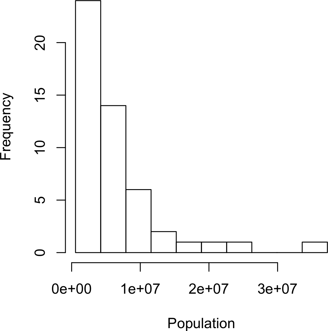
Figure 1-3. Histogram of state populations
A histogram is a way to visualize a frequency table, with bins on the x-axis and data count on the y-axis.
To create a histogram corresponding to Table 1-5 in R, use the hist function with the breaks argument:
hist(state[["Population"]],breaks=breaks)
The histogram is shown in Figure 1-3. In general, histograms are plotted such that:
-
Empty bins are included in the graph.
-
Bins are equal width.
-
Number of bins (or, equivalently, bin size) is up to the user.
-
Bars are contiguous—no empty space shows between bars, unless there is an empty bin.
Statistical Moments
In statistical theory, location and variability are referred to as the first and second moments of a distribution. The third and fourth moments are called skewness and kurtosis. Skewness refers to whether the data is skewed to larger or smaller values and kurtosis indicates the propensity of the data to have extreme values. Generally, metrics are not used to measure skewness and kurtosis; instead, these are discovered through visual displays such as Figures 1-2 and 1-3.
Density Estimates
Related to the histogram is a density plot, which shows the distribution of data values as a continuous line.
A density plot can be thought of as a smoothed histogram,
although it is typically computed directly from the data through a kernel density estimate (see [Duong-2001] for a short tutorial).
Figure 1-4 displays a density estimate superposed on a histogram.
In R, you can compute a density estimate using the density function:
hist(state[["Murder.Rate"]],freq=FALSE)lines(density(state[["Murder.Rate"]]),lwd=3,col="blue")
A key distinction from the histogram plotted in Figure 1-3 is the scale of the y-axis:
a density plot corresponds to plotting the histogram as a proportion rather than counts (you specify this in R using the argument freq=FALSE).
Density Estimation
Density estimation is a rich topic with a long history in statistical literature.
In fact, over 20 R packages have been published that offer functions for density estimation.
[Deng-Wickham-2011] give a comprehesive review of R packages, with a particular recommendation for ASH or KernSmooth.
For many data science problems, there is no need to worry about the various types of density estimates; it suffices to use the base functions.
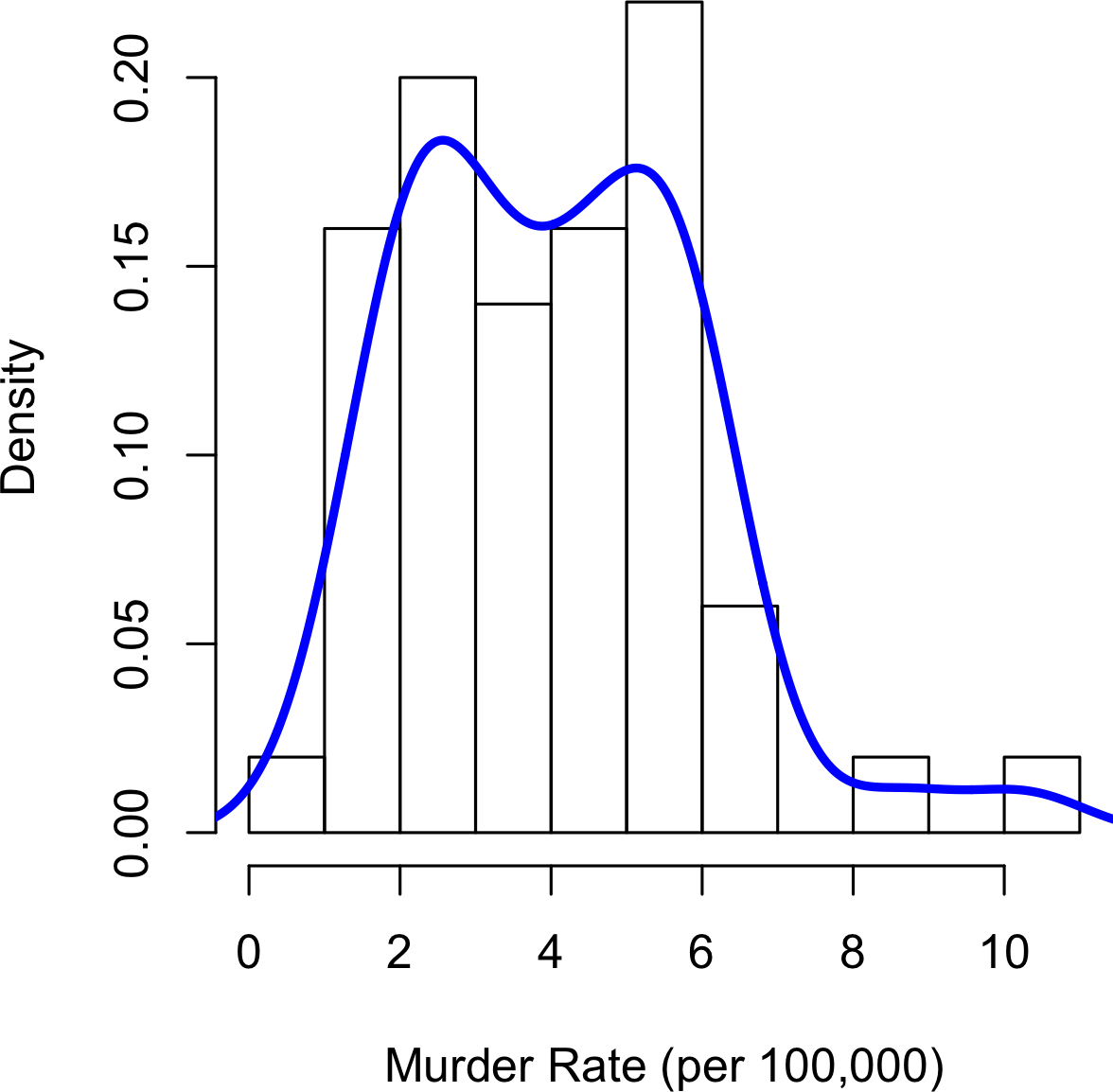
Figure 1-4. Density of state murder rates
Further Reading
-
A SUNY Oswego professor provides a step-by-step guide to creating a boxplot.
-
Density estimation in R is covered in Henry Deng and Hadley Wickham’s paper of the same name.
-
R-Bloggers has a useful post on histograms in R, including customization elements, such as binning (breaks)
-
R-Bloggers also has similar post on boxplots in R.
Exploring Binary and Categorical Data
For categorical data, simple proportions or percentages tell the story of the data.
Getting a summary of a binary variable or a categorical variable with a few categories is a fairly easy matter: we just figure out the proportion of 1s, or of the important categories. For example, Table 1-6 shows the percentage of delayed flights by the cause of delay at Dallas/Fort Worth airport since 2010. Delays are categorized as being due to factors under carrier control, air traffic control (ATC) system delays, weather, security, or a late inbound aircraft.
Carrier |
ATC |
Weather |
Security |
Inbound |
23.02 |
30.40 |
4.03 |
0.12 |
42.43 |
Bar charts are a common visual tool for displaying a single categorical variable, often seen in the popular press.
Categories are listed on the x-axis, and frequencies or proportions on the y-axis.
Figure 1-5 shows the airport delays per year by cause for Dallas/Fort Worth, and it is produced with the R function barplot:
barplot(as.matrix(dfw)/6,cex.axis=.5)
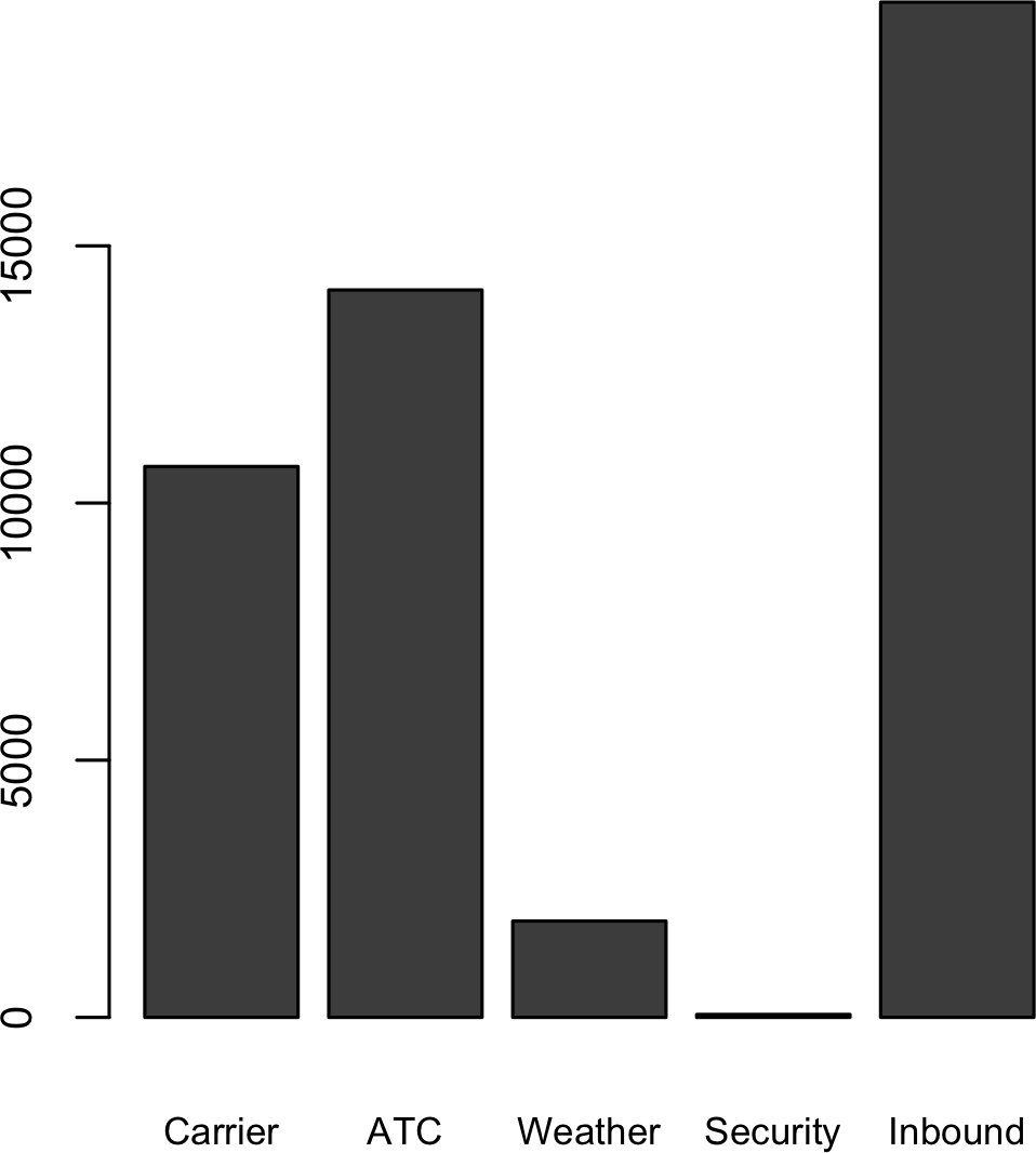
Figure 1-5. Bar plot airline delays at DFW by cause
Note that a bar chart resembles a histogram; in a bar chart the x-axis represents different categories of a factor variable, while in a histogram the x-axis represents values of a single variable on a numeric scale. In a histogram, the bars are typically shown touching each other, with gaps indicating values that did not occur in the data. In a bar chart, the bars are shown separate from one another.
Pie charts are an alternative to bar charts, although statisticians and data visualization experts generally eschew pie charts as less visually informative (see [Few-2007]).
Numerical Data as Categorical Data
In “Frequency Table and Histograms”, we looked at frequency tables based on binning the data. This implicitly converts the numeric data to an ordered factor. In this sense, histograms and bar charts are similar, except that the categories on the x-axis in the bar chart are not ordered. Converting numeric data to categorical data is an important and widely used step in data analysis since it reduces the complexity (and size) of the data. This aids in the discovery of relationships between features, particularly at the initial stages of an analysis.
Mode
The mode is the value—or values in case of a tie—that appears most often in the data. For example, the mode of the cause of delay at Dallas/Fort Worth airport is “Inbound.” As another example, in most parts of the United States, the mode for religious preference would be Christian. The mode is a simple summary statistic for categorical data, and it is generally not used for numeric data.
Expected Value
A special type of categorical data is data in which the categories represent or can be mapped to discrete values on the same scale. A marketer for a new cloud technology, for example, offers two levels of service, one priced at $300/month and another at $50/month. The marketer offers free webinars to generate leads, and the firm figures that 5% of the attendees will sign up for the $300 service, 15% for the $50 service, and 80% will not sign up for anything. This data can be summed up, for financial purposes, in a single “expected value,” which is a form of weighted mean in which the weights are probabilities.
The expected value is calculated as follows:
-
Multiply each outcome by its probability of occurring.
-
Sum these values.
In the cloud service example, the expected value of a webinar attendee is thus $22.50 per month, calculated as follows:
The expected value is really a form of weighted mean: it adds the ideas of future expectations and probability weights, often based on subjective judgment. Expected value is a fundamental concept in business valuation and capital budgeting—for example, the expected value of five years of profits from a new acquisition, or the expected cost savings from new patient management software at a clinic.
Further Reading
No statistics course is complete without a lesson on misleading graphs, which often involve bar charts and pie charts.
Correlation
Exploratory data analysis in many modeling projects (whether in data science or in research) involves examining correlation among predictors, and between predictors and a target variable. Variables X and Y (each with measured data) are said to be positively correlated if high values of X go with high values of Y, and low values of X go with low values of Y. If high values of X go with low values of Y, and vice versa, the variables are negatively correlated.
Consider these two variables, perfectly correlated in the sense that each goes from low to high:
- v1: {1, 2, 3}
- v2: {4, 5, 6}
The vector sum of products is 4 + 10 + 18 = 32. Now try shuffling one of them and recalculating—the vector sum of products will never be higher than 32. So this sum of products could be used as a metric; that is, the observed sum of 32 could be compared to lots of random shufflings (in fact, this idea relates to a resampling-based estimate: see “Permutation Test”). Values produced by this metric, though, are not that meaningful, except by reference to the resampling distribution.
More useful is a standardized variant: the correlation coefficient, which gives an estimate of the correlation between two variables that always lies on the same scale. To compute Pearson’s correlation coefficient, we multiply deviations from the mean for variable 1 times those for variable 2, and divide by the product of the standard deviations:
Note that we divide by n – 1 instead of n; see “Degrees of Freedom, and n or n – 1?” for more details. The correlation coefficient always lies between +1 (perfect positive correlation) and –1 (perfect negative correlation); 0 indicates no correlation.
Variables can have an association that is not linear, in which case the correlation coefficient may not be a useful metric. The relationship between tax rates and revenue raised is an example: as tax rates increase from 0, the revenue raised also increases. However, once tax rates reach a high level and approach 100%, tax avoidance increases and tax revenue actually declines.
Table 1-7, called a correlation matrix, shows the correlation between the daily returns for telecommunication stocks from July 2012 through June 2015. From the table, you can see that Verizon (VZ) and ATT (T) have the highest correlation. Level Three (LVLT), which is an infrastructure company, has the lowest correlation. Note the diagonal of 1s (the correlation of a stock with itself is 1), and the redundancy of the information above and below the diagonal.
| T | CTL | FTR | VZ | LVLT | |
|---|---|---|---|---|---|
T |
1.000 |
0.475 |
0.328 |
0.678 |
0.279 |
CTL |
0.475 |
1.000 |
0.420 |
0.417 |
0.287 |
FTR |
0.328 |
0.420 |
1.000 |
0.287 |
0.260 |
VZ |
0.678 |
0.417 |
0.287 |
1.000 |
0.242 |
LVLT |
0.279 |
0.287 |
0.260 |
0.242 |
1.000 |
A table of correlations like Table 1-7
is commonly plotted to visually display the relationship between multiple variables.
Figure 1-6 shows the correlation between the daily returns for major exchange traded funds (ETFs).
In R, we can easily create this using the package corrplot:
etfs<-sp500_px[row.names(sp500_px)>"2012-07-01",sp500_sym[sp500_sym$sector=="etf",'symbol']]library(corrplot)corrplot(cor(etfs),method="ellipse")
The ETFs for the S&P 500 (SPY) and the Dow Jones Index (DIA) have a high correlation. Similary, the QQQ and the XLK, composed mostly of technology companies, are postively correlated. Defensive ETFs, such as those tracking gold prices (GLD), oil prices (USO), or market volatility (VXX) tend to be negatively correlated with the other ETFs. The orientation of the ellipse indicates whether two variables are positively correlated (ellipse is pointed right) or negatively correlated (ellipse is pointed left). The shading and width of the ellipse indicate the strength of the association: thinner and darker ellipses correspond to stronger relationships.
Like the mean and standard deviation, the correlation coefficient is sensitive to outliers in the data.
Software packages offer robust alternatives to the classical correlation coefficient. For example, the R package robust uses the function covRob to compute a robust estimate of correlation.
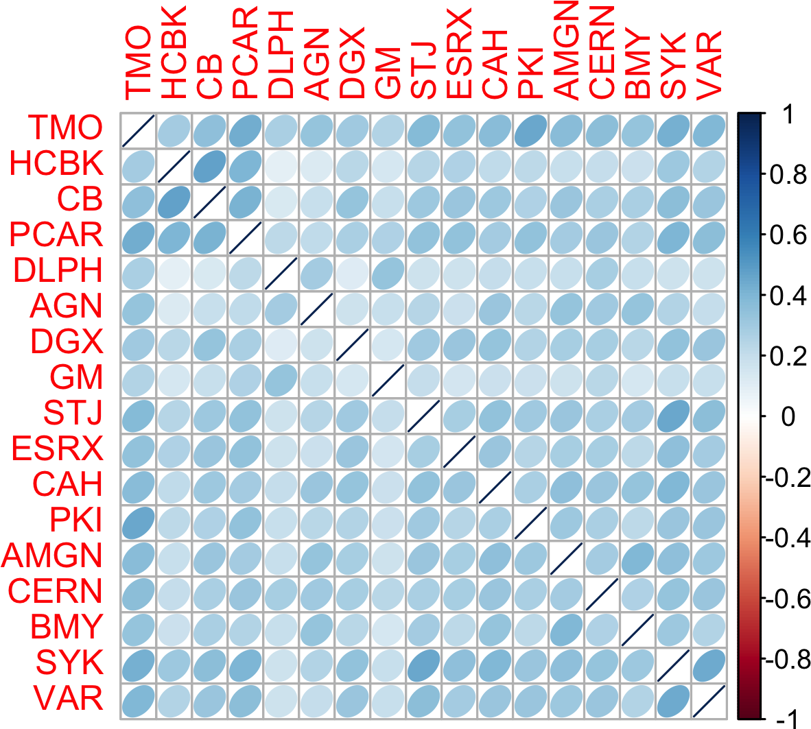
Figure 1-6. Correlation between ETF returns
Other Correlation Estimates
Statisticians have long ago proposed other types of correlation coefficients, such as Spearman’s rho or Kendall’s tau. These are correlation coefficients based on the rank of the data. Since they work with ranks rather than values, these estimates are robust to outliers and can handle certain types of nonlinearities. However, data scientists can generally stick to Pearson’s correlation coefficient, and its robust alternatives, for exploratory analysis. The appeal of rank-based estimates is mostly for smaller data sets and specific hypothesis tests.
Scatterplots
The standard way to visualize the relationship between two measured data variables is with a scatterplot. The x-axis represents one variable, the y-axis another, and each point on the graph is a record. See Figure 1-7 for a plot between the daily returns for ATT and Verizon. This is produced in R with the command:
plot(telecom$T,telecom$VZ,xlab="T",ylab="VZ")
The returns have a strong positive relationship: on most days, both stocks go up or go down in tandem. There are very few days where one stock goes down significantly while the other stock goes up (and vice versa).
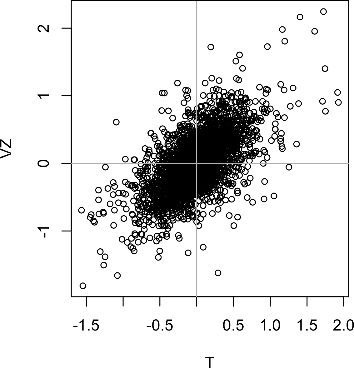
Figure 1-7. Scatterplot between returns for ATT and Verizon
Exploring Two or More Variables
Familiar estimators like mean and variance look at variables one at a time (univariate analysis). Correlation analysis (see “Correlation”) is an important method that compares two variables (bivariate analysis). In this section we look at additional estimates and plots, and at more than two variables (multivariate analysis).
Like univariate analysis, bivariate analysis involves both computing summary statistics and producing visual displays. The appropriate type of bivariate or multivariate analysis depends on the nature of the data: numeric versus categorical.
Hexagonal Binning and Contours (Plotting Numeric versus Numeric Data)
Scatterplots are fine when there is a relatively small number of data values.
The plot of stock returns in Figure 1-7 involves only about 750 points.
For data sets with hundreds of thousands or millions of records, a scatterplot will be too dense, so we need a different way to visualize the relationship.
To illustrate, consider the data set kc_tax, which contains the tax-assessed values for residential properties in King County, Washington.
In order to focus on the main part of the data,
we strip out very expensive and very small or large residences using the subset function:
kc_tax0<-subset(kc_tax,TaxAssessedValue<750000&SqFtTotLiving>100&SqFtTotLiving<3500)nrow(kc_tax0)432693
Figure 1-8 is a hexagon binning plot of the relationship between the finished square feet versus the tax-assessed value for homes in King County. Rather than plotting points, which would appear as a monolithic dark cloud, we grouped the records into hexagonal bins and plotted the hexagons with a color indicating the number of records in that bin. In this chart, the positive relationship between square feet and tax-assessed value is clear. An interesting feature is the hint of a second cloud above the main cloud, indicating homes that have the same square footage as those in the main cloud, but a higher tax-assessed value.
Figure 1-8 was generated by the powerful R package ggplot2, developed by Hadley Wickham [ggplot2].
ggplot2 is one of several new software libraries for advanced exploratory visual analysis of data; see “Visualizing Multiple Variables”.
ggplot(kc_tax0,(aes(x=SqFtTotLiving,y=TaxAssessedValue)))+stat_binhex(colour="white")+theme_bw()+scale_fill_gradient(low="white",high="black")+labs(x="Finished Square Feet",y="Tax Assessed Value")
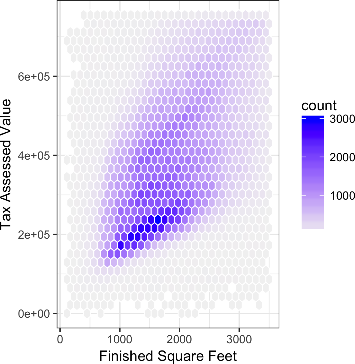
Figure 1-8. Hexagonal binning for tax-assessed value versus finished square feet
Figure 1-9 uses contours overlaid on a scatterplot to visualize the relationship between two numeric variables.
The contours are essentially a topographical map to two variables; each contour band represents a specific density of points, increasing as one nears a “peak.”
This plot shows a similar story as Figure 1-8: there is a secondary peak “north” of the main peak.
This chart was also created using ggplot2 with the built-in geom_density2d function.
ggplot(kc_tax0,aes(SqFtTotLiving,TaxAssessedValue))+theme_bw()+geom_point(alpha=0.1)+geom_density2d(colour="white")+labs(x="Finished Square Feet",y="Tax Assessed Value")
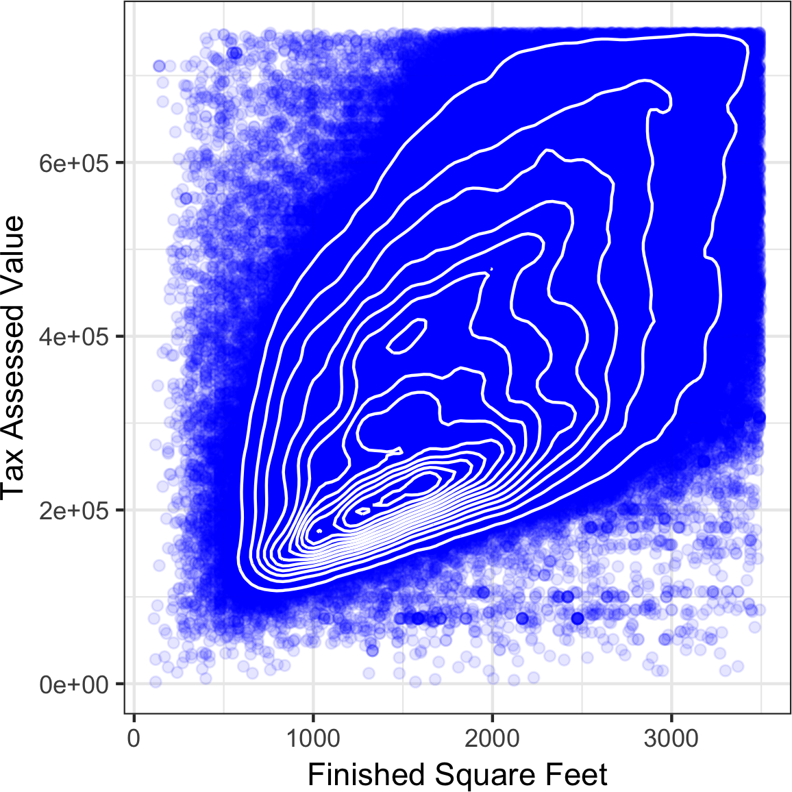
Figure 1-9. Contour plot for tax-assessed value versus finished square feet
Other types of charts are used to show the relationship between two numeric variables, including heat maps. Heat maps, hexagonal binning, and contour plots all give a visual representation of a two-dimensional density. In this way, they are natural analogs to histograms and density plots.
Two Categorical Variables
A useful way to summarize two categorical variables is a contingency table—a table of counts by category.
Table 1-8 shows the contingency table between the grade of a personal loan and the outcome of that loan.
This is taken from data provided by Lending Club, a leader in the peer-to-peer lending business.
The grade goes from A (high) to G (low).
The outcome is either paid off, current, late, or charged off (the balance of the loan is not expected to be collected).
This table shows the count and row percentages.
High-grade loans have a very low late/charge-off percentage as compared with lower-grade loans.
Contingency tables can look at just counts, or also include column and total percentages.
Pivot tables in Excel are perhaps the most common tool used to create contingency tables.
In R, the CrossTable function in the descr package produces contingency tables, and the following code was used to create Table 1-8:
library(descr)x_tab<-CrossTable(lc_loans$grade,lc_loans$status,prop.c=FALSE,prop.chisq=FALSE,prop.t=FALSE)
| Grade | Charged Off | Current | Fully Paid | Late | Total |
|---|---|---|---|---|---|
A |
1562 |
50051 |
20408 |
469 |
72490 |
0.022 |
0.690 |
0.282 |
0.006 |
0.161 |
|
B |
5302 |
93852 |
31160 |
2056 |
132370 |
0.040 |
0.709 |
0.235 |
0.016 |
0.294 |
|
C |
6023 |
88928 |
23147 |
2777 |
120875 |
0.050 |
0.736 |
0.191 |
0.023 |
0.268 |
|
D |
5007 |
53281 |
13681 |
2308 |
74277 |
0.067 |
0.717 |
0.184 |
0.031 |
0.165 |
|
E |
2842 |
24639 |
5949 |
1374 |
34804 |
0.082 |
0.708 |
0.171 |
0.039 |
0.077 |
|
F |
1526 |
8444 |
2328 |
606 |
12904 |
0.118 |
0.654 |
0.180 |
0.047 |
0.029 |
|
G |
409 |
1990 |
643 |
199 |
3241 |
0.126 |
0.614 |
0.198 |
0.061 |
0.007 |
|
Total |
22671 |
321185 |
97316 |
9789 |
450961 |
Categorical and Numeric Data
Boxplots (see “Percentiles and Boxplots”) are a simple way to visually compare the distributions of a numeric variable grouped according to a categorical variable. For example, we might want to compare how the percentage of flight delays varies across airlines. Figure 1-10 shows the percentage of flights in a month that were delayed where the delay was within the carrier’s control.
boxplot(pct_delay~airline,data=airline_stats,ylim=c(0,50))
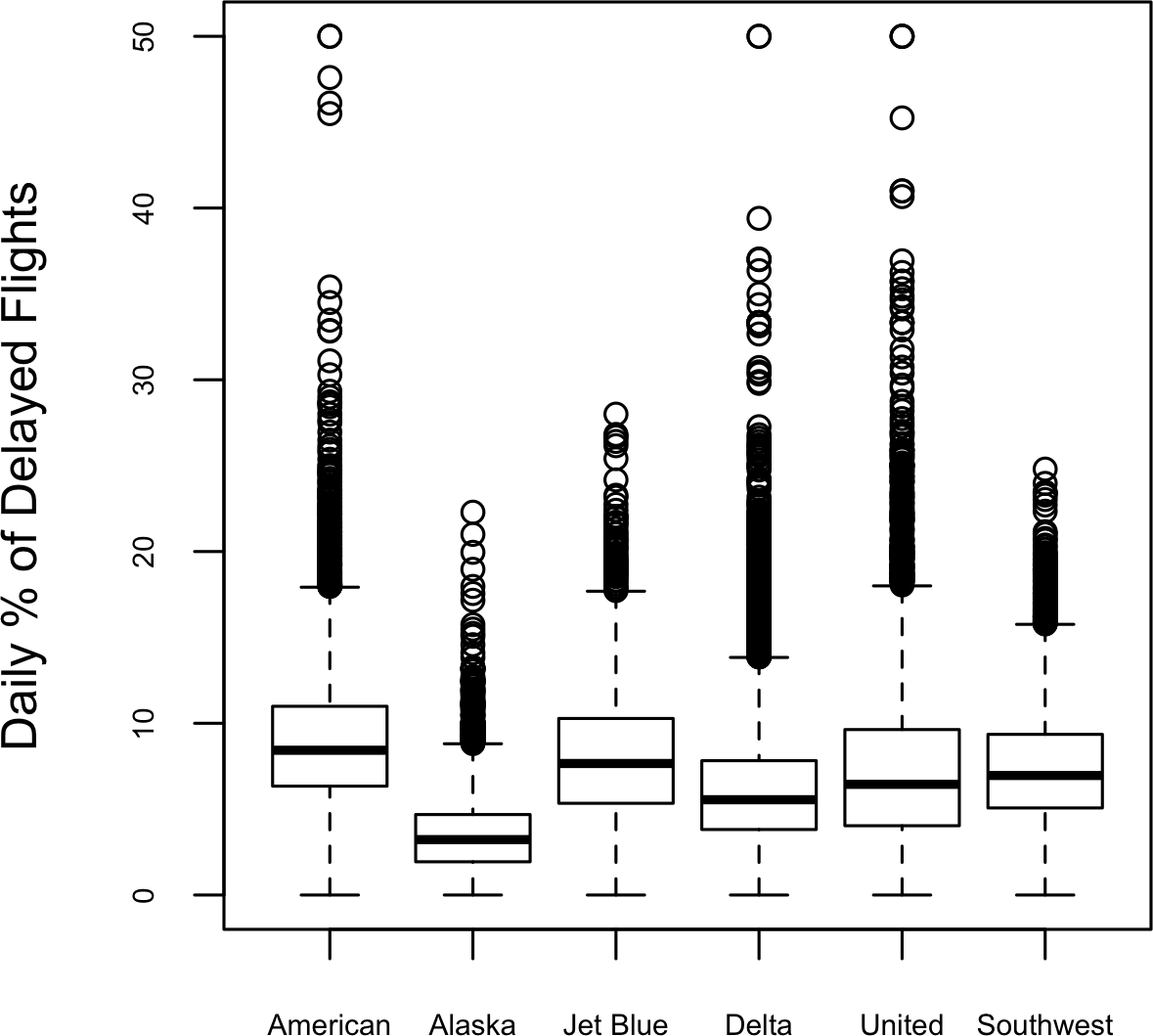
Figure 1-10. Boxplot of percent of airline delays by carrier
Alaska stands out as having the fewest delays, while American has the most delays: the lower quartile for American is higher than the upper quartile for Alaska.
A violin plot, introduced by [Hintze-Nelson-1998], is an enhancement to the boxplot and plots the density estimate with the density on the y-axis.
The density is mirrored and flipped over and the resulting shape is filled in, creating an image resembling a violin.
The advantage of a violin plot is that it can show nuances in the distribution that aren’t perceptible in a boxplot.
On the other hand, the boxplot more clearly shows the outliers in the data.
In ggplot2, the function geom_violin can be used to create a violin plot as follows:
ggplot(data=airline_stats,aes(airline,pct_carrier_delay))+ylim(0,50)+geom_violin()+labs(x="",y="Daily % of Delayed Flights")
The corresponding plot is shown in Figure 1-11.
The violin plot shows a concentration in the distribution near zero for Alaska, and to a lesser extent, Delta.
This phenomenon is not as obvious in the boxplot.
You can combine a violin plot with a boxplot by adding geom_boxplot to the plot (although this is best when colors are used).
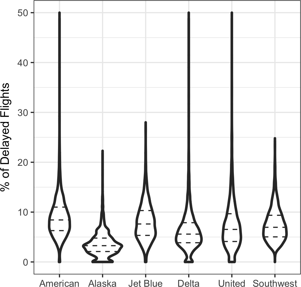
Figure 1-11. Violin plot of percent of airline delays by carrier
Visualizing Multiple Variables
The types of charts used to compare two variables—scatterplots, hexagonal binning, and boxplots—are readily extended to more variables through the notion of conditioning. As an example, look back at Figure 1-8, which showed the relationship between homes’ finished square feet and tax-assessed values. We observed that there appears to be a cluster of homes that have higher tax-assessed value per square foot. Diving deeper, Figure 1-12 accounts for the effect of location by plotting the data for a set of zip codes. Now the picture is much clearer: tax-assessed value is much higher in some zip codes (98105, 98126) than in others (98108, 98188). This disparity gives rise to the clusters observed in Figure 1-8.
We created Figure 1-12 using ggplot2 and the idea of facets, or a conditioning variable (in this case zip code):
ggplot(subset(kc_tax0,ZipCode%in%c(98188,98105,98108,98126)),aes(x=SqFtTotLiving,y=TaxAssessedValue))+stat_binhex(colour="white")+theme_bw()+scale_fill_gradient(low="white",high="blue")+labs(x="Finished Square Feet",y="Tax Assessed Value")+facet_wrap("ZipCode")
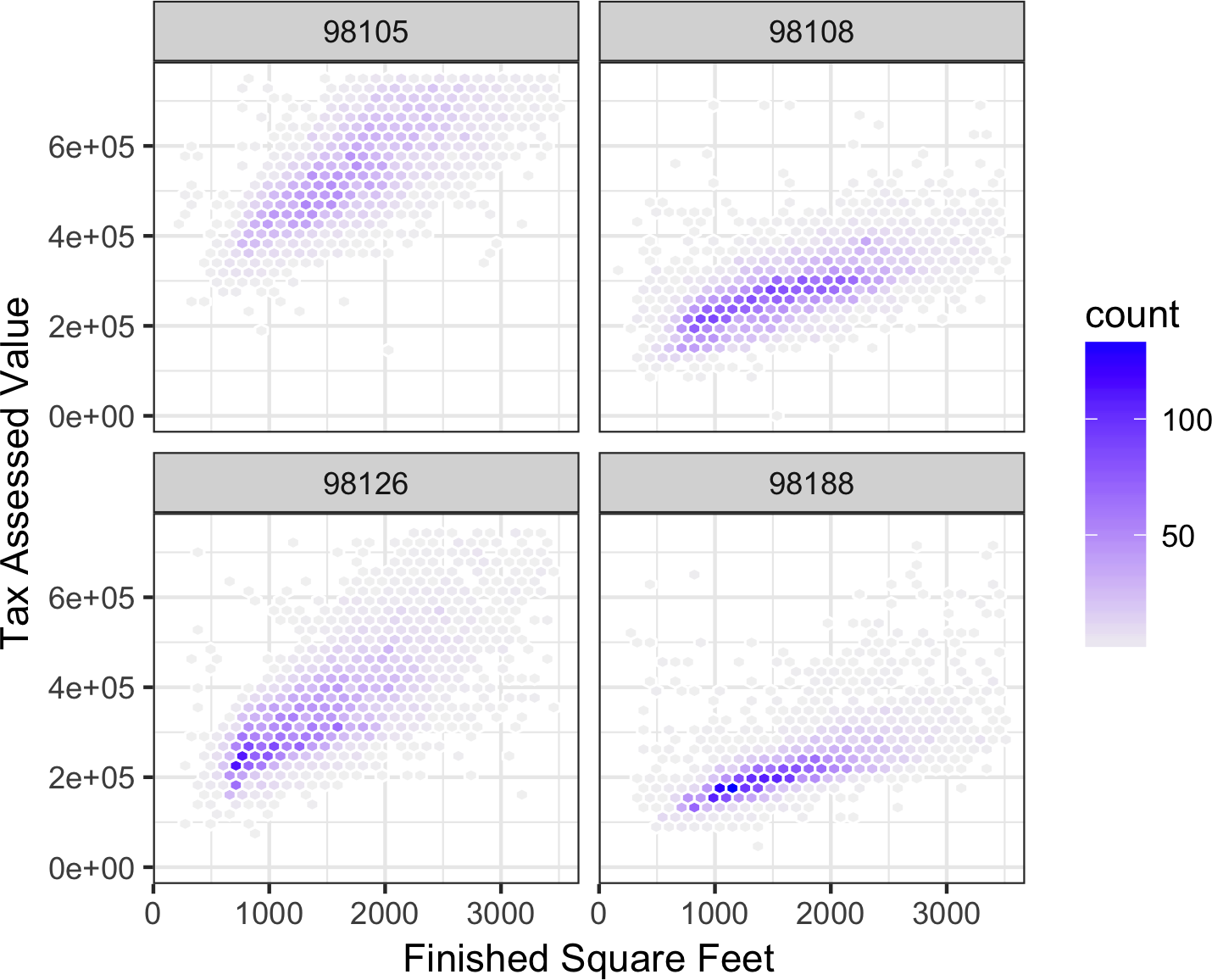
Figure 1-12. Tax-assessed value versus finished square feet by zip code
The concept of conditioning variables in a graphics system was pioneered with Trellis graphics, developed by Rick Becker, Bill Cleveland, and others at Bell Labs [Trellis-Graphics].
This idea has propagated to various modern graphics systems, such as the lattice [lattice] and ggplot2 packages in R and the Seaborn [seaborne] and Bokeh [bokeh] modules in Python.
Conditioning variables are also integral to business intelligence platforms such as Tableau and Spotfire.
With the advent of vast computing power, modern visualization platforms have moved well beyond the humble beginnings of exploratory data analysis.
However, key concepts and tools developed over the years still form a foundation for these systems.
Further Reading
-
Modern Data Science with R, by Benjamin Baumer, Daniel Kaplan, and Nicholas Horton (CRC Press, 2017), has an excellent presentation of “a grammar for graphics” (the “gg” in
ggplot). -
Ggplot2: Elegant Graphics for Data Analysis, by Hadley Wickham, is an excellent resource from the creator of
ggplot2(Springer, 2009). -
Josef Fruehwald has a web-based tutorial on
ggplot2.
Summary
With the development of exploratory data analysis (EDA), pioneered by John Tukey, statistics set a foundation that was a precursor to the field of data science. The key idea of EDA is that the first and most important step in any project based on data is to look at the data. By summarizing and visualizing the data, you can gain valuable intuition and understanding of the project.
This chapter has reviewed concepts ranging from simple metrics, such as estimates of location and variability, to rich visual displays to explore the relationships between multiple variables, as in Figure 1-12. The diverse set of tools and techniques being developed by the open source community, combined with the expressiveness of the R and Python languages, has created a plethora of ways to explore and analyze data. Exploratory analysis should be a cornerstone of any data science project.
Get Practical Statistics for Data Scientists now with the O’Reilly learning platform.
O’Reilly members experience books, live events, courses curated by job role, and more from O’Reilly and nearly 200 top publishers.

