Chapter 52. Three Alternative Approaches to Pie Charts in Tableau
Despite being one of the least effective means of communicating data, I often see pie charts in corporate dashboards and Tableau Public visualizations. New users likely see pie charts as an easy way to spruce up their dashboards, but they are doing themselves a disservice because pie charts increase time to insight—the opposite of what we are trying to achieve with data visualization.
When I share the shortcomings of pie charts, I am usually asked, “But if I can’t use pie charts, then how do I show a parts of a whole relationship?” For this reason, I want to document a better approach to using pie charts in Tableau.
Why does Tableau allow pie charts in the first place?
You may be wondering, if pie charts are so bad, why does Tableau even allow you to build them with Show Me or by changing the mark type to Pie?
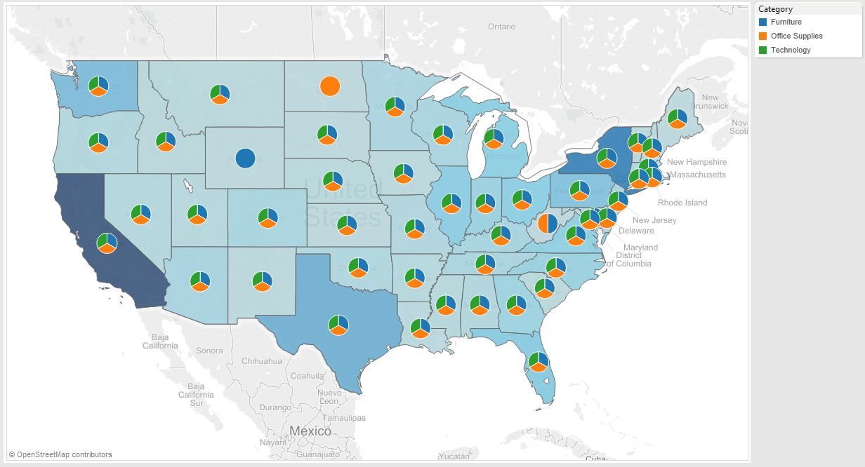
When pie charts were first introduced to Tableau, they were meant to be used for the specific purpose of being a secondary mark type on a filled map. You may have seen this example from Tableau where they show the sales by category by US state using a pie chart on each state:

In this example, the colors on the filled map represent the total sales per state, and the pie is used to show the make-up of total sales in each state. In this scenario, using Pie as the secondary mark type is the only way to accomplish ...
Get Practical Tableau now with the O’Reilly learning platform.
O’Reilly members experience books, live events, courses curated by job role, and more from O’Reilly and nearly 200 top publishers.

