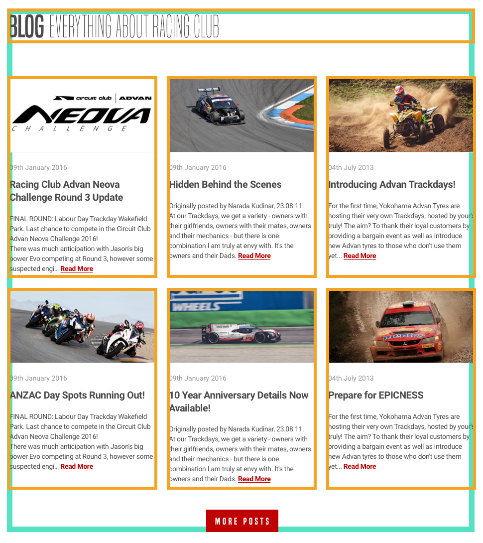
First, as we always do (and you need to get into this habit), we need to analyze the design and see how is it composed:

As we can see, the Blog section is composed of a header and six Blog posts. There are two rows of three posts each, with an equal width of one-third.
We know how to design this with a float and the display: inline-block properties. Let's try to build it with CSS flexbox.
Let's first add the HTML:
<section id="blog"> <div class="container"> <h2><b>Blog</b> Everything about RACING CLUB</h2> </div></section>
Here are some explanations:
- We need to create another section id "blog"
- We need to reuse the class container ...

