DATA VISUALIZATION
Now, if you have a table full of numbers, it's time to get to the subject of data visualization. This is an extremely wide and complex subject. I wouldn't even dream of trying to give you a comprehensive overview of this subject in the small amount of pages I have here. However, I do understand that next time you're working on your presentation, you probably won't have enough time to conceive an ingenious and novel visualization anyway. So I will just touch on the most popular diagrams and most common mistakes people make.
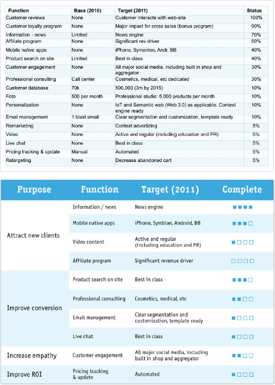
FIGURE 6-11: A table redesigned for presentations.
Discerning between Analytical and Presentational Charts
Just as with tables, charts are used for two purposes. First and foremost, people use charts for analysis. They visualize data to uncover hidden patterns, find dependencies, and make sense of numbers. However, charts are also used for presentations. These are two different goals. What's the difference? Analytical charts are open to interpretation. You can study them and draw multiple conclusions from those charts. Presentation charts are usually optimized to carry one and only one message. If you need to illustrate another message, you just draw another chart. Trust me, most of the time it is far easier to design two charts than to design a chart that carries two clear messages.
Get Presentation Secrets: Do What you Never Thought Possible With Your Presentations now with the O’Reilly learning platform.
O’Reilly members experience books, live events, courses curated by job role, and more from O’Reilly and nearly 200 top publishers.

