Bar Charts
Let's begin with the Problem/Solution approach by looking at an all-too-typical numeric slide, the bar chart in Figure 8.1. (Please see Figure 2 in the insert for the color version of Figure 8.1.) You've probably encountered this type of graphic in many presentations. This example depicts six years of steady sales growth in the history of an up-and-coming company, information that ought to play an exciting role in telling the company's story.
Figure 8.1. How not to design a bar chart.
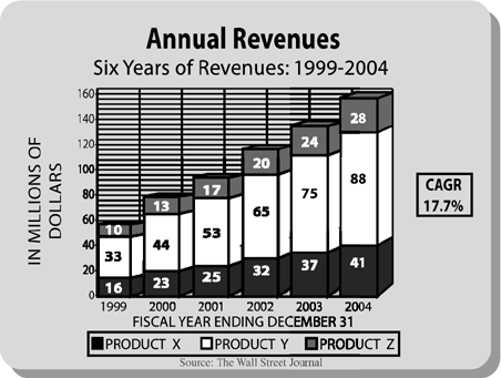
There's certainly plenty of information here. In fact, the problem is that there's too much information for a presentation. If this chart was in a document, ...
Get Presenting to Win: The Art of Telling Your Story now with the O’Reilly learning platform.
O’Reilly members experience books, live events, courses curated by job role, and more from O’Reilly and nearly 200 top publishers.

