3Graphical Displays
In addition to numerical summaries of statistical data, there are various pictorial representations and graphical displays available in R that have a more dramatic impact and make for a better understanding of the data. The ease and speed with which graphical displays can be produced is one of the important features of R. By writing
demo(graphics) you will see examples of the many graphical procedures of R, along with the code needed to implement them. In this chapter, we will examine some of the most common of these.
3.1 BOXPLOTS
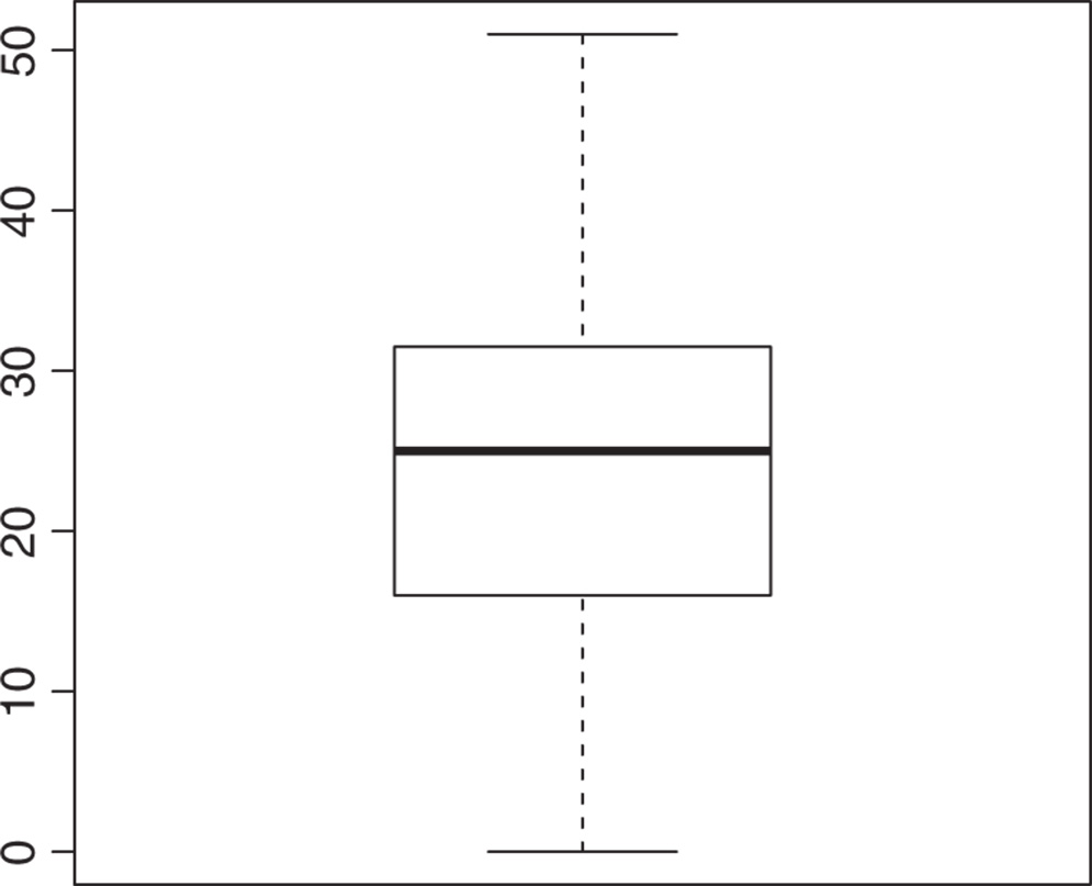
A boxplot is a graphical summary based on the median, quartiles, and extreme values. To display the downtime data given in Example 1.1 using a boxplot, write
boxplot(downtime) which gives Fig. 3.1. Often called the Box and Whiskers Plot, the box represents the interquartile range that contains 50% of cases. The whiskers are the lines that extend from the box to the highest and lowest values. The line across the box indicates the median.

Figure 3.1 A Simple Boxplot
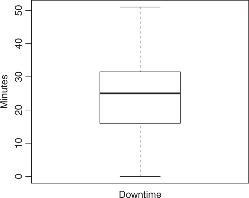
To improve the look of the graph, we could label the axes as follows:
boxplot(downtime, xlab = "Downtime", ylab = "Minutes") which gives Fig. 3.2.

Figure 3.2 A Boxplot with Axis Labels
Multiple boxplots can be displayed on the same axis, by adding extra arguments ...
Get Probability with R, 2nd Edition now with the O’Reilly learning platform.
O’Reilly members experience books, live events, courses curated by job role, and more from O’Reilly and nearly 200 top publishers.

