The Card
The Card is a Material Design component[24] used to visually group together (or separate) widgets.
You can use it as part of the overall layout of an app or inside lists or grids.
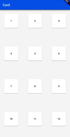
For example, this code:
| | GridView.builder( |
| | padding: EdgeInsets.all(20.0), |
| | |
| | itemCount: 15, |
| | |
| | gridDelegate: SliverGridDelegateWithFixedCrossAxisCount( |
| | crossAxisCount: 3, |
| | crossAxisSpacing: 50.0, |
| | mainAxisSpacing: 100.0, |
| | ), |
| | itemBuilder: (context, i) => Card( |
| | child: Center( |
| | child: Text("${i+1}"), |
| | ), |
| | ), |
| | ), |
nicely shows the space available for each GridView tile on those settings:
But a Card is used really often inside ListViews.
An example ...
Get Programming Flutter now with the O’Reilly learning platform.
O’Reilly members experience books, live events, courses curated by job role, and more from O’Reilly and nearly 200 top publishers.

