December 2022
Beginner to intermediate
588 pages
13h 43m
English
Plot legends give meaning to a visualization, assigning meaning to the various plot elements. We previously saw how to create a simple legend; here we’ll take a look at customizing the placement and aesthetics of the legend in Matplotlib.
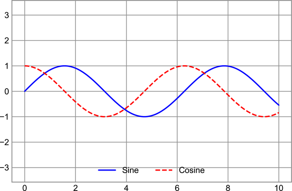
The simplest legend can be created with the plt.legend command, which
automatically creates a legend for any labeled plot elements (see Figure 29-1).
In[1]:importmatplotlib.pyplotaspltplt.style.use('seaborn-whitegrid')
In[2]:%matplotlibinlineimportnumpyasnp
In[3]:x=np.linspace(0,10,1000)fig,ax=plt.subplots()ax.plot(x,np.sin(x),'-b',label='Sine')ax.plot(x,np.cos(x),'--r',label='Cosine')ax.axis('equal')leg=ax.legend()
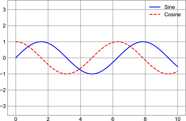
But there are many ways we might want to customize such a legend. For example, we can specify the location and turn on the frame (see Figure 29-2).
In[4]:ax.legend(loc='upper left',frameon=True)fig
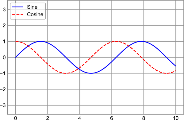
We can use the ncol command to specify the number of columns in the
legend, as shown in Figure 29-3.
In[5]:ax.legend(loc='lower center',ncol=2)fig