December 2022
Beginner to intermediate
588 pages
13h 43m
English
Plot legends identify discrete labels of discrete points. For continuous labels based on the color of points, lines, or regions, a labeled colorbar can be a great tool. In Matplotlib, a colorbar is drawn as a separate axes that can provide a key for the meaning of colors in a plot. Because the book is printed in black and white, this chapter has an accompanying online supplement where you can view the figures in full color. We’ll start by setting up the notebook for plotting and importing the functions we will use:
In[1]:importmatplotlib.pyplotaspltplt.style.use('seaborn-white')
In[2]:%matplotlibinlineimportnumpyasnp
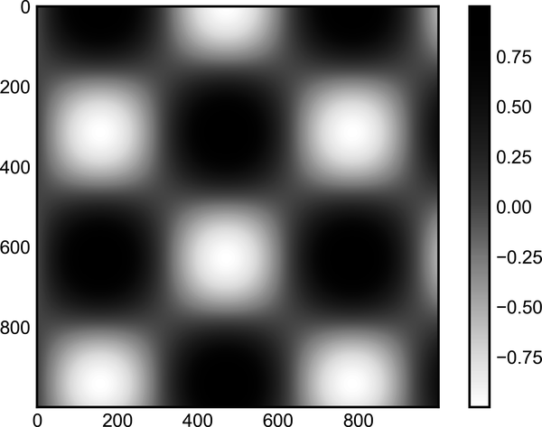
As we have seen several times already, the simplest colorbar can be
created with the plt.colorbar function (see Figure 30-1).
In[3]:x=np.linspace(0,10,1000)I=np.sin(x)*np.cos(x[:,np.newaxis])plt.imshow(I)plt.colorbar();
Full-color figures are available in the supplemental materials on GitHub.
We’ll now discuss a few ideas for customizing these colorbars and using them effectively in various situations.
The colormap can be specified using the cmap argument to the plotting
function that is creating the visualization (see Figure 30-2).
In[4]:plt.imshow(I,cmap='Blues');
The names of available colormaps ...
Read now
Unlock full access


