Creating a bar chart
A bar chart is used to compare measures. The objective of this chart is to compare Sales and Freight by ProductLine. This visualization will help them make decisions on freight. If they are spending more on freight for a specific ProductLine, they can focus on reducing it. To create a bar chart, follow these steps:
- Right-click anywhere on the empty space on the sheet. Hover over New Sheet Object and select Chart.
- On the General tab, Bar Chart is highlighted by default. At the top, check Show Title in Chart and type
Sales vs Freightin the edit box. Click on Next.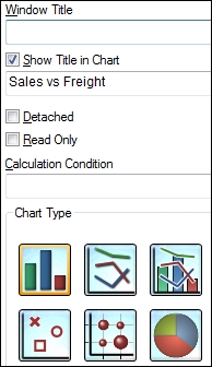
- On the next screen, select ProductLineDesc from the Available Fields/Groups ...
Get QlikView Essentials now with the O’Reilly learning platform.
O’Reilly members experience books, live events, courses curated by job role, and more from O’Reilly and nearly 200 top publishers.

