December 2017
Beginner to intermediate
470 pages
12h 29m
English
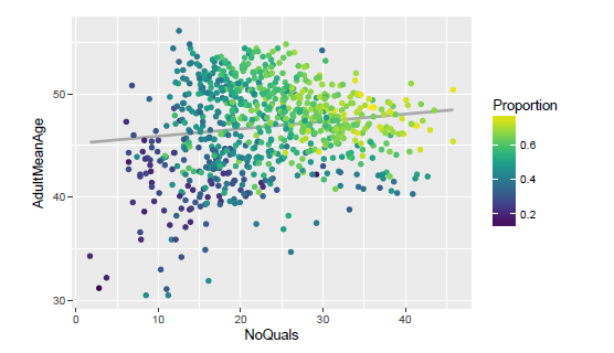
Now that we know how to get a big-picture view of the scatter plots to get a general sense of the relations among variables, how can we get a more detailed look into each scatter plot? Well, I'm glad you asked! To achieve this, we'll do it in two steps. First, we are going to work on producing a single, detailed scatter plot that we're happy with. Second, we're going to develop a simple algorithm that will traverse all variable combinations and create the corresponding plot for each of them:

The graph shown above shows ...