Connecting points in a scatter plot
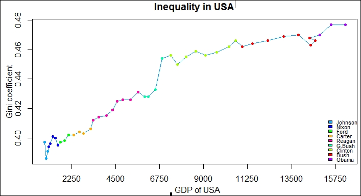
The primary objective of this recipe is to understand how we can connect points in a scatter plot. The plot is inspired by Alberto Cairo infographic regarding the Gini coefficient, and the GDP data under various president's tenure in Brazil and connected points based on these three variables. In this recipe, we will apply the same concept to the USA economy.
Tip
For all the data visualizations and references used in recipes in this book, please refer to the See also section in each recipe
How to do it…
We will start to import the data in R. The dataset comprises of the Gini coefficient, the GDP data of the USA and ...
Get R: Recipes for Analysis, Visualization and Machine Learning now with the O’Reilly learning platform.
O’Reilly members experience books, live events, courses curated by job role, and more from O’Reilly and nearly 200 top publishers.

