Using sparklines
Sparklines are typically small graphics, showing a horizontal line connecting several data points without labeling the values on its axes. The purpose of the sparkline is to show the movement of a trend over a certain period. Since its details are not available, the context of a sparkline must be clear to the dashboard user to interpret its meaning properly. This recipe will show you how to configure a sparkline.
Getting ready
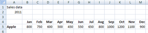
Open a new Dashboard Design file and enter the data into the spreadsheet, as shown in the following screenshot:
How to do it...
- Drag a Sparkline Chart component into the canvas.
- Bind the By Range field to ...
Get SAP BusinessObjects Dashboards 4.0 Cookbook now with the O’Reilly learning platform.
O’Reilly members experience books, live events, courses curated by job role, and more from O’Reilly and nearly 200 top publishers.

