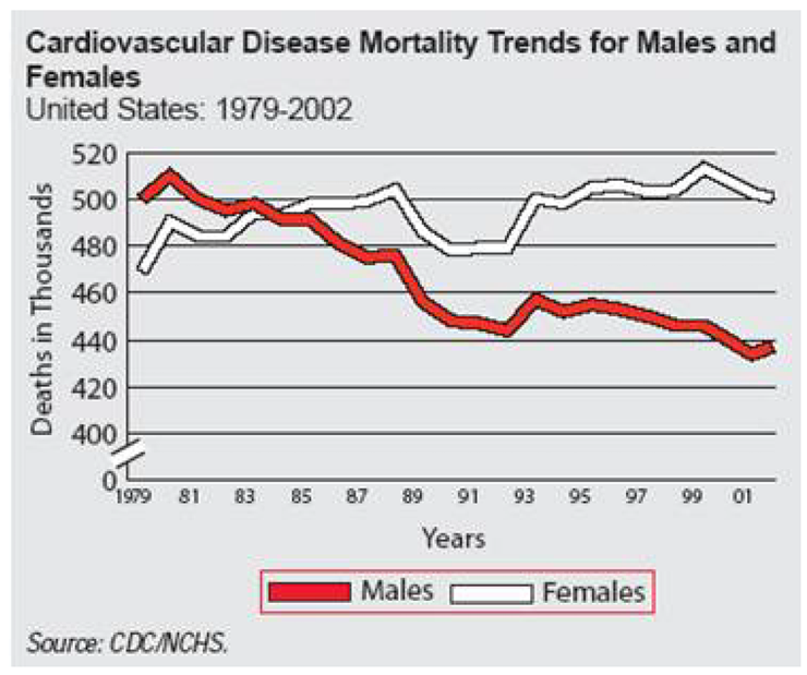
EXAMPLE 18 Fancy Line Graph With Broken Axis
Purpose: Demonstrate how to overlay multiple line symbols to create a âfancyâ line.
I saw the original version of this graph on the biomed.brown.edu Web site, and I liked it so much that I wanted to create the same graph in SAS.
Here is the original.1

The main challenge with re-creating this graph in SAS/GRAPH is that the graph lines have a border color and SAS does not have a built-in option for such a feature. That is where a bit of custom programming, and some ingenuity, come into play.
I did not have the actual raw data, so I estimated the data values:
data my_data;
format date year2.; ...

