You Do It
-
It probably accumulates case sales by brand over some period, such as daily or weekly. Unlikely that every case is represented by a row.
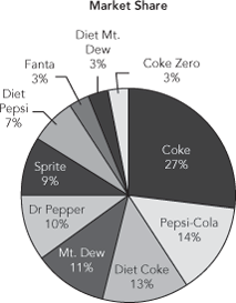
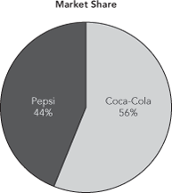
A pie chart emphasizes shares.

-

-

-
The addition of this extra row makes up a big part of both pie charts.

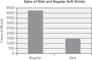
The side-by-side bar chart works well for this. We no longer need the Other category. ...
Get Statistics for Business: Decision Making and Analysis, 3rd Edition now with the O’Reilly learning platform.
O’Reilly members experience books, live events, courses curated by job role, and more from O’Reilly and nearly 200 top publishers.

