Graphic design arguably is itself a grand portal to the
process of education.
EDUCATE
Every day, every minute we are being educated. As
long as information comes our way we are learning
something. To inform implies to educate. Yet there is a
fine line separating these two verbs. Not all information
is truly educational; not all education relies entirely on
information. While the goal may be the same (i.e., to
encourage thinking and doing), the content and context
of informing and educating is sometimes distinct.
Educational messages that provide information require
an additional cognitive step. Translating the information
imbedded in raw image and text into fuel that powers
various behavioral and intellectual engines is the goal.
How this is accomplished demands different steps
depending on what is imparted.
What do we mean by, “Not all education relies on infor-
mation”? Well, sometimes education can be triggered
by designed signs and symbols, similar to those that tell
us to stop, go, do. For example, the logo for we (page 200),
which also cleverly transposes into me, is a mnemonic
for an organization founded by U.S. vice president Al
Gore to improve environmental education and ultimately
action. While the mark is not loaded with data, it does
symbolize a wealth of educational initiatives. So, in
this sense the logo is a button that when literally and
figuratively pressed opens a floodgate that helps educate
people on important environmental issues.
Neither does the poster for 2011 Bridge (page 203),
“Connect. Act. Transform,” provide the data necessary to
actually accomplish these stated behaviors. Rather, it is
an announcement that hopefully will trigger the urge to
learn more. In this way the goal of education is enabled.
Conversely, the McKinsey Conference booklet (page
202) is filled with loads of information, serving as a tuto-
rial for where the global corporations in Switzerland can
199

be found and what they do. For those who need to know
more about Swiss finance and business, the mnemonic
words used throughout this document are guides to the data.
“The Politics of Science” “Shame”, and “Lies” (page 207)
are metaphoric typographic illustrations that compress
many visual ideas into the letters of the respective words.
Given that one picture is worth a thousand words, these
images may not provide facts and figures, but they enable
the reader to immediately comprehend the essential theme
of what is presented.
Given the same metaphoric principle, “It’s Never Too Late
To Get Where You’re Going” (page 209) for the School of
Visual Arts uses New York subway mosaics to signal that
this is, in fact, a poster that appears in the New York subway
stations. Another metaphoric approach, “The Person You Love
is 72.8% Water” (page 204), a useful piece of information if
there ever was one, is composed of lettering that literally
illustrates the message.
Traditional type specimens are the epitome of educational
messaging, for at once it must provide a literal showing and an
aesthetic display of the typeface in question. The samples for
Delvard Display (page 205) let the user know how to translate
the information—type sizes and weights—into functional data.
Obviously, there are various ways to be educated through
and by graphic design. Indeed graphic design arguably is
itself a portal to education. Milton Glaser uses the phrase
“to inform and delight” as a definition of what he does, and of
design. Perhaps it is more accurate to say, “educate and delight,”
since that is the essence of this kind of creative activity.
We Logo
Client: Al Gore and the Alliance for Climate Protection
Agency: COLLINS: and The Martin Agency
Designers: John Moon, Mickey Pangilinan,
Brian Collins, CCO
Art Director/Creative Directors: Ty Harper, Raymond
McKinney, Sean Riley
Typographer: Chester Jenkins, Village
With time running out, Al Gore’s Alliance for
Climate Protection called on COLLINS: and
The Martin Agency to “make solving the
climate crisis everybody’s business.” Using
the inspiration “We the People …” the team
turns me into we, creating a transformational
logo that calls the masses to action. Within
months, hundreds of thousands call for a
global treaty.
stop, think, go, do
200

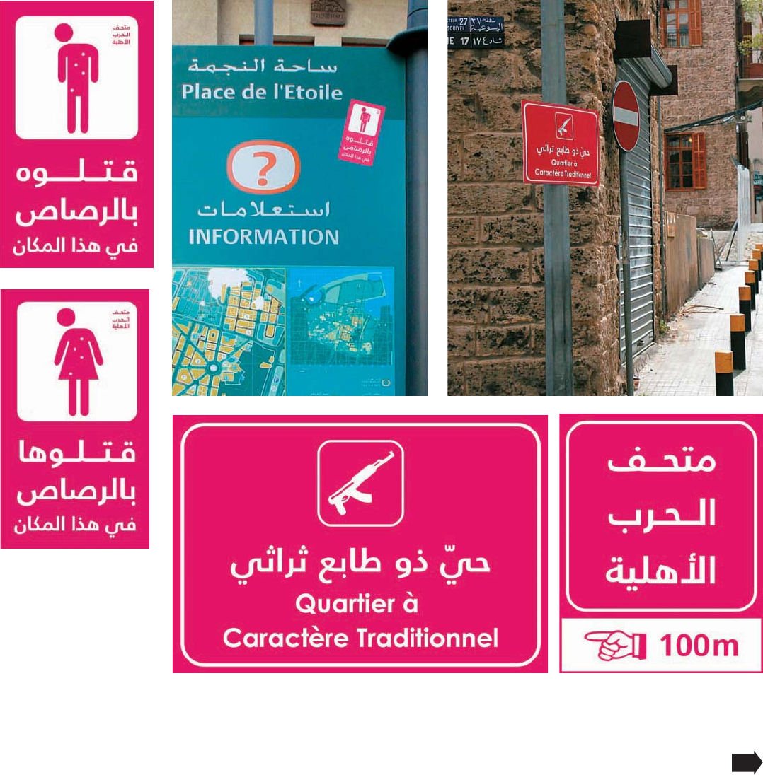
City War Museum
Designer: Mirna Hamady
Area with Cultural Significance
Designer: Mirna Hamady
He/She Was Shot Dead Here
Designer: Mirna Hamady
These signs are at once
deceiving and soothing. Aside
from the image of a machine
gun, the color suggests an
entertainment zone rather
than monuments to horror.
seven : educate
201
Get Stop, Think, Go, Do now with the O’Reilly learning platform.
O’Reilly members experience books, live events, courses curated by job role, and more from O’Reilly and nearly 200 top publishers.

