November 2015
Beginner to intermediate
288 pages
5h 43m
English
Up to this point, we’ve focused on individual lessons that, together, set you up for success when it comes to effectively visualizing and communicating with data. To refresh your memory, we’ve covered the following lessons:
In this chapter, we will look at the comprehensive storytelling with data process from start to end—applying each of the preceding lessons—using a single example.
Let’s begin by considering Figure 8.1, which shows average retail price over time for five consumer products (A, B, C, D, and E). Spend a moment studying it.
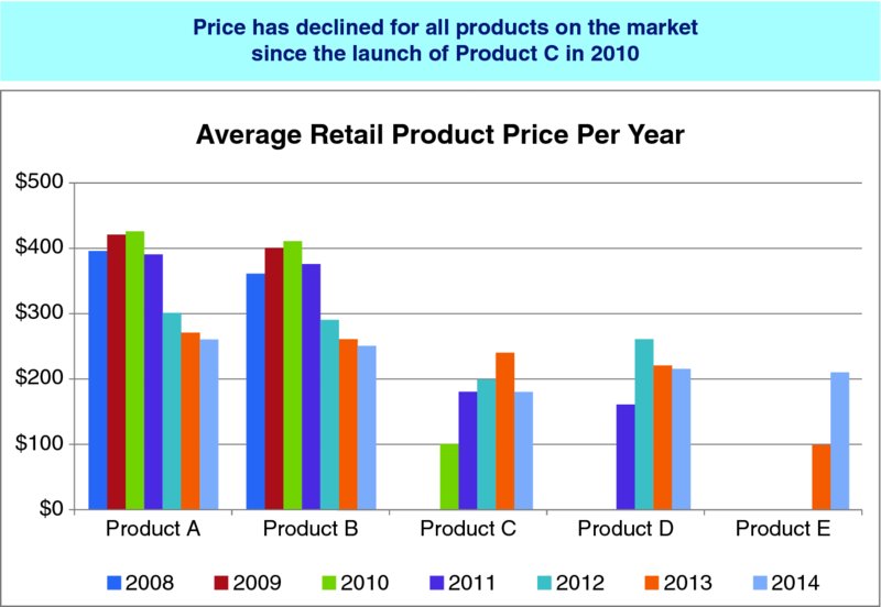
Figure 8.1 Original visual
When presented with this graph, it’s easy to start picking it apart. But before we discuss the best way to visualize the data shown in Figure 8.1, let’s take a step back and consider the context.
The first thing to do when faced with a visualization challenge is to make sure you have a robust understanding of the context and what you need to communicate. We must identify a specific audience and what they need to know or do, and determine the data we’ll use to illustrate our case. We should craft the Big Idea.
In this case, let’s assume ...
Read now
Unlock full access


