CHAPTER 3
Bottoms and Tops, Buying and Selling Cycles, and Percentage Price Oscillator (PPO), with IBM and Hewlett-Packard Exhibits
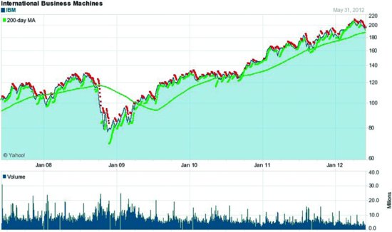
By taking a 50-year look at the IBM and Hewlett-Packard (HPQ) charts, let's examine the typical tops and bottoms that occur on charts over time. Looking over such a long period of time, it is easy to see the buying and selling cycles. Support, where price stops moving down, and resistance levels, where price stops moving up, are much easier to see. You will learn how to identify and use these levels in determining whether demand will continue to take price up or supply will continue to take price down. These long-term charts also answer the question: which is better, a buy and hold strategy or rotation out of underperforming stocks into outperforming stocks when the 200-day moving average is crossed?
INVERTED HEAD-AND-SHOULDERS BOTTOM
Here are the technical signals that were pertinent to IBM (Exhibit 3.1) over time. It has a similar pattern to Exhibit 1.1 in Chapter 1, with price breaking above the 200-day in 2009, and the uptrend continues into 2012. But notice the difference in price performance. Apple goes from $100 to $600, while IBM goes from $100 to $200. Portfolio managers are happy to own IBM but ecstatic when they find an Apple, which is rare.
This is a good example of the trade-off ...
Get Successful Stock Signals for Traders and Portfolio Managers: Integrating Technical Analysis with Fundamentals to Improve Performance, + Website now with the O’Reilly learning platform.
O’Reilly members experience books, live events, courses curated by job role, and more from O’Reilly and nearly 200 top publishers.

