Creating a pie chart
A pie chart is a circle—or pie—that is sliced. Each slice is identified using a different color and/or label. The size or angle of the slice represents that item or category's proportion to the whole. Pie charts are best at showing part-to-whole relationships when there aren't too many slices. Bar charts are great and popular alternatives to pie charts.
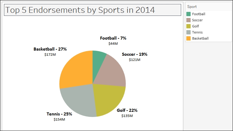
In this recipe, we will create a pie chart that shows the top five endorsements in 2014, sliced by sport.
Getting ready
To follow this recipe, open B05527_01 – STARTER.twbx. Use the worksheet called Pie, and connect to the Top Athlete Salaries (Global Sport Finances) data source. ...
Get Tableau 10 Business Intelligence Cookbook now with the O’Reilly learning platform.
O’Reilly members experience books, live events, courses curated by job role, and more from O’Reilly and nearly 200 top publishers.

