Creating a shared axis chart
A shared axis chart in Tableau is a chart that shares one axis among multiple measures. This chart can be used when the measures have similarly ranged values, and can be presented using one mark and one scale.
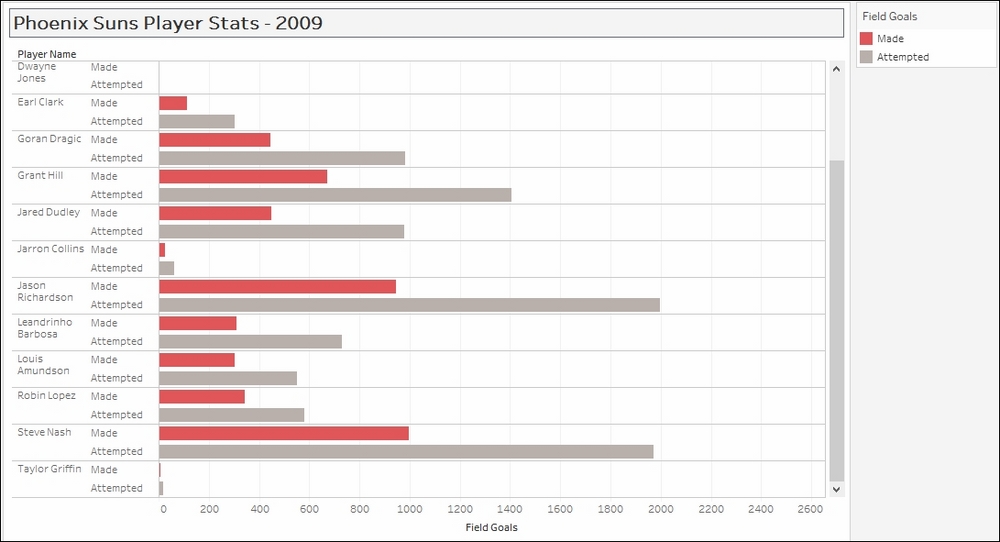
In this recipe, we will compare field goals made vs field goals attempted by Phoenix Suns players in the NBA 2009 season by using a shared axis chart.
Getting ready
To follow this recipe, open B05527_02 – STARTER.twbx. Use the worksheet called Shared Axis, and connect to the Player Stats (NBA Players Regular Season 2009) data source.
How to do it...
The following are the steps to create a shared axis chart:
- From Dimensions ...
Get Tableau 10 Business Intelligence Cookbook now with the O’Reilly learning platform.
O’Reilly members experience books, live events, courses curated by job role, and more from O’Reilly and nearly 200 top publishers.

