In this section, we use UFO sighting data to make Sparklines. Open the Sparkline packaged workbook to follow along. To follow along, use nuforc_events.csv and Sparklines.twbx.
- To begin, move the event date to Columns and shape to Rows. Because we have several years of data, we're filtering the dataset to 2010-2016 and displaying quarters, as follows:
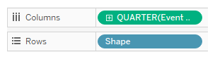
We use the green pill for QUARTER(Event Date) as opposed to the blue one because, in this scenario, the date is continuous rather than a discrete value. In other words, we want date to appear as a value on an axis rather than a value to be grouped.
- Move the measure to the

