Chapter 4. Working with Time
When we were debating the content of this book, no chapter contained more examples than this one. We had so many examples about time that we added them in practically all chapters—including earlier ones.
What makes time interesting is that we can have a single column in our data related to time, and it makes our data extremely flexible to analyze. This is because time data is naturally hierarchical. Whether seconds, minutes, hours, days, weeks, months, quarters, or years, a column including time data gives you flexibility no other column of data will have.
In Chapter 3, we discussed categorical data. Categorical data is ideal for making comparisons. One underlying assumption about all comparisons is consistency. When we, the developers, visualize two non-time-based values, our audience assumes that we are making comparisons that are appropriate. Your audience probably assumes they are the same time period.
Imagine you are doing call-center analytics and are comparing total calls. If today is May 17, 2020, you probably wouldn’t want to compare total calls in 2019 to 2020 because they are two, much different lengths! Whether we are trying to compare year-to-date from the current year, or comparing one month’s performance to the same month a year ago, our audience assumes consistency with time periods—it’s practically an unspoken contract between the developer and the user.
The goal of this chapter is to discuss the natural hierarchy of dates and datetimes and to help you develop calculations that can standardize and automate your visualizations.
In this chapter, we’ll walk you through the foundational calculations to make you an expert in date calculations. After we’ve built out this foundational understanding, we’ll transition to strategies for specific, but regular challenges we’ve faced in working with dates data. And remember: in the remainder of the book, you will see plenty of examples that utilize dates too.
Understanding Dates and Time
Tableau provides users with a very simple interface for working with time. By default, Tableau creates a hierarchy that allows users to easily navigate any datetime possibility. If you drag any date or datetime field onto the visualization, the field will automatically appear aggregated to the nearest year. This is the default of dates in Tableau.
In addition to Year as the default setting, Tableau places time values into a hierarchy. If you drill into the hierarchy, additional detail will be added to your view by quarter, month, week, day, hour, minute, and second.
Tip
This hierarchy will be available to your audience too. If you do not want that functionality, you will need to create custom date calculations—which we highly recommend.
While the default setting for a time field is a year, you can right-click and edit the year calculation and select the appropriate time.
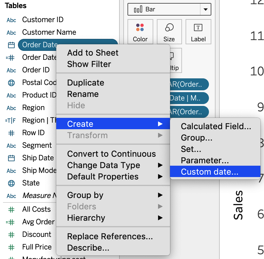
If you do not want a year to be the default value, you can click and hold the Option key on a Mac, or right-click on a PC, while dragging the time field onto the view. From there, you can select the date part or value of interest (Figure 4-1).
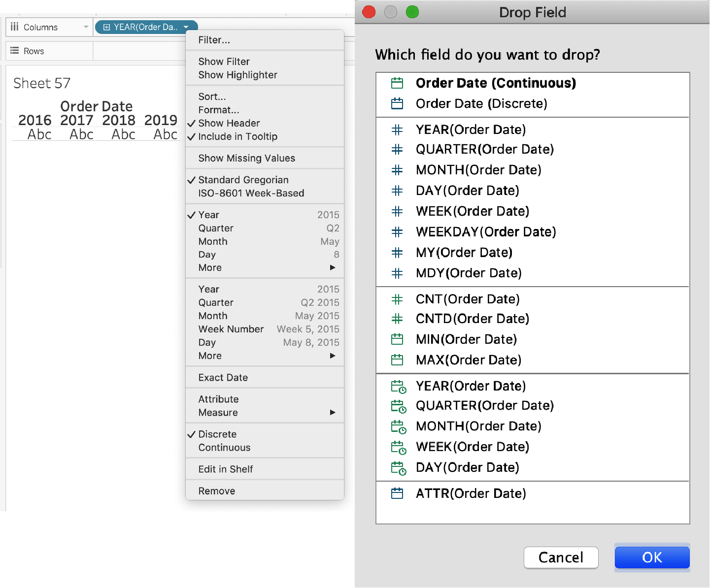
Figure 4-1. The view you will see after clicking and dragging a date onto a view and then right-clicking to change the date type (left); the view you will see after clicking and holding Ctrl (or Option on a Mac) while dragging a date onto the view (right)
Date Parts and Date Values
The way you can work with dates opens up many possibilities. When you look at Figure 4-1, you see many of the options for working with dates. You can choose date parts like Year (2015), Quarter (Q2), or Month (May), and you can choose date values like Quarter (Q2 2015), Month (May 2015), or Day (May 8, 2015). The difference between these is that you’re either choosing a particular part of the date or truncating the date to the most recent date value.
Date Calculations
Whether it’s figuring out the date part or the value to truncate to, Tableau offers the same flexibility in calculated fields through the DATEPART(), DATENAME(), and DATETRUNC() functions. DATEPART() returns a single numeric value for the part of the date of interest. For example, May 8, 2015 would return a value of 5 if set to return the month. DATENAME() returns a string for the part of the date of interest, so May 8, 2015 would return May if set to return the month. It’s a subtle difference, but the way the information is displayed will be different. Unlike DATEPART() and DATENAME(), DATETRUNC() returns an actual date or datetime value. With DATETRUNC(), values are rounded or truncated to the most recent specified date value.
Now, if the preceding two paragraphs sound familiar, it’s because we wanted it that way to show you this next point. While Tableau’s fields on your view might say YEAR, QUARTER, or MONTH, they actually are using these calculations behind the scenes. Let’s take a look at Figures 4-2, 4-3, and 4-4, and you’ll see we have the date part of Month and date value of Year on columns. If you double-click either of these values, Tableau will show the underlying calculations.
First, you have a discrete month and continuous year on the Columns shelf. These fields look nice and clean—and easy to understand. But underneath each of these fields are actually more-complicated functions.
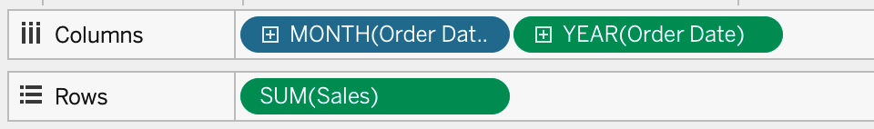
Figure 4-2. The Columns shelf showing discrete month and continuous year
If you double-click the MONTH(Order Date) discrete field, this will open up the ad hoc calculation editor. We’ll use this editor quite a bit in this book. Figure 4-3 shows the underlying calculation for MONTH(Order Date). It turns out this calculation uses the DATEPART() function and specifies month as the first argument in the function. This helps return the month part of the order date.
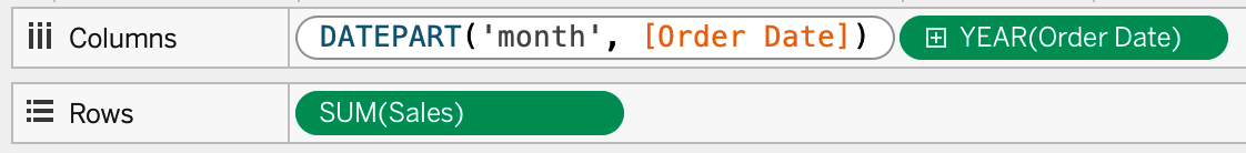
Figure 4-3. The DATEPART() function that makes up the infrastructure of the discrete MONTH(Order Date) field
And if you double-click the continuous field of YEAR(Order Date), the underlying function is DATETRUNC(), which as previously mentioned, rounds a field down to the specified level. This is shown in Figure 4-4. In this case, year will return January 1 of the year in [Order Date].
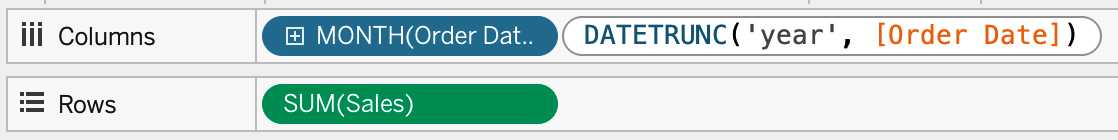
Figure 4-4. The DATETRUNC() field makes up the infrastructure of the continuous YEAR(Order Date) field
What’s great about seeing these calculations is that it helps you learn date calculations inside Tableau while you’re using the default settings of any time field. What’s also great is that you can change these calculations quickly—even in meetings to share insights as conversation occurs.
Date Hierarchies and Custom Dates
You’ll notice that all the dates in Figure 4-4 include hierarchies—this is that little + button to the left of the field names on your date fields on Columns. By default, a date field will automatically create these hierarchies. When you add a date field to your view, your audience will have the ability to interact with that date hierarchy. If you are looking to interact with a specific hierarchy of a date field, working with dates can be a challenge.
Luckily, there are ways to circumvent the automated date hierarchies. You can do this by creating a custom date: you right-click the original time field in the data source and choose Create → Custom date (Figure 4-5). From there, you must select the date part or date value of interest. Once you’ve created this field, place it somewhere in the view and you’ll notice the date has no hierarchy associated with it.
Discrete Versus Continuous Dates
To better understand how dates are visually represented in Tableau, let’s look at four visualizations in which we vary two components on the horizontal axis. Let’s look at the difference between date part and date value, and let’s also look at how discrete and continuous axes vary for the two chart types. This gives you four options to explore (Figure 4-6).
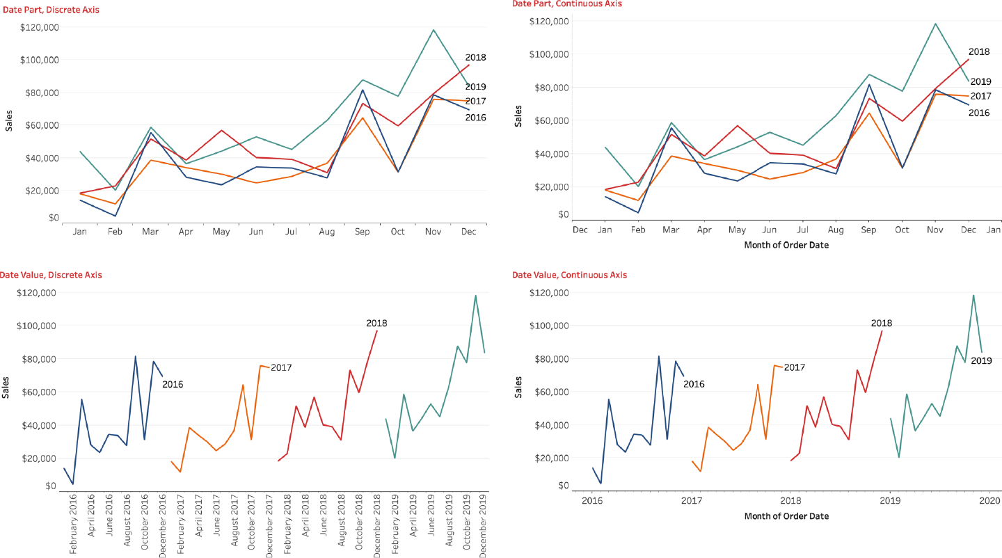
Figure 4-6. Visual output differs depending on whether dates are discrete or continuous and whether you’re working with date parts or date values
You can see how changing just two options can yield four charts that operate quite differently. The two big differences that are worth reiterating: a date part selection returns only a single part of a date field, and the default option for a date part is typically Discrete. This creates bins that separate each date part.
You can still convert discrete date parts to continuous to make a continuous axis. The chart types will look similar, but the axes function differently. If you look at the continuous date part visualization at the top right, you will see that the axis ticks for each month are centered on the month name. With discrete date parts at the top left, the visualization has buckets for each month, and no ticks to align to the values for each month. These ticks make it easier for our audience to understand which months they are looking at, so for this reason we prefer working with continuous fields.
This extends to your date value options too. If you choose a date value of Month, Tableau rounds each value down to the start of each month by default. This gives you month-by-year views of the data. By default, date values are continuous fields, but you can convert them to discrete. You’ll notice on the axis on the bottom left of Figure 4-6 that the axes are distinct buckets of label names. The continuous date values on the bottom right, however, show a single axis with ticks.
Tip
Remember that discrete dimensions will create headers only for data that exists. If you have gaps in your dates, you may want to use a continuous axis to preserve any unrepresented dates.
There is a place for discrete date axes. If you are planning on using a bar chart, you can use discrete date parts. If you are working with line charts, we recommend continuous axes.
Call Frequency: Chips and Bolts Call Center Case Study
The call center of a car part manufacturer, Chips and Bolts (CaB), is looking to improve its customer satisfaction scores. The executives need to better understand the basics before they can assess their performance. As a first step, they want to know how many calls they receive. They’re looking to track this data at 15-minute increments over a 2.5-year window to better understand how call volume may relate to their customer satisfaction surveys. How can this information be represented?
Working with time in Tableau is not without challenges. But it’s easy to place hours and minutes on a chart in Tableau: if you are working with a datetime field, Tableau automatically places it in the datetime hierarchy. Creating a plot on total calls, for instance, wouldn’t be that difficult.
With the continuous date part example shown previously, it’s fairly easy to convert a single date part into a continuous axis to plot multiple time periods. Using continuous date values truncates a date up to a certain date part, but sometimes you want to do the opposite. In this example, we want a continuous axis for hour, minute, and day. Take a look at Figure 4-7, showing total phone inbound calls received from the call center every 15 minutes over 2.5 years.
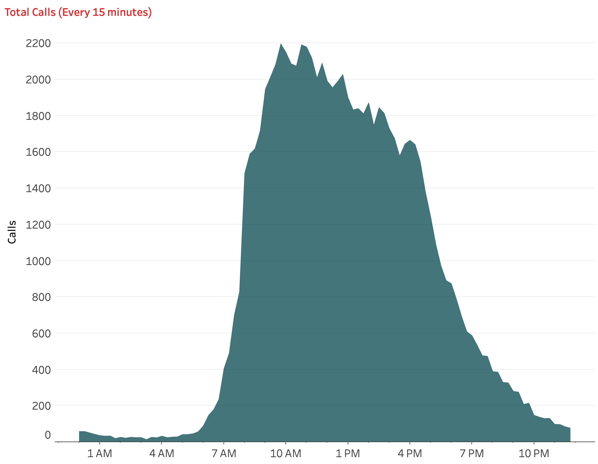
Figure 4-7. An area plot of total calls every 15 minutes
For the first four strategies, you will convert a datetime to various levels of aggregation. To complete the final analysis, call data aggregated on a continuous axis by every 15 minutes, you’ll need to get every date to be the exact same—but retain the time of each row in the data.
Strategy: Determine Total Call Time by Hour
In this strategy, we will tackle the challenge of working with time—particularly on a continuous axis. The result of this strategy is shown in Figure 4-8.

Figure 4-8. A line plot of sales by hour for each of the three years of data
In this strategy, we will plot the total calls by hour, broken down by year:
Create a new sheet and set it to fit the entire view.
Place [Start Date Time] on Columns. Then change the display to discrete hours.
If you are using Tableau Desktop 2020.1 or older, your data source already comes with the [Number of Records] field. If you are working with Tableau 2020.2 or newer, create a calculated field called
[Number of Records]:// Number of Records 1
Add [Number of Records] as a sum to Rows.
Add the discrete year of [Start Date Time] to Color.
Doing this allows you to see that—regardless of year—the calls begin to escalate around 7 a.m. but really pick up by 8 a.m. You also see that calls in 2020 are down across the board.
What’s missing from this analysis is a deeper investigation. Do calls occur at the beginning of each hour, or at mid-hour? If you are creating a staffing plan, the exact times might be more useful.
Strategy: Create a Plot to Measure Total Call Time by Minute
We will expand on the previous strategy by creating a visualization that plots total calls by minute of the day:
Sort the data by minute by clicking the + on the HOUR hierarchy. Figure 4-9 shows the resulting visualization.
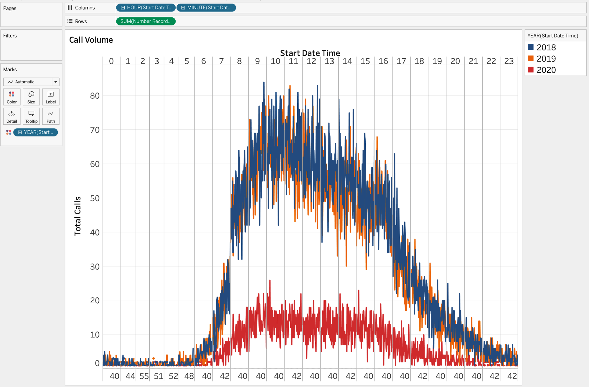
Figure 4-9. A line plot of sales by hour and minute for each of the three years of data
The result shows calls by minute in the day, but now we have two discrete axes: the top axis partitioned by hour, and a second axis for minutes, also creating up to 60 individual partitions within each hour. This creates partitions only where data exists. So if there is no data for hour 0, minute 53 (and there isn’t), the partition doesn’t exist.
Add any missing partitions. If you want to include missing partitions of any specified date part, right-click the date part and select Show Missing Values (Figure 4-10).
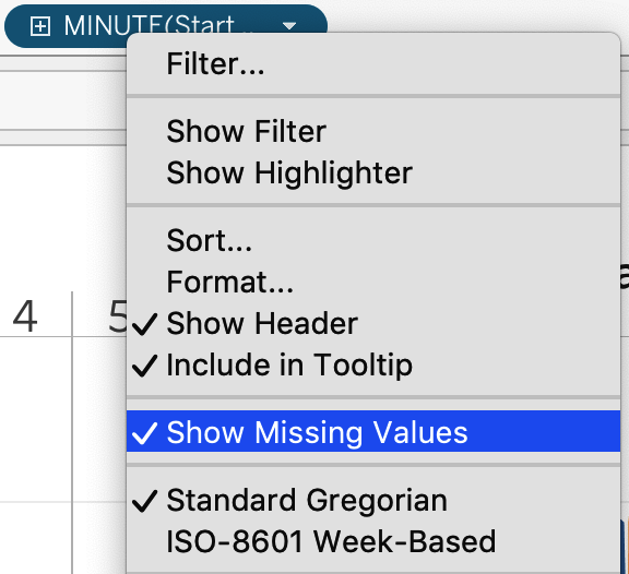
Figure 4-10. To show missing values, right-click the date field and select Show Missing Values
If you take a look at Figure 4-9, you’ll see that your visualization has two sets of discrete bins: one for hours and one for minutes. Using discrete values for hours and minutes is difficult because you end up with 1,440 partitions (24 hours × 60 minutes).
So how can you make a single axis? For this calculation, we are going to rely on two commonly used calculations: DATEADD() and DATEDIFF().
DATEADD() adds or subtracts dates or time and requires three inputs:
A specified date part, written inside quotation marks and in lowercase. This shows the units we are adding to a date, whether it’s seconds or hours or years.
Any integer indicating the amount of time we want to add or subtract. If a negative number is specified, time will be subtracted from the value.
The initial datetime field.
This extremely versatile calculation is one we use all the time.
DATEDIFF() calculates the difference between two dates based on the date part of interest and requires three inputs:
A specified date part
A starting date
An ending date
You can specify various date parts: year, quarter, month, dayofyear, day, weekday, week, hour, minute, second, iso-year, iso-quarter, iso-week, and iso-weekday.
Tip
For more technical help, read Tableau’s documentation on date functions.
Strategy: Create a Continuous Datetime Axis by the Second
You’ll now create a calculation that allows you to have a single axis for time:
Create a calculated field called
[time]and write the following calculation:// time DATEADD( "day", DATEDIFF( "day", [Start Date Time], {MAX(DATETRUNC("day", [Start Date Time]))} ), [Start Date Time] )This calculation will change all dates in your dataset to be equal to the maximum date in your dataset. The time (hour, minutes, and seconds) will remain the same.
Create a continuous axis as follows:
Remove all calculations on the columns.
Add the [time] field as an exact date to the columns.
This will produce the visualization in Figure 4-11.
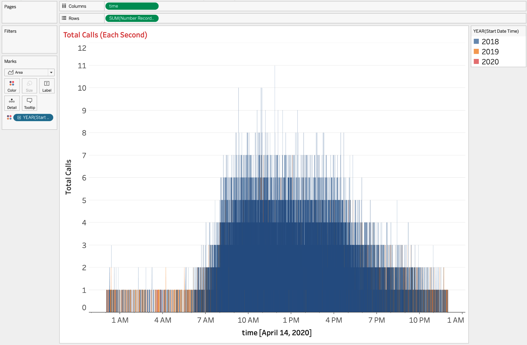
Figure 4-11. Total calls per second of the day using a continuous axis
You now have a continuous axis. However, the analysis is to the second, which isn’t extremely helpful or insightful. Instead of a per-second analysis, maybe you want to capture data every 15 seconds.
Strategy: Create a Continuous Datetime Axis for 15-Second Intervals
You will continue exploring datetime by creating a custom calculation that aggregates calls based on every 15 seconds of the day:
Use the visualization from our preceding strategy.
Create a new calculation and call it
[time / 15 sec].Write the following:
// time / 15 sec
DATEADD(
  "second",
  -(DATEPART("second",[time]) % 15),
  [time]
)
Here you’re first calculating the seconds for the time field. You are then using the modulo operator (
%) to calculate the total seconds every 15 seconds. Therefore, rather than counting to 60, you are counting to 14; then, instead of continuing to 15, you restart at 0.The result of this calculation is a datetime truncated to the most recent 15 seconds.
Click and drag [time / 15 sec] to replace the time field as a continuous axis. This produces the visualization in Figure 4-12.
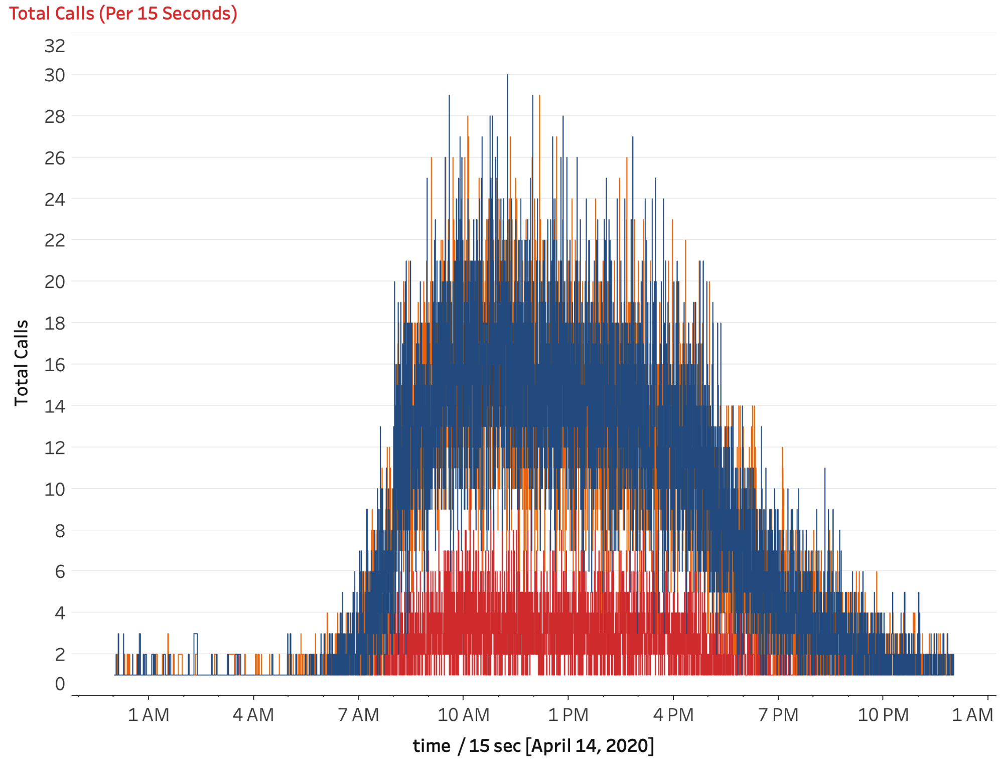
Figure 4-12. Total calls every 15 seconds of the day using a continuous axis
You’re starting to see patterns like those with the hourly plot, but this view is still too granular. Instead of every 15 seconds, what if you looked at every 15 minutes?
Strategy: Create a Continuous Datetime Axis for 15-Minute Intervals
When we started working with this data, we saw that information at the hour LOD was interesting, but we needed to see more information to get more specific. From there, we looked at the plots by every minute and every 15 seconds. Those plots were too detailed. In this strategy, we create a calculation that truncates time to every 15 minutes. The result will be a plot that is far more actionable than the previous three.
Create a new calculation called
[time / 15 min].Write the following:
// time / 15 min
DATEADD(
  "minute",
  -(DATEPART("minute", [time]) % 15),
  DATETRUNC("minute", [time])
)
The format for [time / 15 min] looks almost the same, except we’ve replaced
secondwithminute, and our third argument is nowDATETRUNC("minute", [time])instead oftime. This is because our analysis with [time / 15 sec] was already at the lowest level in Tableau (seconds). Since we are working at a higher level of data, we need to roll up all the values to the nearest minute.Roll up to the nearest minute:
Click and drag to replace [time / 15 sec] with [time / 15 min].
On the Marks card, click Path and change the line type to Step. We like using a step path instead of a straight line because we know that the line represents all values across this 15-minute increment.
Finally, in Figure 4-13, we have a single axis where we can see patterns in the data at 15-minute intervals. This plot gives us lots of great information about how quickly calls are scaling up each morning, with much greater precision than to the nearest hour (but not too precise).
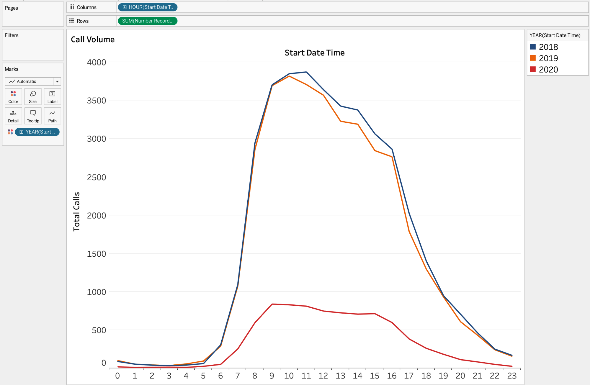
Figure 4-13. Total calls every 15 minutes of the day using a continuous axis
You still have the red line—representing 2020—much lower than all other values. This might be because we’ve collected data only up until April 14, 2020. And because business might be seasonal, comparing time periods that are alike might be worthwhile. But before we do that, we want to take a deeper look at calls per 15 minutes.
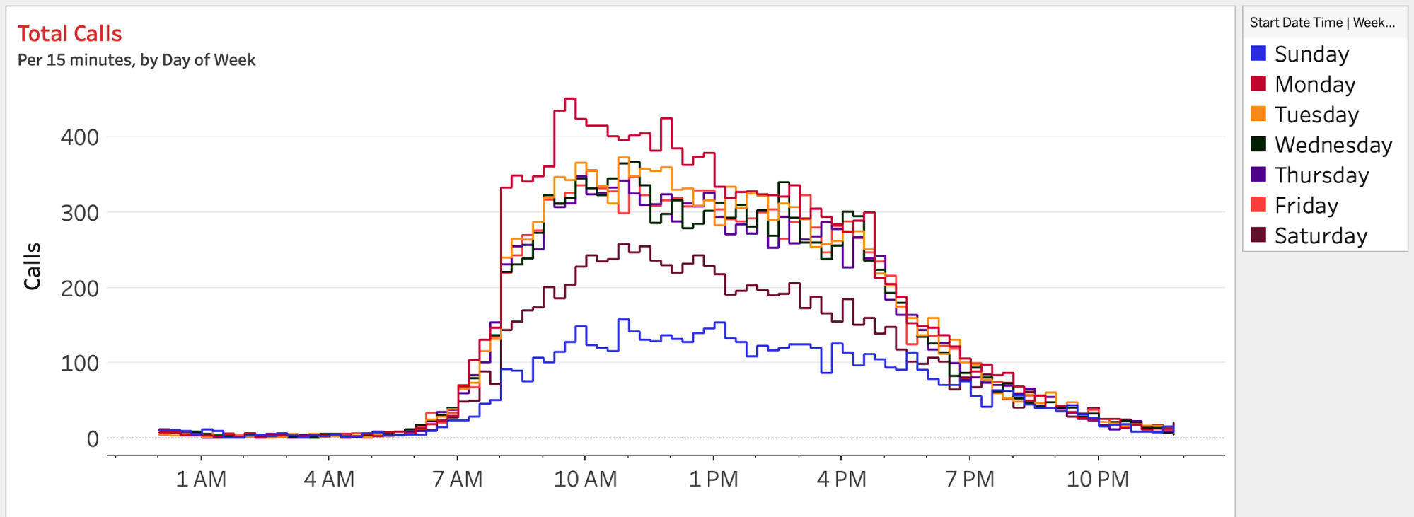
Let’s look at calls per 15 minutes, by day of the week, by adjusting the dimension on Color. Right-click YEAR(Start Date Time) and change the date type to a discrete date part of
weekday(this is located under the More section of the date part). Feel free to edit the colors afterward. Figure 4-14 shows the resulting visualization.
Heatmaps (Highlight Tables)
The information in Figure 4-14 is extremely useful, but there are just too many lines to read through the insights. When we’re working with line charts that have eight or more lines, we immediately consider other chart types. Our go-to chart type for this scenario is the heatmap—though Tableau calls it a highlight table. Heatmaps allow audiences to see change via color, intensity, or hue rather than through direction. This heatmap is displayed as a matrix so that anyone can easily track changes for a single member in a dimension.
Strategy: Build an Essential Heatmap
Let’s create a heatmap that reimagines the same analysis from the line chart in our preceding strategy:
Create a new sheet.
Change the mark type to Square.
Create a custom date for the date part of weekday by using [Start Date Time] and place that on Columns.
Place [time / 15 min] on Rows but choose the Hour date part.
Place [Number of Records] on Color.
Choose a color palette that works for you. We’re choosing a custom color palette (we’ll talk about that more in Chapter 12).
The result is the heatmap in Figure 4-15.
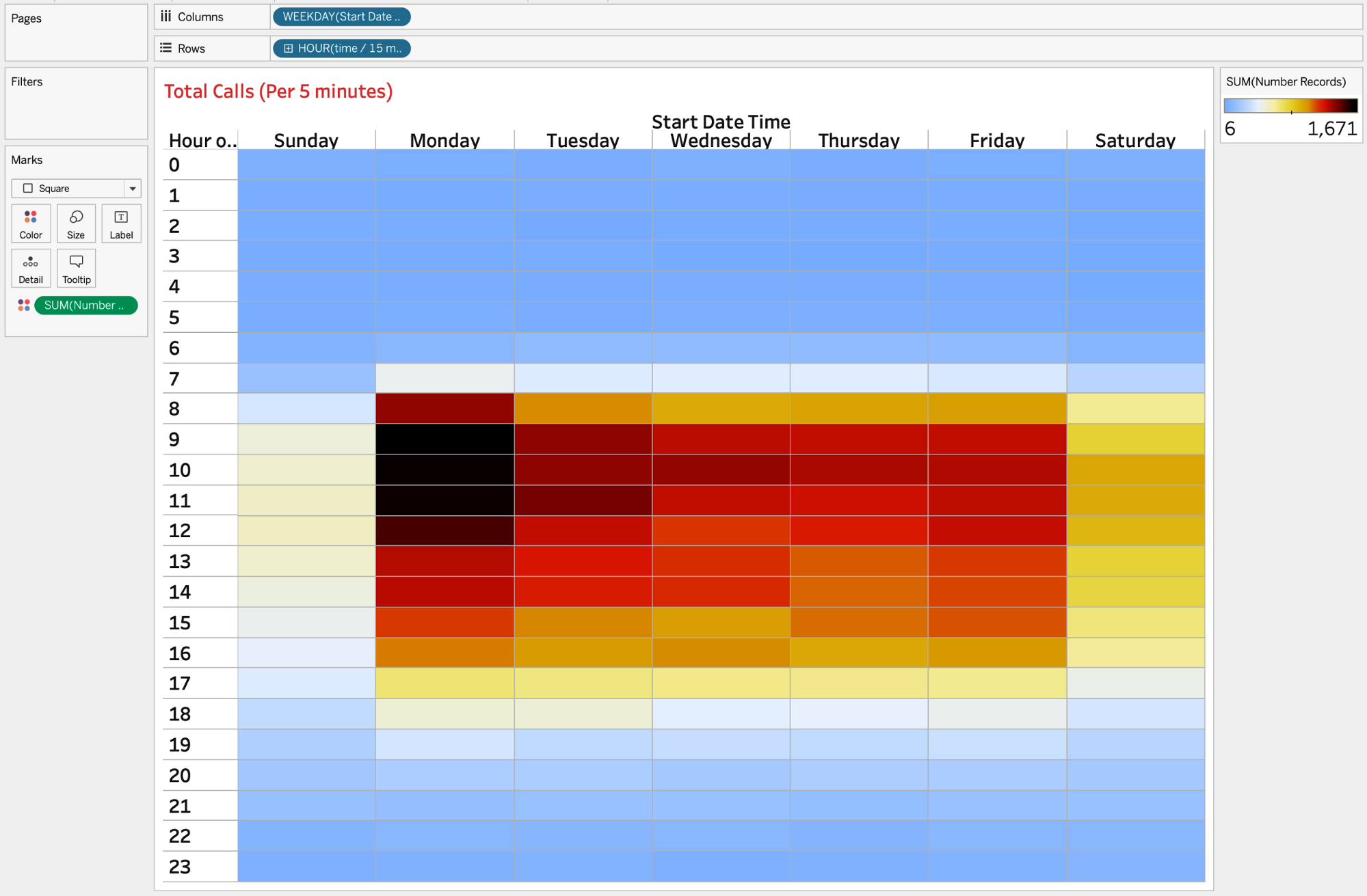
Figure 4-15. Total calls every hour of the day and day of the week using a heatmap
Once again, you see that calls begin to pick up at 8 a.m., through change in color. But you are also able to spot that Mondays, particularly in the morning, are extremely busy. Weekends are quieter, and Sunday is exceptionally slow. We also see that calls begin falling off after 5 p.m. (depicted as 17 in the chart).
Strategy: Create a More Detailed Heatmap
A heatmap can be extremely helpful even when the data is fairly granular. Heatmaps’ value only increases as more complexities and detail are added to a visualization. Follow these steps to add more detail to your heatmap:
Duplicate your visualization from the preceding strategy.
Create a custom date for the date part of Month by using [Start Date Time].
Place it on Columns and to the left of your weekday calculation on Columns.
Click the + on HOUR(time / 15 min) on Rows. This will show time rounded to the nearest 15 minutes.
You’ll notice some whitespace where there are no values on your dashboard. If you want to add marks for those locations, you’ll need to use a lookup calculation:
ZN(LOOKUP(SUM([Number of Records]),0)). (We’ll talk about this in more detail in Chapter 6.) Add this calculation to Color.Format your column and row headers to be more readable. Figure 4-16 shows the resulting visualization.
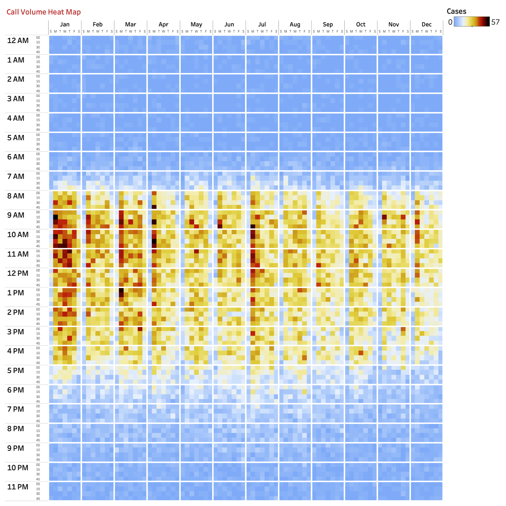
Figure 4-16. Total calls every 15 minutes of the day by month and day of the week using a heatmap
We’ve chosen to format dividers at the Hour and Month level. This allows your audience to quickly navigate to segments of analysis.
This chart shows call volumes by 15-minute increments by month and day of the week. So what insights can you glean from this data?
Calls pick up at 8 a.m. on weekdays almost every month of the year.
More calls tend to occur in the later evening during the summer months.
Regardless of day of the week, a lot of calls typically occur in January.
In April, July, and December, more calls happen on Mondays. This might be because a heater or air conditioner that broke over the weekend results in calls for service on Monday.
Identifying call patterns from this visualization could be extremely helpful in staffing. Mondays are always busy, but it might make sense to bulk up on those days in April, July, and December. With call volumes higher later into the evening in the summer, staffing might be needed until 6 p.m. instead of 5 p.m. This could be offset with staff working fewer hours on non-Mondays during November and December.
We love heatmaps. They are underrated tools for representing time and are particularly useful when data can be represented with many members of a dimension.
Comparing Values Year-to-Date: CaB Call Center Case Study
Now that the call center better understands the number of calls coming in, the staff would like to understand how this has changed over time. It’s currently April, and they want to see the current year represented in the analysis. How can you create a like-to-like comparison against prior years?
For this case study, we will continue our analysis of call center data. In this final analysis, we are concerned with making appropriate comparisons across years. To do so, let’s go back to our plot of total calls per 15 minutes by year (Figure 4-17).
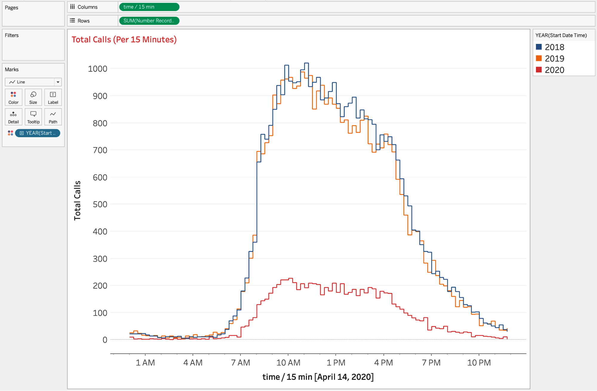
Figure 4-17. Total calls every 15 minutes of the day by year
We see that calls are down, but that’s because we’re at a different point in time in 2020 than the other years. This is partly because our data is only through April 14, 2020. What might be fairer is to compare calls for 2018, 2019, and 2020 through April 14 instead of their overall totals.
This is a challenge we face quite often, regardless of data type: being able to compare similar time periods. So how can you solve the problem? With a well-designed date calculation.
The goal of the next two strategies is to create a calculation to compare the most recent date for the most recent year to the same date in prior years. For the next strategy, you will re-create a bar chart that shows progress to the total. This will allow your audience to keep an eye on overall values while simultaneously displaying comparable year-to-date values. Then, we’ll apply a filter to our line chart, allowing for a proper year-to-date comparison, rather than the visualization shown in Figure 4-18.
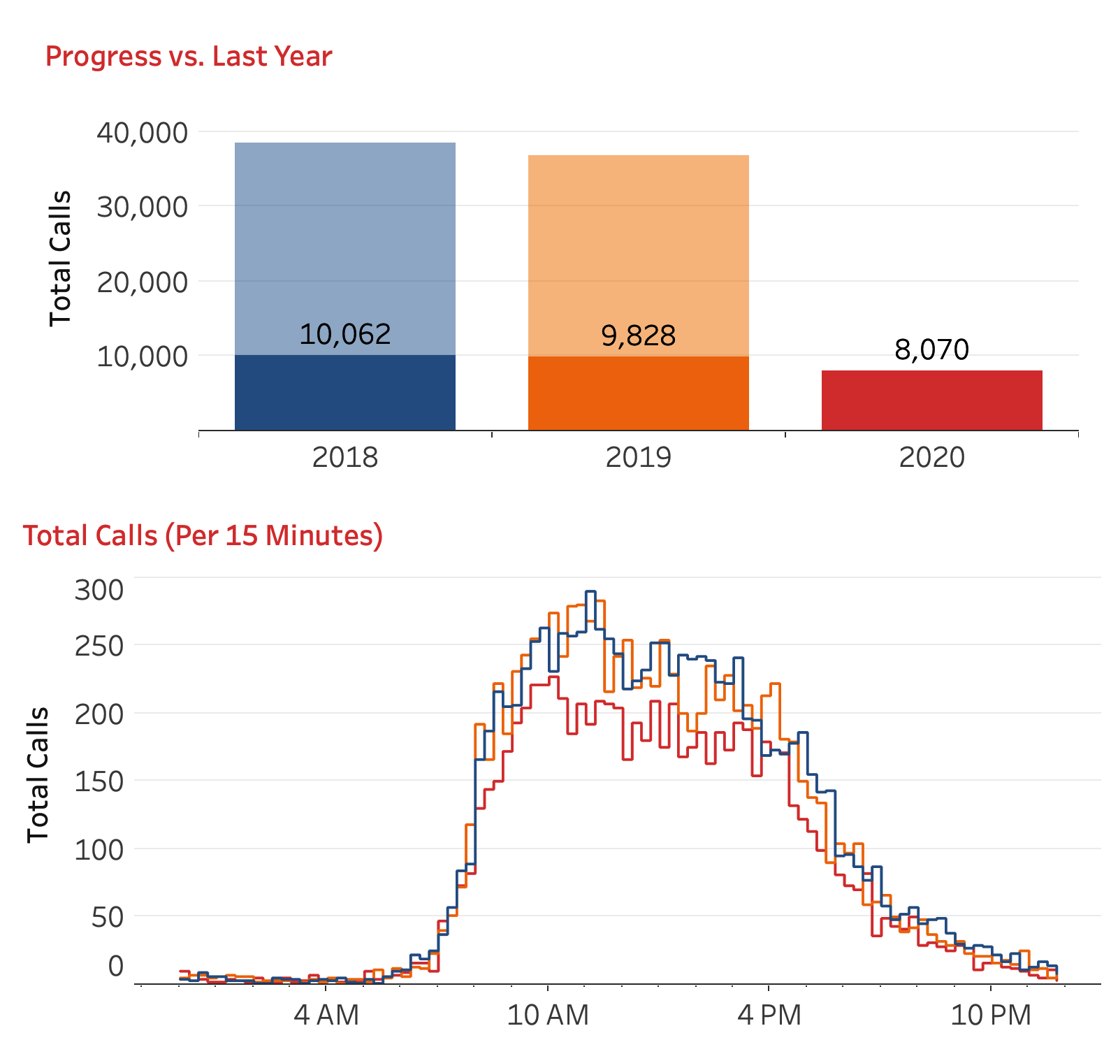
Strategy: Show Progress to the Total by Using Two Bar Charts
In this strategy, you’ll use a bar chart to show progress to the total:
Build the calculations as follows:
Normalize the dates to the same year by creating a calculation called
[Start Date Time | Same Year]:// Start Date Time | Same Year DATEADD( "year", DATEDIFF("year", {MAX([Start Date Time])}, [Start Date Time]), DATETRUNC("day", [Start Date Time]) )Create a second calculation called
[Start Date Time | Same Year | TF]. This is a Boolean that detects whether a date is less than or equal to the day of the year for the most recent year:// Start Date Time | Same Year | TF DATEPART("dayofyear", [Start Date Time | Same Year]) <= DATEPART("dayofyear", {MAX([Start Date Time])})Create a third calculation called
[Total Calls | YTD]:// Total Calls | YTD SUM( IF [Start Date Time| Same Year | TF] THEN [Number Records] END )
This will return year-to-date values for each year.
Build the visualization:
Add [Number of Records] to Rows.
Add [Total Calls | YTD] to the right of [Number of Records] on the Rows shelf.
Create a synchronized dual-axis chart.
Add [Start Date Time] as a discrete year name to Columns and to Color.
Set the opacity on the
SUM([Number of Records])Marks card to 40%.Format your visualization by removing the column and row dividers, adding a darker column axis ruler and tick marks, styling your grid lines, showing just a left axis, and renaming the axis.
Show labels on the AGG(Total Calls | YTD) Marks card.
This results in the bar-on-bar chart in Figure 4-19.
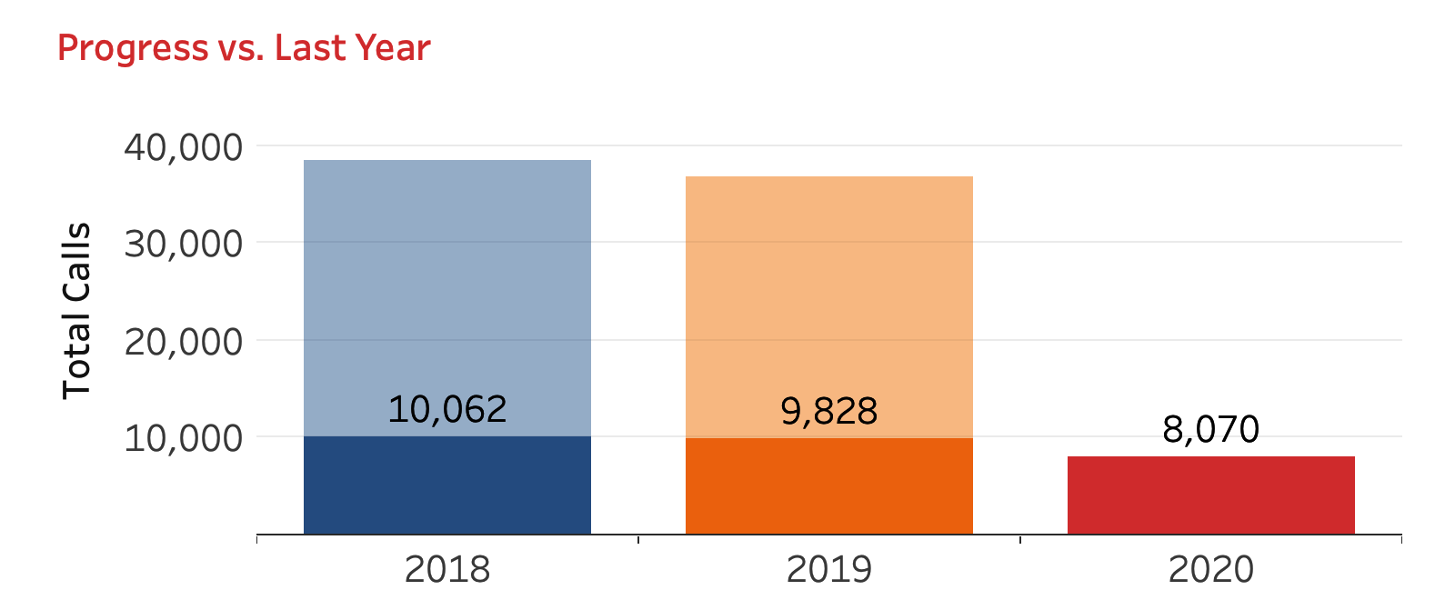
Figure 4-19. The resulting visualization showing the year-to-date progress relative to the current date for the most recent year
In this visualization, we embedded an IF statement inside the aggregation to do the filtering inside the calculation. This is something you should regularly do to allow a visualization to be dynamic. As the year continues, we’ll see the 2020 bar increase. The 100% opaque bars in 2018 and 2019 will also continue to grow. These bars will eventually cap at the values shown in the 40% opaque bars shown on the same axis.
Take a look back at Figure 4-17. That visualization shows total calls for all dates in 2018 and 2019. It also shows just dates through April 14 in 2020. It’s not a like-for-like comparison. It would be great if we could compare these values.
Strategy: Compare Similar Periods on a Line Chart
Unlike the preceding strategy, where we used an IF statement to filter our data, we are going to explicitly place a calculation created on the Filters shelf. Our goal with this strategy is to use a visualization created earlier in the chapter and add a year-to-date filter:
Duplicate your final visualization from the earlier continuous data strategy shown in Figure 4-13.
Ensure that you have completed step 1a and step 1b from the preceding strategy.
Edit Weekday of [Start Date Time] currently on Color by changing the date type to discrete year.
Add [Start Time Date | Same Year | TF] to the Filters shelf, select True, and click OK.
Edit the axis and remove the axis title. Figure 4-20 shows the result.
Figure 4-20. A visualization showing total calls every 15 minutes of the day filtered to the same day of the year for 2018, 2019, and 2020
When you place the results from our preceding two strategies next to each other, the end result is a miniature year-to-date dashboard that allows your audience to track total calls year to date as well as when the calls occurred (Figure 4-21).

Automated Reports
In this section, we are going to look at automating reports by using custom calculations. Whether it’s call center data, financial reports, or student enrollment numbers, we spend a lot of time developing tables that automatically update at the end of a month. While implementing these tables takes a little bit of time, the effort goes a long way in saving time. One of the most common actions we see from novice users of Tableau is manually updating data, then going to a dashboard and editing a filter to include updated data. The goal of the next strategy is to show how to automatically update a dashboard based on the data that is on the dashboard.
Automating Reports for Month-over-Month and Year-over-Year Change: CaB Call Center Case Study
Now that the CaB call center is starting to understand overall call volume by year, the employees want to take a closer look at how manufacturing cycles and large orders impact their satisfaction scores. They have requested a month-over-month view in addition to the year-over-year reporting already provided. This view will show more-granular data. How would you build a report that is still easy to understand? What steps would you take to automate this report?
Take a look at the table in Figure 4-22. It shows the average calls per day as well as the percentage of change in calls month-over-month and year-over-year. The table shows data from March 2019 through March 2020. We decided to not report anything for April because our data reports only through April 14. When we have data reported for the final day of April, the report will automatically update so that the table shows metrics from April 2019 through April 2020. Additionally, this table shows a breakdown of calls by call reason and aggregates to totals.
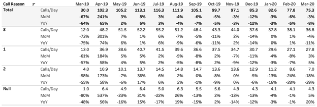
Figure 4-22. Average calls per day and percentage of change in calls, month-over-month and year-over-year, March 2019 through March 2020
Strategy: Automated Rolling Table
In this strategy, you will re-create the table shown in Figure 4-22. This will always show the last 13 fully completed months based on the date with the last entries:
Build the base table for this visualization. Create the metric for our table,
[Calls/Day]:// Calls/Day SUM([Number Records])/COUNTD(DATETRUNC("day", [Start Date Time]))Start by adding [Calls/Day] to Text. Add [Call Reason] to Columns and sort the dimension in descending order by calls per day. Create a new custom date called
[Start Date Time | Month]that returns monthly date values. Place this as a discrete value on Columns. Add column totals and place them at the top, as shown in Figure 4-23.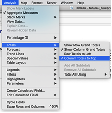
Figure 4-23. To add totals to the top of the columns, choose Analysis → Totals and then select Show Column Grand Totals and Column Totals to Top
Format your table so that only row dividers exist, as shown in Figure 4-24. Add band color to your totals only. This will serve as the base for your month-over-month calculation, your year-over-year calculation, and the automations you will create.
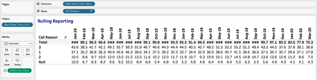
Figure 4-24. The table showing calls per day by call reason and month
Create the month-over-month calculation. This is done with a table calculation. Call this new calculation
[Calls/Day | % Change 1]:// Calls/Day | % Change 1 (ZN([Calls/Day]) - LOOKUP(ZN([Calls/Day]), -1)) / ABS(LOOKUP(ZN([Calls/Day]), -1))
This calculation creates a percent change based on the previous value, in this case the previous month. Because a business may be seasonal (and many are), it’s often better to compare values to the previous year. To do this, create a new calculation called
[Calls/Day | % Change 12]:// Calls/Day | % Change 12 (ZN([Calls/Day]) - LOOKUP(ZN([Calls/Day]), -12)) / ABS(LOOKUP(ZN([Calls/Day]), -12))
You’ll notice that the calculation is just slightly different: –1 has been changed to –12. Double-click [Calls/Day | % Change 1] and [Calls/Day | % Change 12]. This converts the table to include [Measure Names], and the text is now [Measure Values]. The table calculations in [Calls/Day | % Change 1] and [Calls/Day | % Change 12] need updating, but you can wait until we have all the components of the visualization on the view.
Let’s now move on to showing only full months. Start by calculating the maximum date of [Start Date Time] by writing a calculation called
[Start Date Time | Max Date]:// Start Date Time | Max Date {MAX([Start Date Time])}Here we use an LOD calculation to calculate the maximum date in our dataset. We’ll monitor this date so we know when to update our table. This will allow you to calculate relevant time periods dynamically. You just need to find the start and end points of your dynamic table. Let’s first calculate the last day of the last full month and call the calculation
[Last Day of Last Full Month]:// Last Day of Last Full Month DATETRUNC("month", [Start Date Time | Max Date] + 1) - 1Use this calculation to create a Boolean to filter data in the current month—which is not yet complete. Create a calculation called
[Start Date Time | Full Months]:// Start Date Time | Full Months [Start Date Time] <= [Last Day of Last Full Month]
Add this calculation to Filters and select True.
Filter this visualization down to the most recent 13 complete months. Create a new calculation called
[Start Date Time | Last 13 Months]://Start Date Time | Last 13 Months [Start Date Time] > DATEADD("month", -12, [Last Day of Last Full Month] + 1) - 1Place this calculation to the left of [Start Date Time | Month]. Right-click the False header and select Hide. Then deselect Show Header from the same menu (Figure 4-25).
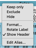
Figure 4-25. Hiding the header by deselecting Show Header
Finalize the table calculations by editing the [Calls/Day | % Change 1] and [Calls/Day | % Change 12] table calculations in the [Measure Values] Marks card so that only [Call Reason] is deselected, as shown in Figure 4-26.
![The table calculation settings for [Calls/Day | % Change 1] and [Calls/Day | % Change 12]](/api/v2/epubs/9781492080077/files/assets/TAST_0426.png)
Figure 4-26. The table calculation settings for [Calls/Day | % Change 1] and [Calls/Day | % Change 12]
Be sure to format both month-over-month and year-over-year calculations as percentages. Finally, right-click and edit the alias (Figure 4-27). [Change Calls/Day | % Change 1] to MoM (month-over-month) and change [Calls/Day | % Change 12] to YoY (year-over-year).
![Right-click [Measure Names] and select Edit Alias](/api/v2/epubs/9781492080077/files/assets/TAST_0427.png)
Figure 4-27. Right-click [Measure Names] and select Edit Alias
The result of all this work (shown previously in Figure 4-22) is a humble table that provides a lot of great insights and is automatically updated each month.
For the most part, we as developers spend very little time thinking about what a year, month, or week even means. We just assume that a year goes from January 1 to December 31. But when it comes to organizations, a fiscal year is defined in many ways. This next section provides a brief overview of working with fiscal dates in Tableau.
Nonstandard Calendars
A fiscal year can start at any time; it can be January 1, June 5, or even the fifth Monday of the standard calendar year. It’s all relative. Tableau provides some flexibility.
If your calendar year starts at the beginning of a month, you can standardize this by right-clicking and then navigating to Default Properties → Fiscal Year Start → Month of Fiscal Year (Figure 4-28). This simplifies the hierarchy associated with that particular date measure.
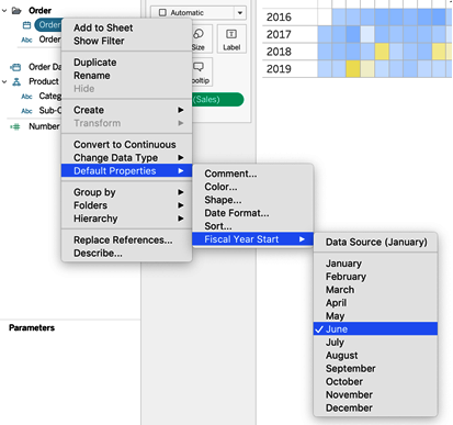
Figure 4-28. Right-click a date to change the default properties of the fiscal year start (in this example, the fiscal year start is set to June)
Some organizations work with the standard Gregorian calendar as their fiscal year: January 1 thru December 31. Other organizations, however, start the fiscal year or month on the first day of the week that month starts. So if January 1 is on a Tuesday, the fiscal year would start on December 30. This calendar type is called ISO-8601. While the name is funky, just know that the calendar is week-based. You can specify the calendar type by right-clicking the date value on your view and selecting ISO-8601 Week-Based. (We’ll just call it an ISO calendar in this section.)
In Figures 4-29 and 4-30, you can see how data from a standard calendar can differ ever so slightly from an ISO calendar.
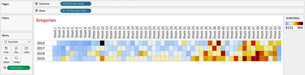
Figure 4-29. Data in a standard calendar
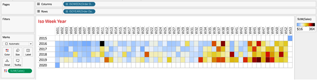
Figure 4-30. Data in an ISO calendar
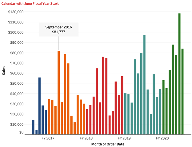
Strategy: Build a Monthly Bar Chart with a June 1 Fiscal Year Start
Let’s take a second to build a visualization with a June fiscal start. To keep it simple, imagine you are building a bar chart that shows total sales by month and fiscal year. You will replicate Figure 4-31:
Connect to the Sample – Superstore dataset.
Duplicate the [Order Date] field and call it
[Order Date | June].Right-click [Order Date | June] and change the default fiscal year start to June.
Add [Order Date | June] as a continuous data value by month to Columns.
Add
SUM([Sales])to Rows.Add YEAR([Order Date | June]) to Color.
Change the mark type to Bar.
Right-click the September 2016 bar and add an annotation to the mark, displaying the date and the total sales.
Visualizing the 4-5-4 Calendar: Office Essentials Case Study
Our large retail store, OE, has relied on data metrics tied to a calendar year. The company would like to redesign some of its standard reports to now follow a 4-5-4 calendar. How would you complete this task?
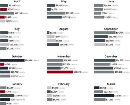
Retailers often use the 4-5-4 calendar. This calendar allows them to compare sales by dividing the year into months based on a repeating four weeks, five weeks, and four weeks. Retailers use this calendar because holidays tend to line up, and because the same number of Saturdays and Sundays are displayed in comparable months. The 4-5-4 sales calendar is not perfect: because the calendar is based on 52 weeks, or 364 days, this leaves an extra day each year to be accounted for. To adjust for this, a week is added to the fiscal calendar every five to six years. These occurred in 2012 and 2017, and will happen again in 2023.
The 4-5-4 calendar year varies from year to year. When February 1 occurs on Thursday, Friday, or Saturday, the calendar year starts the Sunday after February 1. If February 1 occurs on Sunday, Monday, Tuesday, or Wednesday, the calendar year starts the Sunday of the week of February 1.
The next strategy is focused on building date components for the 4-5-4 retail calendar. These include week of the year, month of the year, quarter of the year, and week of the quarter. After you build the components, you will build a visualization highlighting some of those calculations.
Strategy: Build a Bar Chart Using the 4-5-4 Retail Calendar
Create a calculation that calculates February 1. Call the calculation
[Feb 1]:// Feb 1 DATEADD("month", 1, DATETRUNC("year", [Order Date]))Calculate the start of the calendar year based on whether February 1 is after Wednesday in the week. Name the calculation
[454 Year Start]:// 454 Year Start IF DATEPART('weekday', [Feb 1]) > 4 THEN DATETRUNC('week', DATEADD('week', 1, [Feb 1])) ELSE DATETRUNC('week', [Feb 1]) ENDDetermine the start of the 4-5-4 calendar year for the prior year by calculating February 1 for the prior year. Name the calculation
[Feb 1 | PY]:// Feb 1 | PY DATEADD('year', -1, DATEADD("month", 1, DATETRUNC("year", [Order Date])))Calculate the start of the previous calendar year. We will use this calculation with the current year values to determine the week number of the calendar year. Label the calculation
[454 Prior Year Start]:// 454 Prior Year Start IF DATEPART('weekday', [Feb 1 | PY]) > 4 THEN DATETRUNC('week', DATEADD('week', 1, [Feb 1 | PY])) ELSE DATETRUNC('week', [Feb 1 | PY]) ENDParse the retail weeks of the year:
// Retail Week
IF [454 Year Start] <= [Order Date]
THEN DATEDIFF('week', [454 Year Start], [Order Date]) + 1
ELSE ({FIXED [Feb 1] : MAX(DATEDIFF('week',
  [454 Prior Year Start], DATETRUNC('year',[454 Year Start])))}
+
DATEPART('week', [Order Date])
     )
END
Now that you have the week, you can create components like Retail Quarter, Retail Month of Quarter, Retail Week of Quarter, Retail Month, and Retail Week of Month. Build out each of these calculations:
//Retail Quarter
FLOOR(([Retail Week]-1)/13)+1


//Retail Week of Quarter
(([Retail Week] - 1) % 13) + 1


// Retail Month of Quarter
IF [Retail Week of Quarter] <= 4
THEN 1
ELSEIF [Retail Week of Quarter] > 4
AND [Retail Week of Quarter] <= 9
THEN 2
ELSEIF [Retail Week of Quarter] > 9
AND [Retail Week of Quarter] <= 13
THEN 3
END


//Retail Month
IF [Retail Week] <= 4
THEN "February"
ELSEIF [Retail Week] > 4 AND [Retail Week] <= 9
THEN "March"
ELSEIF [Retail Week] > 9 AND [Retail Week] <= 13
THEN "April"
ELSEIF [Retail Week] > 13 AND [Retail Week] <= 17
THEN "May"
ELSEIF [Retail Week] > 17 AND [Retail Week] <= 22
THEN "June"
ELSEIF [Retail Week] > 22 AND [Retail Week] <= 26
THEN "July"
ELSEIF [Retail Week] > 26 AND [Retail Week] <= 30
THEN "August"
ELSEIF [Retail Week] > 30 AND [Retail Week] <= 35
THEN "September"
ELSEIF [Retail Week] > 35 AND [Retail Week] <= 39
THEN "October"
ELSEIF [Retail Week] > 39 AND [Retail Week] <= 43
THEN "November"
ELSEIF [Retail Week] > 43 AND [Retail Week] <= 48
THEN "December"
ELSEIF [Retail Week] > 48 AND [Retail Week] <= 52
THEN "January"
END


// Retail Week of Month
IF [Retail Week of Quarter] <= 4
THEN [Retail Week of Quarter]
ELSEIF [Retail Week of Quarter] > 4
AND [Retail Week of Quarter] <= 9
THEN [Retail Week of Quarter] - 4
ELSEIF [Retail Week of Quarter] > 9
AND [Retail Week of Quarter] <= 13
THEN [Retail Week of Quarter] - 9
END
Having all of these calculations is extremely useful for any visualization using a retail calendar. Let’s create a visualization that we like to use to showcase the retail calendar.
Add a discrete dimension of [Retail Month of Quarter] to Columns. Add a discrete dimension of [Retail Quarter] to Rows. Add [Retail Week of Month] as a continuous dimension to Rows. Add 0.0 as an ad hoc continuous dimension to the right of [Retail Week of Month]. Create a synchronized dual axis.
Add details as follows:
Set the Marks card of [Retail Week of Month] to a bar chart. Add
[Profit Ratio] * (SUM([Profit])/SUM([Sales]))to Color. AddSUM([Sales])and the continuous dimension of [Retail Week] to Text. Format the text so it reads as shown in Figure 4-32.
Figure 4-32. Text labels for the 4-5-4 bar chart
On the Marks card of the 0.0 value, set the mark type to Text. Add [Retail Month] to Text.
For the last part, we need to place a value on Columns that will control both axes. Create a calculation called
[bar]and add it to Columns:// bar IF COUNTD([Retail Week]) = 1 THEN SUM([Sales])/WINDOW_MAX(SUM([Sales])) ELSE .9 END
This calculation will show sales as a percentage of the maximum sales for a retail week for the bars and will place a label of each state at 0.9. Change the table calculation and select all values, as shown in Figure 4-33.
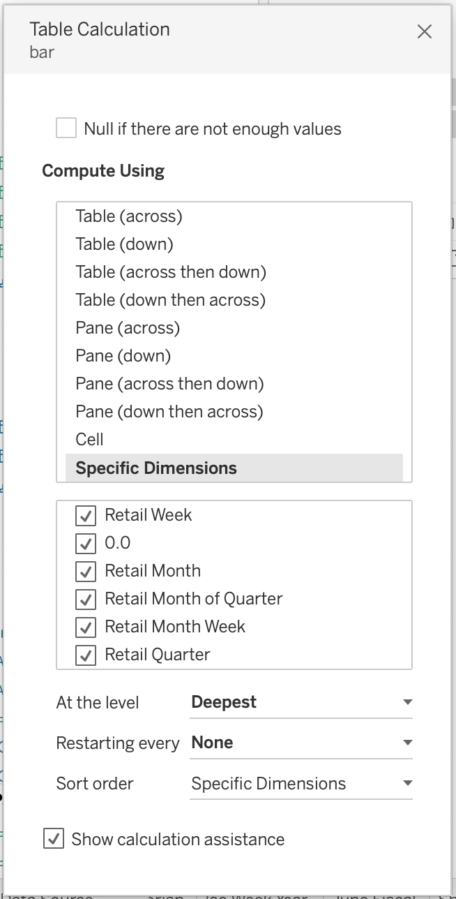
Figure 4-33. Table calculation settings for the 4-5-4 bar chart
Set the bar axis range between 0 and 1.8, and then hide the axis. Reverse the axis of the [Retail Week of Month] field and then hide the axis.
Finally, format the chart according to your design standards.
The resulting visualization is shown in Figure 4-34.
Conclusion
In this chapter, we scratched the tip of the dates-and-times iceberg. Because dates and times are naturally hierarchical, and because dates and times can be treated as either dimensions or measures, a single date field has a nearly unlimited number of combination options.
In the chapter opening, we discussed the importance of understanding the difference between a date part and a date value. With date parts, Tableau returns a single component of a date or time field. The underlying calculation for date parts is the DATEPART() function.
In the first two strategies, we showcased how to plot parts of a date. Combining multiple date parts (in this case, hour and minute) can lead to too many discrete values being shown.
With date values, Tableau returns a date rounded down to the specified part of the date. This means a date part of Month will return the month name or number, while a date value of Month will return the year and month combination. The underlying calculation for a date value is the DATETRUNC() function.
Tableau defaults date parts to dimensions, and date values to continuous values. While those are the default values, we can convert either to discrete or continuous values. Our selection of discrete or continuous values affects what our axes might look like and therefore the type of chart we are most likely to select.
The final fundamental we discussed was Tableau making a date hierarchy available to your audience by default. If you are looking to limit the availability of this hierarchy, you must use a custom date.
For most audiences, working with a continuous axis is more intuitive because that’s how people think about time! This lends itself to the selection of line charts. One challenge of working with dates is creating continuous plots of a single date part. We tackled this challenge of creating continuous axes. In each of these challenges, we moved from showing data rounded to the nearest second of the day, to the nearest 15 seconds, and to the nearest 15 minutes.
While line plots—and occasionally bar charts—are two common ways in which date and time values are visualized, we like to use heatmaps (which only Tableau calls highlight tables). Line charts provide a limited ability to describe more than five lines—any more, and it becomes difficult, even for the most data-savvy audience, to interpret patterns. One simple alternative to line charts is heatmaps. We highlighted the flexibility of this chart type when working with date and time fields.
Another regular challenge when working with dates is comparing previous years to the current year to date. We showed you a calculation you can use to calculate the year-to-date values of any date. This can be used inside aggregate calculations and can be used to create a chart that shows progress to a total. We extended this same year-to-date calculation to adjust line charts to make fair comparisons.
We also looked at how to create automated reports by using both LOD and table calculations. By using discrete date values and the LAST() function, you can easily show the last N months. We also showcased how you can use a table calculation to complete month-over-month and year-over-year calculations.
We wrapped up the chapter talking about non-Gregorian calendars. Gregorian calendars are the standard, but some organizations have fiscal years that start at different months other than January. We even went beyond the traditional calendar and discussed the 4-5-4 calendar, which is common with retail and consumer-packaged goods companies.
The next chapter covers key performance indicators (KPIs). KPIs are standalone metrics that your audience can use to drive day-to-day operations or guide strategic decisions. While KPIs are focused on the metric itself, they are often defined by a specific time period. If you become fluent with date fields in Tableau, creating dynamic, automated KPIs will come naturally.
Get Tableau Strategies now with the O’Reilly learning platform.
O’Reilly members experience books, live events, courses curated by job role, and more from O’Reilly and nearly 200 top publishers.

