The Burn-Down Chart
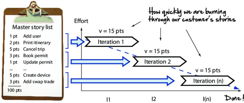
Although we haven’t formally introduced the project burn-down chart, we’ve seen glimpses of it on our travels. It’s the graph that shows how quickly we as a team are burning through our customer’s user stories, and it tells us when we can expect to be done.

On the y-axis we track the amount of work remaining (days of effort or points), and on the x-axis we track time by iteration. Simply record the amount of work (pts) remaining each iteration, and plot that on the graph. The slope of the line is the team velocity (how much the team got done each iteration).
The burn-down chart is a great vehicle for showing the state of ...
Get The Agile Samurai now with the O’Reilly learning platform.
O’Reilly members experience books, live events, courses curated by job role, and more from O’Reilly and nearly 200 top publishers.

