The Complete Graphic Designer
92
The fi rst goal of every poster is to grab the atten-
tion of passersby and immediately communicate the
intended message. With our world becoming increas-
ingly cluttered with lights, signs, billboards, and fl yers,
creating dynamic posters that stand out among the
visual noise and connect with viewers is increasingly
diffi cult. Because of this, a strong visual concept that
requires little if any text to communicate and a clear
hierarchy are paramount.
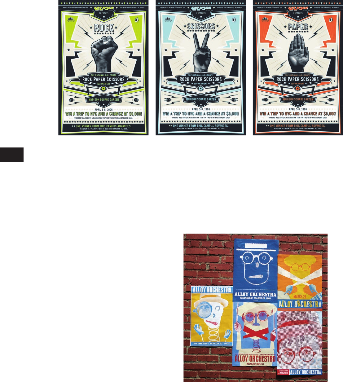
A series of three posters advertises
the National Rock Paper Scissors
Collegiate Championship through
bold graphics and bright colors.
When viewed individually, the hand
gestures have dual meaning. The
rock sign also means “power,” the
scissor sign “peace,” and the paper
sign “stop.”
Design: Archrival
Posters
Because these posters were placed
in urban environments on concrete
posts or brick walls, the designer
chose bold, bright colors to attract
attention and coarse illustrations
with visible halftone patterns to
reinforce their urban appeal.
Design: Archrival
TB
Provision-Complete Graphic Designer
CD109-59/4028
1st
proof
CGD p084-111_Text file_.indd 92CGD p084-111_Text file_.indd 92 1/20/09 10:36:11 AM1/20/09 10:36:11 AM
Common Design Jobs
93
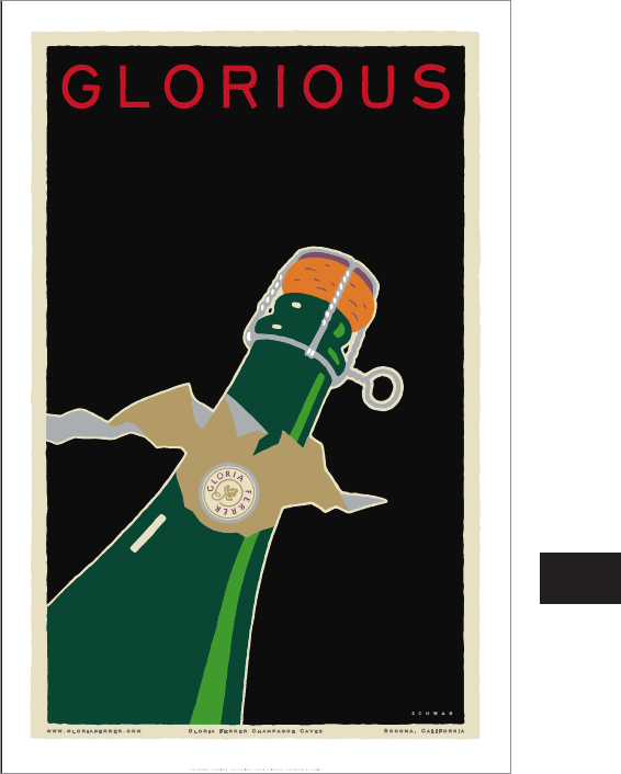
Posters have the power to com-
municate with very few words. In
this bold yet simple design, the
headline plays off of the winery
name, Gloria Ferrer.
Design: Michael Schwab Studio
Poster Design Considerations
Physical location
When designing a poster, take into consideration where
the poster will be hung. Will it be inside a building, well-
lit, among numerous other posters on a busy thorough-
fare, or will it be folded and sent in the mail? Determine
if your viewers will have time to stop and observe the
poster, in which case you can afford to create a more
intricate work; or if you need to catch their eyes and
communicate the message in a few seconds with a bold
and simplistic composition. Every scenario will require a
different design strategy for success.
Size
Large posters are more effective at grabbing viewer
attention. The only restrictions are where the poster
will be displayed, the size of the printing press, and
the client’s budget.
Color
Posters utilizing bright, vibrant colors tend to pop
off a surface unless they are hung in a sea of equally
vibrant works. In this case, a one- or two-color piece
can be just as, if not more, effective.
Typography
In a world where viewers are over-stimulated by graphic
images and messages, a poster utilizing simple typogra-
phy will stand out and convey its information most ef-
fi ciently. Depending on the characteristics of a selected
font, typography has the ability to convey emotional
and expressive qualities. Sans serif fonts are very direct
and authoritative looking, while serif and italic types are
friendlier and more approachable.
Imagery
Simple and direct visuals attract the viewer’s attention
and compel them to read presented information. Gener-
ally speaking, images should dominate the composition
unless a typographic solution is used.
TB
Provision-Complete Graphic Designer
CD109-59/4028
1st
proof
CGD p084-111_Text file_.indd 93CGD p084-111_Text file_.indd 93 1/20/09 10:36:22 AM1/20/09 10:36:22 AM
The Complete Graphic Designer
94
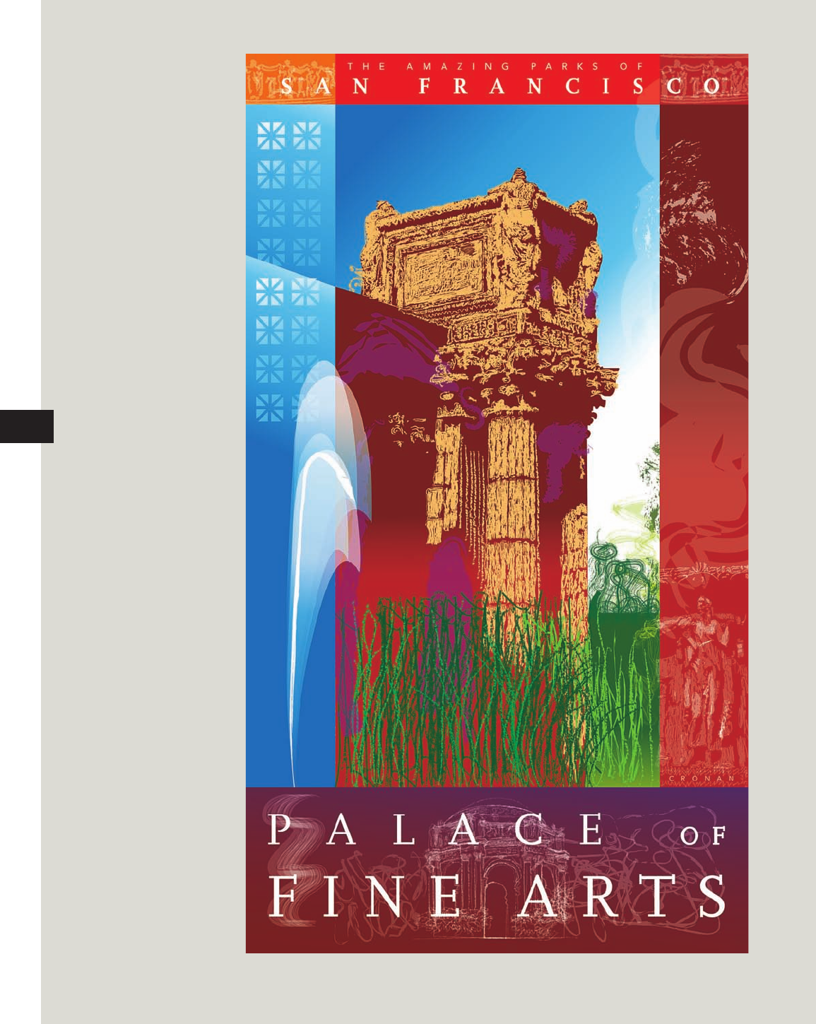
A photomontage of imagery,
color, and textures combine to
advertise the Palace of Fine Arts
in San Francisco. The poster’s
narrow format gives the work and
subject a commanding feel, while
the painterly qualities convey the
venue’s approachability.
Design: Michael Cronan Design
TB
Provision-Complete Graphic Designer
CD109-59/4028
1st
proof
CGD p084-111_Text file_.indd 94CGD p084-111_Text file_.indd 94 1/20/09 10:36:22 AM1/20/09 10:36:22 AM
Get The Complete Graphic Designer now with the O’Reilly learning platform.
O’Reilly members experience books, live events, courses curated by job role, and more from O’Reilly and nearly 200 top publishers.

