The Complete Graphic Designer
98
Architectural and graphic standard
guides for federal buildings are
compartmentalized into separate
volumes. A slipcase allows all piec-
es to be stored in the same place
for easy reference and portability.
Design: C&G Partners
A publication’s primary functions are to entertain,
educate, or present reference material in a logical and
easy-to-use format. Therefore, it is essential that the
design does not inhibit the reader’s comprehension
of the material. Although some publications stray
from basic rules of typography and layout, it is best to
follow traditional design conventions unless the client
requests otherwise.
Clean and consistent layouts with a logical fl ow from
page to page can be achieved through the use of a
well-structured grid. By devising visual systems for
specifi c types of information such as captions, chapter
openers, and sidebars, readers will be able to navigate
the piece with ease. It is also important to remember
that large amounts of text tend to fatigue the eyes;
therefore ample “white” or negative space, proportion-
al column width, and appropriate leading for the type
size are important things to keep in mind.
All publications, from novels and annual reports to user
manuals and magazines, have a different audience and
a different function, so each requires a unique design
solution. Depending on the amount of information and
the target audience, the designer must create a format
that will engage the audience and deliver content in an
appropriate and well thought-out manner.
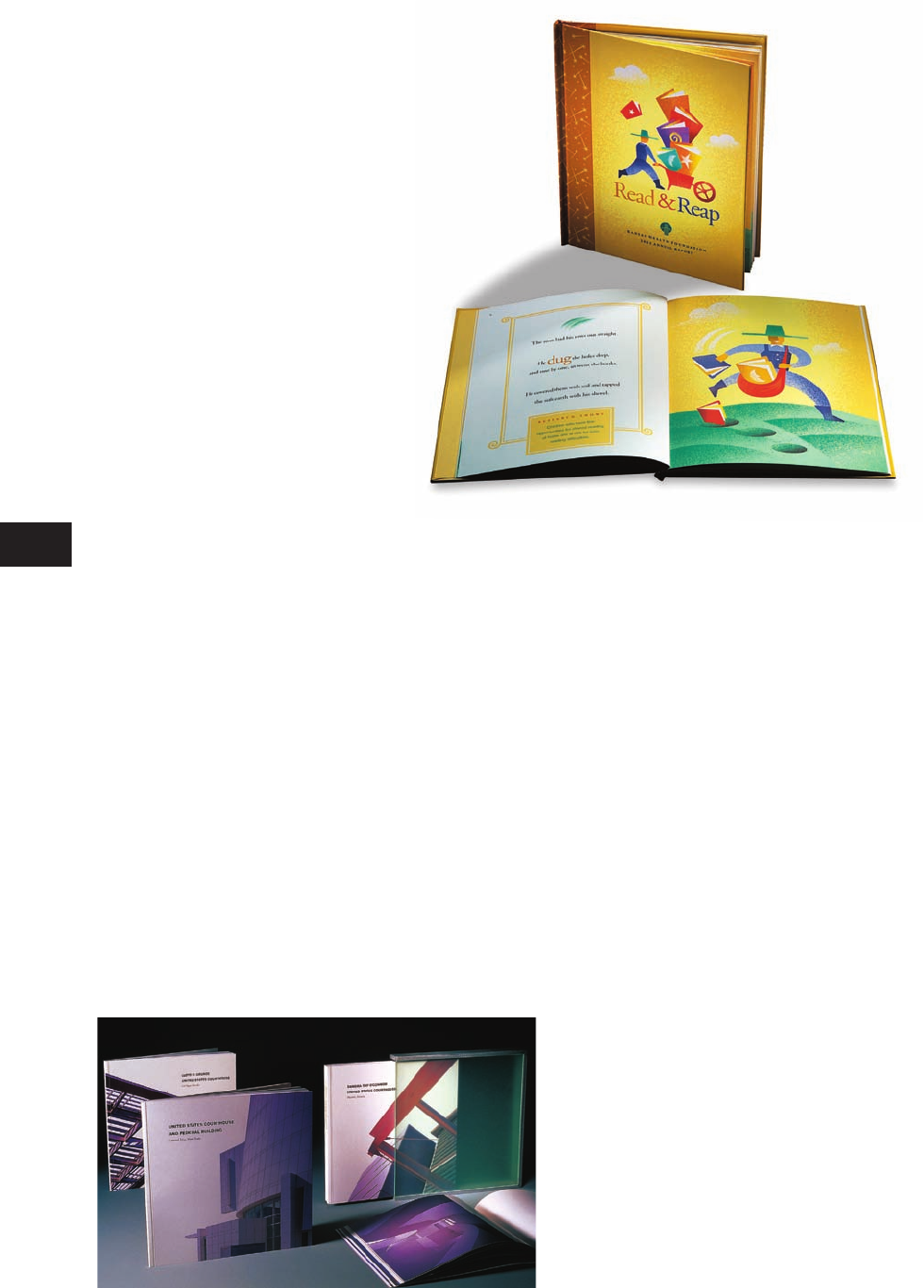
Bold color and illustration
styles appeal to children. This
piece merges the function of a
foundation’s annual report with an
actual children’s book. Whimsical
illustration visually interprets the
story, while facts for adults and
information about contributors
appear at the bottom of the page.
Design: Greteman Group
Publication Design
TB
Provision-Complete Graphic Designer
CD109-59/4028
1st
proof
CGD p084-111_Text file_.indd 98CGD p084-111_Text file_.indd 98 1/20/09 10:36:35 AM1/20/09 10:36:35 AM
Common Design Jobs
99
Publication Design
Considerations
Type size should be appropriate
for the audience. For a general
audience, font sizes should be no
less than 9 points in large bodies
of text, but elderly people tend to
have weaker eyesight and require
12- or 13-point text. Children that
are learning to read also require
large print to help them decipher
individual letters and sounds.
Books or publications must be easily
navigable. To help readers fi nd and
comprehend the information they
need, use sections or chapters to or-
ganize content. A complete table of
contents and an index for complex
works will clarify the structure and
increase the overall effectiveness of
the piece. Never underestimate the
value of folios (page numbers). They
are essential and should be easy to
locate on the page.
99
Shelf presence
Dust jackets and covers not only
provide protection for a book, they
advertise the content. Most of the
time, only the spines of books are
visible. Incorporating vibrant color
or graphics helps the piece stand
out from others on a bookstore or
library shelf. Make sure the name
of the piece is clearly legible and
readable from a distance.
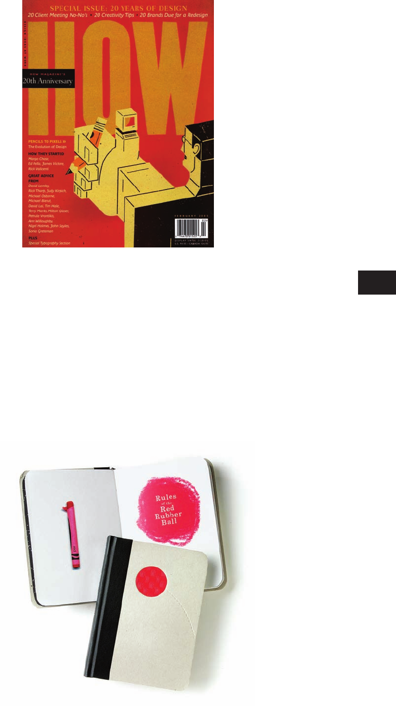
A large masthead (logo) dominates
the front of How Magazine, demand-
ing viewer attention when displayed
on magazine racks. The use of
illustration instead of traditional
photography for the cover also
helps establish shelf presence for
the publication.
Design: Pentagram
The title for Rules of the Red Rubber
Ball does not appear on the cover.
Instead, a circular swatch of red
rubber (the same used to make
playground balls) has been inlaid
in the chipboard cover above an
embossed dotted line. The simple
tactile embellishments are enough
to entice and engage viewers.
Design: Willoughby Design
TB
Provision-Complete Graphic Designer
CD109-59/4028
1st
proof
CGD p084-111_Text file_.indd 99CGD p084-111_Text file_.indd 99 1/20/09 10:36:37 AM1/20/09 10:36:37 AM
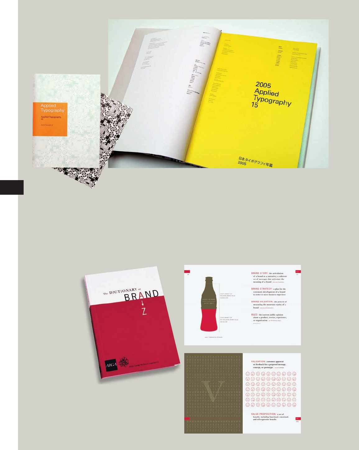
Designed with the audience in
mind, these books appeal to
graphic designers—smaller type
sizes are used in each of these solu-
tions because a clean layout and
minimal text is preferred. Simplifi ed
illustrations with large blocks of
color reinforce the content, while a
solid grid structure defi nes an easy-
to-follow visual hierarchy.
Design: Shinnoske, Inc.
Below: Willoughby Design
The Complete Graphic Designer
100
TB
Provision-Complete Graphic Designer
CD109-59/4028
1st
proof
CGD p084-111_Text file_.indd 100CGD p084-111_Text file_.indd 100 1/20/09 10:36:40 AM1/20/09 10:36:40 AM
Get The Complete Graphic Designer now with the O’Reilly learning platform.
O’Reilly members experience books, live events, courses curated by job role, and more from O’Reilly and nearly 200 top publishers.

