Chapter 8
Working with Type
The effectiveness of an innovative layout depends not just on your use of color but on your use of typography as well. As in graphic design, typography is one of the foundations of good visual design. Settings or placing, type involves the careful selection of a finely proportioned collection of lines and shapes, which are reproductions of the original letterforms. The correct use of type is just as important on an electronic page as in any other medium. Type must always be pleasing to look at and easy to read. As with other areas of visual design, there are rules to follow and limitations to be aware of when it comes to working with typography for an electronic purpose. Look at the two “Once upon a time” layouts. The one on the left is rather plain, while the one on the right is charming and appealing.
Fig. 8–1: Which of these paragraphs do you think would be more fun to read?
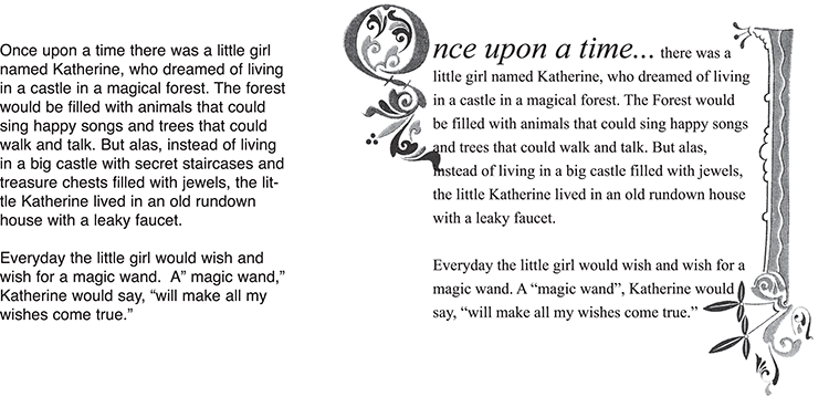
To work with typography successfully, you need to understand it. There is, of course, no “ideal type solution,” but there are guidelines to follow to help you choose the right typography for any given situation (fig. 8-1). Legibility is the key to success with your designs.
A Brief Lesson on Type for Multimedia Design
Let’s start with some terminology. In type design, there are typefaces and fonts. A typeface is a unified set of shapes, or “glyphs,” that form a complete alphabet ...
Get The Graphic Designer's Guide to Portfolio Design, 3rd Edition now with the O’Reilly learning platform.
O’Reilly members experience books, live events, courses curated by job role, and more from O’Reilly and nearly 200 top publishers.

