Job No:11-22360 Title:RP-Language of Graphic Design
#175 Dtp:177 Page:218
Job No:11-22360 Title:RP-Language of Graphic Design
#175 Dtp:177 Page:219
(RAY)
218-225_22360.indd 219 11/16/10 10:51:04 PM
219218
(Text)
“Without proportion there can be no principles in the design
of any temple; that is, if there is no precise relation between its
members, as in the case of those of a well-shaped man.”
VitruVius (80–70 BC), Roman, Architect, Author, Engineer
proportion
22
pro·por·tion \pr -'po
˙
r-sh n\ n
3: the relation of one part to another
or to the whole with respect to
magnitude, quantity, or degree
Proportion is the systemat-
ic relationship of one thing
to another in any given
composition. In
visual communications, it is an essential design principle defined
as the integral relationship of sizes within a composition. These in-
tegral relationships are transparent and function as an underlying
Job No:11-22360 Title:RP-Language of Graphic Design
AC59773 #175 Dtp:177 Page:219
Job No:11-22360 Title:RP-Language of Graphic Design
AC59773 #175 Dtp:177 Page:218
(RAY)
218-225_C59773.indd 219 12/13/10 10:32 AM

Job No:11-22360 Title:RP-Language of Graphic Design
AC59773 #175 Dtp:177 Page:220
(RAY)
218-225_C59773.indd 220 12/13/10 10:34 AM
(Text)
framework for all compositional elements.
Proportion also represents the critical
relationship between one part of a composi-
tion and another or between the whole of a
composition and its size, quantity, or degree.
Generally the goal of any proportional
system is to produce a sense of coherence,
harmony, and integrity among the elements.
Historical References
Proportion has shaped our visual world
throughout history—it is an intrinsic part of
the Parthenon, da Vinci’s Mona Lisa, and
Michelangelo’s David.
(continued on page 222)
1957
Paris, France
Adrian Frutiger (b. 1928) is one of the
most prominent typographers of the twen-
tieth century and the designer of one of the
most notable typeface families ever to be
created—the sans serif Univers.
As a young boy, he experimented with
invented scripts and stylized handwrit-
ing as a negative response to the formal,
cursive penmanship being enforced at the
Swiss school he was attending. At the age
of sixteen, he began a apprenticeship as
a compositor with an Interlaken printer.
During this apprenticeship, he also learned
woodcutting, engraving, and calligraphy.
Between 1949 and 1951, Frutiger stud-
ied at the Kunstgewerbeschule (School of
Applied Arts) in Zurich. In 1952, Charles
Peignot recruited Frutiger for Deberny &
Peignot, one of the world’s foremost type
foundries in Paris. At that time, Deberny
& Peignot was using a new phototypeset-
ting process and wanted Frutiger to adapt
typefaces for it, as well as design a large,
matched typeface family of different
weights. During this period, he began to
design the Univers family.
The twenty-one variations of the Univ-
ers typeface family have five weights and
four widths. At its center is Univers 55, the
equivalent of a standard “book” weight.
Frutiger also proposed to abandon impre-
cise terms such as condensed, extended,
light, bold, roman, and italic, and instead
use a reference numbering system that il-
lustrated the proportional relationships be-
tween each variation. At the time, it was a
revolutionary concept of how typefaces and
their related families could be described.
He also created a visual “periodic
table” for the Univers family—its vertical
axis identifies different weights, and any
variation beginning with the same num-
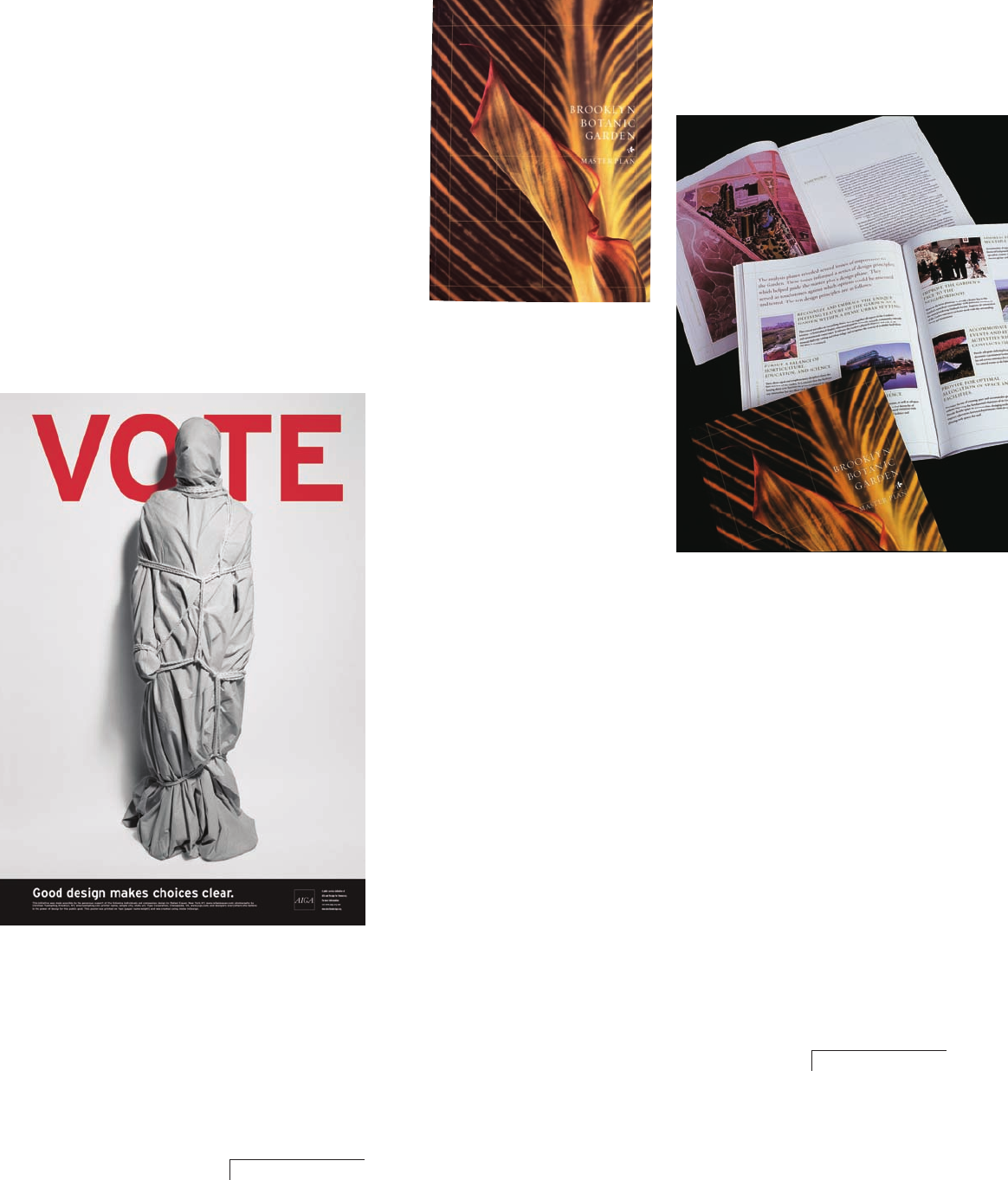
AlfAlfA Studio
New York, New York, USA
Poulin + MorriS inc.
New York, New York, USA
Job No:11-22360 Title:RP-Language of Graphic Design
#175 Dtp:177 Page:220
(RAY)
218-225_22360.indd 220 11/16/10 8:34:25 PM
Get The Language of Graphic Design now with the O’Reilly learning platform.
O’Reilly members experience books, live events, courses curated by job role, and more from O’Reilly and nearly 200 top publishers.

