7. Contrast
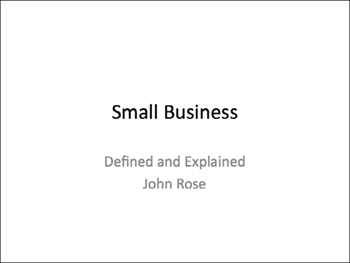
Contrast is probably the single most important feature of design that makes things appealing to our eyes. Glancing at the two slides below, both of which say exactly the same thing, to which one do you feel your eyes pulling toward?

This is PowerPoint’s default slide opener. There’s not much contrast on this page—the text is practically all the same size; the colors are similar; the white page is more important than the black type; it’s all rather wimpy. If you show this as your opening slide, you look wimpy. Tidy, but wimpy.
With a contrast in the size of the type and the strong black/white, your eyes are pulled into this ...
Get The Non-Designer’s Presentation Book: principles for effective presentation design now with the O’Reilly learning platform.
O’Reilly members experience books, live events, courses curated by job role, and more from O’Reilly and nearly 200 top publishers.

