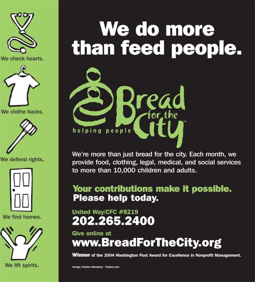
Color Plate 1. High-contrast colors and type weights deliver an organization's message in a subway car. Creative firm: Fixation Marketing. Client: Bread for the City; Dan Hoffman. Creative director: Bruce E. Morgan. Designer/illustrator: Elizabeth Ellen. Copywriter: Kathryn Tidyman. (See page 21.)
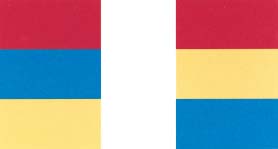
Color Plate 2. Red and blue shown side by side in equally strong intensities seem to produce a shimmering effect on the eye, not conducive to comfortable reading. Graph Design for the Eye and Mind by Stephen M. Kosslyn. (See page 32.)

Color Plate 3. Caffeine-starved color-blind patients have to rely on legible type for direction to an eye hospital's coffee shop because they can't see the cup in the graphic on Paul Mijksenaar's signs. It's one sign in a series that spoofs a colorblindness test. Design firm: Bureau Mijksenaar bv. Client: Oogziekenhuis [Eye Hospital] Rotterdam. (See page 32.)
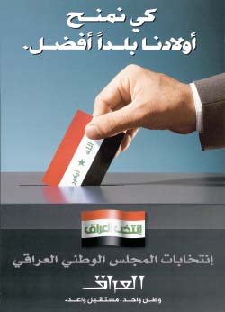
Color Plate 4. A poster to promote Iraq's interim-government election in January 2005 uses symbols that mean something to the audience. Even audience members who don't read Arabic only had to recognize ...
Get The Practical Guide to Information Design now with the O’Reilly learning platform.
O’Reilly members experience books, live events, courses curated by job role, and more from O’Reilly and nearly 200 top publishers.

