Plots for Single Samples
When we have a just one variable, the choice of plots is more restricted:
- histograms to show a frequency distribution;
- index plots to show the values of y in sequence;
- time-series plots;
- compositional plots like pie diagrams
Histograms
The commonest plots for a single sample are histograms and index plots. Histograms are excellent for showing the mode, the spread and the symmetry (skew) of a set of data. The R function hist is deceptively simple. Here is a histogram of 1000 random points drawn from a Poisson distribution with a mean of 1.7:
hist(rpois(1000,1.7),
           main="",xlab="random numbers from a Poisson with mean 1.7")
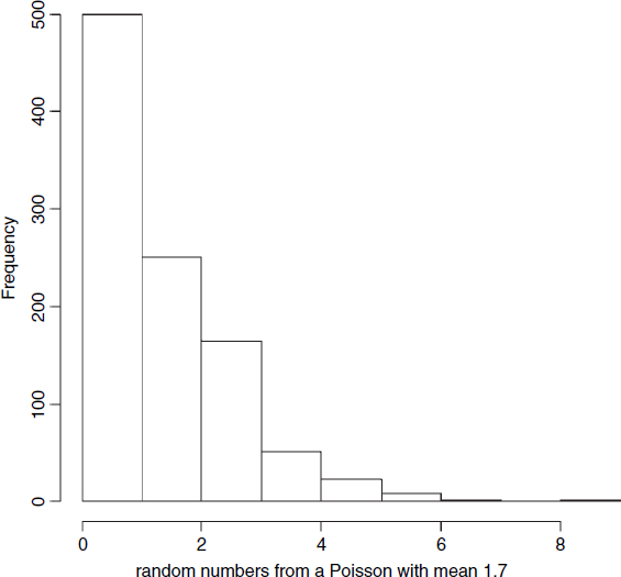
This illustrates perfectly one of the big problems with histograms: it is not clear what the bar of height 500 is showing. Is it the frequency of zeros, or the frequency of zeros and ones lumped together? What we really want in a case like this is a separate histogram bar for each integer value from 0 to 8. We achieve this by specifying the breaks on the x axis to be at −0.5, 0.5, 1.5, ... , like this:
hist(rpois(1000,1.7),breaks=seq(-0.5,9.5,1),
          main="",xlab="random numbers from a Poisson with mean 1.7")
That's more like it. Now we can see that the mode is 1 (not 0), and that 2s are substantially more frequent than 0s. The distribution is said to be ‘skew to the right’ (or ‘positively skew’) because the long tail is on the right-hand ...
Get The R Book now with the O’Reilly learning platform.
O’Reilly members experience books, live events, courses curated by job role, and more from O’Reilly and nearly 200 top publishers.

