Now it’s YOUR TURN to Play It with


YOUR SOLUTION
DIFFERENT IS BETTER
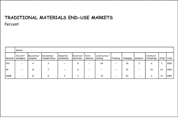
Here, we’ll assume that the content and its message are well thought through, but that somehow the layout you see—or don’t see—is simply illegible.
Now let’s be clear: if the chart is important enough to be presented, then it’s important enough to be legible. So what can you think of that would make the chart legible?
Yes, you could remove those columns that show no data, only ...
Get The Say It With Charts Complete Toolkit now with the O’Reilly learning platform.
O’Reilly members experience books, live events, courses curated by job role, and more from O’Reilly and nearly 200 top publishers.

