Chapter 6
The Professional’s SketchUp Environment
A professional’s work environment is streamlined, logical, and organized. SketchUp provides a default environment that is great for learning but is ultimately not fit for professional use. Customize the SketchUp environment to make it work best for you. Optimize system resources, remove visual clutter, and access all commands with a keystroke by adding your own set of shortcuts to enhance your SketchUp experience.
Toolbars
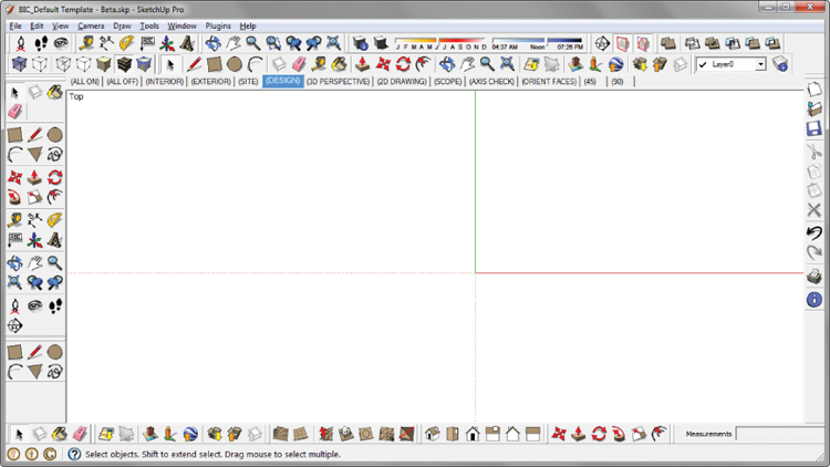
Toolbars generally clutter screen space with static icons taking up space that should be used for exciting 3D graphics (Figure 6-1, Figure 6-2). Using toolbars and icons takes your eyes off of the design. It’s like texting while driving: it’s very distracting and can be disastrous. That might be an exaggeration, but seriously, you should keep your eyes on the road and model at all times by minimizing your use of toolbars. Instead of having all those buttons and icons, a better solution is to have an extensive collection of keyboard shortcuts. If you can’t completely eliminate toolbars and go full-screen full-time, try to limit yourself to the following settings.
Figure 6-1: Excessive toolbars are distracting and take attention away from the task at hand, which is designing.

Figure 6-2: Utilize a sleek toolset by limiting yourself to one row of toolbars. This will encourage the use of keyboard shortcuts.
Get The SketchUp Workflow for Architecture: Modeling Buildings, Visualizing Design, and Creating Construction Documents with SketchUp Pro and LayOut now with the O’Reilly learning platform.
O’Reilly members experience books, live events, courses curated by job role, and more from O’Reilly and nearly 200 top publishers.

