Chapter . Oceans Apart
Simplicity in type leads to lasting, effective design
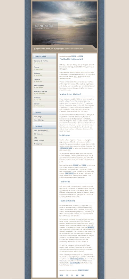
THE WONDERFUL COLOR PALETTE used in Oceans Apart emerged from a photograph that designer Ryan Sims took during a visit to Southern California. As calm as the Pacific itself, the colors and imagery of the design provide a slight contrast with the sense of gentle movement from the image that draws the visitor in.
Oceans Apart is not abrupt or loud. Part of what helps create this subtle feeling is the design’s simplicity. Instead of adding multiple images, colors, and typefaces, Sims kept to a Hemingway-like ...
Get The Zen of CSS Design: Visual Enlightenment for the Web now with the O’Reilly learning platform.
O’Reilly members experience books, live events, courses curated by job role, and more from O’Reilly and nearly 200 top publishers.

