Chapter 4. The “Hello World” of TinyML: Building and Training a Model
In Chapter 3, we learned the basic concepts of machine learning and the general workflow that machine learning projects follow. In this chapter and the next, we’ll start putting our knowledge into practice. We’re going to build and train a model from scratch and then integrate it into a simple microcontroller program.
In the process, you’ll get your hands dirty with some powerful developer tools that are used every day by cutting-edge machine learning practitioners. You’ll also learn how to integrate a machine learning model into a C++ program and deploy it to a microcontroller to control current flowing in a circuit. This might be your first taste of mixing hardware and ML, and it should be fun!
You can test the code that we write in these chapters on your Mac, Linux, or Windows machine, but for the full experience, you’ll need one of the embedded devices mentioned in “What Hardware Do You Need?”:
To create our machine learning model, we’ll use Python, TensorFlow, and Google’s Colaboratory, which is a cloud-based interactive notebook for experimenting with Python code. These are some of the most important tools for real-world machine learning engineers, and they’re all free to use.
Note
Wondering about the title of this chapter? It’s a tradition in programming that new technologies are introduced with example code that demonstrates how to do something very simple. Often, the simple task is to make a program output the words, “Hello, world.” There’s no clear equivalent in ML, but we’re using the term “hello world” to refer to a simple, easy-to-read example of an end-to-end TinyML application.
Over the course of this chapter, we will do the following:
-
Obtain a simple dataset.
-
Train a deep learning model.
-
Evaluate the model’s performance.
-
Convert the model to run on-device.
-
Write code to perform on-device inference.
-
Build the code into a binary.
-
Deploy the binary to a microcontroller.
All the code that we will use is available in TensorFlow’s GitHub repository.
We recommend that you walk through each part of this chapter and then try running the code. There are instructions on how to do this along the way. But before we start, let’s discuss exactly what we’re going to build.
What We’re Building
In Chapter 3, we discussed how deep learning networks learn to model patterns in their training data so they can make predictions. We’re now going to train a network to model some very simple data. You’ve probably heard of the sine function. It’s used in trigonometry to help describe the properties of right-angled triangles. The data we’ll be training with is a sine wave, which is the graph obtained by plotting the result of the sine function over time (see Figure 4-1).
Our goal is to train a model that can take a value, x, and predict its sine, y. In a real-world application, if you needed the sine of x, you could just calculate it directly. However, by training a model to approximate the result, we can demonstrate the basics of machine learning.
The second part of our project will be to run this model on a hardware device. Visually, the sine wave is a pleasant curve that runs smoothly from –1 to 1 and back. This makes it perfect for controlling a visually pleasing light show! We’ll be using the output of our model to control the timing of either some flashing LEDs or a graphical animation, depending on the capabilities of the device.
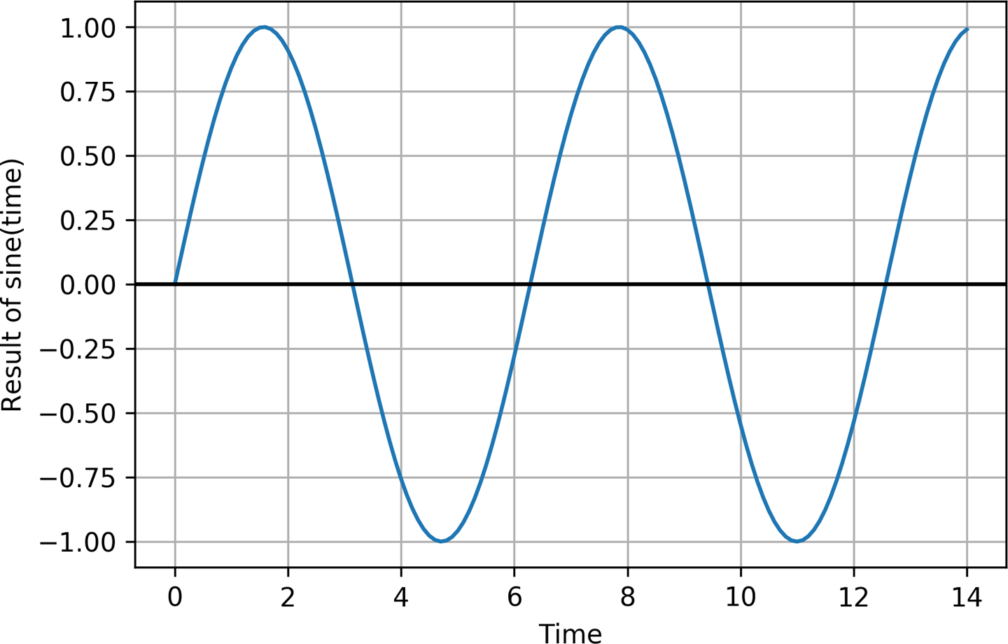
Figure 4-1. A sine wave
Online, you can see an animated GIF of this code flashing the LEDs of a SparkFun Edge. Figure 4-2 is a still from this animation, showing a couple of the device’s LEDs lit. This may not be a particularly useful application of machine learning, but in the spirit of a “hello world” example, it’s simple, fun, and will help demonstrate the basic principles you need to know.
After we get our basic code working, we’ll be deploying it to three different devices: the SparkFun Edge, an Arduino Nano 33 BLE Sense, and an ST Microelectronics STM32F746G Discovery kit.
Note
Since TensorFlow is an actively developed open source project that is continually evolving, you might notice some slight differences between the code printed here and the code hosted online. Don’t worry—even if a few lines of code change, the basic principles remain the same.
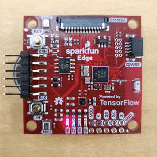
Figure 4-2. The code running on a SparkFun Edge
Our Machine Learning Toolchain
To build the machine learning parts of this project, we’re using the same tools used by real-world machine learning practitioners. This section introduces them to you.
Python and Jupyter Notebooks
Python is the favorite programming language of machine learning scientists and engineers. It’s easy to learn, works well for many different applications, and has a ton of libraries for useful tasks involving data and mathematics. The vast majority of deep learning research is done using Python, and researchers often release the Python source code for the models they create.
Python is especially great when combined with something called Jupyter Notebooks. This is a special document format that allows you to mix writing, graphics, and code that can be run at the click of a button. Jupyter notebooks are widely used as a way to describe, explain, and explore machine learning code and problems.
We’ll be creating our model inside of a Jupyter notebook, which permits us to do awesome things to visualize our data during development. This includes displaying graphs that show our model’s accuracy and convergence.
If you have some programming experience, Python is easy to read and learn. You should be able to follow this tutorial without any trouble.
Google Colaboratory
To run our notebook we’ll use a tool called Colaboratory, or Colab for short. Colab is made by Google, and it provides an online environment for running Jupyter notebooks. It’s provided for free as a tool to encourage research and development in machine learning.
Traditionally, you needed to create a notebook on your own computer. This required installing a lot of dependencies, such as Python libraries, which can be a headache. It was also difficult to share the resulting notebook with other people, since they might have different versions of the dependencies, meaning the notebook might not run as expected. In addition, machine learning can be computationally intensive, so training models might be slow on your development computer.
Colab allows you to run notebooks on Google’s powerful hardware, at zero cost. You can edit and view your notebooks from any web browser, and you can share them with other people, who are guaranteed to get the same results when they run them. You can even configure Colab to run your code on specially accelerated hardware that can perform training more quickly than a normal computer.
TensorFlow and Keras
TensorFlow is a set of tools for building, training, evaluating, and deploying machine learning models. Originally developed at Google, TensorFlow is now an open source project built and maintained by thousands of contributors across the world. It is the most popular and widely used framework for machine learning. Most developers interact with TensorFlow via its Python library.
TensorFlow does many different things. In this chapter we’ll use Keras, TensorFlow’s high-level API that makes it easy to build and train deep learning networks. We’ll also use TensorFlow Lite, a set of tools for deploying TensorFlow models to mobile and embedded devices, to run our model on-device.
Chapter 13 will cover TensorFlow in much more detail. For now, just know that it is an extremely powerful and industry-standard tool that will continue to serve your needs as you go from beginner to deep learning expert.
Building Our Model
We’re now going to walk through the process of building, training, and converting our model. We include all of the code in this chapter, but you can also follow along in Colab and run the code as you go.
First, load the notebook. After the page loads, at the top, click the “Run in Google Colab” button, as shown in Figure 4-3. This copies the notebook from GitHub into Colab, allowing you to run it and make edits.

Figure 4-3. The “Run in Google Colab” button
By default, in addition to the code, the notebook contains a sample of the output you should expect to see when the code is run. Since we’ll be running through the code in this chapter, let’s clear this output so the notebook is in a pristine state. To do this, in Colab’s menu, click Edit and then select “Clear all outputs,” as shown in Figure 4-4.
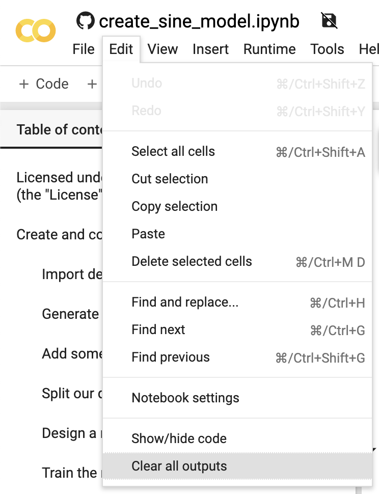
Figure 4-4. The “Clear all outputs” option
Nice work. Our notebook is now ready to go!
Tip
If you’re already familiar with machine learning, TensorFlow, and Keras, you might want to skip ahead to the part where we convert our model to use with TensorFlow Lite. In the book, jump to “Converting the Model for TensorFlow Lite”. In Colab, scroll down to the heading “Convert to TensorFlow Lite.”
Importing Dependencies
Our first task is to import the dependencies we need. In Jupyter notebooks, code and text are arranged in cells. There are code cells, which contain executable Python code, and text cells, which contain formatted text.
Our first code cell is located under “Import dependencies.” It sets up all of the libraries that we need to train and convert our model. Here’s the code:
# TensorFlow is an open source machine learning library!pipinstalltensorflow==2.0importtensorflowastf# NumPy is a math libraryimportnumpyasnp# Matplotlib is a graphing libraryimportmatplotlib.pyplotasplt# math is Python's math libraryimportmath
In Python, the import statement loads a library so that it can be used from our code. You can see from the code and comments that this cell does the following:
-
Installs the TensorFlow 2.0 library using
pip, a package manager for Python -
Imports TensorFlow, NumPy, Matplotlib, and Python’s
mathlibrary
When we import a library, we can give it an alias so that it’s easy to refer to later. For example, in the preceding code, we use import numpy as np to import NumPy and give it the alias np. When we use it in our code, we can refer to it as np.
The code in code cells can be run by clicking the button that appears at the upper left when the cell is selected. In the “Import dependencies” section, click anywhere in the first code cell so that it becomes selected. Figure 4-5 shows what a selected cell looks like.
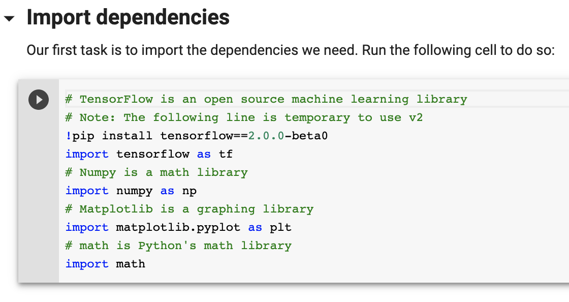
Figure 4-5. The “Import dependencies” cell in its selected state
To run the code, click the button that appears in the upper left. As the code is being run, the button will animate with a circle as depicted in Figure 4-6.
The dependencies will begin to be installed, and you’ll see some output appearing. You should eventually see the following line, meaning that the library was installed successfully:
Successfully installed tensorboard-2.0.0 tensorflow-2.0.0 tensorflow-estimator-2.0.0
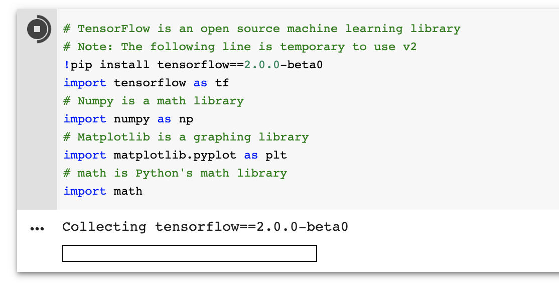
Figure 4-6. The “Import dependencies” cell in its running state
After a cell has been run in Colab, you’ll see that a 1 is now displayed in the upper-left corner when it is no longer selected, as illustrated in Figure 4-7. This number is a counter that is incremented each time the cell is run.
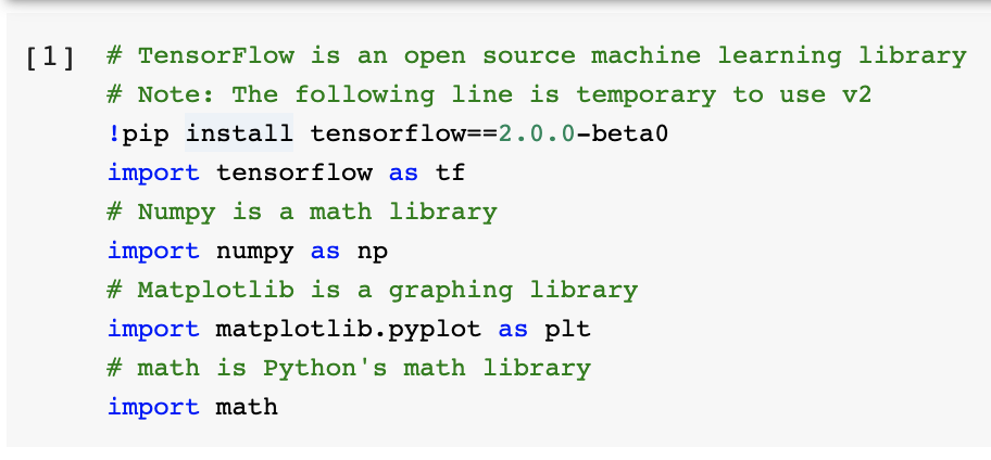
Figure 4-7. The cell run counter in the upper-left corner
You can use this to understand which cells have been run, and how many times.
Generating Data
Deep learning networks learn to model patterns in underlying data. As we mentioned earlier, we’re going to train a network to model data generated by a sine function. This will result in a model that can take a value, x, and predict its sine, y.
Before we go any further, we need some data. In a real-world situation, we might be collecting data from sensors and production logs. For this example, however, we’re using some simple code to generate a dataset.
The next cell is where this will happen. Our plan is to generate 1,000 values that represent random points along a sine wave. Let’s take a look at Figure 4-8 to remind ourselves what a sine wave looks like.
Each full cycle of a wave is called its period. From the graph, we can see that a full cycle is completed approximately every six units on the x-axis. In fact, the period of a sine wave is 2 × π, or 2π.
So that we have a full sine wave worth of data to train on, our code will generate random x values from 0 to 2π. It will then calculate the sine for each of these values.

Figure 4-8. A sine wave
Here’s the full code for this cell, which uses NumPy (np, which we imported earlier) to generate random numbers and calculate their sine:
# We'll generate this many sample datapointsSAMPLES=1000# Set a "seed" value, so we get the same random numbers each time we run this# notebook. Any number can be used here.SEED=1337np.random.seed(SEED)tf.random.set_seed(SEED)# Generate a uniformly distributed set of random numbers in the range from# 0 to 2π, which covers a complete sine wave oscillationx_values=np.random.uniform(low=0,high=2*math.pi,size=SAMPLES)# Shuffle the values to guarantee they're not in ordernp.random.shuffle(x_values)# Calculate the corresponding sine valuesy_values=np.sin(x_values)# Plot our data. The 'b.' argument tells the library to print blue dots.plt.plot(x_values,y_values,'b.')plt.show()
In addition to what we discussed earlier, there are a few things worth pointing out in this code. First, you’ll see that we use np.random.uniform() to generate our x values. This method returns an array of random numbers in the specified range. NumPy contains a lot of useful methods that operate on entire arrays of values, which is very convenient when dealing with data.
Second, after generating the data, we shuffle it. This is important because the training process used in deep learning depends on data being fed to it in a truly random order. If the data were in order, the resulting model would be less accurate.
Next, notice that we use NumPy’s sin() method to calculate our sine values. NumPy can do this for all of our x values at once, returning an array. NumPy is great!
Finally, you’ll see some mysterious code invoking plt, which is our alias for Matplotlib:
# Plot our data. The 'b.' argument tells the library to print blue dots.plt.plot(x_values,y_values,'b.')plt.show()
What does this code do? It plots a graph of our data. One of the best things about Jupyter notebooks is their ability to display graphics that are output by the code you run. Matplotlib is an excellent tool for creating graphs from data. Since visualizing data is a crucial part of the machine learning workflow, this will be incredibly helpful as we train our model.
To generate the data and render it as a graph, run the code in the cell. After the code cell finishes running, you should see a beautiful graph appear underneath, like the one shown in Figure 4-9.
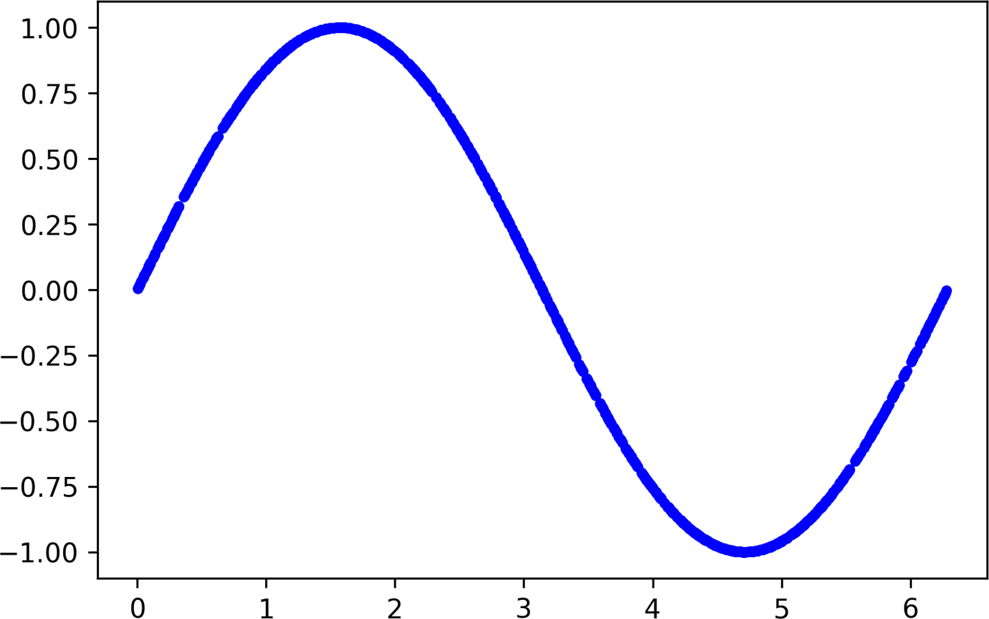
Figure 4-9. A graph of our generated data
This is our data! It is a selection of random points along a nice, smooth sine curve. We could use this to train our model. However, this would be too easy. One of the exciting things about deep learning networks is their ability to sift patterns from noise. This allows them to make predictions even when trained on messy, real-world data. To show this off, let’s add some random noise to our datapoints and draw another graph:
# Add a small random number to each y valuey_values+=0.1*np.random.randn(*y_values.shape)# Plot our dataplt.plot(x_values,y_values,'b.')plt.show()
Run this cell and take a look at the results, as shown in Figure 4-10.
Much better! Our points are now randomized, so they represent a distribution around a sine wave instead of a smooth, perfect curve. This is much more reflective of a real-world situation, in which data is generally quite messy.
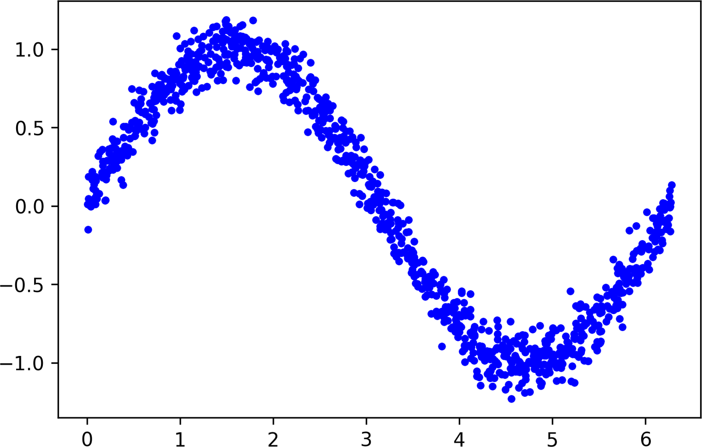
Figure 4-10. A graph of our data with noise added
Splitting the Data
From the previous chapter, you might remember that a dataset is often split into three parts: training, validation, and test. To evaluate the accuracy of the model we train, we need to compare its predictions to real data and check how well they match up.
This evaluation happens during training (where it is referred to as validation) and after training (referred to as testing). It’s important in each case that we use fresh data that was not already used to train the model.
To ensure that we have data to use for evaluation, we’ll set some aside before we begin training. Let’s reserve 20% of our data for validation, and another 20% for testing. We’ll use the remaining 60% to train the model. This is a typical split used when training models.
The following code splits our data and then plots each set as a different color:
# We'll use 60% of our data for training and 20% for testing. The remaining 20%# will be used for validation. Calculate the indices of each section.TRAIN_SPLIT=int(0.6*SAMPLES)TEST_SPLIT=int(0.2*SAMPLES+TRAIN_SPLIT)# Use np.split to chop our data into three parts.# The second argument to np.split is an array of indices where the data will be# split. We provide two indices, so the data will be divided into three chunks.x_train,x_validate,x_test=np.split(x_values,[TRAIN_SPLIT,TEST_SPLIT])y_train,y_validate,y_test=np.split(y_values,[TRAIN_SPLIT,TEST_SPLIT])# Double check that our splits add up correctlyassert(x_train.size+x_validate.size+x_test.size)==SAMPLES# Plot the data in each partition in different colors:plt.plot(x_train,y_train,'b.',label="Train")plt.plot(x_validate,y_validate,'y.',label="Validate")plt.plot(x_test,y_test,'r.',label="Test")plt.legend()plt.show()
To split our data, we use another handy NumPy method: split(). This method takes an array of data and an array of indices and then chops the data into parts at the indices provided.
Run this cell to see the results of our split. Each type of data will be represented by a different color (or shade, if you’re reading the print version of this book), as demonstrated in Figure 4-11.
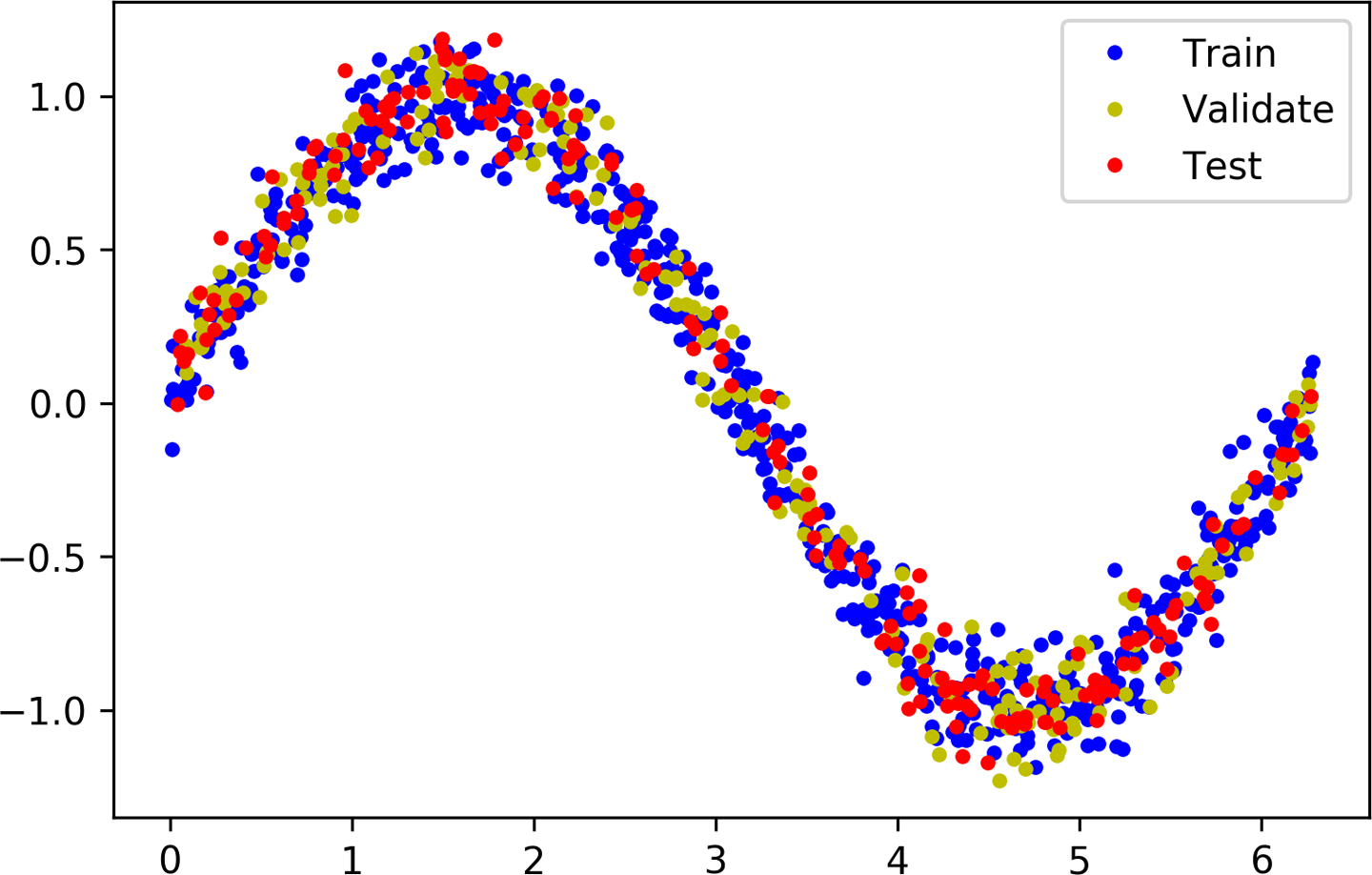
Figure 4-11. A graph of our data split into training, validation, and test sets
Defining a Basic Model
Now that we have our data, it’s time to create the model that we’ll train to fit it.
We’re going to build a model that will take an input value (in this case, x) and use it to predict a numeric output value (the sine of x). This type of problem is called a regression. We can use regression models for all sorts of tasks that require a numeric output. For example, a regression model could attempt to predict a person’s running speed in miles per hour based on data from an accelerometer.
To create our model, we’re going to design a simple neural network. It uses layers of neurons to attempt to learn any patterns underlying the training data so that it can make predictions.
The code to do this is actually quite straightforward. It uses Keras, TensorFlow’s high-level API for creating deep learning networks:
# We'll use Keras to create a simple model architecturefromtf.kerasimportlayersmodel_1=tf.keras.Sequential()# First layer takes a scalar input and feeds it through 16 "neurons." The# neurons decide whether to activate based on the 'relu' activation function.model_1.add(layers.Dense(16,activation='relu',input_shape=(1,)))# Final layer is a single neuron, since we want to output a single valuemodel_1.add(layers.Dense(1))# Compile the model using a standard optimizer and loss function for regressionmodel_1.compile(optimizer='rmsprop',loss='mse',metrics=['mae'])# Print a summary of the model's architecturemodel_1.summary()
First, we create a Sequential model using Keras, which just means a model in which each layer of neurons is stacked on top of the next, as we saw in Figure 3-1. We then define two layers. Here’s where the first layer is defined:
model_1.add(layers.Dense(16,activation='relu',input_shape=(1,)))
The first layer has a single input—our x value—and 16 neurons. It’s a Dense layer (also known as a fully connected layer), meaning the input will be fed into every single one of its neurons during inference, when we’re making predictions. Each neuron will then become activated to a certain degree. The amount of activation for each neuron is based on both its weight and bias values, learned during training, and its activation function. The neuron’s activation is output as a number.
Activation is calculated by a simple formula, shown in Python. We won’t ever need to code this ourselves, since it is handled by Keras and TensorFlow, but it will be helpful to know as we go further into deep learning:
activation=activation_function((input*weight)+bias)
To calculate the neuron’s activation, its input is multiplied by the weight, and the bias is added to the result. The calculated value is passed into the activation function. The resulting number is the neuron’s activation.
The activation function is a mathematical function used to shape the output of the neuron. In our network, we’re using an activation function called rectified linear unit, or ReLU for short. This is specified in Keras by the argument activation=relu.
ReLU is a simple function, shown here in Python:
defrelu(input):returnmax(0.0,input)
ReLU returns whichever is the larger value: its input, or zero. If its input value is negative, ReLU returns zero. If its input value is above zero, ReLU returns it unchanged.
Figure 4-12 shows the output of ReLU for a range of input values.
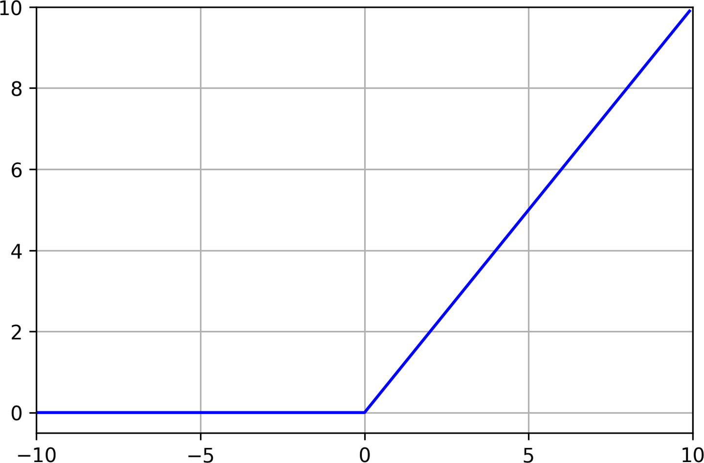
Figure 4-12. A graph of ReLU for inputs from –10 to 10
Without an activation function, the neuron’s output would always be a linear function of its input. This would mean that the network could model only linear relationships in which the ratio between x and y remains the same across the entire range of values. This would prevent a network from modeling our sine wave, because a sine wave is nonlinear.
Since ReLU is nonlinear, it allows multiple layers of neurons to join forces and model complex nonlinear relationships, in which the y value doesn’t increase by the same amount for every increment of x.
Note
There are other activation functions, but ReLU is the most commonly used. You can see some of the other options in the Wikipedia article on activation functions. Each activation function has different trade-offs, and machine learning engineers experiment to find which options work best for a given architecture.
The activation numbers from our first layer will be fed as inputs to our second layer, which is defined in the following line:
model_1.add(layers.Dense(1))
Because this layer is a single neuron, it will receive 16 inputs, one for each of the neurons in the previous layer. Its purpose is to combine all of the activations from the previous layer into a single output value. Since this is our output layer, we don’t specify an activation function—we just want the raw result.
Because this neuron has multiple inputs, it has a corresponding weight value for each. The neuron’s output is calculated by the following formula, shown in Python:
# Here, `inputs` and `weights` are both NumPy arrays with 16 elements eachoutput=sum((inputs*weights))+bias
The output value is obtained by multiplying each input with its corresponding weight, summing the results, and then adding the neuron’s bias.
The network’s weights and biases are learned during training. The compile() step in the code shown earlier in the chapter configures some important arguments used in the training process, and prepares the model to be trained:
model_1.compile(optimizer='rmsprop',loss='mse',metrics=['mae'])
The optimizer argument specifies the algorithm that will adjust the network to model its input during training. There are several choices, and finding the best one often comes down to experimentation. You can read about the options in the Keras documentation.
The loss argument specifies the method used during training to calculate how far the network’s predictions are from reality. This method is called a loss function. Here, we’re using mse, or mean squared error. This loss function is used in the case of regression problems, for which we’re trying to predict a number. There are various loss functions available in Keras. You can see some of the options listed in the Keras docs.
The metrics argument allows us to specify some additional functions that are used to judge the performance of our model. We specify mae, or mean absolute error, which is a helpful function for measuring the performance of a regression model. This metric will be measured during training, and we’ll have access to the results after training is done.
After we compile our model, we can use the following line to print some summary information about its architecture:
# Print a summary of the model's architecturemodel_1.summary()
Run the cell in Colab to define the model. You’ll see the following output printed:
Model: "sequential"
_________________________________________________________________
Layer (type)                 Output Shape              Param #
=================================================================
dense (Dense)                (None, 16)                32
_________________________________________________________________
dense_1 (Dense)              (None, 1)                 17
=================================================================
Total params: 49
Trainable params: 49
Non-trainable params: 0
_________________________________________________________________
This table shows the layers of the network, their output shapes, and their numbers of parameters. The size of a network—how much memory it takes up—depends mostly on its number of parameters, meaning its total number of weights and biases. This can be a useful metric when discussing model size and complexity.
For simple models like ours, the number of weights can be determined by calculating the number of connections between neurons in the model, given that each connection has a weight.
The network we’ve just designed consists of two layers. Our first layer has 16 connections—one between its input and each of its neurons. Our second layer has a single neuron, which also has 16 connections—one to each neuron in the first layer. This makes the total number of connections 32.
Since every neuron has a bias, the network has 17 biases, meaning it has a total of 32 + 17 = 49 parameters.
We’ve now walked through the code that defines our model. Next, we’ll begin the training process.
Training Our Model
After we define our model, it’s time to train it and then evaluate its performance to see how well it works. When we see the metrics, we can decide if it’s good enough, or if we should make changes to our design and train it again.
To train a model in Keras we just call its fit() method, passing all of our data and some other important arguments. The code in the next cell shows how:
history_1=model_1.fit(x_train,y_train,epochs=1000,batch_size=16,validation_data=(x_validate,y_validate))
Run the code in the cell to begin training. You’ll see some logs start to appear:
Train on 600 samples, validate on 200 samples
Epoch 1/1000
600/600 [==============================] - 1s 1ms/sample - loss: 0.7887 - mae: 0.7848 - val_loss: 0.5824 - val_mae: 0.6867
Epoch 2/1000
600/600 [==============================] - 0s 155us/sample - loss: 0.4883 - mae: 0.6194 - val_loss: 0.4742 - val_mae: 0.6056
Our model is now training. This will take a little while, so while we wait let’s walk through the details of our call to fit():
history_1=model_1.fit(x_train,y_train,epochs=1000,batch_size=16,validation_data=(x_validate,y_validate))
First, you’ll notice that we assign the return value of our fit() call to a variable named history_1. This variable contains a ton of information about our training run, and we’ll use it later to investigate how things went.
Next, let’s take a look at the fit() function’s arguments:
x_train,y_train-
The first two arguments to
fit()are thexandyvalues of our training data. Remember that parts of our data are kept aside for validation and testing, so only the training set is used to train the network. epochs-
The next argument specifies how many times our entire training set will be run through the network during training. The more epochs, the more training will occur. You might think that the more training happens, the better the network will be. However, some networks will start to overfit their training data after a certain number of epochs, so we might want to limit the amount of training we do.
In addition, even if there’s no overfitting, a network will stop improving after a certain amount of training. Since training costs time and computational resources, it’s best not to train if the network isn’t getting better!
We’re starting out with 1,000 epochs of training. When training is complete, we can dig into our metrics to discover whether this is the correct number.
batch_size-
The
batch_sizeargument specifies how many pieces of training data to feed into the network before measuring its accuracy and updating its weights and biases. If we wanted, we could specify abatch_sizeof1, meaning we’d run inference on a single datapoint, measure the loss of the network’s prediction, update the weights and biases to make the prediction more accurate next time, and then continue this cycle for the rest of the data.Because we have 600 datapoints, each epoch would result in 600 updates to the network. This is a lot of computation, so our training would take ages! An alternative might be to select and run inference on multiple datapoints, measure the loss in aggregate, and then updating the network accordingly.
If we set
batch_sizeto600, each batch would include all of our training data. We’d now have to make only one update to the network every epoch—much quicker. The problem is, this results in less accurate models. Research has shown that models trained with large batch sizes have less ability to generalize to new data—they are more likely to overfit.The compromise is to use a batch size that is somewhere in the middle. In our training code, we use a batch size of 16. This means that we’ll choose 16 datapoints at random, run inference on them, calculate the loss in aggregate, and update the network once per batch. If we have 600 points of training data, the network will be updated around 38 times per epoch, which is far better than 600.
When choosing a batch size, we’re making a compromise between training efficiency and model accuracy. The ideal batch size will vary from model to model. It’s a good idea to start with a batch size of 16 or 32 and experiment to see what works best.
validation_data-
This is where we specify our validation dataset. Data from this dataset will be run through the network throughout the training process, and the network’s predictions will be compared with the expected values. We’ll see the results of validation in the logs and as part of the
history_1object.
Training Metrics
Hopefully, by now, training has finished. If not, wait a few moments for it to complete.
We’re now going to check various metrics to see how well our network has learned. To begin, let’s look at the logs written during training. This will show how the network has improved during training from its random initial state.
Here are the logs for our first and last epochs:
Epoch 1/1000
600/600 [==============================] - 1s 1ms/sample - loss: 0.7887 - mae: 0.7848 - val_loss: 0.5824 - val_mae: 0.6867
Epoch 1000/1000
600/600 [==============================] - 0s 124us/sample - loss: 0.1524 - mae: 0.3039 - val_loss: 0.1737 - val_mae: 0.3249
The loss, mae, val_loss, and val_mae tell us various things:
loss-
This is the output of our loss function. We’re using mean squared error, which is expressed as a positive number. Generally, the smaller the loss value, the better, so this is a good thing to watch as we evaluate our network.
Comparing the first and last epochs, the network has clearly improved during training, going from a loss of ~0.7 to a smaller value of ~0.15. Let’s look at the other numbers to see whether this improvement is enough!
mae-
This is the mean absolute error of our training data. It shows the average difference between the network’s predictions and the expected
yvalues from the training data.We can expect our initial error to be pretty dismal, given that it’s based on an untrained network. This is certainly the case: the network’s predictions are off by an average of ~0.78, which is a large number when the range of acceptable values is only from –1 to 1!
However, even after training, our mean absolute error is ~0.30. This means that our predictions are off by an average of ~0.30, which is still quite awful.
val_loss-
This is the output of our loss function on our validation data. In our final epoch, the training loss (~0.15) is slightly lower than the validation loss (~0.17). This is a hint that our network might be overfitting, because it is performing worse on data it has not seen before.
val_mae-
This is the mean absolute error for our validation data. With a value of ~0.32, it’s worse than the mean absolute error on our training set, which is another sign that the network might be overfitting.
Graphing the History
So far, it’s clear that our model is not doing a great job of making accurate predictions. Our task now is to figure out why. To do so, let’s make use of the data collected in our history_1 object.
The next cell extracts the training and validation loss data from the history object and plots it on a chart:
loss=history_1.history['loss']val_loss=history_1.history['val_loss']epochs=range(1,len(loss)+1)plt.plot(epochs,loss,'g.',label='Training loss')plt.plot(epochs,val_loss,'b',label='Validation loss')plt.title('Training and validation loss')plt.xlabel('Epochs')plt.ylabel('Loss')plt.legend()plt.show()
The history_1 object contains an attribute called, history_1.history, which is a dictionary recording metric values during training and validation. We use this to collect the data we’re going to plot. For our x-axis we use the epoch number, which we determine by looking at the number of loss datapoints. Run the cell and you’ll see the graph in Figure 4-13.
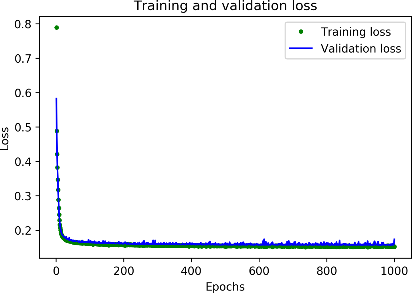
Figure 4-13. A graph of training and validation loss
As you can see, the amount of loss rapidly decreases over the first 50 epochs, before flattening out. This means that the model is improving and producing more accurate predictions.
Our goal is to stop training when either the model is no longer improving or the training loss is less than the validation loss, which would mean that the model has learned to predict the training data so well that it can no longer generalize to new data.
The loss drops precipitously in the first few epochs, which makes the rest of the graph quite difficult to read. Let’s skip the first 100 epochs by running the next cell:
# Exclude the first few epochs so the graph is easier to readSKIP=100plt.plot(epochs[SKIP:],loss[SKIP:],'g.',label='Training loss')plt.plot(epochs[SKIP:],val_loss[SKIP:],'b.',label='Validation loss')plt.title('Training and validation loss')plt.xlabel('Epochs')plt.ylabel('Loss')plt.legend()plt.show()
Figure 4-14 presents the graph produced by this cell.
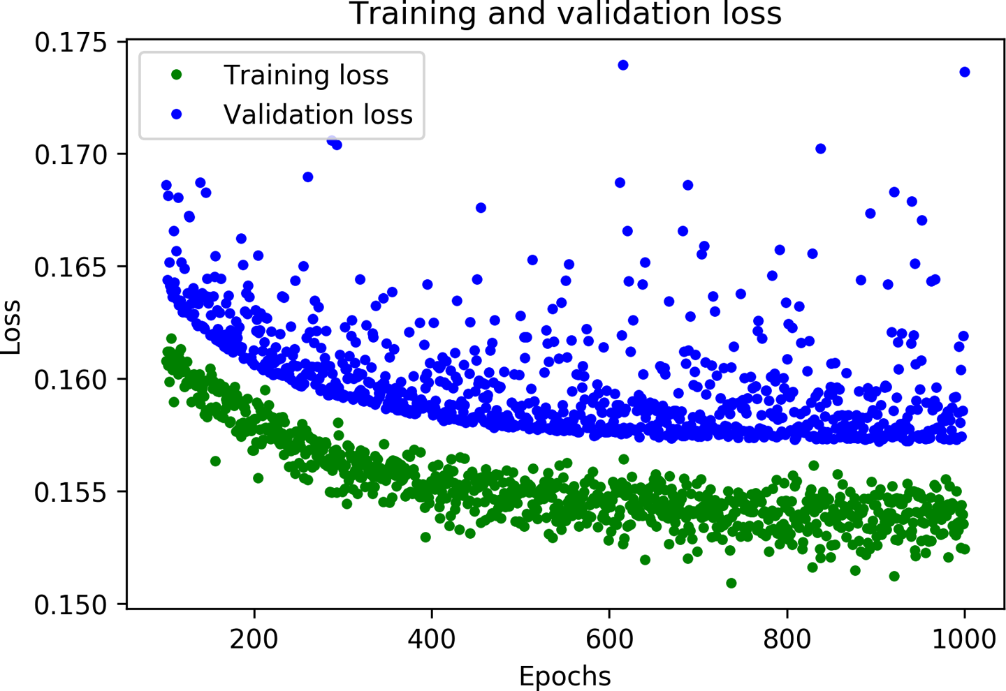
Figure 4-14. A graph of training and validation loss, skipping the first 100 epochs
Now that we’ve zoomed in, you can see that loss continues to reduce until around 600 epochs, at which point it is mostly stable. This means that there’s probably no need to train our network for so long.
However, you can also see that the lowest loss value is still around 0.15. This seems relatively high. In addition, the validation loss values are consistently even higher.
To gain more insight into our model’s performance we can plot some more data. This time, let’s plot the mean absolute error. Run the next cell to do so:
# Draw a graph of mean absolute error, which is another way of# measuring the amount of error in the prediction.mae=history_1.history['mae']val_mae=history_1.history['val_mae']plt.plot(epochs[SKIP:],mae[SKIP:],'g.',label='Training MAE')plt.plot(epochs[SKIP:],val_mae[SKIP:],'b.',label='Validation MAE')plt.title('Training and validation mean absolute error')plt.xlabel('Epochs')plt.ylabel('MAE')plt.legend()plt.show()
Figure 4-15 shows the resulting graph.
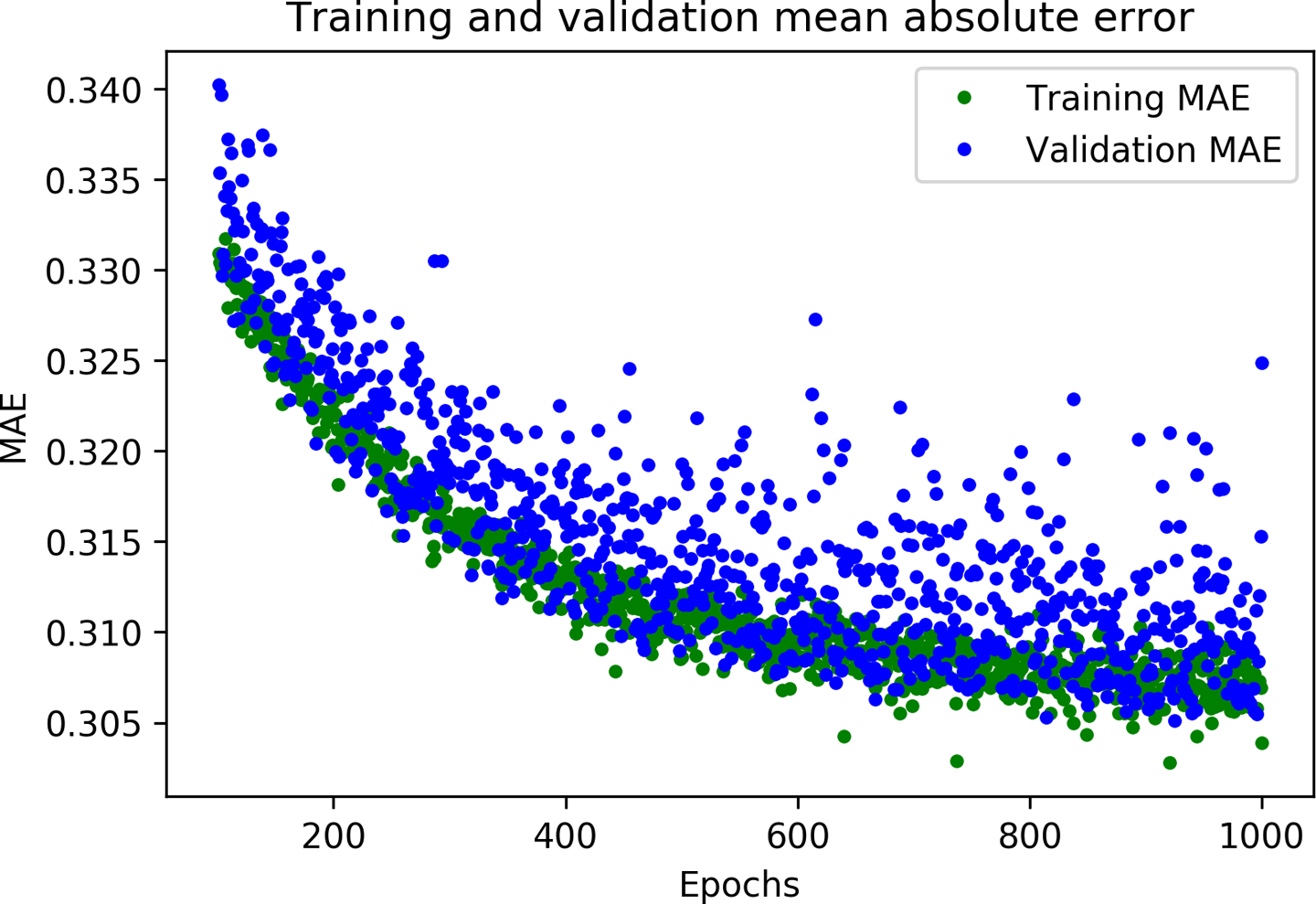
Figure 4-15. A graph of mean absolute error during training and validation
This graph of mean absolute error gives us some further clues. We can see that on average, the training data shows lower error than the validation data, which means that the network might have overfit, or learned the training data so rigidly that it can’t make effective predictions about new data.
In addition, the mean absolute error values are quite high, around ~0.31, which means that some of the model’s predictions are wrong by at least 0.31. Since our expected values only range in size from –1 to +1, an error of 0.31 means we are very far from accurately modeling the sine wave.
To get more insight into what is happening, we can plot our network’s predictions for the training data against the expected values.
This happens in the following cell:
# Use the model to make predictions from our validation datapredictions=model_1.predict(x_train)# Plot the predictions along with the test dataplt.clf()plt.title('Training data predicted vs actual values')plt.plot(x_test,y_test,'b.',label='Actual')plt.plot(x_train,predictions,'r.',label='Predicted')plt.legend()plt.show()
By calling model_1.predict(x_train), we run inference on all of the x values from the training data. The method returns an array of predictions. Let’s plot this on the graph alongside the actual y values from our training set. Run the cell to see the graph in Figure 4-16.
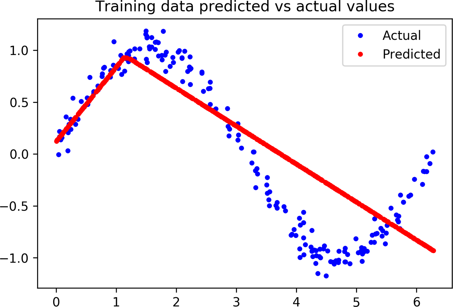
Figure 4-16. A graph of predicted versus actual values for our training data
Oh, dear! The graph makes it clear that our network has learned to approximate the sine function in a very limited way. The predictions are highly linear, and only very roughly fit the data.
The rigidity of this fit suggests that the model does not have enough capacity to learn the full complexity of the sine wave function, so it’s able to approximate it only in an overly simplistic way. By making our model bigger, we should be able to improve its performance.
Improving Our Model
Armed with the knowledge that our original model was too small to learn the complexity of our data, we can try to make it better. This is a normal part of the machine learning workflow: design a model, evaluate its performance, and make changes in the hope of seeing improvement.
An easy way to make the network bigger is to add another layer of neurons. Each layer of neurons represents a transformation of the input that will hopefully get it closer to the expected output. The more layers of neurons a network has, the more complex these transformations can be.
Run the following cell to redefine our model in the same way as earlier, but with an additional layer of 16 neurons in the middle:
model_2=tf.keras.Sequential()# First layer takes a scalar input and feeds it through 16 "neurons." The# neurons decide whether to activate based on the 'relu' activation function.model_2.add(layers.Dense(16,activation='relu',input_shape=(1,)))# The new second layer may help the network learn more complex representationsmodel_2.add(layers.Dense(16,activation='relu'))# Final layer is a single neuron, since we want to output a single valuemodel_2.add(layers.Dense(1))# Compile the model using a standard optimizer and loss function for regressionmodel_2.compile(optimizer='rmsprop',loss='mse',metrics=['mae'])# Show a summary of the modelmodel_2.summary()
As you can see, the code is basically the same as for our first model, but with an additional Dense layer. Let’s run the cell to see the summary() results:
Model: "sequential_1"
_________________________________________________________________
Layer (type)                 Output Shape              Param #
=================================================================
dense_2 (Dense)              (None, 16)                32
_________________________________________________________________
dense_3 (Dense)              (None, 16)                272
_________________________________________________________________
dense_4 (Dense)              (None, 1)                 17
=================================================================
Total params: 321
Trainable params: 321
Non-trainable params: 0
_________________________________________________________________
With two layers of 16 neurons, our new model is a lot larger. It has (1 * 16) + (16 * 16) + (16 * 1) = 288 weights, plus 16 + 16 + 1 = 33 biases, for a total of 288 + 33 = 321 parameters. Our original model had only 49 total parameters, so this is a 555% increase in model size. Hopefully, this extra capacity will help represent the complexity of our data.
The following cell will train our new model. Since our first model stopped improving so quickly, let’s train for fewer epochs this time—only 600. Run this cell to begin training:
history_2=model_2.fit(x_train,y_train,epochs=600,batch_size=16,validation_data=(x_validate,y_validate))
When training is complete, we can take a look at the final log to get a quick feel for whether things have improved:
Epoch 600/600
600/600 [==============================] - 0s 150us/sample - loss: 0.0115 - mae: 0.0859 - val_loss: 0.0104 - val_mae: 0.0806
Wow! You can see that we’ve already achieved a huge improvement—validation loss has dropped from 0.17 to 0.01, and validation mean absolute error has dropped from 0.32 to 0.08. This looks very promising.
To see how things are going, let’s run the next cell. It’s set up to generate the same graphs we used last time. First, we draw a graph of the loss:
# Draw a graph of the loss, which is the distance between# the predicted and actual values during training and validation.loss=history_2.history['loss']val_loss=history_2.history['val_loss']epochs=range(1,len(loss)+1)plt.plot(epochs,loss,'g.',label='Training loss')plt.plot(epochs,val_loss,'b',label='Validation loss')plt.title('Training and validation loss')plt.xlabel('Epochs')plt.ylabel('Loss')plt.legend()plt.show()
Figure 4-17 shows the result.
Next, we draw the same loss graph but with the first 100 epochs skipped so that we can better see the detail:
# Exclude the first few epochs so the graph is easier to readSKIP=100plt.clf()plt.plot(epochs[SKIP:],loss[SKIP:],'g.',label='Training loss')plt.plot(epochs[SKIP:],val_loss[SKIP:],'b.',label='Validation loss')plt.title('Training and validation loss')plt.xlabel('Epochs')plt.ylabel('Loss')plt.legend()plt.show()
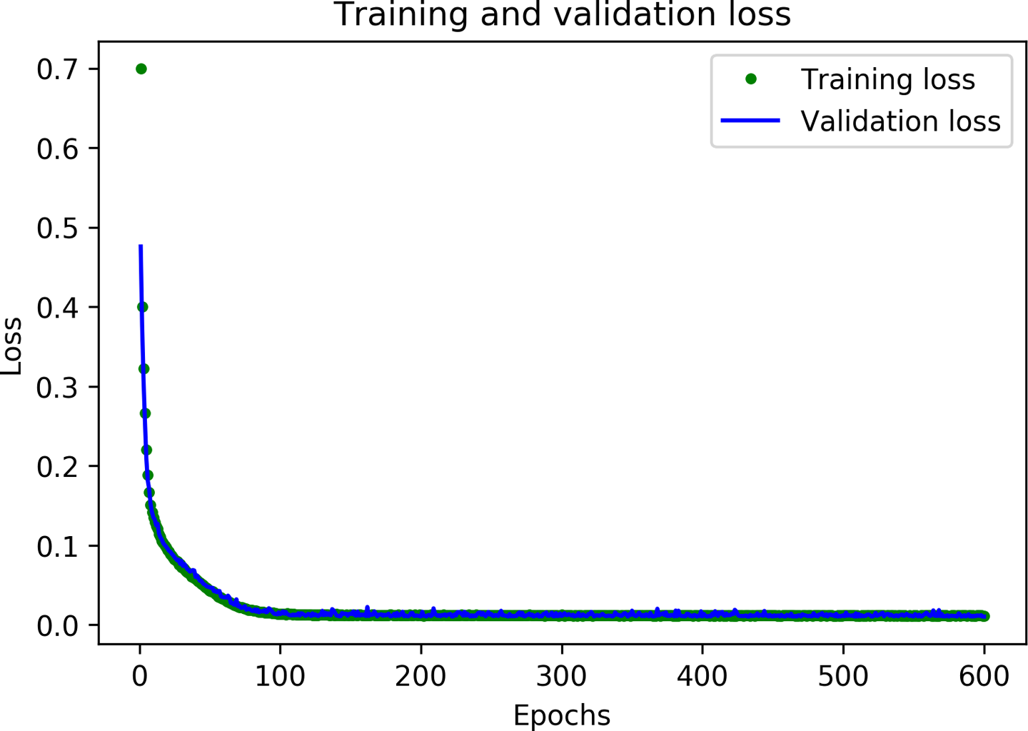
Figure 4-17. A graph of training and validation loss
Figure 4-18 presents the output.
Finally, we plot the mean absolute error for the same set of epochs:
plt.clf()# Draw a graph of mean absolute error, which is another way of# measuring the amount of error in the prediction.mae=history_2.history['mae']val_mae=history_2.history['val_mae']plt.plot(epochs[SKIP:],mae[SKIP:],'g.',label='Training MAE')plt.plot(epochs[SKIP:],val_mae[SKIP:],'b.',label='Validation MAE')plt.title('Training and validation mean absolute error')plt.xlabel('Epochs')plt.ylabel('MAE')plt.legend()plt.show()
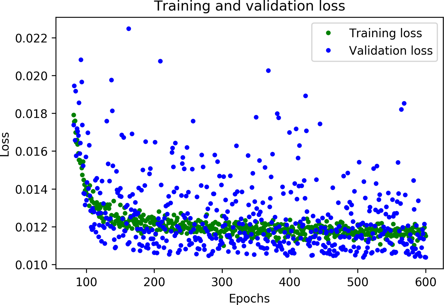
Figure 4-18. A graph of training and validation loss, skipping the first 100 epochs
Figure 4-19 depicts the graph.
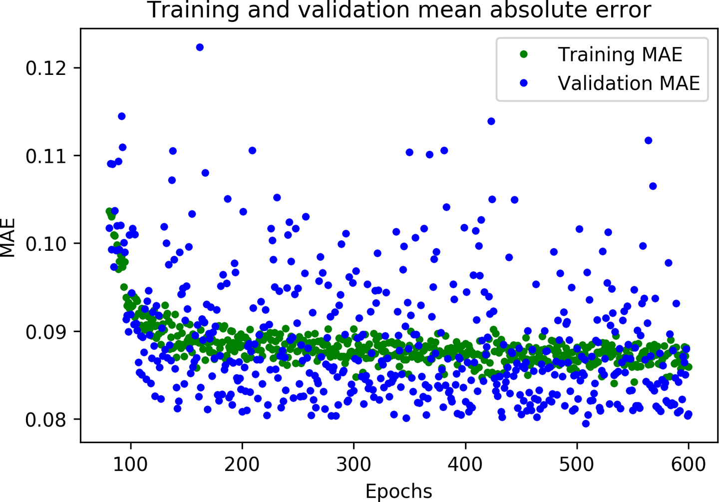
Figure 4-19. A graph of mean absolute error during training and validation
Great results! From these graphs, we can see two exciting things:
-
The metrics are broadly better for validation than training, which means the network is not overfitting.
-
The overall loss and mean absolute error are much better than in our previous network.
You might be wondering why the metrics for validation are better than those for training, and not merely identical. The reason is that validation metrics are calculated at the end of each epoch, meanwhile training metrics are calculated while the epoch of training is still in progress. This means validation happens on a model that has been trained for slightly longer.
Based on our validation data, our model seems to be performing great. However, to be sure of this, we need to run one final test.
Testing
Earlier, we set aside 20% of our data to use for testing. As we discussed, it’s very important to have separate validation and test data. Since we fine-tune our network based on its validation performance, there’s a risk that we might accidentally tune the model to overfit its validation set and that it might not be able to generalize to new data. By retaining some fresh data and using it for a final test of our model, we can make sure that this has not happened.
After we’ve used our test data, we need to resist the urge to tune our model further. If we did make changes with the goal of improving test performance, we might cause it to overfit our test set. If we did this, we wouldn’t be able to know, because we’d have no fresh data left to test with.
This means that if our model performs badly on our test data, it’s time to go back to the drawing board. We’ll need to stop optimizing the current model and come up with a brand new architecture.
With that in mind, the following cell will evaluate our model against our test data:
# Calculate and print the loss on our test datasetloss=model_2.evaluate(x_test,y_test)# Make predictions based on our test datasetpredictions=model_2.predict(x_test)# Graph the predictions against the actual valuesplt.clf()plt.title('Comparison of predictions and actual values')plt.plot(x_test,y_test,'b.',label='Actual')plt.plot(x_test,predictions,'r.',label='Predicted')plt.legend()plt.show()
First, we call the model’s evaluate() method with the test data. This will calculate and print the loss and mean absolute error metrics, informing us as to how far the model’s predictions deviate from the actual values. Next, we make a set of predictions and plot them on a graph alongside the actual values.
Now we can run the cell to learn how our model is performing! First, let’s see the results of evaluate():
200/200 [==============================] - 0s 71us/sample - loss: 0.0103 - mae: 0.0718
This shows that 200 datapoints were evaluated, which is our entire test set. The model took 71 microseconds to make each prediction. The loss metric was 0.0103, which is excellent, and very close to our validation loss of 0.0104. Our mean absolute error, 0.0718, is also very small and fairly close to its equivalent in validation, 0.0806.
This means that our model is working great, and it isn’t overfitting! If the model had overfit our validation data, we could expect that the metrics on our test set would be significantly worse than those resulting from validation.
The graph of our predictions against our actual values, shown in Figure 4-20, makes it clear how well our model is performing.
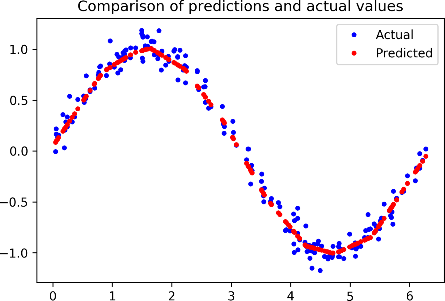
Figure 4-20. A graph of predicted versus actual values for our test data
You can see that, for the most part, the dots representing predicted values form a smooth curve along the center of the distribution of actual values. Our network has learned to approximate a sine curve, even though the dataset was noisy!
If you look closely, however, you’ll see that there are some imperfections. The peak and trough of our predicted sine wave are not perfectly smooth, like a real sine wave would be. Variations in our training data, which is randomly distributed, have been learned by our model. This is a mild case of overfitting: instead of learning the smooth sine function, our model has learned to replicate the exact shape of our data.
For our purposes, this overfitting isn’t a major problem. Our goal is for this model to gently fade an LED on and off, and it doesn’t need to be perfectly smooth to achieve this. If we thought the level of overfitting was problematic, we could attempt to address it through regularization techniques or by obtaining more training data.
Now that we’re happy with our model, let’s get it ready to deploy on-device!
Converting the Model for TensorFlow Lite
At the beginning of this chapter we briefly touched on TensorFlow Lite, which is a set of tools for running TensorFlow models on “edge devices”—meaning everything from mobile phones down to microcontroller boards.
Chapter 13 goes into detail on TensorFlow Lite for Microcontrollers. For now, we can think of it as having two main components:
- TensorFlow Lite Converter
-
This converts TensorFlow models into a special, space-efficient format for use on memory-constrained devices, and it can apply optimizations that further reduce the model size and make it run faster on small devices.
- TensorFlow Lite Interpreter
-
This runs an appropriately converted TensorFlow Lite model using the most efficient operations for a given device.
Before we use our model with TensorFlow Lite, we need to convert it. We use the TensorFlow Lite Converter’s Python API to do this. It takes our Keras model and writes it to disk in the form of a FlatBuffer, which is a special file format designed to be space-efficient. Because we’re deploying to devices with limited memory, this will come in handy! We’ll look at FlatBuffers in more detail in Chapter 12.
In addition to creating a FlatBuffer, the TensorFlow Lite Converter can also apply optimizations to the model. These optimizations generally reduce the size of the model, the time it takes to run, or both. This can come at the cost of a reduction in accuracy, but the reduction is often small enough that it’s worthwhile. You can read more about optimizations in Chapter 13.
One of the most useful optimizations is quantization. By default, the weights and biases in a model are stored as 32-bit floating-point numbers so that high-precision calculations can occur during training. Quantization allows you to reduce the precision of these numbers so that they fit into 8-bit integers—a four times reduction in size. Even better, because it’s easier for a CPU to perform math with integers than with floats, a quantized model will run faster.
The coolest thing about quantization is that it often results in minimal loss in accuracy. This means that when deploying to low-memory devices, it is nearly always worthwhile.
In the following cell, we use the converter to create and save two new versions of our model. The first is converted to the TensorFlow Lite FlatBuffer format, but without any optimizations. The second is quantized.
Run the cell to convert the model into these two variants:
# Convert the model to the TensorFlow Lite format without quantizationconverter=tf.lite.TFLiteConverter.from_keras_model(model_2)tflite_model=converter.convert()# Save the model to diskopen("sine_model.tflite","wb").write(tflite_model)# Convert the model to the TensorFlow Lite format with quantizationconverter=tf.lite.TFLiteConverter.from_keras_model(model_2)# Indicate that we want to perform the default optimizations,# which include quantizationconverter.optimizations=[tf.lite.Optimize.DEFAULT]# Define a generator function that provides our test data's x values# as a representative dataset, and tell the converter to use itdefrepresentative_dataset_generator():forvalueinx_test:# Each scalar value must be inside of a 2D array that is wrapped in a listyield[np.array(value,dtype=np.float32,ndmin=2)]converter.representative_dataset=representative_dataset_generator# Convert the modeltflite_model=converter.convert()# Save the model to diskopen("sine_model_quantized.tflite","wb").write(tflite_model)
To create a quantized model that runs as efficiently as possible, we need to provide a representative dataset—a set of numbers that represent the full range of input values of the dataset on which the model was trained.
In the preceding cell, we can use our test dataset’s x values as a representative dataset. We define a function, representative_dataset_generator(), that uses the yield operator to return them one by one.
To prove these models are still accurate after conversion and quantization, we use both of them to make predictions and compare these against our test results. Given that these are TensorFlow Lite models, we need to use the TensorFlow Lite interpreter to do so.
Because it’s designed primarily for efficiency, the TensorFlow Lite interpreter is slightly more complicated to use than the Keras API. To make predictions with our Keras model, we could just call the predict() method, passing an array of inputs. With TensorFlow Lite, we need to do the following:
-
Instantiate an
Interpreterobject. -
Call some methods that allocate memory for the model.
-
Write the input to the input tensor.
-
Invoke the model.
-
Read the output from the output tensor.
This sounds like a lot, but don’t worry about it too much for now; we’ll walk through it in detail in Chapter 5. For now, run the following cell to make predictions with both models and plot them on a graph, alongside the results from our original, unconverted model:
# Instantiate an interpreter for each modelsine_model=tf.lite.Interpreter('sine_model.tflite')sine_model_quantized=tf.lite.Interpreter('sine_model_quantized.tflite')# Allocate memory for each modelsine_model.allocate_tensors()sine_model_quantized.allocate_tensors()# Get indexes of the input and output tensorssine_model_input_index=sine_model.get_input_details()[0]["index"]sine_model_output_index=sine_model.get_output_details()[0]["index"]sine_model_quantized_input_index=sine_model_quantized.get_input_details()[0]["index"]sine_model_quantized_output_index=\sine_model_quantized.get_output_details()[0]["index"]# Create arrays to store the resultssine_model_predictions=[]sine_model_quantized_predictions=[]# Run each model's interpreter for each value and store the results in arraysforx_valueinx_test:# Create a 2D tensor wrapping the current x valuex_value_tensor=tf.convert_to_tensor([[x_value]],dtype=np.float32)# Write the value to the input tensorsine_model.set_tensor(sine_model_input_index,x_value_tensor)# Run inferencesine_model.invoke()# Read the prediction from the output tensorsine_model_predictions.append(sine_model.get_tensor(sine_model_output_index)[0])# Do the same for the quantized modelsine_model_quantized.set_tensor\(sine_model_quantized_input_index,x_value_tensor)sine_model_quantized.invoke()sine_model_quantized_predictions.append(sine_model_quantized.get_tensor(sine_model_quantized_output_index)[0])# See how they line up with the dataplt.clf()plt.title('Comparison of various models against actual values')plt.plot(x_test,y_test,'bo',label='Actual')plt.plot(x_test,predictions,'ro',label='Original predictions')plt.plot(x_test,sine_model_predictions,'bx',label='Lite predictions')plt.plot(x_test,sine_model_quantized_predictions,'gx',\label='Lite quantized predictions')plt.legend()plt.show()
Running this cell yields the graph in Figure 4-21.
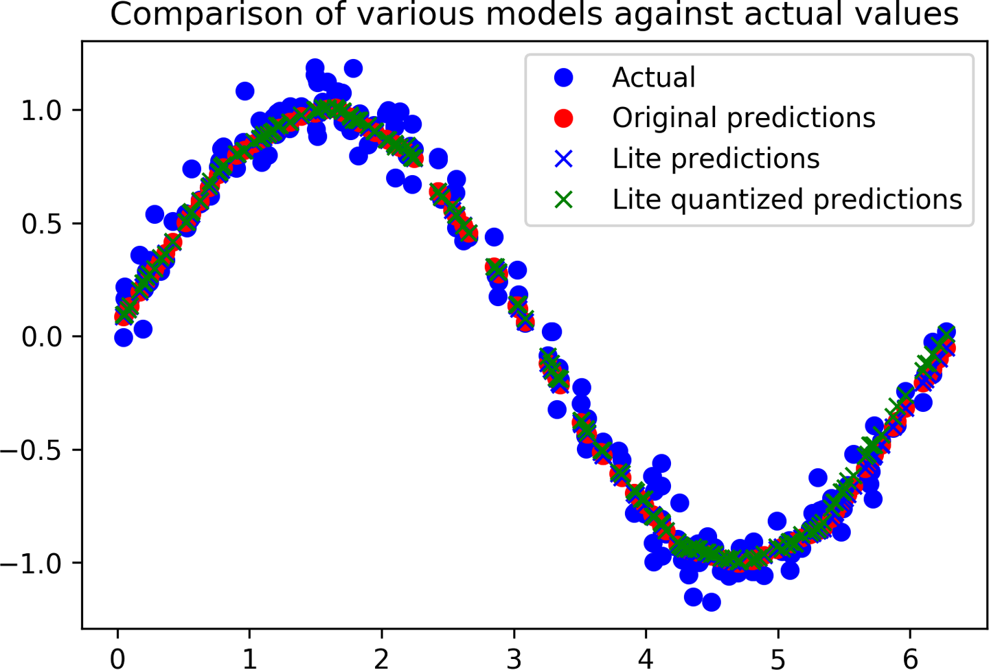
Figure 4-21. A graph comparing models’ predictions against the actual values
We can see from the graph that the predictions for the original model, the converted model, and the quantized model are all close enough to be indistinguishable. Things are looking good!
Since quantization makes models smaller, let’s compare both converted models to see the difference in size. Run the following cell to calculate their sizes and compare them:
importosbasic_model_size=os.path.getsize("sine_model.tflite")("Basic model is%dbytes"%basic_model_size)quantized_model_size=os.path.getsize("sine_model_quantized.tflite")("Quantized model is%dbytes"%quantized_model_size)difference=basic_model_size-quantized_model_size("Difference is%dbytes"%difference)
You should see the following output:
Basic model is 2736 bytes
Quantized model is 2512 bytes
Difference is 224 bytes
Our quantized model is 224 bytes smaller than the original version, which is great—but it’s only a minor reduction in size. At around 2.4 KB, this model is already so small that the weights and biases make up only a fraction of the overall size. In addition to weights, the model contains all the logic that makes up the architecture of our deep learning network, known as its computation graph. For truly tiny models, this can add up to more size than the model’s weights, meaning quantization has little effect.
More complex models have many more weights, meaning the space saving from quantization will be much higher. It can be expected to approach four times for most sophisticated models.
Regardless of its exact size, our quantized model will take less time to execute than the original version, which is important on a tiny microcontroller.
Converting to a C File
The final step in preparing our model for use with TensorFlow Lite for Microcontrollers is to convert it into a C source file that can be included in our application.
So far during this chapter, we’ve been using TensorFlow Lite’s Python API. This means that we’ve been able to use the Interpreter constructor to load our model files from disk.
However, most microcontrollers don’t have a filesystem, and even if they did, the extra code required to load a model from disk would be wasteful given our limited space. Instead, as an elegant solution, we provide the model in a C source file that can be included in our binary and loaded directly into memory.
In the file, the model is defined as an array of bytes. Fortunately, there’s a convenient Unix tool named xxd that is able to convert a given file into the required format.
The following cell runs xxd on our quantized model, writes the output to a file called sine_model_quantized.cc, and prints it to the screen:
# Install xxd if it is not available!apt-get -qq install xxd# Save the file as a C source file!xxd -i sine_model_quantized.tflite > sine_model_quantized.cc# Print the source file!cat sine_model_quantized.cc
The output is very long, so we won’t reproduce it all here, but here’s a snippet that includes just the beginning and end:
unsignedcharsine_model_quantized_tflite[]={0x1c,0x00,0x00,0x00,0x54,0x46,0x4c,0x33,0x00,0x00,0x12,0x00,0x1c,0x00,0x04,0x00,0x08,0x00,0x0c,0x00,0x10,0x00,0x14,0x00,// ...0x00,0x00,0x08,0x00,0x0a,0x00,0x00,0x00,0x00,0x00,0x00,0x09,0x04,0x00,0x00,0x00};unsignedintsine_model_quantized_tflite_len=2512;
To use this model in a project, you could either copy and paste the source or download the file from the notebook.
Wrapping Up
And with that, we’re done building our model. We’ve trained, evaluated, and converted a TensorFlow deep learning network that can take a number between 0 and 2π and output a good-enough approximation of its sine.
This was our first taste of using Keras to train a tiny model. In future projects, we’ll be training models that are still tiny, but far more sophisticated.
For now, let’s move on to Chapter 5, where we’ll write code to run our model on microcontrollers.
Get TinyML now with the O’Reilly learning platform.
O’Reilly members experience books, live events, courses curated by job role, and more from O’Reilly and nearly 200 top publishers.

