Chapter 62. Z-Pattern, F-Pattern, Visual Hierarchy
It is easy to imagine every user excitedly reading every letter you write and every pixel you make. Get over it, because real users won’t. They scan.
“Scanning” means the user only stops to read when something catches their eye. This lesson is about scanning patterns.
Using a website or an app may feel like a different experience every time, but in fact, the way people look at any design is fairly predictable.
The Z-Pattern
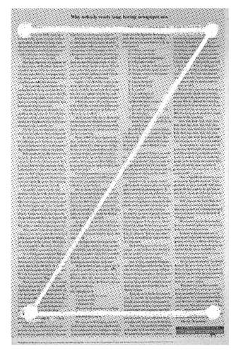
Let’s start with the most boring design I can imagine: an entire newspaper page of solid text. All one story. No headlines. No images. No breaks or pull quotes; just text, in even columns, from corner to corner.
In a design like that—which I hope you never create—users will generally scan it in a pattern something like a “Z,” starting in the upper left and ending in the lower right. Anything in the layout that isn’t near the Z probably won’t be noticed.
Boring! Zzzzzzzz.... (see what I did there?)
The reason I spent so much time teaching you visual design principles is so you would know how you can make this layout better.
Aha!
If we add a bigger headline (visual weight), create one column to follow (line tension), and use smaller sections (repetition), we can get people closer to the famous F-Pattern.
F-Pattern
Similar layouts = similar scanning pattern. Google results make a great F-Pattern if you track the eye movements ...
Get UX for Beginners now with the O’Reilly learning platform.
O’Reilly members experience books, live events, courses curated by job role, and more from O’Reilly and nearly 200 top publishers.

