Introducing alignment diagrams
With this unique tool, you can visually map your existing customer experience and envision future solutions.
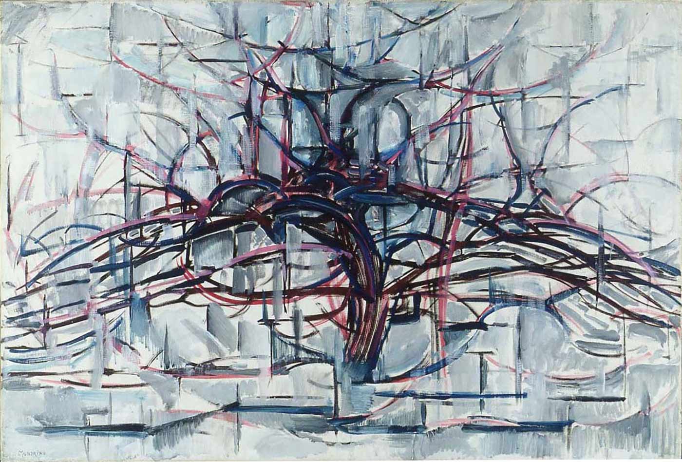 "Horizontal Tree," by Piet Mondrian, 1911. (source: Wikimedia Commons)
People expect some benefit when they use the products and services an organization provides. They want to get some job done, solve a problem, or experience a particular emotion. If they then perceive this benefit valuable, they’ll give something in return—money, time, or attention.
To survive, organizations need to capture some worth from their offerings. They need to earn profit, maximize reach, or improve their image. Value creation is bi-directional.

Learn faster. Dig deeper. See farther.
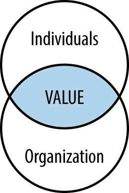
But how do we locate the source of value in such a relationship? Simply put, value creation lies at the intersection of human interaction with the provider of a service. It’s where the experiences of individuals intersect with the offerings of an organization (Figure 1-1).
A number of years ago, I was struggling to determine what type of diagram to use on a project: a customer journey map, mental model diagram, service blueprint, or something else. After some comparison of several examples, a similar set of principles became apparent: these diagrams all represent the value creation equation in some way.
Viewing the commonalities of various diagrams opened up possibilities. I wasn’t locked into one prescribed method over another. I realized the focus should not be on a specific technique, rather on the broader concept of value alignment.
…the focus should not be on a specific technique, rather on the broader concept of value alignment.
More importantly, I was better able to connect the dots between human-centered design and business objectives. Concentrating on alignment allowed me to talk with business leaders and stakeholders about the importance of design in reaching their goals. Within a short time, I was running workshops with senior leaders and showing my diagrams to CEOs.
Creating solutions by focusing on the interaction between individuals and organizations represents a perspective referred to as value-centered design. In his article “Searching for the Center of Design,” service design expert Jess McMullin defines value-centered design as follows:
Value-centered design starts a story about an ideal interaction between an individual and an organization and the benefits each realizes from that interaction.
In this chapter, I introduce the concept of alignment diagrams to describe a class of diagrams that visualize the story of interaction between individuals and an organization. By the end you should have a firm grasp of value alignment, the commonalities and key differences between diagram types, and the benefits of value alignment.
Alignment Diagrams
The term alignment diagram refers to any map, diagram, or visualization that reveals both sides of value creation in a single overview. They are a category of diagram that illustrates the interaction between people and organizations.
Such diagrams are not new and already used in practice. Thus my definition of alignment diagram is less of a proposition for a specific technique than a recognition of how existing approaches can be seen in a new, constructive way.
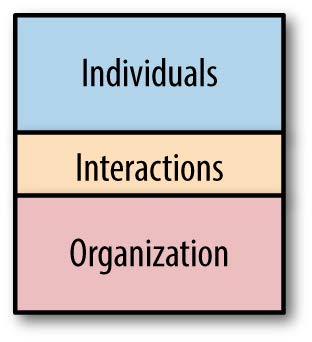
Logically, alignment diagrams have two parts (Figure 1-2). On the one side, they illustrate aspects of the individual’s experience—a depiction of aggregate behavior across archetypal users. On the other, alignment diagrams reflect an organization’s offerings and processes. The points of interaction between the two are the means of value exchange.
You may have already used them: service blueprints, customer journey maps, experience maps, and mental model diagrams are widespread examples.
The following sections compare common types of diagrams to reveal their similarities. These five examples represent archetypes of diagrams. Most other related diagrams can be categorized against one of these core patterns. Part 3 deals with each of these diagrams, as well as related diagrams.
1. Service Blueprints
Service blueprints diagram a service offering. The technique has the longest history of the examples discussed in the book.
Figure 1-3 shows a service blueprint created by Brandon Schauer, a strategist and business analyst with Adaptive Path, a leading user experience design group. It depicts the experience of a conference attendee.
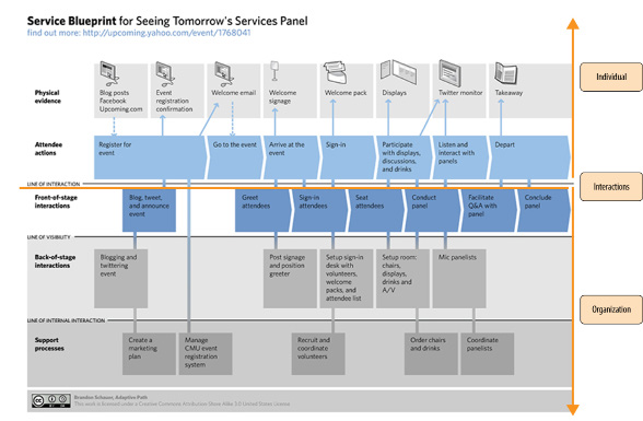
The customer actions are indicated at the top and business processes at the bottom. In the middle Schauer indicated the “line of interaction”—the touchpoints where there is an exchange of value.
2. Customer Journey Maps
Customer journey maps illustrate the experiences of an individual as a customer of an organization. They typically include making a choice, such as the decision to buy a product or service, as well as to stay loyal customer.
Figure 1-4 shows a simple customer journey map of a search service for finding architects internationally. This is a modified version of a diagram I created for a project a number of years ago, concealing the name of the product and company. It describes how a customer interacts with the provider of the search service from beginning to end.
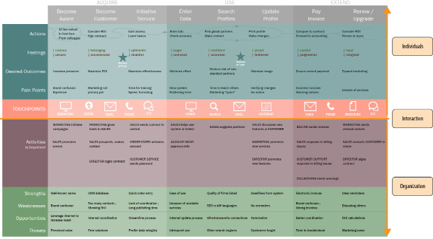
Phases of interaction are listed across the top, starting with “Become Aware” and going to “Renew/Upgrade.” The rows show various facets of the customer experience: actions, state of mind and feelings, desired outcomes, and pain points.
The bottom half shows key departmental activities to support or respond to the customer. An analysis of strengths, weakness, opportunities, and threats appears below that. The primary means of interaction are listed in the middle row.
3. Experience Maps
Experience maps are relatively new. They illustrate experiences people have within a given domain. Figure 1-5 shows an example of an experience map created by Chris Risdon, also of Adaptive Path. This particular map shows the phases in a trip through Europe by train.
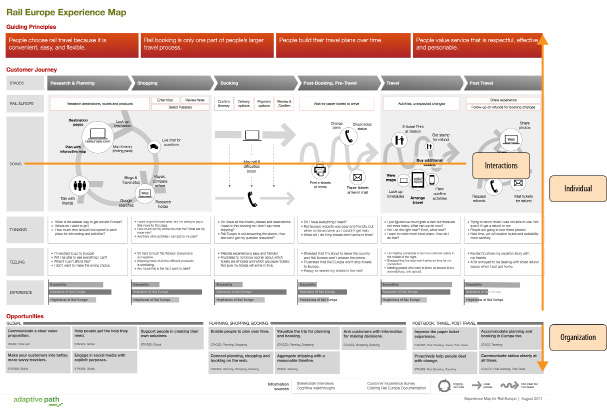
It describes the experience people have when traveling in the top portion. At the bottom are opportunities for the business. The interactions between the two are embedded in the middle of the diagram.
4. Mental Model Diagrams
A mental model diagram is the broad exploration of human behaviors, feelings, and motivations. The approach was pioneered by Indi Young and detailed in her book Mental Models. These are typically very large diagrams that, when printed, can cover an entire wall. The example in Figure 1-6 shows a close-up of a mental model diagram for going to the movies.
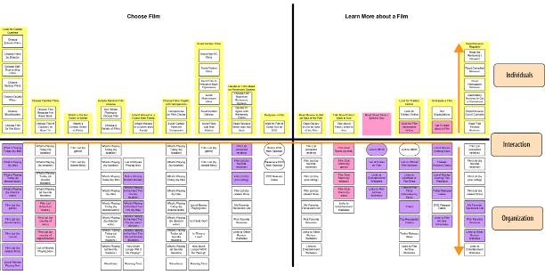
A horizontal line in the middle divides the diagram into two parts. The top shows individual’s tasks, feelings, and philosophies. These are grouped by topic into what are called towers, which are then sectioned off into goal spaces (e.g., “Choose Film” and “Learn More about a Film”). The boxes below the center line show support for achieving those goals from various products or services.
Unlike customer journey maps, service blueprints, or experience maps, the structure of mental model diagrams is hierarchical rather than chronological. The two-part arrangement qualifies it as an alignment diagram nonetheless.
5. Spatial Maps
These diagrams map out aspects of an experience spatially. As the name implies, spatial maps are neither chronological nor hierarchical. The three-dimensional aspect of this example makes it unique from the previous examples.
Figure 1-7 shows an example of a spatial diagram call an isometric map. It was created by Paul Kahn, Julia Moisand Egea, and Laurent Kling. On the left are rectangles, called “carpets.” These reflect departments and divisions in a company. Individual “cards” shown in the middle represent different content types and artifacts used within the system described. And on the right are users of this content, with touchpoints between the two parts.
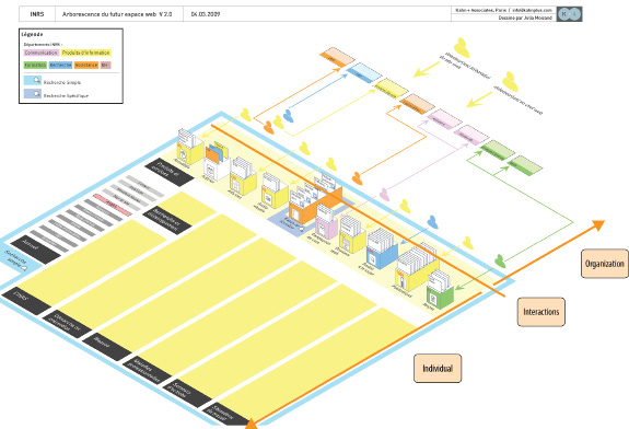
Table 1-1 summarizes each of the previous diagram type examples through this lens. Each diagram types tells the story of value-centered design in a different way, with different conventions and representations.
| DIAGRAM TYPE | STORY | INTERACTION | INDIVIDUAL | ORGANIZATION |
|---|---|---|---|---|
| Customer Journey Map | Chronological | Touchpoints | Actions, thoughts, feelings, pain points, etc. | Roles and departments involved in creating an experience |
| Experience Map | Chronological | Touchpoints | Actions, thoughts, feelings, pain points | Physical and social artifacts in a system; opportunities |
| Service Blueprints | Chronological | Line of interaction | Actions, physical evidence | Backstage actors and processes |
| Mental Model Diagrams | Hierarchical | Center line | Tasks, feelings, philosophies | Support—products and services available |
| Spatial Maps | Spatial | Midpoint with arrows | Actions, needs, information flow | Data systems, departments |
Note that terminology is used inconsistently in practice. You may find what one person calls a customer journey map another calls an experience map or blueprint. The lines between these example are oftentimes blurred. Don’t be overly concerned with the terminology; instead, focus on the results of your mapping effort. The notion of alignment diagrams finds common ground between these examples. As the fields of customer experience, user experience, and service design merge and overlap, it becomes increasingly important to have a range of approaches to solve unique problems.
Benefits
Alignment diagrams are no panacea. They do not provide immediate answers outright. Instead, they are compelling visualizations that draw others into important conversations about creating value. Your ultimate goal is creating an inclusive dialog within the organization, not creating the diagram itself.
Mapping experiences has many potential benefits. These include building empathy, providing a common “big picture,” breaking silos, reducing complexity, and finding opportunities. Alignment diagrams also generally enjoy a great deal of longevity.
Alignment diagrams help build empathy
It’s often amazing how little organizations know about the experiences that the people they serve actually go through. Alignment diagrams shed light on real-world human conditions. In doing so they instill empathy into an organization.
Bruce Temkin, a leader in customer experience management, stresses the relevance and importance of such mapping activities. He writes in a blog post:
Companies need to use tools and processes that reinforce an understanding of actual customer needs. One of the key tools in this area is something called a customer journey map… Used appropriately, these maps can shift a company’s perspective from inside- out to outside-in.1
Looking back into the organization from the outside causes a change in perspective, one that is more sensitive to people’s thoughts and feelings.
Alignment diagrams provide a common “big picture”
Diagrams serve as a shared reference, helping to build consensus. In this sense, alignment diagrams are strategic tools: they influence decision making at all levels and lead to consistency in actions.
For instance, Jon Kolko, VP of Consumer Design at Blackboard, believes diagrams help address what he calls “alignment attrition”—the tendency to get out of sync with one another. As he writes in his article “Dysfunctional Products Come from Dysfunctional Organizations,” visualizations help.
A visual model becomes one of the most effective tools for minimizing alignment-attrition. A visual model captures and freezes a thought in time. By building a visual model together, alignment is offloaded to and “frozen in” the diagram. Your thoughts, opinions, and views will change, but the diagram won’t, and so you’ve added a constraining boundary to the idea—and a tool for concretely visualizing how the product vision is changing.
What’s more, diagrams also help retain a common big picture as organizations change personnel. Team members may come and go, and diagrams help maintain continuity. In this sense, they also play a knowledge management function role.
Alignment diagrams break down silos
People experience a product or service in a holistic way. Ideal solutions can easily cross an organization’s department lines. Illustrations of the customer experience typically reveal divisional joints in an organization. Discussion around them sparks cross-department collaboration.
Creating diagrams also aids in the design of cross-channel experiences. Consider the cross-channel blueprint (Figure 1-8) created by Tyler Tate, an entrepreneur and expert in search system design. While it doesn’t include the richness of other types of alignment diagrams, it does align user behavior (along the top of the chart) with channels (vertically on the left) and support from the organization (the bottom row).
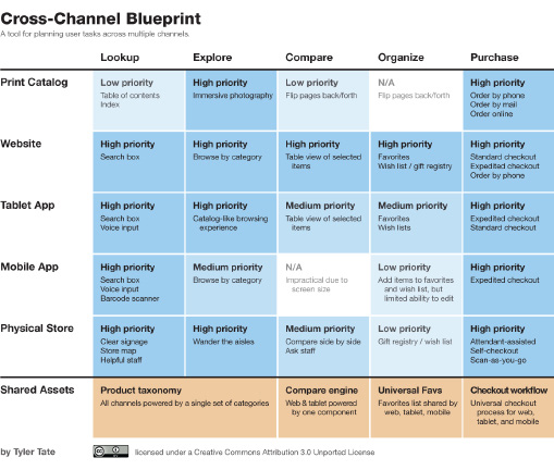
In this simple, yet insightful example, a product taxonomy spans all channels. But in a typical organization, the print catalog department is likely different from the digital product team and from the physical store. In this case, the implementation of a cross-channel taxonomy requires these units to work directly with one another.
Alignment diagrams bring focus
In a study in 2011 by Booz and Company, a majority of the 1800 executives surveyed indicated they were unable to focus on business strategy: they are being pulled in too many directions. Conflicting priorities, competing business units, and an inability to find attractive markets are some of the top issues that contribute to this state. As a result, many companies lack coherence.
Coherence in business strategy—or incoherence, as is often the case—is the subject of The Essential Advantage by Paul Leinwand and Cesare Mainardi. After years of research in corporate strategy, the authors conclude:
To unlock the benefits of coherence, you need to take deliberate steps—to reconsider your current strategy, overcome the conventional separation between your outward-facing and inward-facing activities, and bring your organization into focus.2
Alignment diagrams represent such a deliberate step: they inherently match outward and inward-facing endeavors. In doing so, they bring focus and coherency to organizations.
Alignment diagrams reveal opportunities
Visualizations offer an immediacy of comprehension, providing insight into previously unnoticed value-creation opportunities. Indi Young describes this potential in a common response to her mental model diagrams from stakeholders:
I have invited executives to presentations 15 minutes earlier than other folks, so they can stand in front of the diagram on the wall and walk from the left to right, asking me questions as they go. As I answer their questions, I explain how it will be used to direct product design. This kind of walkthrough is quick, to the point, and stays in the context of “missed” and “future” opportunities that executives usually focus on. Many executives have told me that they’re never before seen all this information collected so succinctly in one place.3
While the diagrams themselves don’t give an immediate solution, their presentation to the team often has an ah-ha effect. They pinpoint areas for improvement in both operational efficiency and experience design, as well as expose opportunities for growth. Good diagrams are both compelling and engaging, providing an outside-in view of the organization.
Alignment diagrams enjoy longevity
Mapping an experience is a foundational activity. Because they uncover fundamental human needs and emotions, the data is not volatile. Once completed, diagrams tend not to change very quickly. Alignment diagrams generally remain valid for years.
1 Bruce Tempkin. “It’s All About Your Customer’s Journey,” Customer Experience Matters (2010)
2Paul Leinwand & Cesare Mainardi. The Essential Advantage (Harvard Business Review Press, 2010)
3Indi Young. Mental Models (Rosenfeld Media, 2009)
Summary
This chapter introduced the term alignment diagrams, a category of diagrams that visually align individuals’ experiences with an organization. It is an umbrella term for various, contemporary approaches. Thus, alignment diagrams are not a specific technique or method, rather a reframing of existing practices.
Examples of alignment diagrams include service blueprints, customer journey maps, experience maps, mental model diagrams, and spatial maps.
Mapping an experience is a foundational activity.
By looking at the common principles of alignment found in this type of diagram, mapping takes on a more strategic function. There are many benefits to alignment diagrams:
- They build empathy, shifting an organization’s view from inside-out to outside-in.
- Alignment diagrams give teams a common big picture.
- Mapping experiences help break organization silos.
- Visualizations bring focus to organizations.
- Alignment diagrams point to opportunities for improvement and innovation.
Alignment diagrams also enjoy substantial longevity. They are based on fundamental human needs and emotions. Once completed, they tend not to change quickly.
Alignment diagrams are foundational. They don’t provide answers or solutions directly, but facilitate conversation and stimulate deeper reflection. As complexity in business increases, such approaches are no longer nice to have: they are imperative tools for an organization to learn about the experiences it creates and the relationships it forms.
Focusing on alignment opens up possibilities. To benefit from the range of options within the category of alignment diagrams requires making choices: which experiences to map, what areas to focus on, and what diagram might work best. Chapter 4 provides practical guidance on the selections you’ll make when creating a diagram.
Further Reading
Jim Kalbach and Paul Kahn. “Locating Value with Alignment Diagrams,” Parsons Journal of Information Mapping (April 2011); and Jim Kalbach, “Alignment Diagrams: Focusing the Business on Shared Value,” Boxes and Arrows (Sept 2011)
This pair of articles by the author are the first concrete writings on alignment diagrams as defined in this book. They are based on a presentation given at the Euro Information Architecture conference in Paris in 2010. This first was co-authored with Paul Kahn, who greatly helped develop the concept of alignment diagrams.
Harley Manning & Kerry Bodine. Outside In: The Power of Putting Customers at the Center of Your Business (New Harvest, 2012)
This is an excellent, full-length book on the value of customer experience design for businesses. “Customer experience is at the heart of everything you do—how you conduct your business, the way your people behave when they interact with customers and each other, the value you provide,” the authors write. Mapping is a key activity to gain insight into the experience customers actually have with your organization.
Jess McMullin. “Searching for the Center of Design,” Boxes and Arrows (Sept 2003)
In this article, McMullin calls for us to think beyond user-centered design and embrace value-centered design. This principle underlies the basic notion of alignment diagrams.
Andy Polaine, Lavrans Løvlie & Ben Reason. Service Design (Rosenfeld Media, 2013)
This book provides an excellent overview of the field of service design, with hands-on tools and tips for practitioners. Chapter 5 discusses service blueprints in some detail and positions them as a key activity in the service design process.
Diagram and Image Credits
Figure 1-3: Brandon Schauer, “Service Blueprint for Seeing Tomorrow’s Panel Services,” retrieved from flickr (CC Share-Alike 3.0).
Figure 1-4: Customer journey map created using Excel by Jim Kalbach, modified from its original form.
Figure 1-5: Experience map for Rail Europe taken from: Chris Risdon. “The Anatomy of an Experience Map” Adaptive Path Blog (2001), used with permission. http ://adaptivepath.org/ideas/the-anatomy-of-an-experience-map/.
Figure 1-6: Section of a mental model diagram created by Indi Young and included in her book Mental Models (Rosenfeld Media, 2008), used with permission.
Figure 1-7: Isometric map created by Paul Kahn, Julia Moisand Egea, and Laurent Kling, originally appearing in: Paul Kahn & Julia Moisand. “Patterns that Connect: the Value of Mapping Complex Data Networks,” Information Design Journal (2009).