Pivot Charts
Access lets you create charts based on the data in a pivot table report. In fact, every Pivot Table view has an associated Pivot Chart view. To switch from the table to the chart that displays your results graphically, select PivotTable Tools | Designâ ViewâPivotChart View, or use the view buttons at the bottom-right corner of the window.
With the product pivot-table example from earlier in this chapter, the pivot chart lets you easily spot high-flying groups. You just need to look for the biggest bars, as shown in Figure 9-21.
Tip
Choose PivotChart Tools | DesignâShow/HideâLegend to see a legend box that identifies your groups.
Like pivot tables, pivot charts are interactive. If you look closely at a pivot chart, you see that the field headers youâve chosen for rows, columns, and data items appear on the chart itself. You can use these field headers to change the data thatâs displayed, rearrange the grouping levels, or apply filtering, all without leaving your chart. For example, in Figure 9-21, if you want to show fewer countries, just click the Country field header on the right side of the chart. A list of countries appears, with a checkmark next to each country youâve chosen to display. If you turn off a checkmark, that country disappears from the pivot chart and the underlying pivot table.
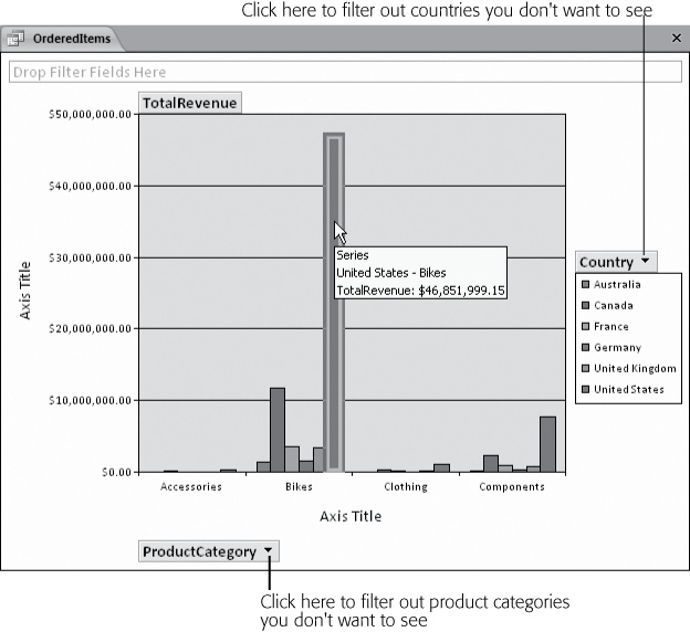
Figure 9-21. This pivot chart shows a pivot table thatâs been ...
Get Access 2010: The Missing Manual now with the O’Reilly learning platform.
O’Reilly members experience books, live events, courses curated by job role, and more from O’Reilly and nearly 200 top publishers.

