Create a Simple Bar Graph on a Report
Problem
You need to create a simple bar graph on a report. Microsoft Graph or the Office Web Components would probably work, but you’re hoping for a simpler native Access solution. You need a bar for each row showing the relative score for each student. Can’t you do this with the standard Access controls?
Solution
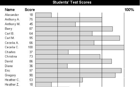
You can place a rectangle control in the detail section of your report and set its width during the Format event that occurs as Access lays out each row of data. This solution shows how you can create a simple bar graph, setting the width of the rectangle control to be based on a numeric value in your data.
Open and run the report rptGraph in 03-06.MDB
(see Figure 3-12). This report shows a list of
students and their scores, along with a bar whose width represents
the value of the score.

Figure 3-12. The sample report, rptGraph
To create a bar graph like this one in your own applications, follow these steps:
Create your report, including the text data you’d like to show for each row. The sample report shows the Name and Score fields from tblScores, using controls named txtName and txtScore.
Add a rectangle control from the report toolbox and place it next to the data in the detail section. In the sample report, the rectangle’s control name is rctBar. The control’s width isn’t important, because you’ll be adjusting that programmatically ...
Get Access Cookbook now with the O’Reilly learning platform.
O’Reilly members experience books, live events, courses curated by job role, and more from O’Reilly and nearly 200 top publishers.

