Chapter 19. Using the Flex Charting Controls
The Flex Charting controls allow to you to represent numeric and statistical data visually in a graphical, interactive format. When presented in its raw form, numeric data can be difficult for users to interpret and grasp. When presented visually, in the form of pie charts, bar charts, and other graphical patterns, the data can be understood much more easily.
Consider the following visual presentations. The application in Figure 19.1 uses the following raw data, stored in an XML file:
<?xml version="1.0"?>
<data>
    <row>
    <fruit>Apples</fruit>
    <sales>34</sales>
    </row>
    <row>
    <fruit>Oranges</fruit>
    <sales>23</sales>
    </row>
    <row>
    <fruit>Pears</fruit>
    <sales>45</sales>
    </row>
</data>
Figure 19.1 shows the data display in a DataGrid and a ColumnChart control. The DataGrid shows the data in its raw form, while the chart makes the data more understandable to the user.
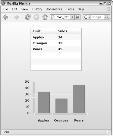
Figure 19.1. A data set displayed in a DataGrid and a ColumnChart
The data is clearly presented either way, but the graphical chart lets the user understand its meaning on a more intuitive level. Applications that make extensive use of charting controls are sometimes known as dashboard applications because, like a car's dashboard, they give the user a sense of the data with a quick glance.
Note
The Flex Charting controls are included in the Flex Data Visualization components package and are ...
Get Adobe® Flex® 3 Bible now with the O’Reilly learning platform.
O’Reilly members experience books, live events, courses curated by job role, and more from O’Reilly and nearly 200 top publishers.

