Chapter 4. Correlation and Regression
Have you heard that ice cream consumption is linked to shark attacks? Apparently Jaws has a lethal appetite for mint chocolate chip. Figure 4-1 visualizes this proposed relationship.

Figure 4-1. The proposed relationship between ice cream consumption and shark attacks
“Not so,” you may retort. “This does not necessarily mean that shark attacks are triggered by ice cream consumption.”
“It could be,” you reason, “that as the outside temperature increases, more ice cream is consumed. People also spend more time near the ocean when the weather is warm, and that coincidence leads to more shark attacks.”
“Correlation Does Not Imply Causation”
You’ve likely heard repeatedly that “correlation does not imply causation.”
In Chapter 3, you learned that causation is a fraught expression in statistics. We really only reject the null hypothesis because we simply don’t have all the data to claim causality for sure. That semantic difference aside, does correlation have anything to do with causation? The standard expression somewhat oversimplifies their relationship; you’ll see why in this chapter using the tools of inferential statistics you picked up earlier.
This will be our final chapter conducted primarily in Excel. After that, you will have sufficiently grasped the framework of analytics to be ready to be move into R and Python.
Introducing Correlation
So far, we’ve mostly been analyzing statistics one variable at a time: we’ve found the average reading score or the variance in housing prices, for example. This is known as univariate analysis.
We’ve also done a bit of bivariate analysis. For example, we compared the frequencies of two categorical variables using a two-way frequency table. We also analyzed a continuous variable when grouped by multiple levels of a categorical variable, finding descriptive statistics for each group.
We will now calculate a bivariate measure of two continuous variables using correlation. More specifically, we will use the Pearson correlation coefficient to measure the strength of the linear relationship between two variables. Without a linear relationship, the Pearson correlation is unsuitable.
So, how do we know our data is linear? There are more rigorous ways to check, but, as usual, a visualization is a great start. In particular, we will use a scatterplot to depict all observations based on their x and y coordinates.
If it appears a line could be drawn through the scatterplot that summarizes the overall pattern, then it’s a linear relationship and the Pearson correlation can be used. If you would need a curve or some other shape to summarize the pattern, then the opposite holds. Figure 4-2 depicts one linear and two nonlinear relationships.

Figure 4-2. Linear versus nonlinear relationships
In particular, Figure 4-2 gives an example of a positive linear relationship: as values on the x-axis increase, so do the values on the y-axis (at a linear rate).
It’s also possible to have a negative correlation, where a negative line summarizes the relationship, or no correlation at all, in which a flat line summarizes it. These different types of linear relationships are shown in Figure 4-3. Remember, these all must be linear relationships for correlation to apply.

Figure 4-3. Negative, zero, and positive correlations
Once we’ve established that the data is linear, we can find the correlation coefficient. It always takes a value between –1 and 1, with –1 indicating a perfect negative linear relationship, 1 a perfect positive linear relationship, and 0 no linear relationship at all. Table 4-1 shows some rules of thumb for evaluating the strength of a correlation coefficient. These are not official standards by any means, but a useful jumping-off point for interpretation.
| Correlation coefficient | Interpretation |
|---|---|
–1.0 |
Perfect negative linear relationship |
–0.7 |
Strong negative relationship |
–0.5 |
Moderate negative relationship |
–0.3 |
Weak negative relationship |
0 |
No linear relationship |
+0.3 |
Weak positive relationship |
+0.5 |
Moderate positive relationship |
+0.7 |
Strong positive relationship |
+1.0 |
Perfect positive linear relationship |
With the basic conceptual framework for correlations in mind, let’s do some analysis in Excel. We will be using a vehicle mileage dataset; you can find mpg.xlsx in the mpg subfolder of the book repository’s datasets folder. This is a new dataset, so take some time to learn about it: what types of variables are we working with? Summarize and visualize them using the tools covered in Chapter 1. To help with subsequent analysis, don’t forget to add an index column and convert the dataset into a table, which I will call mpg.
Excel includes the CORREL() function to calculate the correlation
coefficient between two arrays:
CORREL(array1, array2)
Let’s use this function to find the correlation between weight and
mpg in our dataset:
=CORREL(mpg[weight], mpg[mpg])
This indeed returns a value between –1 and 1: –0.832. (Do you remember how to interpret this?)
A correlation matrix presents the correlations across all pairs of variables. Let’s build one using the Data Analysis ToolPak. From the ribbon, head to Data → Data Analysis → Correlation.
Remember that this is a measure of linear relationship between two continuous variables, so we should exclude categorical variables like origin and be judicious about including discrete variables like cylinders or model.year. The ToolPak insists on all variables being in a contiguous range, so I will cautiously include cylinders. Figure 4-4 shows what the ToolPak source menu should look like.
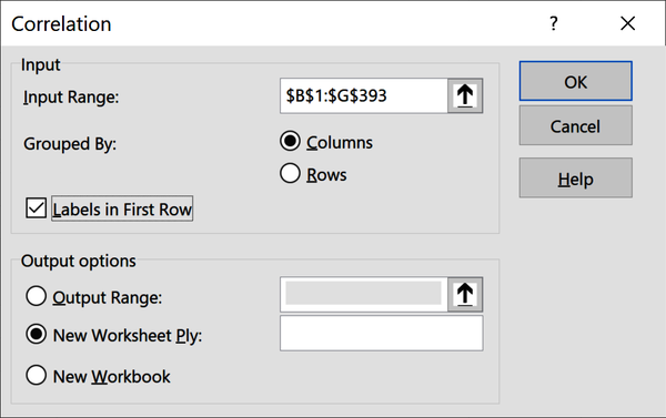
Figure 4-4. Inserting a correlation matrix in Excel
This results in a correlation matrix as shown in Figure 4-5.

Figure 4-5. Correlation matrix in Excel
We can see the –0.83 in cell B6: it’s the intersection of weight and
mpg. We would also see the same value in cell F2, but Excel left this half of the matrix blank, as it’s redundant information. All values along the diagonal are 1, as any variable
is perfectly correlated with itself.
Warning
The Pearson correlation coefficient is only a suitable measure when the relationship between the two variables is linear.
We’ve made a big leap in our assumptions about our variables by analyzing their correlations. Can you think of what that is? We assumed their relationship is linear. Let’s check that assumption with scatterplots. Unfortunately, there is no way in basic Excel to generate scatterplots of each pair of variables at once. For practice, consider plotting them all, but let’s try it with the weight and mpg variables. Highlight this data, then head to the ribbon and click Insert → Scatter.
I will add a custom chart title and relabel the axes to aid in interpretation. To change the chart title, double-click on it. To relabel the axes, click the perimeter of the chart and then select the plus sign that appears to expand the Chart Elements menu. (On Mac, click inside the chart and then Chart Design → Add Chart Element.) Select Axis Titles from the menu. Figure 4-6 shows the resulting scatterplot. It’s not a bad idea to include units of measurement on the axes to help outsiders make sense of the data.
Figure 4-6 looks basically like a negative linear relationship, with a greater spread given lower weights and higher mileages. By default, Excel plotted the first variable in our data selection along the x-axis and the
second along the y-axis. But why not the other way around? Try switching the order
of these columns in your worksheet so that weight is in column E and mpg in column F, then insert a new scatterplot.
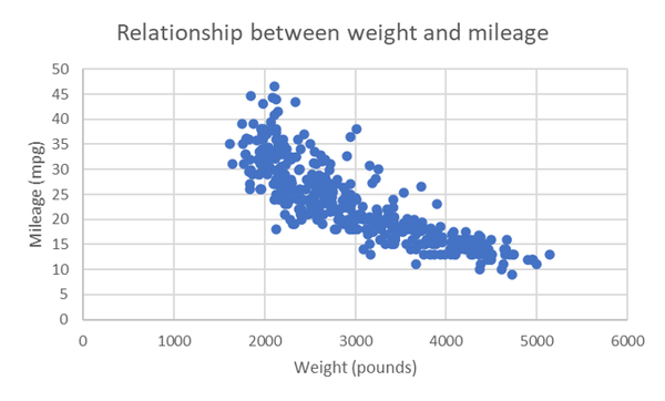
Figure 4-6. Scatterplot of weight and mileage
Figure 4-7 shows a mirror image of the relationship. Excel is a great tool, but as with any tool, you have to tell it what to do. Excel will calculate correlations regardless of whether the relationship is linear. It will also make you a scatterplot without concern for which variable should go on which axis.
So, which scatterplot is “right?” Does it matter? By convention, the independent variable goes on the x-axis, and dependent on the y-axis. Take a moment to consider which is which. If you’re not sure, remember that the independent variable is generally the one measured first.
Our independent variable is weight because it was determined by the design and building of the car. mpg is the dependent variable because we assume it’s affected by the car’s weight. This puts weight on the x-axis and mpg on the y-axis.
In business analytics, it is uncommon to have collected data just for the sake of statistical analysis; for example, the cars in our mpg dataset were built to generate revenue, not for a research study on the impact of weight on mileage. Because there are not always clear independent and dependent variables, we need to be all the more aware of what these variables are measuring, and how they are measured. This is why having some knowledge of the domain you are studying, or at least descriptions of your variables and how your observations were collected, is so valuable.
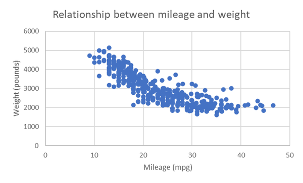
Figure 4-7. Scatterplot of mileage and weight
From Correlation to Regression
Though it’s conventional to place the independent variable on the x-axis, it makes no difference to the related correlation coefficient. However, there is a big caveat here, and it relates to the earlier idea of using a line to summarize the relationship found by the scatterplot. This practice begins to diverge from correlation, and it’s one you may have heard of: linear regression.
Correlation is agnostic to which variable you call independent and which you call dependent; that doesn’t factor into its definition as “the extent to which two variables move together linearly.”
On the other hand, linear regression is inherently affected by this relationship as “the estimated impact of a unit change of the independent variable X on the dependent variable Y.”
You are going to see that the line we fit through our scatterplot can be expressed as an equation; unlike the correlation coefficient, this equation depends on how we define our independent and dependent variables.
Like correlation, linear regression assumes that a linear relationship exists between the two variables. Other assumptions do exist and are important to consider when modeling data. For example, we do not want to have extreme observations that may disproportionately affect the overall trend of the linear relationship.
For the purposes of our demonstration, we will overlook this and other assumptions for now. These assumptions are often difficult to test using Excel; your knowledge of statistical programming will serve you well when looking into the deeper points of linear regression.
Take a deep breath; it’s time for another equation:
Equation 4-1. The equation for linear regression
The goal of Equation 4-1 is to predict our dependent variable Y. That’s the left side. You may remember from school that a line can be broken into its intercept and slope. That’s where and , respectively, come in. In the second term, we multiply our independent variable by a slope coefficient.
Finally, there will be a part of the relationship between our independent and dependent variable that can be explained not by the model per se but by some external influence. This is known as the model’s error and is indicated by .
Earlier we used the independent samples t-test to examine a significant difference in means between two groups. Here, we are measuring the linear influence of one continuous variable on another. We will do this by examining whether the slope of the fit regression line is statistically different than zero. That means our hypothesis test will work something like this:
H0: There is no linear influence of our independent variable on our dependent variable. (The slope of the regression line equals zero.)
Ha: There is a linear influence of our independent variable on our dependent variable. (The slope of the regression line does not equal zero.)
Figure 4-8 shows some examples of what significant and insignificant slopes might look like.
Remember, we don’t have all the data, so we don’t know what the “true” slope would be for the population. Instead, we are inferring whether, given our sample, this slope would be statistically different from zero. We can use the same p-value methodology to estimate the slope’s significance that we did to find the difference in means of two groups. We will continue to conduct two-tailed tests at the 95% confidence interval. Let’s jump into finding the results using Excel.
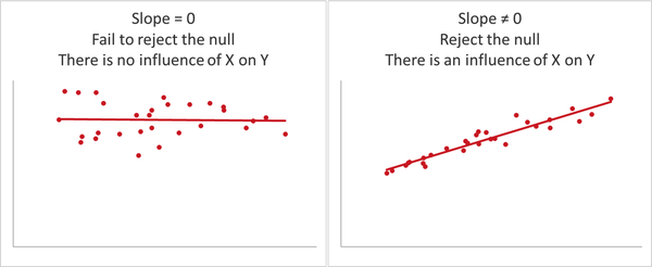
Figure 4-8. Regression models with significant and insignificant slopes
Linear Regression in Excel
In this demo of linear regression on the mpg dataset in Excel, we test whether a car’s weight (weight) has a significant influence on its mileage (mpg). That means our hypotheses will be:
H0: There is no linear influence of weight on mileage.
Ha: There is a linear influence of weight on mileage.
Before getting started, it’s a good idea to write out the regression equation using the specific variables of interest, which I’ve done in Equation 4-2:
Equation 4-2. Our regression equation for estimating mileage
Let’s start with visualizing the results of the regression: we already have the scatterplot from Figure 4-6, now it’s just a matter of overlaying or “fitting” the regression line onto it. Click on the perimeter of the plot to launch the “Chart Elements” menu. Click on “Trendline,” then “More Options” to the side. Click the radio button at the bottom of the “Format Trendline” screen reading “Display Equation on chart.”
Now let’s click on the resulting equation on the graph to add bold formatting and increase its font size to 14. We’ll make the trendline solid black and give it a 2.5-point width by clicking on it in the graph, then going to the paint bucket icon at the top of the Format Trendline menu. We now have the making of linear regression. Our scatterplot with trendline looks like Figure 4-9. Excel also includes the regression equation we are looking for from Equation 4-2 to estimate a car’s mileage based on its weight.
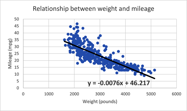
Figure 4-9. Scatterplot with trendline and regression equation for the effect of weight on mileage
We can place the intercept before the slope in our equation to get Equation 4-3.
Equation 4-3. Equation 4-3. Our fit regression equation for estimating mileage
Notice that Excel does not include the error term as part of the regression equation. Now that we’ve fit the regression line, we’ve quantified the difference between what values we expect from the equation and what values are found in the data. This difference is known as the residual, and we’ll come back to it later in this chapter. First, we’ll get back to what we set out to do: establish statistical significance.
It’s great that Excel fit the line for us and gave us the resulting equation. But this does not give us enough information to conduct the hypothesis test: we still don’t know whether the line’s slope is statistically different than zero. To get this information, we will again use the Analysis ToolPak. From the ribbon, go to Data → Data Analysis → Regression. You’ll be asked to select your Y and X ranges; these are your dependent and independent variables, respectively. Make sure to indicate that your inputs include labels, as shown in Figure 4-10.
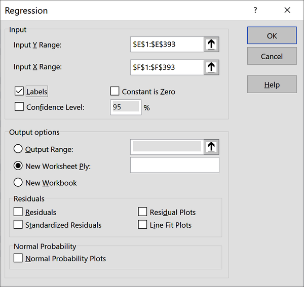
Figure 4-10. Menu settings for deriving a regression with the ToolPak
This results in quite a lot of information, which is shown in Figure 4-11. Let’s step through it.
Ignore the first section in cells A3:B8 for now; we will return to it later. Our second section in A10:F14 is labeled ANOVA (short for analysis of variance).
This tells us whether our regression performs significantly better with the coefficient of the slope included versus one with just the intercept.
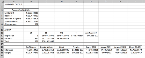
Figure 4-11. Regression output
Table 4-2 spells out what the competing equations are here.
| Incercept-only model | Model with coefficients |
|---|---|
mpg = 46.217 |
mpg = 46.217 − 0.0076 × weight |
A statistically significant result indicates that our coefficients do
improve the model. We can determine the results of the test from the p-value found in cell F12
of Figure 4-11. Remember, this is scientific notation, so read the p-value as 6.01 times 10 to the power of –102: much smaller than 0.05. We can conclude that weight is
worth keeping as a coefficient in the regression model.
That brings us to the third section in cells A16:I18; here is where we find what we were
originally looking for. This range contains a lot of information, so
let’s go column by column starting with the coefficients in cells B17:B18. These should look familiar as the intercept and slope of the line that were given in Equation 4-3.
Next, the standard error in C17:C18. We talked about this in Chapter 3: it’s a measure of variability across repeated samples and in this case can be thought of as a measure of our coefficients’ precision.
We then have what Excel calls the “t Stat,” otherwise known as the t-statistic or test statistic, in D17:D18; this can be derived by dividing the coefficient
by the standard error. We can compare it to our critical value of 1.96 to establish statistical significance at 95% confidence.
It’s more common, however, to interpret and report on the p-value, which gives the same information. We have two p-values to interpret. First, the intercept’s coefficient in E17. This tells us
whether the intercept is significantly different than zero. The
significance of the intercept is not part of our hypothesis test, so this information is irrelevant. (This is another good example of why we can’t always take Excel’s output at face value.)
Warning
While most statistical packages (including Excel) report the p-value of the intercept, it’s usually not relevant information.
Instead, we want the p-value of weight in cell E18: this is related to the line’s slope. The p-value is well under 0.05, so we reject the null and conclude that weight does likely
influence mileage. In other words, the line’s slope is significantly different than zero. Just like with our earlier hypothesis tests, we will shy away from concluding that we’ve “proven” a relationship, or that more weight causes lower mileage. Again, we are making inferences about a population based on a sample, so uncertainty is inherent.
The output also gives us the 95% confidence interval for our intercept
and slope in cells F17:I18. By default, this is stated twice: had we asked for a
different confidence interval in the input menu, we’d have received both here.
Now that you’re getting the hang of interpreting the regression output, let’s try making a point estimate based on the equation line: what would we expect the mileage to be for a car weighing 3,021 pounds? Let’s plug it into our regression equation in Equation 4-4:
Equation 4-4. Equation 4-4. Making a point estimate based on our equation
Based on Equation 4-4, we expect a car weighing 3,021
pounds to get 23.26 miles per gallon. Take a look at the source dataset: there is an observation weighing
3,021 pounds (Ford Maverick, row 101 in the dataset) and it gets 18 miles per gallon, not 23.26. What
gives?
This discrepancy is the residual that was mentioned earlier: it’s the difference between the values we estimated in the regression equation and those that are found in the actual data. I’ve included this and some other observations in Figure 4-12. The scatterpoints represent what values are actually found in the dataset, and the line represents what values we predicted with the regression.
It stands to reason that we’d be motivated to minimize the difference between these values. Excel and most regression applications use ordinary least squares (OLS) to do this. Our goal in OLS is to minimize residuals, specifically, the sum of squared residuals, so that both negative and positive residuals are measured equally. The lower the sum of squared residuals, the less of a difference there is between our actual and expected values, and the better our regression equation is at making estimates.
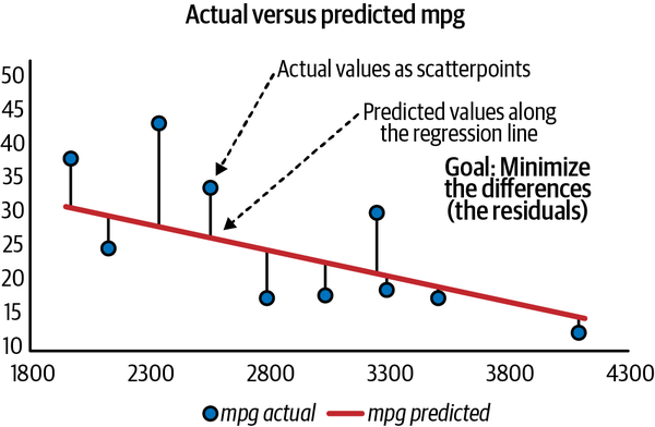
Figure 4-12. Residuals as the differences between actual and predicted values
We learned from the p-value of our slope that there is a significant relationship between independent and dependent variables. But this does not tell us how much of the variability in our dependent variable is explained by our independent variable.
Remember that variability is at the heart of what we study as analysts; variables vary, and we want to study why they vary. Experiments let us do that, by understanding the relationship between an independent and dependent variable. But we won’t be able to explain everything about our dependent variable with our independent variable. There will always be some unexplained error.
R-squared, or the coefficient of determination (which Excel refers to as R-square), expresses as a percentage how much variability in the dependent variable is explained by our regression model. For example, an R-squared of 0.4 indicates that 40% of variability in Y can be explained by the model. This means that 1 minus R-squared is what variability can’t be explained by the model. If R-squared is 0.4, then 60% of Y’s variability is unaccounted for.
Excel calculates R-squared for us in the first box of regression output; take a look back to cell B5 in Figure 4-11. The square root of R-squared is multiple R, which is also seen in cell B4 of the output. Adjusted R-square (cell B6) is used as a more conservative estimate of R-squared for a model with multiple independent variables. This measure is of interest when conducting multiple linear regression, which is beyond the scope of this book.
There are other ways than R-squared to measure the
performance of regression: Excel includes one of them, the standard
error of the regression, in its output (cell B7 in Figure 4-11). This measure tells us the average distance that observed values deviate from the regression line. Some analysts prefer this or other measures to R-squared for evaluating regression models, although R-squared remains a dominant choice. Regardless of preferences, the best evaluation often comes from evaluating multiple figures in their proper context, so there’s no need to swear by or swear off any one measure.
Congratulations: you conducted and interpreted a complete regression analysis.
Rethinking Our Results: Spurious Relationships
Based on their temporal ordering and our own logic, it’s nearly absolute in our mileage example that weight should be the independent variable and mpg the dependent. But what happens if we fit the regression line with these variables reversed? Go ahead and give it a try using the ToolPak. The resulting regression equation is shown in Equation 4-5.
Equation 4-5. Equation 4-5. A regression equation to estimate weight based on mileage
We can flip our independent and dependent variables and get the same correlation coefficient. But when we change them for regression, our coefficients change.
Were we to find out that mpg and weight were both influenced simultaneously by some outside variable, then neither of these models would be correct. And this is the same scenario that we’re faced with in ice cream consumption and shark attacks. It’s silly to say that ice cream consumption has any influence on shark attacks, because both of these are influenced by temperature, as Figure 4-13 depicts.
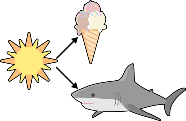
Figure 4-13. Ice cream consumption and shark attacks: a spurious relationship
This is called a spurious relationship. It’s frequently found in data, and it may not be as obvious as this example. Having some domain knowledge of the data you are studying can be invaluable for detecting spurious relationships.
Warning
Variables can be correlated; there could even be evidence of a causal relationship. But the relationship might be driven by some variable you’ve not even accounted for.
Conclusion
Remember this old phrase?
Correlation doesn’t imply causation.
Analytics is highly incremental: we usually layer one concept on top of the next to build increasingly complex analyses. For example, we’ll always start with descriptive statistics of the sample before attemping to infer parameters of the population. While correlation may not imply causation, causation is built on the foundations of correlation. That means a better way to summarize the relationship might be:
Correlation is a necessary but not sufficient condition for causation.
We’ve just scratched the surface of inferential statistics in this and previous chapters. A whole world of tests exists, but all of them use the same framework of hypothesis testing that we’ve used here. Get this process down, and you’ll be able to test for all sorts of different data relationships.
Advancing into Programming
I hope you’ve seen and agree that Excel is a fantastic tool for learning statistics and analytics. You got a hands-on look at the statistical principles that power much of this work, and learned how to explore and test for relationships in real datasets.
That said, Excel can have diminishing returns when it comes to more advanced analytics. For example, we’ve been checking for properties like normality and linearity using visualizations; this is a good start, but there are more robust ways to test them (often, in fact, using statistical inference). These techniques often rely on matrix algebra and other computationally intensive operations that can be tedious to derive in Excel. While add-ins are available to make up for these shortcomings, they can be expensive and lack particular features. On the other hand, as open source tools R and Python are free, and include many app-like features called packages that serve nearly any use case. This environment will allow you to focus on the conceptual analysis of your data rather than raw computation, but you will need to learn how to program. These tools, and the analytics toolkit in general, will be the focus of Chapter 5.
Exercises
Practice your correlation and regression chops by analyzing the ais dataset found in the book repository’s datasets folder. This dataset includes height, weight, and blood readings from male and female Australian athletes of different sports.
With the dataset, try the following:
-
Produce a correlation matrix of the relevant variables in this dataset.
-
Visualize the relationship of ht and wt. Is this a linear relationship? If so, it is negative or positive?
-
Of ht and wt, which do you presume is the independent and dependent variable?
-
Is there a significant influence of the independent variable on the dependent variable?
-
What is the slope of your fit regression line?
-
What percentage of the variance in the dependent variable is explained by the independent variable?
-
-
This dataset contains a variable for body mass index, bmi. If you are not familiar with this metric, take a moment to research how it’s calculated. Knowing this, would you want to analyze the relationship between ht and bmi? Don’t hesitate to lean on common sense here rather than just statistical reasoning.
Get Advancing into Analytics now with the O’Reilly learning platform.
O’Reilly members experience books, live events, courses curated by job role, and more from O’Reilly and nearly 200 top publishers.

