Chapter 1. Foundations of Exploratory Data Analysis
“You never know what is gonna come through that door,” Rick Harrison says in the opening of the hit show Pawn Stars. It’s the same in analytics: confronted with a new dataset, you never know what you are going to find. This chapter is about exploring and describing a dataset so that we know what questions to ask of it. The process is referred to as exploratory data analysis, or EDA.
What Is Exploratory Data Analysis?
American mathematician John Tukey promoted the use of EDA in his book, Exploratory Data Analysis (Pearson). Tukey emphasized that analysts need first to explore the data for potential research questions before jumping into confirming the answers with hypothesis testing and inferential statistics.
EDA is often likened to “interviewing” the data; it’s a time for the analyst to get to know it and learn about what interesting things it has to say. As part of our interview, we’ll want to do the following:
-
Classify our variables as continuous, categorical, and so forth
-
Summarize our variables using descriptive statistics
-
Visualize our variables using charts
EDA gives us a lot to do. Let’s walk through the process using Excel and a real-life dataset. You can find the data in the star.xlsx workbook, which can be found in the datasets folder of this book’s repository, under the star subfolder. This dataset was collected for a study to examine the impact of class size on test scores. For this and other Excel-based demos, I suggest you complete the following steps with the raw data:
-
Make a copy of the file so that the original dataset is unchanged. We’ll later be importing some of these Excel files into R or Python, so any changes to the datasets will impact that process.
-
Add an index column called id. This will number each row of the dataset so that the first row has an ID of 1, the second of 2, and so forth. This can be done quickly in Excel by entering numbers into the first few rows of the column, then highlighting that range and using Flash Fill to complete the selection based on that pattern. Look for the small square on the bottom right-hand side of your active cell, hover over it until you see a small plus sign, then fill out the rest of your range. Adding this index column will make it easier to analyze data by group.
-
Finally, convert your resulting dataset into a table by selecting any cell in the range, then going to the ribbon and clicking on Insert → Table. The keyboard shortcut is Ctrl + T for Windows, Cmd + T for Mac. If your table has headers, make sure the “My table has headers” selection is turned on. Tables carry quite a few benefits, not the least of which is their aesthetic appeal. It’s also possible to refer to columns by name in table operations.
You can give the table a specific name by clicking anywhere inside it, then going to the ribbon and clicking Table Design → Table Name under the Properties group, as shown in Figure 1-1.
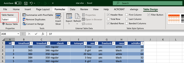
Figure 1-1. The Table Name box
Doing these first few analysis tasks will be good practice for other datasets you want to work with in Excel. For the star dataset, your completed table should look like Figure 1-2. I’ve named my table star. This dataset is arranged in a rectangular shape of columns and rows.
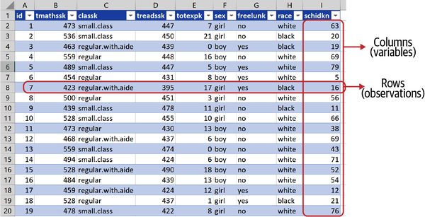
Figure 1-2. The star dataset, arranged in rows and columns
You’ve probably worked with enough data to know that this is a desirable shape for analysis. Sometimes, we need to clean up our data to get it to the state we want; I will discuss some of these data-cleaning operations later in the book. But for now, let’s count our blessings and learn about our data and about EDA.
In analytics, we often refer to observations and variables rather than rows and columns. Let’s explore the significance of these terms.
Observations
In this dataset we have 5,748 rows: each is a unique observation. In this case, measurements are taken at the student level; observations could be anything from individual citizens to entire nations.
Variables
Each column offers a distinct piece of information about our observations. For example, in the star dataset we can find each student’s reading score (treadssk) and which class type the student was in (classk). We’ll refer to these columns as variables. Table 1-1 describes what each column in star is measuring:
| Column | Description |
|---|---|
id |
Unique identifier/index column |
tmathssk |
Total math scaled score |
treadssk |
Total reading scaled score |
classk |
Type of class |
totexpk |
Teacher’s total years of experience |
sex |
Sex |
freelunk |
Qualified for free lunch? |
race |
Race |
schidkn |
School indicator |
Ready for a tautology? We call them variables because their values may vary across observations. If every observation we recorded returned the same measurements, there wouldn’t be much to analyze. Each variable can provide quite different information about our observations. Even in this relatively small dataset, we have text, numbers, and yes/no statements all as variables. Some datasets can have dozens or even hundreds of variables.
It can help to classify these variable types, as these distinctions will be important when we continue our analysis. Keep in mind that these distinctions are somewhat arbitrary and may change based on the purpose and circumstances of our analysis. You will see that EDA, and analytics in general, is highly iterative.
Note
Classifying variables is somewhat arbitrary and, like much of analytics, built on rules of thumb rather than hard-and-fast-criteria.
I will discuss the different variable types as shown in Figure 1-3, then classify the star dataset based on these distinctions.
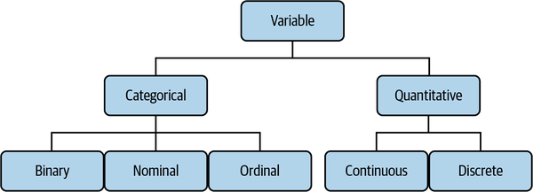
Figure 1-3. Types of variables
There are further types of variables that could be covered here: for example, we won’t consider the difference between interval and ratio data. For a closer look at variable types, check out Sarah Boslaugh’s Statistics in a Nutshell, 2nd edition (O’Reilly). Let’s work our way down Figure 1-3, moving from left to right.
Categorical variables
Sometimes referred to as qualitative variables, these describe a quality or characteristic of an observation. A typical question answered by categorical variables is “Which kind?” Categorical variables are often represented by nonnumeric values, although this is not always the case.
An example of a categorical variable is country of origin. Like any variable, it could take on different values (United States, Finland, and so forth), but we aren’t able to make quantitative comparisons between them (what is two times Indonesia, anyone?). Any unique value that a categorical variable takes is known as a level of that variable. Three levels of a country of origin could be US, Finland, or Indonesia, for example.
Because categorical variables describe a quality of an observation rather than a quantity, many quantitative operations on this data aren’t applicable. For example, we can’t calculate the average country of origin, but we could calculate the most common, or the overall frequency count of each level.
We can further distinguish categorical values based on how many levels they can take, and whether the rank-ordering of those levels is meaningful.
Binary variables can only take two levels. Often, these variables are stated as yes/no responses, although this is not always the case. Some examples of binary variables:
-
Married? (yes or no)
-
Made purchase? (yes or no)
-
Wine type? (red or white)
In the case of wine type, we are implicitly assuming that our data of interest only consists of red or white wine…but what happens if we also want to analyze rosé? In that case, we can no longer include all three levels and analyze the data as binary.
Any qualitiative variable with more than two levels is a nominal variable. Some examples include:
-
Country of origin (US, Finland, Indonesia, and so forth)
-
Favorite color (orange, blue, burnt sienna, and so forth)
-
Wine type (red, white, rosé)
Note that something like an ID number is a categorical variable stated numerically: while we could take an average ID number, this figure is meaningless. Importantly, there is no intrinsic ordering of nominal variables. For example, red as a color can’t inherently be ordered higher or lower than blue. Since intrinsic ordering isn’t necessarily clear, let’s look at some examples of its use.
Ordinal variables take more than two levels, where there is an intrinsic ordering between these levels. Some examples of ordinal variables:
-
Beverage size (small, medium, large)
-
Class (freshman, sophomore, junior, senior)
-
Weekdays (Monday, Tuesday, Wednesday, Thursday, Friday)
Here, we can inherently order levels: senior is higher than freshman, whereas we can’t say the same about red versus blue. While we can rank these levels, we can’t necessarily quantify the distance between them. For example, the difference in size between a small and medium beverage may not be the same as that between a medium and large beverage.
Quantitative variables
These variables describe a measurable quantity of an observation. A typical question answered by quantitative variables is “How much?” or “How many?” Quantitative variables are nearly always represented by numbers. We can further distinguish between quantitative variables based on the number of values they can take.
Observations of a continuous variable can in theory take an infinite number of values between any two other values. This sounds complicated, but continuous variables are quite common in the natural world. Some examples:
-
Height (within a range of 59 and 75 inches, an observation could be 59.1, 74.99, or any other value in between)
-
pH level
-
Surface area
Because we can make quantitative comparisons across observations of continuous variables, a fuller range of analyses apply to them. For example, it makes sense to take the average of continuous variables, whereas with categorical ones, it doesn’t. Later in this chapter, you’ll learn how to analyze continuous variables by finding their descriptive statistics in Excel.
On the other hand, observations of a discrete variable can take only a fixed number of countable values between any two values. Discrete variables are quite common in the social sciences and business. Some examples include:
-
Number of individuals in a household (within a range of 1 and 10, an observation could be 2 or 5, but not 4.3)
-
Units sold
-
Number of trees in a forest
Often, when we are dealing with discrete variables with many levels, or many observations, we treat them as continuous for the fuller range of statistical analysis that affords. For example, you may have heard that the average US household has 1.93 children. We know that no family actually has such a number of children. After all, this is a discrete variable that comes in whole numbers. However, across many observations this claim can be a helpful representation of how many children are to be expected in a typical household.
But wait, there’s more! In more advanced analytics, we will also often recalculate and blend variables: for example, we may take a logarithmic transformation of one variable so that it meets the assumptions of a given analysis, or we may extract the meaning of many variables into fewer using a method called dimensionality reduction. These techniques are beyond the scope of this book.
Demonstration: Classifying Variables
Using what you’ve learned so far, classify the star variables using the types covered in Figure 1-3. As you think through it, don’t hesitate to investigate the data. I’ll give you an easy way to do so here, and we’ll walk through a more thorough process later in this chapter.
One quick way to get a sense of what type variables may be is by finding the number of unique values they take. This can be done in Excel by checking the filter preview. I’ve clicked on the drop-down arrow next to the sex variable in Figure 1-4 and found it takes only two distinct values. What kind of variable do you think this might be? Take a moment to walk through the variables using this or other methods.
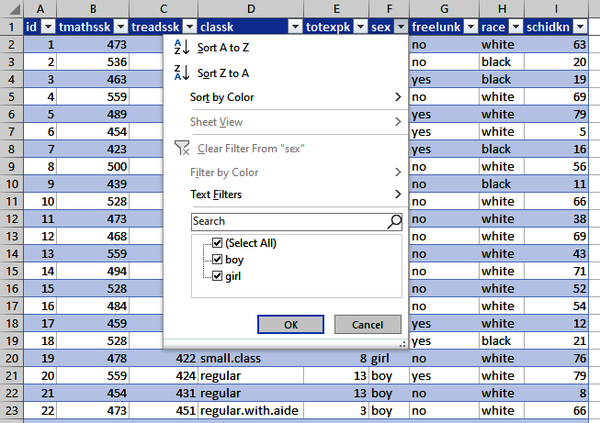
Figure 1-4. Using the filter preview to find how many distinct values a variable takes
Table 1-2 shows how I decided to classify these variables.
| Variable | Description | Categorical or quantitative? | Type? |
|---|---|---|---|
id |
Index column |
Categorical |
Nominal |
tmathssk |
Total math scaled score |
Quantitative |
Continuous |
treadssk |
Total reading scaled score |
Quantitative |
Continuous |
classk |
Type of class |
Categorical |
Nominal |
totexpk |
Teacher’s total years of experience |
Quantitative |
Discrete |
sex |
Sex |
Categorical |
Binary |
freelunk |
Qualified for free lunch? |
Categorical |
Binary |
race |
Race |
Categorical |
Nominal |
schidkn |
School indicator |
Categorical |
Nominal |
Some of these variables, like classk and freelunk were easier to categorize. Others, like schidkn and id, were not so obvious: they are stated in numeric terms, but cannot be quantitatively compared.
Warning
Just because data is stated numerically doesn’t mean it can be used as a quantitative variable.
You’ll see that only three of these are quantitative: tmathssk, treadssk, and totexpk. I decided to classify the first two as continuous, and the last as discrete. To understand why, let’s start with totexpk, the number of years of the teacher’s experience. All of these observations are expressed in whole numbers, ranging from 0 to 27. Because this variable can only take on a fixed number of countable values, I classified it as discrete.
But what about tmathssk and treadssk, the test scores? These are also expressed in whole numbers: that is, a student can’t receive a reading score of 528.5, only 528 or 529. In this respect, they are discrete. However, because these scores can take on so many unique values, in practice it makes sense to classify them as continuous.
It may surprise you to see that for such a rigorous field as analytics, there are very few hard-and-fast rules.
Recap: Variable Types
Know the rules well, so you can break them effectively.
Dalai Lama XIV
The way we classify a variable influences how we treat it in our analysis—for example, we can calculate the mean of continous variables, but not nominal variables. At the same time, we often bend the rules for expediency—for example, taking the average of a discrete variable, so that a family has 1.93 children on average.
As we progress in our analysis, we may decide to twist more rules, reclassify variables, or build new variables entirely. Remember, EDA is an iterative process.
Exploring Variables in Excel
Let’s continue exploring the star dataset with descriptive statistics and visualizations. We will be conducting this analysis in Excel, although you could follow these same steps in R or Python and get matching results. By the end of the book, you’ll be able to conduct EDA using all three methods.
We’ll start our variable exploration with the categorical variables of star.
Exploring Categorical Variables
Remember that we are measuring qualities and not quantities with categorical variables, so these won’t have a meaningful average, minimum, or maximum, for example. We can still conduct some analysis on this data, namely by counting frequencies. We can do this in Excel with PivotTables. Place your cursor anywhere in the star dataset and select Insert → PivotTable, as in Figure 1-5. Click OK.
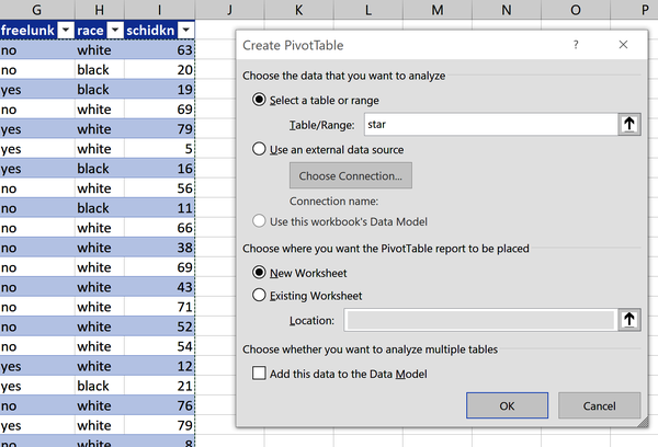
Figure 1-5. Inserting a PivotTable
I would like to find how many observations come from each class type. To do so, I will drag classk to the Rows area of the PivotTable, and id to the Values. By default, Excel will take the sum of the id field. It’s made the mistake of assuming a categorical variable to be quantitative. We cannot quantitatively compare ID numbers, but we can count their frequencies. To do this on Windows, click “Sum of id” in the Values area and select Value Field Settings. Under “Summarize value field by,” select “Count.” Click OK. For Mac, click the i icon next “Sum of id” to do this. Now we have what we want: the number of observations for each class type. This is known as a one-way frequency table and is shown in Figure 1-6.
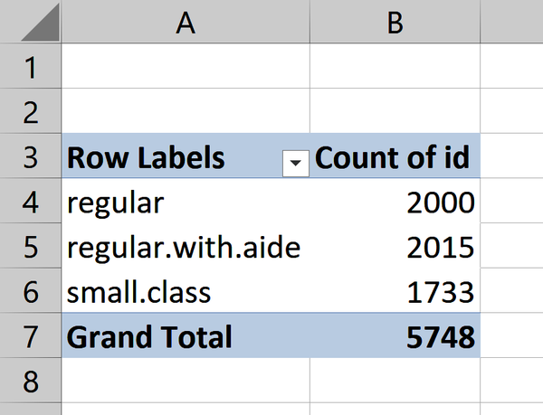
Figure 1-6. One-way frequency table of class type
Let’s break this frequency count into observations of students who were and were not on the free lunch program. To do this, place freelunk into the Columns area of the PivotTable. We now have a two-way frequency table, as in Figure 1-7.
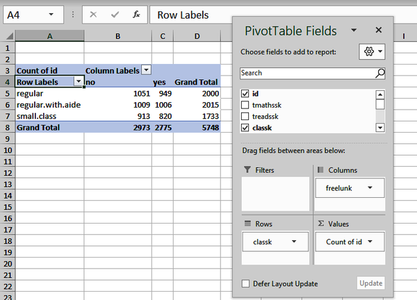
Figure 1-7. Two-way frequency table of class type by lunch program
Throughout this book, we’ll be creating visualizations as part of our analysis. With everything else we have to cover, we won’t spend too much time on the principles and techniques of data visualization. However, this field is well worth your study; for a helpful introduction, check out Claus O. Wilke’s Fundamentals of Data Visualization (O’Reilly).
We can visualize a one- or two-way frequency table with a bar chart (also known as a barplot or countplot). Let’s plot our two-way frequency table by clicking inside the PivotTable and clicking on Insert → Clustered Column. Figure 1-8 shows the result. I will add a title to the chart by clicking around its perimeter, then on the plus sign icon that appears on the upper right. Under the Chart Elements menu that appears, check on the selection for Chart Title. To find this menu on Mac, click on the chart and from the ribbon go to Design → Add Chart Element. I’ll be adding charts this way several more times in the book.
Notice that the countplot and table have each split the number of observations by class type into students who are and are not on the free lunch program. For example, 1,051 and 949 indicate the first and second labels and bars on the table and countplot, respectively.
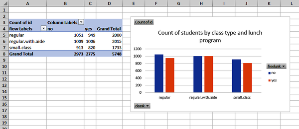
Figure 1-8. Two-way frequency table visualized as countplot
Even for analysis as simple as a two-way frequency table, it’s not a bad idea to visualize the results. Humans can process lines and bars on a chart far more easily than they can numbers in a table, so as our analysis grows in complexity, we should continue to plot the results.
We can’t make quantitative comparisons about categorical data, so any analysis we perform on them will be based on their counts. This may seem unexciting, but it’s still important: it tells us what levels of values are most common, and we may want to compare these levels by other variables for further analysis. But for now, let’s explore quantitative variables.
Exploring Quantitative Variables
Here, we’ll run a fuller range of summary or descriptive statistics. Descriptive statistics allow you to summarize datasets using quantitative methods. Frequencies are one type of descriptive statistic; let’s walk through some others and how to calculate them in Excel.
Measures of central tendency are one set of descriptive statistics that express what value or values a typical observation takes. We will cover the three most common of these measures.
First, the mean or average. More specifically the arithmetic mean, this is calculated by adding all observations together and dividing that number by the total number of observations. Of all the statistical measures covered, you may be most familiar with this one, and it’s one we’ll continue to refer to.
Next, the median. This is the observation found in the middle of our dataset. To calculate the median, sort or rank the data from low to high, then count into the data from both sides to find the middle. If two values are found in the middle, take the average to find the median.
Finally, the mode: the most commonly occurring value. It is also helpful to sort the data to find the mode. A variable can have one, many, or no modes.
Excel has a rich suite of statistical functions, including some to calculate measures of central tendency, which are shown in Table 1-3.
| Statistic | Excel function |
|---|---|
Mean |
|
Median |
|
Mode |
|
MODE.MULT() is a new function in Excel that uses the power of dynamic
arrays to return multiple potential modes. If you do not have access
to this function, try MODE(). Using these functions, find the measures of central tendency for our
tmathssk scores. Figure 1-9 shows the results.
From this analysis, we see our three measures of central tendency have quite similar values, with a mean of 485.6, median of 484, and mode of 489. I’ve also decided to find out how often the mode occurs: 277 times.

Figure 1-9. Calculating measures of central tendency in Excel
With all of these measures of central tendency, which one is right to focus on? I’ll answer this with a brief case study. Imagine you are consulting at a nonprofit. You’ve been asked to look at donations and advise which measure of central tendency to track. The donations are shown in Table 1-4. Take a moment to calculate and decide.
$10 |
$10 |
$25 |
$40 |
$120 |
The mean seems like a conventional one to track, but is $41 really representative of our data? All individual donations but one were actually less than that; the $120 donation is inflating this number. This is one downside of the mean: extreme values can unduly influence it.
We wouldn’t have this problem if we used the median: $25 is perhaps a better representation of the “middle value” than $41. The problem with this measure is it does not account for the precise value of each observation: we are simply “counting down” into the middle of the variable, without taking stock of each observation’s relative magnitude.
That leaves us with the mode, which does offer useful information: the most common gift is $10. However, $10 is not all that representative of the donations as a whole. Moreover, as mentioned, a dataset can have multiple modes or none, so this is not a very stable measure.
Our answer to the nonprofit, then? It should track and evaluate them all. Each measure summarizes our data from a different perspective. As you will see in later chapters, however, it’s most common to focus on the mean when conducting more advanced statistical analysis.
Note
We will frequently analyze several statistics to get a fuller perspective about the same dataset. No one measure is necessarily better than others.
Now that we have established where the “center” of the variable is, we want to explore how “spread” those values are from the center. Several measures of variability exist; we’ll focus on the most common.
First, the range, or the difference between the maximum and minimum values. Though simple to derive, it is highly sensitive to observations: just one extreme value, and the range can be misleading about where most observations are actually found.
Next, the variance. This is a measure of how spread observations are from the mean. This is a bit more intensive to calculate than what we’ve covered thus far. Our steps will be:
-
Find the mean of our dataset.
-
Subtract the mean from each observation. This is the deviation.
-
Take the sum of the squares of all deviations.
-
Divide the sum of the squares by the number of observations.
That’s a lot to follow. For operations this involved, it can be helpful to use mathematical notation. I know it can take some getting used to and is intimidating at first, but consider the alternative of the previous list. Is that any more intelligible? Mathematical notation can provide a more precise way to express what to do. For example, we can cover all the steps needed to find the variance in Equation 1-1:
Equation 1-1. Formula for finding variance
is our variance. tells us that we need to subtract each observation from the average , and square it. tells us to sum those results. Finally, that result is divided by the number of observations .
I will use mathematical notation a few more times in this book, but only to the extent that it is a more efficient way to express and understand a given concept than writing down all the steps discursively. Try calculating the variance of the numbers in Table 1-5.
3 |
5 |
2 |
6 |
3 |
2 |
Because this statistic is comparatively more complex to derive, I will use Excel to manage the calculations. You’ll learn how to calculate the variance using Excel’s built-in functions in a moment. Figure 1-10 shows the results.
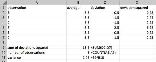
Figure 1-10. Calculating the variance in Excel
You can find these results in the variability worksheet of the accompanying workbook for this chapter, ch-1.xlsx.
You may be asking why we are working with the square of the deviations. To see why, take the sum of the unsquared deviations. It’s zero: these deviations cancel each other out.
The problem with the variance is that now we are working in terms of squared deviations of the original unit. This is not an intuitive way to analyze data. To correct for that, we’ll take the square root of the variance, known as the standard deviation. Variability is now expressed in terms of the original unit of measurement, the mean. Equation 1-2 shows the standard deviation expressed in mathematical notation.
Equation 1-2. Formula for finding standard deviation
Using this formula, the standard deviation of Figure 1-10 is 1.5 (the square root of 2.25). We can calculate these measures of variability in Excel using the functions in Table 1-6. Note that different functions are used for the sample versus population variance and standard deviation. The sample measure uses rather than in the denominator, resulting in a larger variance and standard deviation.
| Statistic | Excel function |
|---|---|
Range |
|
Variance (sample) |
|
Standard deviation (sample) |
|
Variance (population) |
|
Standard deviation (population) |
|
The distinction between the sample and population will be a key theme of later chapters. For now, if you’re not sure you have collected all the data that you’re interested in, use the sample functions. As you’re beginning to see, we have several descriptive statistics to look out for. We can expedite calculating them using Excel’s functions, but we can also use its Data Analysis ToolPak to derive a full suite of descriptive statistics with a few clicks.
Tip
Some statistical measures differ when calculated for a population or a sample. If you’re not sure which you’re working with, assume the sample.
This add-in comes installed with Excel, but you need to load it first. For Windows, from the ribbon select File → Options > Add-ins. Then click Go toward the bottom of the menu. Select Analysis ToolPak from the menu, then click OK. It is not necessary to select the Analysis ToolPak–VBA option. For Mac, from the menu bar you will select Data → Analysis Tools. Select Analysis ToolPak from the menu, then click OK. You may need to restart Excel to complete the configuration. After that, you will see a new Data Analysis button in the Data tab.
In Table 1-1, we determined that tmathssk and treadssk are continuous
variables. Let’s calculate their descriptive statistics using the
ToolPak. From the ribbon, select Data → Data Analysis →
Descriptive Statistics. A menu will appear; select the input range B1:C5749. Make sure to turn the checkboxes on for “Labels in First Row” and
“Summary statistics.” Your menu should look like Figure 1-11. You can leave the other settings as-is and click
OK.
This will insert descriptive statistics for these two variables into a new worksheet, as in Figure 1-12.
Now let’s look at finding descriptive statistics for each level of a categorical variable for the sake of comparison across groups. To do this, insert a new PivotTable based off the star data into a new worksheet. Place freelunk in the Columns area, id in the Rows, and Sum of treadssk in the Values section. Remember that the id field is a unique identifier, so we really shouldn’t sum this in the PivotTable, despite what it thinks.
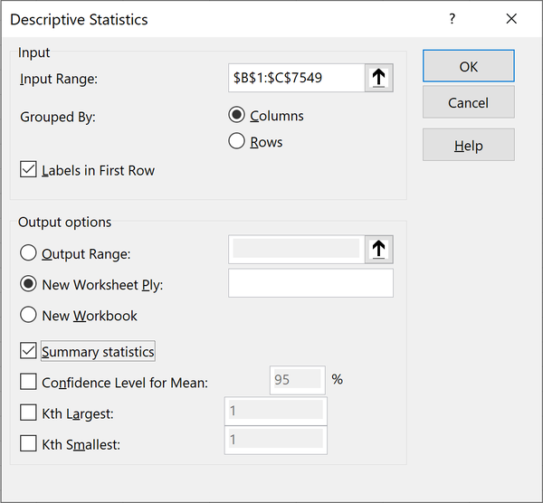
Figure 1-11. Deriving descriptive statistics with the Analysis ToolPak
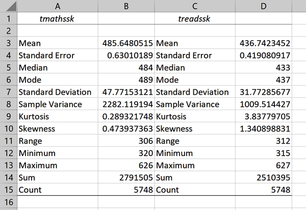
Figure 1-12. Descriptive statistics derived from the Analysis ToolPak
For this and any future PivotTable operations we’ll be conducting, it’s best to turn off all totals by clicking inside it and selecting Design → Grand Totals → Off for Rows and Columns. This way we don’t mistakenly include grand totals as part of the analysis. You can now use the ToolPak to insert descriptive statistics. Figure 1-13 shows the result.
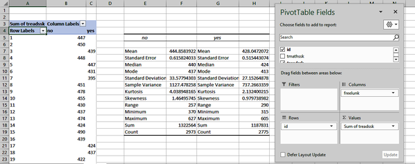
Figure 1-13. Calculating descriptive statistics by group
You know the majority of these measures already; this book will touch on the rest later. It may seem like all of the information presented by the ToolPak negates any need for visualizing the data. In fact, visualizations still play an indispensable role in EDA. In particular, we’ll use them to tell us about the distribution of observations across the entire range of values in a variable.
First, we’ll look at histograms. With these plots, we can visualize the relative frequency of observations by interval. To build a histogram of treadssk in Excel, select that range of data, then go to the ribbon and select Insert → Histogram. Figure 1-14 shows the result.
We can see from Figure 1-14 that the most frequently occurring interval is between 426.6 and 432.8, and there are approximately 650 observations falling in this range. None of our actual test scores include decimals, but our x-axis may include them depending on how Excel establishes the intervals, or bins. We can change the number of bins by right-clicking on the x-axis of the chart and selecting Format Axis. A menu will appear at the right. (These features are not available for Mac.)
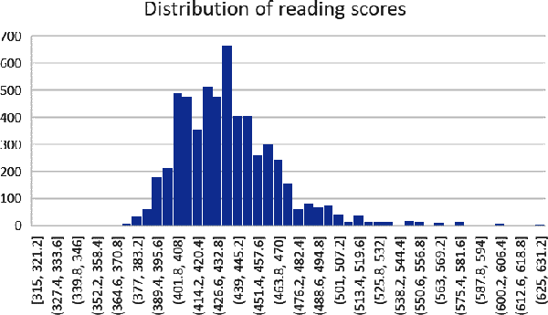
Figure 1-14. Distribution of reading scores
By default, Excel decided on 51 bins, but what if we (approximately) halved and doubled that number at 25 and 100, respectively? Adjust the numbers in the menu; Figure 1-15 shows the results. I like to think of this as “zooming in and out” on the details of the distribution.

Figure 1-15. Changing the number of histogram bins
With the distribution visualized as a histogram, we can quickly see that there are a sizable number of test scores to the extreme right of the distribution, but that most test scores are overwhelmingly in the 400–500 range.
What if we wanted to see how the distribution of reading scores varies across the three class sizes? Here, we are comparing a continuous variable across three levels of a categorical one. Setting this up with a histogram in Excel will take some “hacking,” but we can lean on PivotTables to get the job done.
Insert a new PivotTable based on the star dataset, then drag treadssk to the Rows area, classk to the Columns area, and “Count of id” to the Values area. Again, subsequent analysis will be easier if we remove totals from the PivotTable.
Now let’s create a chart from this data. Click anywhere in your PivotTable, and from the ribbon, select Insert → Clustered Column. The result, shown in Figure 1-16, is extremely hard to read, but compare it to the source PivotTable: it is telling us that for students with a score of 380, 10 had regular classes, 2 had regular classes with aides, and 2 had small classes.
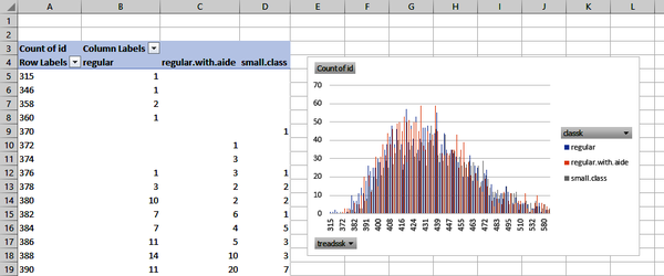
Figure 1-16. Starting a multigroup histogram
From here, it’s a matter of rolling these values up into larger intervals. To do this, right-click anywhere inside the values of your PivotTable’s first column and select Group. Excel will default this grouping to increments of 100; change it to 25.
A recognizable histogram is starting to emerge. Let’s reformat the chart to make it look even more like one. Right-click on any of the bars of the chart and select Format Data Series. You will turn Series Overlap to 75% and Gap Width to 0%. Figure 1-17 shows the result.
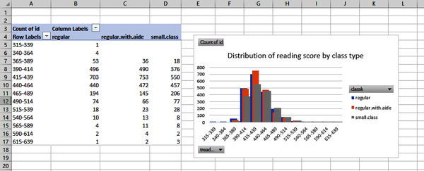
Figure 1-17. Creating a multigroup histogram with a PivotTable
We could set the gap widths to completely intersect, but then it becomes even harder to see the regular class size distribution. Histograms are a go-to visualization to see the distribution of a continuous variable, but they can quickly get cluttered.
As an alternative, let’s look at boxplots. Here, we’ll visualize our distribution in terms of quartiles. The center of the boxplot is a measure you’re familiar with, the median.
As the “middle” of our dataset, one way to think about the median is as the second quartile. We can find the first and third quartiles by dividing our dataset evenly into quadrants and finding their midpoints. Figure 1-18 labels these various elements of a boxplot.
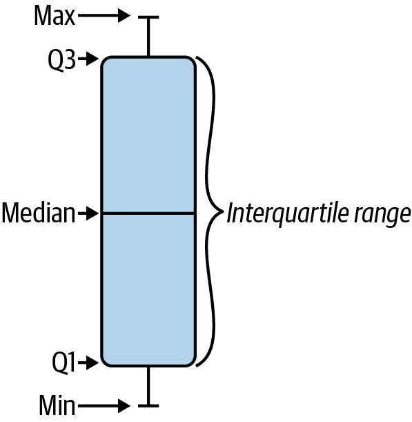
Figure 1-18. Elements of a boxplot
The part of the resulting plot found in the “box” is known as the interquartile range. This range is used as the basis for deriving other parts of the plot. The remaining range that falls within 1.5 times the interquartile range is represented by two lines or “whiskers.” In fact, Excel refers to this type of chart as Box & Whisker.
Observations that aren’t found within this range are shown as individual dots on the plot. These are considered outliers. The boxplot may be more complex than the histogram, but fortunately Excel will handle all preparation for us. Let’s return to our treadssk example. Highlight this range, then from the ribbon select Insert → Box & Whisker.
We can see in Figure 1-19 that our interquartile range falls within about 415 to 450, and that there are several outliers, especially on the high side. We noticed similar patterns about the data from the histogram, although we had a more visual perspective of the complete distribution, and were able to examine at different levels of granularity with different bin widths. Just like with the descriptive statistics, each visualization offers a unique perspective of the data; none is inherently superior to the others.
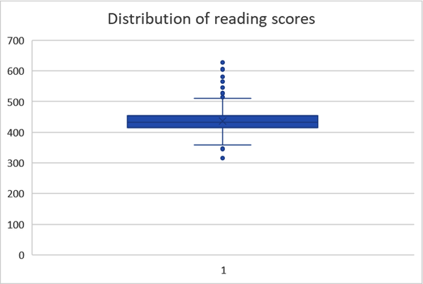
Figure 1-19. A boxplot of reading scores
One advantage of the boxplot is that it gives us some precise information about where the quartiles of our data are located, and what observations are considered outliers. Another is that it can be easier to compare distributions across multiple groups. To make boxplots of multiple groups in Excel, it’s easiest to have the categorical variable of interest directly to the left of the continuous one. In this manner, move classk to the left of treadssk in your data source. With this data selected, click Insert → Box & Whisker from the ribbon. In Figure 1-20 we see that the general distribution of scores looks similar across the three groups.
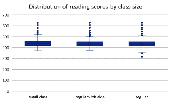
Figure 1-20. A boxplot of reading scores by class type
To recap, when working with quantitative data we can do much more than count frequencies:
-
We can determine what value(s) the data is centered around using measures of central tendency.
-
We can determine how relatively spread out that data is using measures of variability.
-
We can visualize the distribution of that data using histograms and boxplots.
There are other descriptive statistics and other visualizations to explore quantitative variables with. You will even learn about some of them later in the book. But this is a good start with the most crucial questions to ask of your data during EDA.
Conclusion
While we never know what we’ll get in a new dataset, the EDA framework gives us a good process to make sense of it. We now know what kind of variables we’re working with in star, and how their observations as a whole look and behave: quite an in-depth interview. In Chapter 3, we will build on this work by learning how to confirm the insights we’ve gained about the data by exploring it. But before that, we’ll take a tour of probability in Chapter 2, which provides much of the fuel for the analytics engine.
Exercises
Practice your EDA skills with the housing dataset, available in the book’s repository under datasets → housing → housing.xlsx. This is a real-life dataset consisting of housing sales prices in the city of Windsor, Ontario, Canada. You can find a description of the variables on the readme worksheet of the file. Complete the following, and don’t hesitate to complete your own EDA as well:
-
Classify each variable’s type.
-
Build a two-way frequency table of airco and prefarea.
-
Return descriptive statistics for price.
-
Visualize the distribution of lotsize.
You can find a solution to these and all other book exercises in the exercise-solutions folder of the book repository. There is a file named for each chapter.
Get Advancing into Analytics now with the O’Reilly learning platform.
O’Reilly members experience books, live events, courses curated by job role, and more from O’Reilly and nearly 200 top publishers.

