Chapter 4. Introducing script.aculo.us
Most of the last chapter dealt with the Rails helpers that interact with Prototype. In this chapter, we’ll shift attention to script.aculo.us, and the Rails helpers that use it. script.aculo.us provides eye-catching visual effects and transitions and powerful drag-and-drop elements.
The relationship between Prototype and script.aculo.us is close. They’re both developed in concert with Rails, and they share very similar coding styles and APIs. In fact, some of what is now script.aculo.us was originally part of Prototype. Despite the close ties, the two libraries have different goals. Prototype is designed to be an extension of JavaScript—it provides features that arguably ought to be part of the core language, such as convenient methods for data structures, DOM interaction, and easy Ajax calls. On the other hand, script.aculo.us works at a higher level, closer to the application and UI levels, by providing components built on Prototype. In some cases, those components are surprisingly complex and yet usable with just a few lines of code.
We’ll put the examples for this chapter into a new controller, so from your Rails project directory, run the generator:
script/generate controller chapter4 index
If you already created an application-wide layout (layouts/application.rhtml) and CSS file (public/stylesheets/application.css) from the beginning of Chapter 3, they will automatically be used for this controller as well.
Now let’s take a look at what script.aculo.us is most famous for: its visual effects.
Visual Effects
The most popular component of script.aculo.us is its
Effect object, which is used to attach a variety of cinematic effects to UI events. Using script.aculo.us effects, many of the slick animated transitions that people have come to associate with Flash can be accomplished without plug-ins at all, and in a way that preserves the benefits of HTML.
What about cross-platform compatibility? In general, the script.aculo.us visual effects work reliably across different browsers (Internet Explorer 6+ for Windows, Firefox, Safari, Konqeror, Camino, and, with a few exceptions, Opera). And because the animated effects are time-based (as opposed to frame-based) they work consistently on systems of different speeds. You might be wondering: just because visual effects are easy, does that mean they’re a good idea? Isn’t it just eye candy? And what does it have to do with Ajax, anyway?
The full answer to those questions will come in Chapter 6, but here’s the short one. More than just mere decoration, visual effects can be essential to providing a good user experience, especially in conjunction with Ajax. For more than 10 years, users have gotten used to the way the Web works, and Ajax undermines many of their expectations. For example, there’s a basic expectation that web pages are static, that they won’t change once they’re loaded. But in the last chapter, all the Ajax examples made changes to the page without reloading, which has the potential to become confusing. To address that, visual effects can provide cues that make the interface more natural and discoverable.
Tip
A word of caution: just like special effects in the movies, script.aculo.us effects are generally best when you don’t notice them—when they are subtle and unobtrusive, they and contribute something to the plot. Remember when desktop publishing arrived in the 1980s, and every neighborhood newsletter suddenly used 10 different fonts, because it could? If at all possible, try not to get similarly drunk on the power of script.aculo.us.
The script.aculo.us’
Effect object is where the magic resides. Let’s look at it. First, we’ll need an element to try our effects on, so add one to the top of the new index.rhtml:
<div id="target" class="green box">
  <div>Here's a DIV with some text.</div>
</div>
Now let’s use the
link_to_function to call an effect on the new element. Add this below the DIV:
<%= link_to_function "Fade", "new Effect.Fade('target')" %>Remember, link_to_function takes two arguments: the first is the text for the link, and the second is a JavaScript statement to be evaluated. In this example, that statement is a method call on script.aculo.us’ Effect.Fade. Load the page in your browser and try out the link—you should see the target element slowly fade away, until it’s removed from the page flow altogether. Internally, the first argument to Fade() is passed through Prototype’s $() function—which means you can pass it either the ID of an element or an element reference itself.
There’s another way to trigger effects, thanks to the fact that Prototype’s Element methods are added to every element that is accessed via $(). That means you can call visualEffect directly on a DOM element:
$('target').visualEffect('fade')script.aculo.us has five core effects that control fundamental aspects of an element: Opacity, Scale, Move, Highlight, and Parallel. To get a feel for each:
<%= link_to_function "Opacity",
    "new Effect.Opacity('target', {to:0.5})" %>
<%= link_to_function "Scale",
    "new Effect.Scale('target', 200)" %>
<%= link_to_function "Move",
    "new Effect.Move('target', {x:50,y:10})" %>
<%= link_to_function "Highlight",
    "new Effect.Highlight('target')" %>
<%= link_to_function "Parallel",
    "new Effect.Parallel([
      new Effect.Move('target', {x:50,y:10}),
      new Effect.Opacity('target', {to:0.5})
     ])" %>
In your application, you’ll usually use
combination effects, which are composed of the core effects—often by means of Effect.Parallel. script.aculo.us includes 16 standard combination effects, but you can define as many new ones as you like. Here are the standard ones:
To try out all the standard combination effects, you could write a link for each one. Instead, let’s keep things DRY by iterating through an array instead:
<% %w( Fade Appear Highlight Fold Pulsate SlideUp SlideDown
Shrink Grow Squish Shake DropOut SwitchOff Puff BlindUp
BlindDown ).each do |name| %>
<%= link_to_function name, "new Effect.#{name}('target')" %>
<% end %>Toggling
Some of the effects are grouped into pairs (Fade/Appear, BlindUp/BlindDown, and SlideUp/SlideDown). script.aculo.us provides a convenient method to toggle between the effects,
Effect.toggle:
Effect.toggle('target') /* uses Fade/Appear */
Effect.toggle('target', 'blind')
Effect.toggle('target', 'slide')
Options
The Effect.* methods take an optional second parameter: a hash of options. Some options are effect-specific, but we’ll look at those that apply to every effect.
duration specifies how long the effect should last, in seconds. For example:
<%= link_to_function "Fade",
      "new Effect.Fade('target', { duration:5 })" %>
fps determines the frames per second. The default is 25, and it can’t exceed 100. For example:
<%= link_to_function "Choppy Fade",
      "new Effect.Fade('target', { duration:10, fps:2 })" %>
Note that because script.aculo.us effects are time-based, rather than frame-based, slower systems will automatically drop frames as necessary.
delay specifies the time in seconds before the effect will be started. For example:
<%= link_to_function "Fade",
      "new Effect.Fade('target', { delay:2 })" %>
from and to define the starting and ending points of the effect as values between 0 and 1. For example, you could jump directly to the halfway point of an effect, then gradually fade to 25 percent, and then stop:
<%= link_to_function "Fade with from",
      "new Effect.Fade('target', { from:0.5, to:0.25 })" %>
Queues
In some circumstances, you may want to chain effects, so that they occur sequentially. As a first attempt, you might simply call one effect after the other:
<%= link_to_function "Blind Up/Down",
      "new Effect.BlindUp('target');
       new Effect.BlindDown('target')" %>
Unfortunately, this won’t have the desired result. As new effects are created, script.aculo.us adds them to a global queue. By default, these effects are executed in parallel—which means these two effects will collide with each other. To specify an effect’s position in the queue, use the queue option:
<%= link_to_function "Blind Up/Down",
      "new Effect.BlindUp('target');
       new Effect.BlindDown('target', { queue: 'end' })" %>
Now the two effects will execute sequentially, rather than at once. If you want more than two effects sequentially, just keep adding them with a queue of end. The queue option can also take a value of front, which causes the effect to be executed before anything else in the queue.
script.aculo.us also supports multiple queues, so that you can create named scopes for effects queues that run independently. For more information on creating queue scopes, see Chapter 11.
Callbacks
The options hash can also take parameters for
callbacks that are executed through the effect’s life cycle. beforeStart is called before the main effects rendering loop is started. beforeUpdate is called on each iteration of the effects rendering loop, before the redraw takes places. afterUpdate is called on each iteration of the effects rendering loop, after the redraw takes places. afterFinish is called after the last redraw of the effect was made. Callbacks are passed one argument, a reference to the effect object. For example:
<%= link_to_function "Fade with callback",
      "new Effect.Fade('target', { afterUpdate: function(effect) {
         effect.element.innerHTML = effect.currentFrame;
       }})" %>
Chapter 11 covers Effect callbacks in more detail.
Transitions
The transition option determines the pattern of change—a constant linear rate of change, gradual speed up, or anything else. There are eight standard transitions, and you can easily define new ones. To override the default transition for an effect, use the transition option like this:
<%= link_to_function "Fade with wobble",
      "new Effect.Fade('target',
         { transition: Effect.Transitions.wobble })" %>
The available transitions are: linear, reverse, none, full, sinoidal, pulse, wobble, and flicker. Chapter 11 describes them in detail and explains how to create custom transitions. To get a feel for the possibilities, create a demo for yourself of each transition:
<% %w( linear reverse none full sinoidal pulse
       wobble flicker ).each do |name| %>
  <%= link_to_function "Fade with #{name}",
        "new Effect.Fade('target',
          { transition: Effect.Transitions.#{name} })" %>
<% end %>
Visual Effect Helper
So far, we’ve been using script.aculo.us’s Effect object directly, without the aid of Rails helpers. Rails also provides a helper to generate visual effects, allowing you to create effects without writing JavaScript. The helper is
visual_effect, and it’s used like this:
visual_effect(:fade, :target)
The first argument is the name of a script.aculo.us effect (almost—see the note below), and the second is the ID of a DOM element. The
visual_effect helper outputs a JavaScript snippet, so it’s usually used in combination with another helper, like link_to_function:
<li><%= link_to_function "Fade", visual_effect(:fade, :target) %></li>
The toggle effects can be used from the helper method as well:
<%= link_to_function "Toggle Blind",
    visual_effect(:toggle_blind, :target) %>
Tip
Standard Ruby style is to use underscores to separate words in variable and method names. The script.aculo.us effect methods, on the other hand, follow the JavaScript convention of “CamelCase.” So when you are using the visual_effect helper, remember to use the lower-case, underscored versions of the effect names; e.g., BlindUp becomes blind_up.
The visual_effect helper is especially useful when combined with Ajax helpers, such as link_to_remote. For example, you might use the Highlight effect to draw the user’s attention to a portion of the page that has been updated via Ajax. To see it in action, first add a new action to chapter4_controller.rb:
def get_time
  render :text => Time.now
end
And then create an Ajax link to it in views/chapter4/index.rhtml:
<%= link_to_remote "Get Time",
    :update   => "current_time",
    :url      => { :controller => "chapter3", :action => "get_time" },
    :complete => visual_effect(:highlight, :current_time) %>
<div id="current_time"></div>
Notice that, unlike the examples in the last chapter, we aren’t writing custom JavaScript in the :complete option—instead, we let the visual_effect helper write it for us.
Drag and Drop
The ability to directly manipulate on-screen objects is often taken for granted in desktop applications, but web interfaces have been slow to follow—largely due to the complex DOM manipulation it requires. script.aculo.us changes that equation, and provides surprisingly easy and powerful support for drag-and-drop interfaces. That means that web developers can decide to use drag and drop based primarily on usability concerns, rather than technical ones. As with visual effects, it’s important to remember that drag and drop is often not the best solution to an interface problem. But when it is, script.aculo.us makes it painless.
Draggables
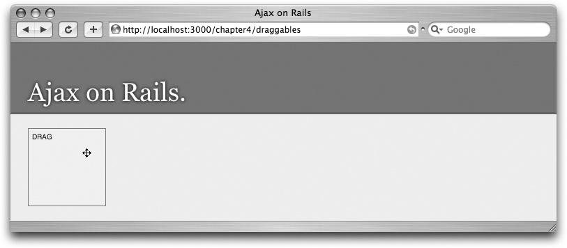
script.aculo.us provides a Draggable class that’s used to add draggability to DOM elements. To get started, create a new template file, draggables.rhtml. In it, add this:
<div id="dragDIV" class="green box">drag</div>
<%= javascript_tag "new Draggable('dragDIV')" %>
When the page is loaded (http://localhost:3000/chapter4/draggables), the JavaScript statement causes a new instance of the Draggable class to be created, tied to the given element ID. From then on, you can drag the element around the page. Notice how it becomes slightly transparent while it is dragged—it uses the same Opacity effect we explored earlier. The Draggable constructor takes an optional second parameter for options, which will be detailed later.
Rails provides the draggable_element helper to create draggables. Just like Draggable.initialize, the first argument is the ID of an element, and the second is a hash of options. For example:
<div id="helperDIV" class="green box">helper</div>
<%= draggable_element :helperDIV %>
The output of draggable_element is a <script> element with a new
Draggable statement. If you just need the JavaScript statement without the <script> tags, use draggable_element_js instead. For example:
<div id="clickDIV" class="green box">
    <%= button_to_function "Make draggable",
         draggable_element_js(:clickDIV) %>
</div>
For usability, it’s often a good idea to change the cursor when it’s over a draggable element. The CSS cursor property makes it easy. For example:
<div class="green box" style="cursor:move">drag</div>
When the user mouses over this element, the cursor will change to a “move” icon (as in Figure 4-1), indicating that the element is draggable. Of course, the CSS doesn’t need to be inline—it could easily be part of the external stylesheet.
Draggable options
As with the Effect.* methods, Draggable.initialize takes a JavaScript hash of options to customize their behavior. The draggable_element helper takes a Ruby hash and converts it to JavaScript.
revert, if set to true, causes the element to return back to its original location after being dragged. The value can also be a function, which will get called when a drag ends, to determine whether the element should be reverted. For example:
<div id="revertDIV" class="green box">revert</div>
<%= draggable_element :revertDIV, :revert => true %>

<div id="functionRevertDIV" class="green box">function revert</div>
<%= draggable_element :functionRevertDIV,
     :revert => "function(el){
        return Position.page(el)[0] > 100; }" %>
In the second example, :revert is a function that is passed a reference to the element when the dragging stops. In this case, it reverts the drag only if the position of the element is more than 100 pixels from the left edge of the window.
ghosting, if set to true, will clone when a drag starts, leaving the original in place until the drag ends. For example:
<div id="ghostingDIV" class="green box">ghosting</div>
<%= draggable_element :ghostingDIV, :ghosting => true %>
handle allows for a subelement to be used as the handle—the part that can be clicked on to start the drag. The value should be a JavaScript expression that will evaluate to an element ID, or an element reference. For example:
<div id="handleDIV" class="green box">
  <span id="myHandle">handle</span>
</div>
<%= draggable_element :handleDIV, :handle => "'myHandle'" %>
Note that myHandle is in two sets of quotes—that’s because it’s a JavaScript expression that needs to evaluate to a string.
change can be set to a function that will be called every time the draggable is moved while dragging. The callback function gets the draggable as a parameter. For example:
<div id="changeDIV" class="green box">change</div>
<%= draggable_element :changeDIV, :change => "function(draggable) {
  draggable.element.innerHTML=draggable.currentDelta();
}" %>
constraint, if set to horizontal or vertical, will constrain the element to that dimension. It is evaluated as a JavaScript expression, so specifying a DOM element ID requires two sets of quote marks. For example:
<div id="constraintDIV" class="green box">constraint</div>
<%= draggable_element :constraintDIV, :constraint => 'vertical' %>
snap allows you to snap the draggable to a grid. If snap is false (the default), no snapping occurs. If the value is an integer n, the element will jump to the nearest point on a grid of n pixels. The value can also be an array of the form [
x
,
y
], so that the horizontal and vertical axis can be constrained differently. Finally, the value can be a function that will be passed the current [
x
,
y
] coordinates of the element (as offsets from its starting position, not absolute coordinates), returns the snapped coordinates. For example:
<div id="snapDIV_50" class="green box">snap to 50</div>
<%= draggable_element :snapDIV_50, :snap => 50 %>

<div id="snapDIV_50_100" class="green box">snap to 50,100</div>
<%= draggable_element :snapDIV_50_100, :snap => '[50,100]' %>

<div id="snapDIV_function" class="green box">snap to function</div>
<%= draggable_element :snapDIV_function, :snap => "function(x, y) {
  new_x = (x > 100) ? 100 : ((x < 0) ? 0 : x);
  new_y = (y > 100) ? 100 : ((y < 0) ? 0 : y);
  return [ new_x, new_y ];
}" %>
The last example demonstrates the power of defining a function for the snap option. For both the x and y dimensions, it limits the value to between 0 and 100. The result is that the draggable is constrained to a small box on the screen.
Droppables
Droppables are DOM elements that can receive dropped draggables and take some action as a result, such as an Ajax call. To create a
droppable with JavaScript, use Droppables.add:
<div id="dropDIV" class="pink box">drop</div>
<%= javascript_tag "Droppables.add('dropDIV', {hoverclass:'hover'})" %>
The second argument is a hash of options, which are detailed in the “Droppable options” section. The Rails helpers for creating droppables are drop_receiving_element and drop_receiving_element_js. For example:
<div id="dropHelperDIV" class="pink box">drop here.</div>
<%= drop_receiving_element :dropHelperDIV, :hoverclass => 'hover' %>
The drop_receiving_element_js helper does exactly the same thing, except that it outputs plain JavaScript, instead of JavaScript wrapped in <script> tags.
A droppable doesn’t necessarily accept every draggable; several of the options below can be used to determine which draggables are accepted when.
Droppable options
hoverclass is a class name that will be added to the droppable when an accepted draggable is hovered over it, indicating to the user that the droppable is active. We’ve already seen a couple examples of this in the previous section.
accept can be a string or an array of strings with CSS classes. If provided, the droppable will only accept draggables that have one of these CSS classes. For example:
<div id="dragGreen" class="green box">drag</div>
<%= draggable_element :dragGreen, :revert => true %>

<div id="dragPink" class="pink box">drag</div>
<%= draggable_element :dragPink, :revert => true %>

<div id="dropAccept" class="pink box">drop here (green only).</div>
<%= drop_receiving_element :dropAccept, :hoverclass => "hover",
     :accept => 'green' %>
containment specifies that the droppable will only accept the draggable if it’s contained in the given elements or array of elements. It is evaluated as a JavaScript expression, so specifying a DOM element ID requires two sets of quotation marks. For example:
<div id="one">
    <div id="dragGreen2" class="green box">drag</div>
    <%= draggable_element :dragGreen2, :revert => true %>
</div>

<div id="two">
    <div id="dragPink2" class="pink box">drag</div>
    <%= draggable_element :dragPink2, :revert => true %>
</div>

<div id="dropContainment" class="pink box">drop here.</div>
<%= drop_receiving_element :dropContainment, :hoverclass => "hover",
    :containment => "'one'" %>
onHover is a callback function that fires whenever a draggable is moved over the droppable, and the droppable accepts it. The callback gets three parameters: the draggable, the droppable, and the percentage of overlapping as defined by the overlap option. A simple example, without any parameters:
<div id="dropOnHover" class="pink box">drop</div>
<%= drop_receiving_element :dropOnHover, :hoverclass => "hover",
      :onHover => "function(){ $('dropOnHover').update('hover!'); }" %>
And here is an example using all three possible callback parameters:
<div id="dropOnHover" class="pink box">drop</div>
<%= drop_receiving_element :dropOnHover, :hoverclass => "hover",
      :onHover => "function(draggable, droppable, overlap){
         $('dropOnHover').update('you dragged ' + draggable.id +
              ' over ' + droppable.id + ' by ' + overlap +
              ' percent'); }" %>
onDrop is called whenever a draggable is released over the droppable and it’s accepted. The callback gets two parameters: the draggable element and the droppable element. For example:
<div id="dropOnDrop" class="pink box">drop</div>
<%= drop_receiving_element :dropOnDrop, :hoverclass => "hover",
    :onDrop => "function(drag, drop){
       alert('you dropped ' + drag.id + ' on ' + drop.id) }" %>
Droppables with Ajax
All the options specified in the previous section are available whether you create your droppable with JavaScript (Droppables.add) or the Rails helpers (drop_receiving_element and drop_receiving_element_js). However, when created with the helpers, some additional options are available. Namely, all the link_to_remote options, such as update and url (described in Chapter 3), are also available, and will be used to create an onDrop callback function for doing Ajax calls with droppables. For example:
<div id="drag" class="green box">drag</div>
<%= draggable_element :drag, :revert => true %>

<div id="drop" class="pink box">drop</div>
<%= drop_receiving_element :drop, :hoverclass => "hover",
     :update => "status", :url => { :action => "receive_drop" } %>

<div id="status"></div>
Notice that the :url option points to a receive_drop action, so we’ll need to define that in chapter4_controller.rb:
def receive_drop
  render :text => "you dropped element id #{params[:id]}"
end
Unless overridden by the :with option, the drop_receiving_element Ajax call will automatically include the ID of the draggable as the id parameter of the request.
Sortables
Sortables are built on top of draggables and droppables so that with one fell swoop, you can give a group of elements advanced drag-and-drop behavior so that they can be reordered graphically.
Use Sortable.create to create a sortable from JavaScript. For example:
<ul id="list">
  <li>Buy milk</li>
  <li>Take out trash</li>
  <li>Make first million</li>
</ul>

<%= javascript_tag "Sortable.create('list')" %>
Of course, Rails provides helpers for this task as well:
sortable_element and
sortable_element_js. Just like the other drag-and-drop related helpers, the first argument is the target DOM element and the second is a hash of options used to affect the behavior. The other available options are:
-
hoverclass Passed on to the droppables, so that the specified CSS class is added to the droppable whenever an acceptable draggable is hovered over it.
-
handle Passed on to the draggable. This is especially useful when the sortable elements are interactive, such as links or form elements. For example:
<ul id="listHandle">
  <li><span class="handle">x</span> Buy milk</li>
  <li><span class="handle">x</span> Take out trash</li>
  <li><span class="handle">x</span> Make first million</li>
</ul>

<%= sortable_element :listHandle, :handle => 'handle' %>
-
ghosting Passed on to the draggables as well. For example:
<ul id="listGhosting">
  <li>Buy milk</li>
  <li>Take out trash</li>
  <li>Make first million</li>
</ul>

<%= sortable_element :listGhosting, :ghosting => true %>
-
constraintandoverlap Work together to determine which direction the Sortable will operate in: either
vertical(the default) orhorizontal.constraintis passed on to the draggables—it restricts which direction the elements can be dragged.overlapis passed to the droppable, making it only accept the draggable element if it is more than 50 percent overlapped in the given dimension. For example:<ul id="listHorizontal"> <li style="display: inline; margin-right: 10px;">Buy milk</li> <li style="display: inline; margin-right: 10px;">Take out trash</li> <li style="display: inline; margin-right: 10px;">Make first million</li> </ul> <%= sortable_element :listHorizontal, :constraint => 'horizontal', :overlap => 'horizontal' %>-
tag Sets the kind of tag that is used for the sortable elements. By default, this is
LI, which is appropriate forULandOLlist containers. If the sortable elements are something else (such as paragraphs orDIVs), you can specify that here. For example:<div id="listTag"> <div>Buy milk</div> <div>Take out trash</div> <div>Make first million</div> </div> <%= sortable_element :listTag, :tag => 'div' %>
-
only Restricts the selection of child elements to elements with the given CSS class or an array of classes. For example:
<ul id="listOnly">
  <li class="sortable">Buy milk</li>
  <li class="sortable">Take out trash</li>
  <li>Make first million</li>
</ul>

<%= sortable_element :listOnly, :only => 'sortable' %>
-
containment Used to enable drag-and-drop between multiple containers. A container will only accept draggables whose parent element is in
containment, which can be either an ID or an array of IDs. For example:<ul id="list1"> <li>Buy milk</li> <li>Take out trash</li> </ul> <ul id="list2"> <li>Make first million</li> </ul> <%= sortable_element :list1, :containment => ['list1', 'list2'] %> <%= sortable_element :list2, :containment => ['list1', 'list2'] %>
-
dropOnEmpty Useful when you have two sortable containers, and you want elements to be able to be dragged between them. By default, an empty container can’t have new draggables dropped onto it. By setting
dropOnEmptytotrue, that’s reversed. For example:<ul id="listFull"> <li id="thing_1">Buy milk</li> <li id="thing_2">Take out trash</li> <li id="thing_3">Make first million</li> </ul> <ul id="listEmpty"> </ul> <%= sortable_element :listFull, :containment => ['listFull', 'listEmpty'], :dropOnEmpty => true %> <%= sortable_element :listEmpty, :containment => ['listFull', 'listEmpty'], :dropOnEmpty => true %>-
scroll Allows for sortables to be contained in scrollable areas, and dragged elements will automatically adjust the scroll. To accomplish this, the scrollable container must be wrapped in an element with the style
overflow:scroll, and thescrolloption should be set to that element’s ID. The value is evaluated as a JavaScript expression, so it’s necessary to put it in two sets of quotes. Scrolling in script.aculo.us must be explicitly enabled, by settingPosition.includeScrollOffsetstotrue. For example:<div id="container" style="overflow: scroll; height: 200px;"> <ul id="listScroll"> <% 20.times do |i| %> <li>Buy milk</li> <li>Take out trash</li> <li>Make first million</li> <% end %> </ul> </div> <%= javascript_tag "Position.includeScrollOffsets = true" %> <%= sortable_element :listScroll, :scroll => "'container'" %>-
onChange Called whenever the sort order changes while dragging. When dragging from one sortable to another, the callback is called once on each sortable. The callback gets the affected element as its parameter. For example:
<ul id="listChange"> <li>Buy milk</li> <li>Take out trash</li> <li>Make first million</li> </ul> <%= sortable_element :listChange, :onChange => "function(el) { alert(el.innerHTML); }" %>-
onUpdate Called when the drag ends and the sortable’s order has changed. When dragging from one sortable to another,
onUpdateis called once for each sortable. The callback gets the container as its parameter. For example:<ul id="listUpdate"> <li>Buy milk</li> <li>Take out trash</li> <li>Make first million</li> </ul> <%= sortable_element :listUpdate, :onUpdate => "function(el) { alert(el.innerHTML); }" %>
Ajax-enabled sortables
As with droppables, the
sortable_element helper also can take all the familiar Ajax options that link_to_remote provides. By default, when an Ajax call is created, the action called gets the serialized sortable elements as parameters. To work, the IDs of the sortable elements should follow the naming convention used by Sortable.serialize: the unique part of the ID should be at the end, preceded by an underscore. So item_1, person_2, and _3 would make good IDs, but item1, 2_person and 3 would not. For example:
<ul id="listAjax">
  <li id="item_1">Buy milk</li>
  <li id="item_2">Take out trash</li>
  <li id="item_3">Make first million</li>
</ul>

<%= sortable_element :listAjax,
     :url      => { :action => 'repeat' },
     :complete => "alert(request.responseText);" %>
In the example, reordering the list triggers an Ajax call to the repeat action, which gets a listAjax array parameter containing the IDs of the sortable elements, in the current order. To see this in action, define a repeat action to echo back the parameters it receives, like this:
def repeat
  render :text => params.inspect
end
For a real-world example of creating sortables and handling reordering on the server side, see the Review Quiz example application in Example A.
Summary
This chapter introduced the major features of script.aculo.us—specifically, those features of the library that have corresponding Rails helpers. Those features fall into two main categories: visual effects and drag and drop. The library has even more to offer and is fully dissected in Chapter 11.
In the next chapter, we’ll explore the crown jewel of Ajax on Rails: Ruby-generated JavaScript (RJS).
Get Ajax on Rails now with the O’Reilly learning platform.
O’Reilly members experience books, live events, courses curated by job role, and more from O’Reilly and nearly 200 top publishers.

