Plot histograms of batting averages for each team in just a few lines of code.
Lattices are a powerful technique for plotting lots of different graphs at once. With the Lattice package, you can divide observations into multiple groups (for example, teams, positions, and stadiums) and draw a different plot for each group. You can also use the package to plot any combination of graphs in one shot—say, a scatter plot, histogram, pie chart, and bar chart—but I think that’s a lot less interesting. Lattices are incredibly useful for comparing groups of teams or players. At a glance, you can quickly see how one group is different from another. You can do this in Excel (plot lots of little diagrams for different subsets of players), but it would take you quite a while.
For these examples, I looked at 2003 batting averages by team. I was curious how the distribution of batting averages differed between teams. Were some teams spread wide apart, with a large difference between best and worst teams? Were other teams packed closely together, with a large number of similarly performing players? Let’s see if there is anything interesting in the data.
In this hack, I examine statistics from 2004, taking only players with more than 250 at bats. (Normally, I like to use 502 plate appearances, which is the number a player needs to qualify for MLB awards. However, there weren’t enough players with qualifying at bats to make these charts interesting, so I reduced the threshold to 250. See “Significant Number of At Bats” [Hack #63] for a more thorough discussion of this subject.)
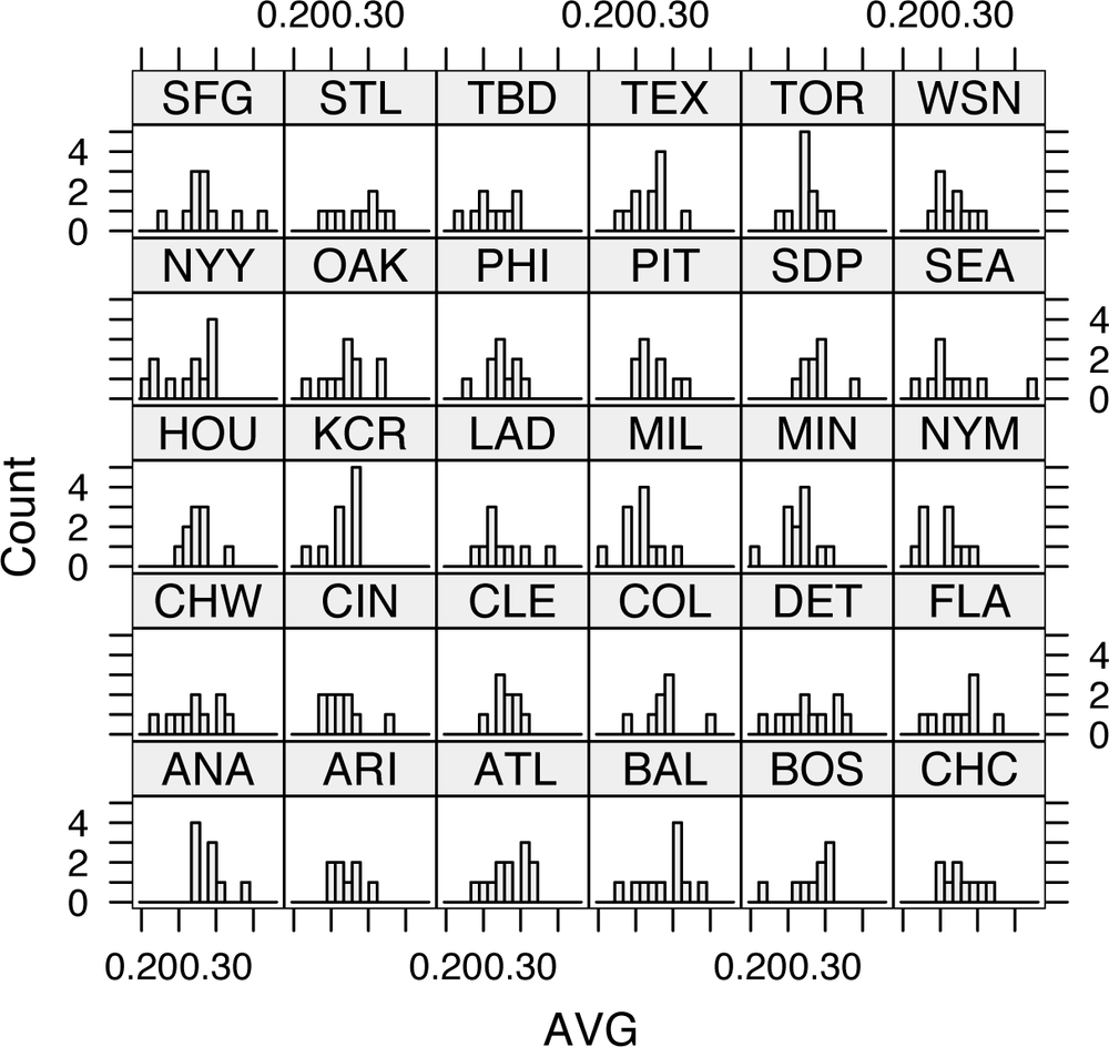
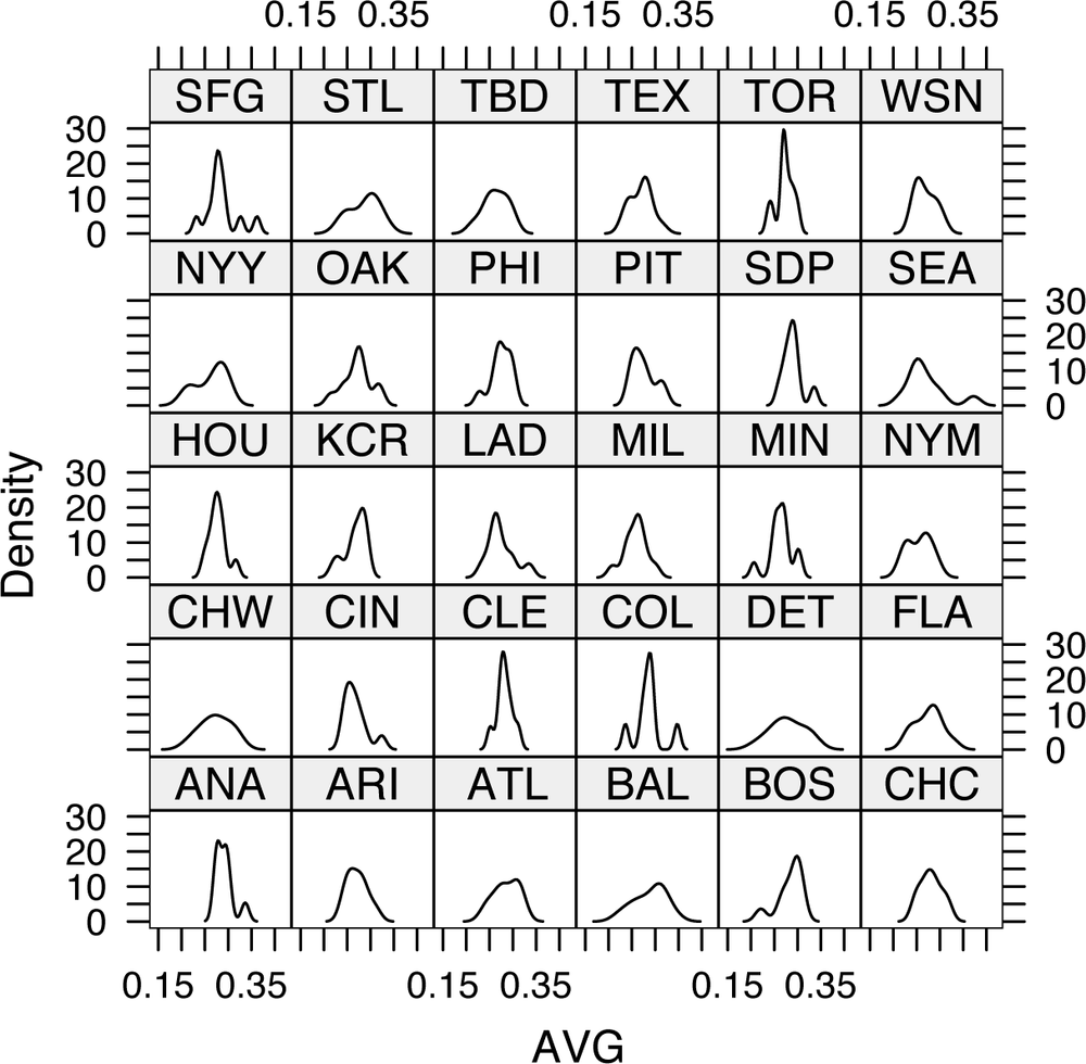
With the data in hand, you can plot the batting average (AVG = H / AB) for players on each team. First, the code uses R’s histogram() command to plot a histogram for each team, splitting each plot into 10 columns so that we can see some detail. The next example shows how to use densityplot() to produce a continuous curve that you can use to estimate the density of players close to each average. (That’s a fancy way of saying that R is going to draw a line that follows the shape of the histogram.)
As with most Lattice package functions, the commands have dozens of possible options, but you need almost none of them. The key argument to this function is the formula. Most Lattice package plotting tools use formulas to express the input. A formula takes this form:
<dependent variable> ~ <independent variables> | <conditioning variables>
The dependent variable corresponds to the y axis. (If you plan to build a model from your data, this is what you are trying to predict.) This part is not required for univariate (single-variable) functions, such as histograms. The independent variables are the x variables (the predictors in a model). The conditioning variable is the term that you are using to specify which observations go in which graphs. In our example cases, we want to produce histogram and density plots of the batting average, so we use the ~ AVG | teamID formula.
We’ll use RMySQL [Hack #33] to connect to the Baseball DataBank database [Hack #10] and generate a lattice. The code is remarkably short:
	#Load the appropriate libraries
	library(DBI);
	library (RMySQL);
	library (lattice);

	#Establish the connection to the database
	drv<-dbDriver("MySQL");
	con<-dbConnect( drv, username="jadler", password="P@ssw0rd",
	  dbname="bbdatabank",host="localhost");

	#Build the data set
	res<-dbSendQuery(con,
	  "select * from batting where yearID=2003 and AB > 250");
	batting2003<-fetch(res, n=-1);
	attach(batting2003);

	#Compute batting averages
	AVG<-H/AB;

	#Plot the charts
	histogram(~ AVG | teamID), nint=10
densityplot(~ AVG | teamID), plot.points=FALSEThe last two lines in the code listing actually produce the plots. The histogram(~AVG | teamID, nint=10) command produces a diagram like the one shown in Figure 4-12.
The densityplot(~ AVG | teamID, plot.points=FALSE) line produces a diagram similar to the one shown in Figure 4-13.
A quick look at this plot shows some surprising results. Some teams are much more concentrated than others are (e.g., Boston, all of whose players hit well). Others, like Philadelphia, are spread out. And more surprisingly, a few teams, including the Cubs (CHN), have two pronounced peaks.
Some of these effects are probably due to stadiums. For example, Boston’s high average is probably caused by Fenway Park’s Green Monster in left field, and the Dodgers’ (LAN) low average is probably the result of playing in Dodger Stadium (famously a pitcher’s park).
Get Baseball Hacks now with the O’Reilly learning platform.
O’Reilly members experience books, live events, courses curated by job role, and more from O’Reilly and nearly 200 top publishers.


