Plot charts showing where players hit the most baseballs.
Many baseball players tend to hit balls to some parts of the field more often than to others. Perhaps the best illustrations are sluggers Jason Giambi and Barry Bonds. Each player hits the most balls to the right side of the field. When these guys are batting, the opposing defense will shift toward the right side of the field.
Managers use a tool called spray charts to decide where to position defensive players because it shows where baseballs are most likely to be hit. This hack teaches you how to plot spray charts, using data from MLB Gameday. You can find similar charts on the Internet (for example, try the Hitting Chart links for individual players at MLB.com), but there are some advantages in plotting these yourself. First, you can choose any set of players to plot. Second, you can focus on certain situations and matchups. Finally, you can draw some easier-to-read charts, such as hexagonal bins.
For this hack, we’re going to use the matchup data we derived in “Find Data on Hit Locations” [Hack #29] . This file includes game IDs, game dates, teams, a hit indicator, x and y coordinates of each ball in play, the name of the pitcher and batter, and the way the play was scored (i.e., single, groundout, or home run). We’ll load this data into R, set up axes to show the field, and then plot hits and outs.
In “Find Data on Hit Locations” [Hack #29] , we created a file containing the results of each hitter-pitcher matchup.
The file was just a comma-separated value file with a header, so we can load this file into a data frame with R’s read.csv() procedure:
	>matchups <-read.csv("~/Desktop/book/matchups.txt")
	>names(matchups)
	[1] "gid"   "year"   "month"   "day"     "away"  "home"    "game"   "hit"  "x"
[10] "y" "inning" "batter" "pitcher" "type" "batting"We need to set the right window size (to show the whole field) and plot the diamond. We will do this with two plotting commands in R. We use the plot() command to draw the window and set the appropriate axes. We then use the lines() command to draw the diamond.
	>plot (0:250, -250:0, type="n", bg="white")
>lines(c(125,150,125,100,125),c(-210,-180,-150,-180,-210), col=c("black"))Now, let’s plot some hits and outs! To do this, we will use the points() function to add points to the diagram. As arguments, this function requires a set of x and y coordinates (as two separate vectors). Optionally, you can choose colors and shapes for points. For details, see the help file.
In this example, we’ll look at where Jorge Posada (NY Yankees catcher) hit off Pedro Martinez (Red Sox pitcher) in 2003. We’ll start by extracting a subset of the match-up data to include only these players:
>jorge.vs.pedro <- subset(matchups, pitcher=="Martinez" & batter == "Posada")
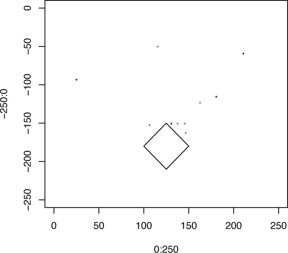
Next, we’ll use blue to show hits (through the col=c(“blue”) option) and red to show outs (through the col=c(“red”) option). We’ll plot a small, solid dot at each location (using the pch=20 option).
	>points(subset(jorge.vs.pedro$x, jorge.vs.pedro$hit==0), subset(-jorge.vs.pedro$y,
jorge.vs.
	pedro$hit==0), pch=20, col=c("red"))
	>points(subset(jorge.vs.pedro$x, jorge.vs.pedro$hit==1), subset(-jorge.vs.pedro$y,
jorge.vs.
	pedro$hit==1), pch=20, col=c("blue"))
This produces a simple diagram like the one shown in Figure 4-15.
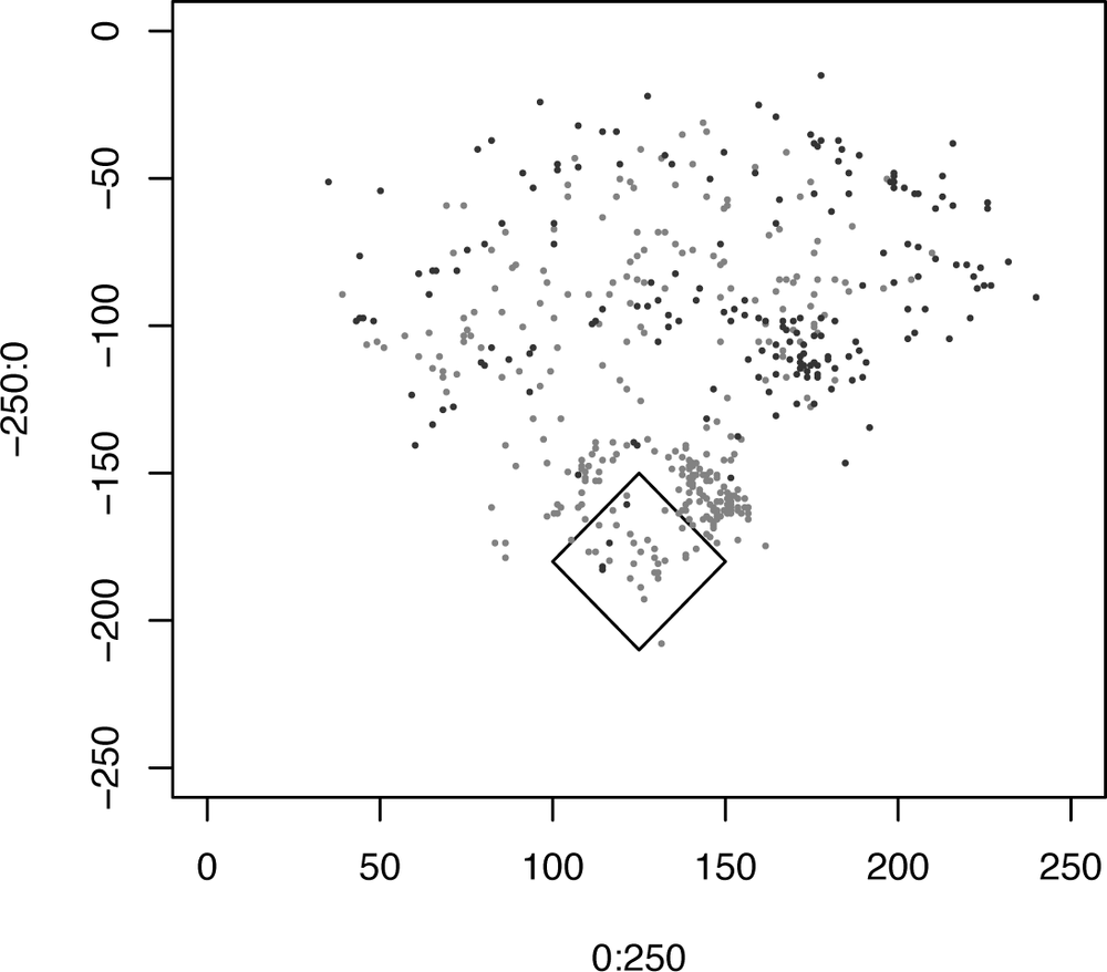
You can also look at where all the balls by a player landed. Let’s look at where all the balls that David Ortiz hit in play in 2003 landed. We’ll use the same code as we did earlier, but we’ll define a subset containing all the places where David Ortiz was the batter:
	>plot (0:250, -250:0, type="n",bg="white")
	>lines(c(125,150,125,100,125),c(-210,-180,-150,-180,-210), col=c("black"))
	>ortiz <- subset(matchups, batter == "Ortiz")
	>points(subset(ortiz$x, ortiz$hit==0), subset(-ortiz$y, ortiz$hit==0), pch=20,
col=c("red"))
	>points(subset(ortiz$x, ortiz$hit==1), subset(-ortiz$y, ortiz$hit==1), pch=20,
col=c("blue"))
This produces a diagram like the one shown in Figure 4-16.
Clearly, you can see that David Ortiz tends to hit balls more often to right field. Wouldn’t it be nice to have a cleaner way to see this density? We’ll use another visualization technique, called hexagonal binning, to get a clearer picture of where Ortiz’s hits land.
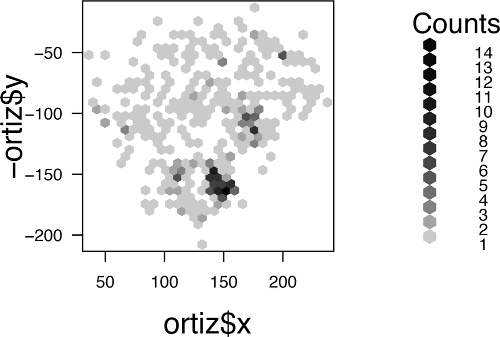
The idea of hexagonal binning is to break a two-dimensional plane into different bins. First, the bins make interlocking hexagons. It is possible to use squares (or interlocking triangles or another shape), but hexagons look “rounder” than squares. Next, the algorithm counts the number of points inside each bin. Finally, a plotting tool colors hexagons according to the density of points.
To use this tool, you need to download the hexbin package. In the Windows version of R, go to the Packages menu and select “Install Packages from Bioconductor.” (This package is available from Bioconductor, not CRAN.) Select “hexbin” from the list and click OK. R will install the package on your local machine.
In the Mac OS X version of R, select Package Installer from the Packages & Data menu. Select “Bioconductor (binaries)” from the Packages Repository menu. Click the Get List button to see a list of the available packages. Select “hexbin” and click the Install/Update button to install.
After installing the package, you need to load it. You can do this from the Packages menu, or you can issue the following command:
>library(hexbin)
There are two steps to doing a hexagonal bin plot. First, you create the R hexagonal bin object. Then, you plot the object to view it. Here is a hexagonal bin plot for the David Ortiz batting data set:
	>ortiz.hexbins <- hexbin(ortiz$x, -ortiz$y)
	>plot(ortiz.hexbins)
And that’s it! This produces a graph like the one shown in Figure 4-17. Darker areas indicate a greater number of balls.
You can do many additional things with this information. Here are a few suggestions:
- Show edges of specific ballparks
In this example, I just showed how to plot a diamond in roughly the right spot, but you can use information about each ballpark to show the exact borders of a particular stadium.
- Use more colors to differentiate types of hits
You can use different colors for line drives, ground balls, and fly balls. Or maybe for singles, doubles, triples, home runs, and outs.
- Show lefty-righty matchups
Curious how a batter fares against lefties or righties? Or how well a pitcher fares against each? Join the matchup information with a table showing which players are lefties and righties and plot these matchups in different colors to look for patterns.
- Find outfield borders from HR data
If you look at where home runs land, you can determine where the outfield borders are.
Get Baseball Hacks now with the O’Reilly learning platform.
O’Reilly members experience books, live events, courses curated by job role, and more from O’Reilly and nearly 200 top publishers.


