Once data is collected, uploaded, and processed, users need to be able to access, evaluate, and explore their data. The main design goal behind YFD and PEIR was to make personal data understandable to nonprofessionals. Data has to be presented in a way that is relatable; it has to be humanized. Oftentimes we get caught up in statistical charts and graphs, which are extremely useful, but at the same time we want to engage users so that they stay interested, continue collecting data, and keep coming back to the site to gauge their progress in whatever they are tracking. Users should understand that the data is about them and reflect the choices they make in their daily lives.
I like to think of data visualization as a story. The main character is the user, and we can go two ways. A story of charts and graphs might read a lot like a textbook; however, a story with context, relationships, interactions, patterns, and explanations reads like a novel. This is not to say that one or the other is better. There are plenty of interesting textbooks, and probably just as many—if not more—boring novels. We want something in between the textbook and novel when we visualize personal data. We want to present the facts, but we also want to provide context, like the who, what, when, where, and why of the numbers. We are after emotion. Data often can be sterile, but only if we present it that way.
In the case of PEIR, we were met with the challenge of presenting scientific data—carbon impact, exposure to high levels of particulate matter, and impact to sensitive sites such as hospitals and schools. Impact and exposure are not a part of everyday conversation. Most people do not know whether 1,000 kilograms of carbon emissions in a day is a lot or a little. Is one hour of exposure to high levels of particulate matter normal? These types of questions factor into PEIR's visualization design. It is important to remember, however, that even though the resulting data is not immediately understandable, it is all derived from location data, which is extremely intuitive. There are perhaps few types of data that are so immediately understandable as one's place in physical space. Therefore, we use maps as the visualization anchor point and work from there.
Location-based data drives the PEIR system, so an interactive map is the core of the user interface. We initially used the Google Maps API, but quickly nixed it in the interest of flexibility. Instead, we use Modest Maps. It is a display and interaction library for tile-based maps in Flash and implemented in ActionScript 3.0. Modest Maps provides a core set of features, such as panning and zooming, but allows designers and developers to easily customize displays. Modest Maps implementations can easily switch map tiles, whether the choice is to use Microsoft's map tiles, Google's, custom-built ones, or all of the above. We are free to adjust color, layout, and overall style, which lend themselves to good design practice and useful visualization, and the flexibility allows us to incorporate our own visualizations on the map or as a supplement. In the end, we do not want to limit ourselves to just maps, and Modest Maps provides the flexibility we need to do this.
We experimented with a number of different ways to represent PEIR data before deciding on the final mapping scheme. During the design process, we considered several parameters:
How can users interact with a lot of traces at once without cluttering the map?
How can we represent both stationary (user is idle) and traveling (user is moving) data chunks at the same time?
How do we display values from all four microenvironment models?
What colors should we use to represent GPS trace, impact, and exposure?
How do we shift focus toward the actual data and away from the underlying map tiles?
In the early stages of the design process, we mapped GPS traces the way that users typically see location tracks: simply a line that goes from point to point. This was before taking values from the microenvironment models into account, so the map was a basic implementation using Modest Maps and tiles from OpenStreetMap. GPS traces were mono-colored and represented nothing but location; there was a circle at the end so that the user would know where the trip began and ended.
This worked to a certain extent, but we soon had to visualize more data, so we changed the format. We colored traces based on impact and exposure values. The color scheme used five shades of red. Higher levels of, say, carbon impact were darker shades of red. Similarly, trips that had lower carbon impact were lighter shades of red.
The running metaphor is that the more impact the user has on the environment, the more the trip should stand out on the map. The problem with this implementation was that the traces on the map did not stand out (Figure 1-1). We tried using brighter colors, but the brightly colored trips clashed with the existing colors on the map. Although we want traces to stand out, we do not want to strain the user's eyes. To solve this problem we tried a different mapping scheme that again made all trips on the map mono-color, but used circles to encode impact and exposure. All traces were colored white, and the model values were visually represented with circles that varied in size at the end of each trip. Greater values were displayed as circles larger in area while lesser values were smaller in area. This design scheme was short-lived.
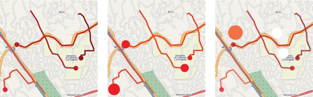
Figure 1-1. We experimented with different visual cues on a map to best display location data with impact and exposure values. The above shows three iterations during our preliminary design. The left map shows GPS traces color-coded by carbon impact; in the center map, we encoded impact with uni-color area circles; on the right, we incorporated GPS data showing when the user was idle and went back to using color-coding. (See Color Plate 1.)
One problem with representing values only at the end of a trace was that users thought the circles indicated that something happened at the very end of each trip. However, this is not the case. The map should show that something is happening during the entirety of a trip. Carbon is emitted everywhere you travel, not collected and then released at a destination.
We switched back to color-coding trips and removed the scaled area circles representing our models' values. At this point in the design process, we now had two types of GPS data: traveling and stationary. Traveling trips meant that the user was moving, whether on foot or in a vehicle; stationary chunks are times when the user is not moving. She might be sitting at a desk or stuck in traffic. To display stationary chunks, we did not completely abandon the idea of using area circles on the map. Larger circles mean longer duration, and smaller circles mean shorter duration. Similar to traveling trips, which are represented by lines, area circles are color-coded appropriately. For example, if the user chooses to color-code by particulate matter exposure, a stationary chunk that was spent idle on the freeway is shown as a brightly colored circle.
However, we are again faced with same problem as before: trying to make traces stand out on the map without clashing with the map's existing colors. We already tried different color schemes for the traces, but had not yet tried changing the shades of the actual map. Inspired by Trulia Snapshot, which maps real estate properties, we grayscaled map tiles and inverted the color filters so that map items that were originally lightly colored turned dark and vice versa. To be more specific, the terrain was originally lightly colored, so now it is dark gray, and roads that were originally dark are now light gray. This darkened map lets lightly colored traces stand out, and because the map is grayscale, there is less clashing (Figure 1-2). Users do not have to try hard to distinguish their data from roads and terrain. Modest Maps provided this flexibility.
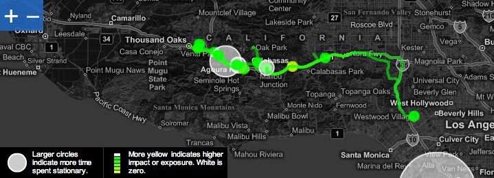
Figure 1-2. In the current mapping scheme, we use color filters to highlight the data. The map serves solely as context. Linked histograms show impact and exposure distributions of mapped data. When the user scrolls over a histogram bar, the corresponding GPS data is highlighted on the map. (See Color Plate 2.)
Once we established map tiles as the dark background and represented trips in the light foreground, we decided what colors to use. This is important because users recognize some colors as specific types of events. For example, red often means to stop or that there is danger ahead, whereas green means progress or growth, especially from an environmental standpoint.
It is also important to not use too many contrasting colors. Using dissimilar colors without any progression indicates categorical data. Model values, however, are on a continuous scale. Therefore, we use colors with a subtle gradient. In the earlier versions we tried a color scale that contained different shades of green. Users commented that because green usually means good or environmentally friendly, it was strange to see high levels of impact and exposure encoded with that color. Instead, we still use shades of green but also incorporate yellows. From low to high values, we incrementally shift from green to yellow, respectively. Trips that have impact or exposure values of zero are white.
Users can potentially map hundreds of trips at one time, providing an overview of traveling habits, impact, and exposure, but the user also needs to read individual trip details. Mapping a trip is not enough. Users have to be able to interact with trips so that they know the context of their travels.
When the user scrolls over a trip on the PEIR map, that trip is highlighted, while all other trips are made less prominent and blend in with the background without completely disappearing. To be more specific, transparency of the trip of interest is decreased while the other trips are blurred by a factor of five. Cabspotting, a visualization that maps cab activities in San Francisco, inspired this effect. When the user clicks on a trip on the map, the trip log automatically scrolls to the trip of interest. Again, the goal is to provide users with as much context as possible without confusing them or cluttering the screen.
These features, of course, handle multiple trips only to a certain extent. For example, if there are hundreds of long trips in a condensed area, they can be difficult to navigate due to clutter. This is an area we plan to improve as we incorporate user-contributed metadata such as tags and classification.
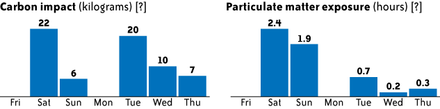
PEIR provides histograms on the right side of the map to show distributions of impact and exposure for selected trips. There are four histograms, one for each microenvironment model. The histograms automatically update whenever the user selects a trip from the trip log. If trips are mostly high in impact or exposure, the histograms are skewed to the right; similarly, if trips are mostly low in impact or exposure, the histograms are skewed to the left.
We originally thought the histograms would be useful since they are so widely used in statistics, but that proved not to be the case. The histograms actually confused more than they provided insight. Although a small portion of the test group thought they were useful, most expected the horizontal axis to be time and the vertical axis to be the amount of impact or exposure. People seemed more interested in patterns over time than overall distributions. Therefore, we switched to time-based bar charts (Figure 1-3). Users are able to see their impact and exposure over time and browse by week.
PEIR lets users share their impact and exposure with Facebook friends as another way to compare values. It is through sharing that we get around the absolute scale interpretation of axes and shift emphasis onto relative numbers, which better helps users make inferences. Although 1,000 kilograms of carbon might seem like a lot, a comparison against other users could change that misconception. Our Facebook application shows aggregated values in users' Facebook profiles compared against other Facebook friends who have installed the PEIR Facebook application (Figure 1-4).
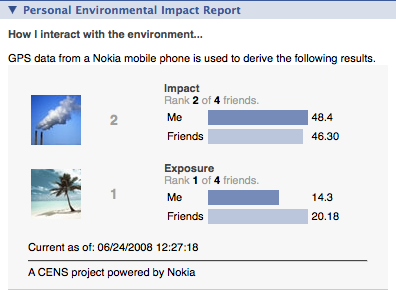
Figure 1-4. PEIR's Facebook application lets users share their impact and exposure findings as well as compare their values with friends. (See Color Plate 3.)
The PEIR Facebook application shows bar graphs for the user's impact and exposure and the average of impact and exposure for his or her friends. The application also shows overall rank. Those who have less impact or exposure are higher in rank. Icons also provide more context. If impact is high, an icon with a chimney spouting a lot of smoke appears. If impact is low, a beach with clear skies appears.
Shifting attention back to the PEIR interface, users also have a network page in addition to their personal profile. The network page again shows rankings for the last week of impact and exposure, but also shows how the user's friends rank. The goal is for users to try to climb in the rankings for least impact and exposure while at the same time encouraging their friends to try to improve. Although actual values in units of kilograms or hours for impact or exposure might be unclear at first, rankings are immediately useful. When users pursue higher ranking, values from PEIR microenvironment models mean more in the same way that a score starts to mean something while playing a video game.
The reader should take notice that no GPS data is shared. We take data privacy very seriously and make many efforts to keep certain data private, which is why only impact and exposure aggregates are shown in the network pages.
Whereas PEIR deals with data that is not immediately relatable, YFD is on the opposite side of the spectrum. YFD helps users track data that is a part of everyday conversation. Like PEIR, though, YFD aims to make the little things in our lives more visible. It is the aggregate of small choices that have a great effect. The visualization had to show this.
To begin, we go back to one of the challenges mentioned earlier. We want users to tweet frequently and work personal data collection into their daily Twitter routine. What are the motivations behind data collection? Why does a user track what he eats or his sleep habits? Maybe someone wants to lose weight so that he feels more confident around the opposite sex, or he wants to get more sleep so that he does not fall asleep at his desk. Another user, however, might want to gain weight, because she lost weight when she was sick, or maybe she sleeps too much and always feels groggy when she gets up. Others just might be curious. Whatever the motivation, it is clear that everyone has his or her own reasons for personal data collection. YFD highlights that motivation as a reminder to the user, because no matter what diet system someone is on or sleep program he is trying, people will not change unless they really want to. Notice the personal words of motivation in large print in the middle of the screen in Figure 1-5.
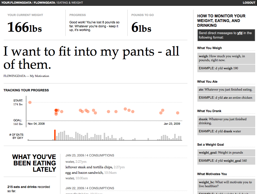
Figure 1-5. People track their weight and what they eat for different reasons. YFD places motivation front and center. (See Color Plate 4.)
It is also worth noting that each tracker's page shows what has happened most recently at the top. This serves a few purposes. First, it will update whenever the user tweets a data point, so that the user can see his status whenever he logs in to YFD. Second, we do not want to stray too far from the feel of Twitter, again to reinforce working YFD tweets into the Twitter routine. Finally, the design choice largely came out of the experience with PEIR. Users seem to expect time-based visualization, so most YFD visualization is just that.
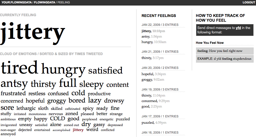
There is one exception, though—the feelings and emotions tracker (Figure 1-6). As anyone can tell you, emotions are incredibly complicated. How do you quantify happiness or sadness or nervousness? It did not seem right to break emotions down into graphs and numbers, so a sorted tag cloud is used instead. It somehow feels more organic. Emotions of higher frequency are larger than those that occur rarely. The YFD trackers are all modular at these early stages of development, but I do plan to eventually integrate all trackers as if YFD were a dashboard into a user's life. The feelings tracker will be in the center of it all. In the end, everything we do is driven by how we feel or how we want to feel.
Get Beautiful Data now with the O’Reilly learning platform.
O’Reilly members experience books, live events, courses curated by job role, and more from O’Reilly and nearly 200 top publishers.

